ConstraintLayout Tutorial for Android: Complex Layouts
In this ConstraintLayout tutorial, you’ll learn how to dynamically position UI elements in relation to other elements on the screen and to animate your views. By Fuad Kamal.
ConstraintLayout is a layout on Android that gives you adaptable and flexible ways to create views for your apps.
ConstraintLayout, which is now the default layout in Android Studio, gives you many ways to place objects. You can constrain them to their container, to each other or to guidelines. This allows you to create large, complex, dynamic and responsive views in a flat hierarchy. It even supports animations!
In this tutorial, you’ll learn to use a multitude of ConstraintLayout‘s features by building an app for a space travel agency. In the process, you’ll learn how to:
- Convert from other types of layouts to
ConstraintLayout. - Dynamically position UI elements onscreen in relation to other elements.
- Animate your views.
Note: This tutorial assumes you are familiar with the basics of Android, Kotlin and ConstraintLayout. If you’re new to Android, check out our Beginning Android tutorial. If you know Android but are unfamiliar with Kotlin, take a look at Kotlin For Android: An Introduction. To catch up on ConstraintLayout, check out ConstraintLayout Tutorial for Android: Getting Started
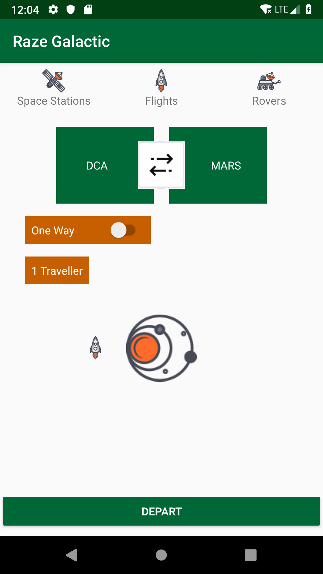
Raze Galactic — An Intergalactic Travel Service
During this tutorial, you’ll build an interface for an intergalactic travel app which lets users book trips between planets, plan weekend space station getaways and make moon rover reservations to get around when they reach their destination.

Getting Started
Use the Download Materials button at the top or bottom of this tutorial to download the starter project.
Open the starter project in Android Studio. Build and run the app.
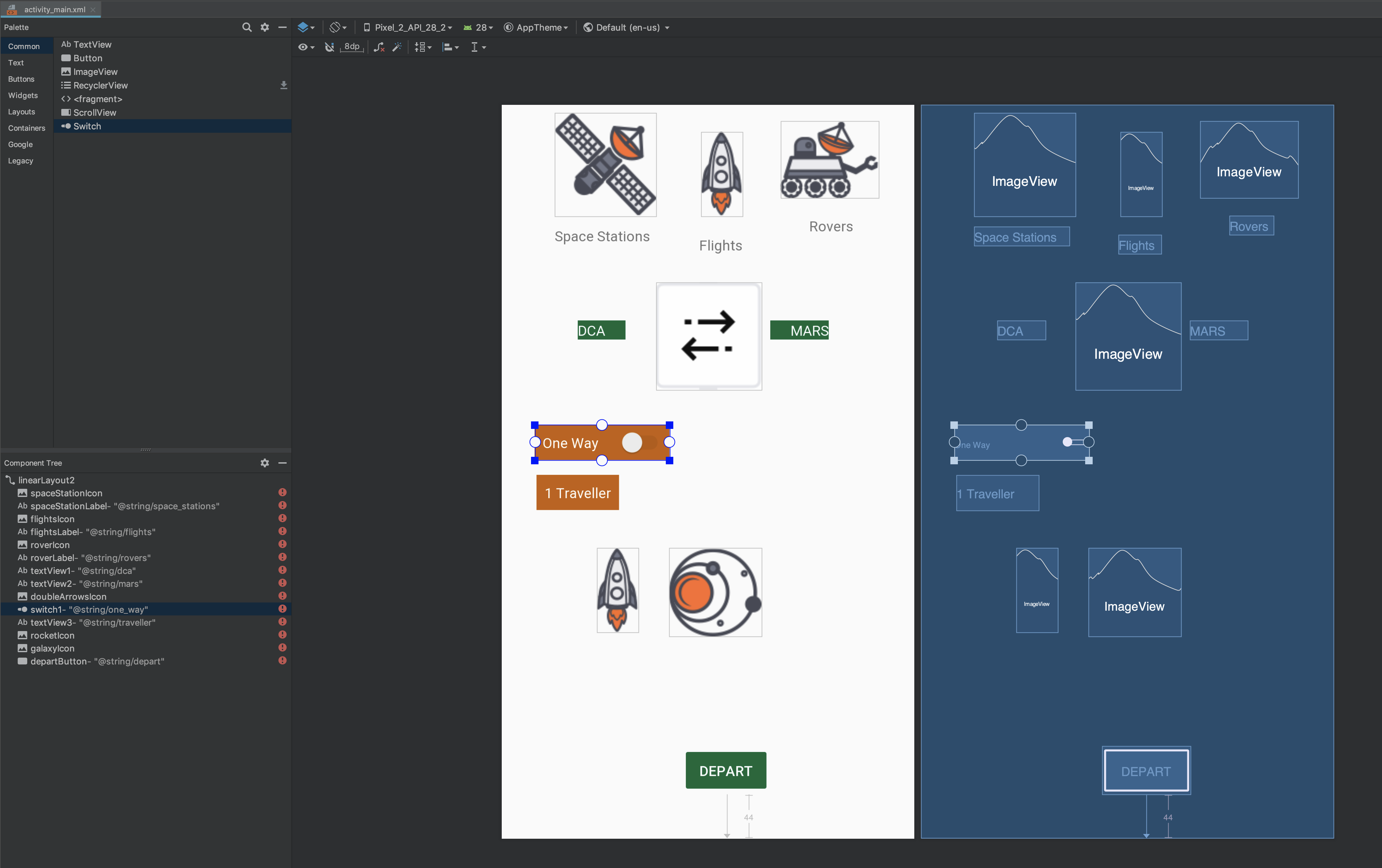
There are many elements in this app. You’ll learn how to display them properly using a complex ConstraintLayout in this tutorial.
To start, go to Android Studio and open the layout file for this app, activity_main.xml, in Design view. Notice the structure of the layout is a series of nested LinearLayouts and RelativeLayouts.

ConstraintLayout is not the best choice for simple layouts, but it’s great for complex layouts like the one in this tutorial.
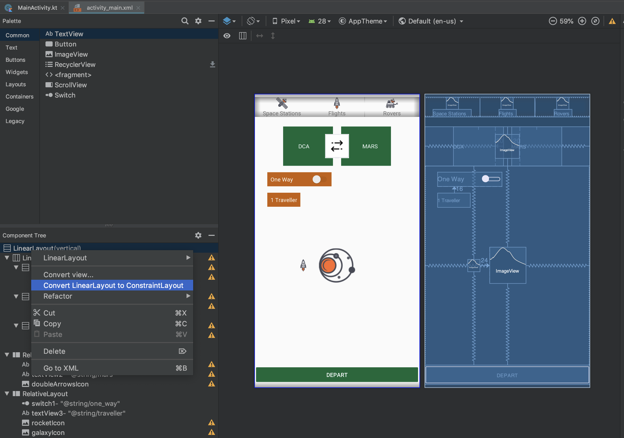
Converting a Layout to ConstraintLayout
In the Component Tree in Design view, right-click on the top-level LinearLayout and select Convert LinearLayout to ConstraintLayout from the context menu:
Next, you should get a pop-up dialog with some options:

Accept the defaults after reading what they do and click on OK to dismiss the dialog and convert the layout. Android Studio will then attempt to remove all the nested layouts and convert your layout to ConstraintLayout.
At this point, you may need to give Android Studio a moment to do some processing as it tries to figure out the new layout. After a moment, your layout may look like this:

After another moment, all your views may just jump into the upper left corner of the layout. If this happens, don’t panic!
Note: Make sure to turn off Autoconnect for this tutorial. Find this option in the toolbar of the design editor when you have ConstraintLayout selected.

Removing Inferred Constraints
During the conversion process, Android Studio performs a number of steps. The last one may have been Infer Constraints, whose results might not quite be what you wanted. ;] If that’s the case, simply go to the Edit menu and choose Undo Infer Constraints:

Alternatively, you can simply press ⌘-Z on Mac or Control-Z on Windows.
In the Design view of Android Studio, your preview may now look like this:

It’s close, but not quite where the layout needs to be. You can drag the views around a bit until they look more like the original layout:

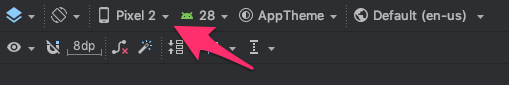
Note: This tutorial uses a Pixel 2 as the device in the preview. If you are using a different device, the views may look different than they do in the screenshots. You can change this setting in the toolbar.
Don’t spend a lot of time trying to get the layout exactly like it was before. At this point, you just want a very rough estimation to get yourself visually oriented. You’ll add all the constraints you need to make it look perfect throughout the rest of this tutorial.
When you are done, your layout may look something like this:
If Android Studio added any constraints automatically as you dragged the views around, just click the Clear All Constraints button to get rid of them.

One last thing before putting theses elements in their final places, change the ID of the root ConstraintLayout to be constraintLayout.
Resizing the Images
Next, fix the image sizes by clicking on each of the icons, spaceStationIcon, flightsIcon, and roverIcon, at the top. Then, in the Attributes panel, change the layout_width and layout_height properties from wrap_content to 30dp.

You’ll see a bunch of errors listed in the Component Tree. These appear because Android doesn’t have any information from constraints to tell it where to position the UI elements. You’ll start fixing that problem now.
Note: Android Studio offers various ConstraintLayout tools to save you time, but they don’t always do what you expect. It helps to visualize what the constraints should do before you start to add them. That way, if Android Studio’s tools misbehave, you can add individual constraints one at a time to achieve the effect you want.
Keep this in mind as you use the Align menu and other tools in the steps below: if Android Studio doesn’t do what you expect, go back and add the individual constraints yourself.
Adding Constraints: Figuring out Alignment
You’ll set your constraints with a top-down approach, starting with the elements at the top of the screen and working your way down to the bottom.
You want the three icons at the top of the screen to line up with each other horizontally. Then you’ll center the labels under each of those icons.
Constraining the First Icon
First, you’ll constrain spaceStationIcon above the word “Space Stations” to the top of the screen.
To do this, click on spaceStationIcon to select it and reveal its constraint anchors. Click on the top anchor and drag it to the top of the view. The icon may slide up to the top of the view. Don’t connect its left constraint yet.
With the spaceStationIcon selected, drag it down from the top so that there’s a little space between the top of the view and the rocket.
Next, switch to Code view and examine the updated XML for the rocket icon. You have added one new constraint, app:layout_constraintTop_toTopOf="parent", and a top margin attribute for the space between the rocket and the top of the view. Update the code to set the margin to 15dp.
The XML for spaceStationIcon should now look like this:
<ImageView
  android:id="@+id/spaceStationIcon"
  android:layout_width="30dp"
  android:layout_height="30dp"
  android:layout_marginTop="15dp"
  android:src="@drawable/space_station_icon"
  app:layout_constraintTop_toTopOf="parent" />
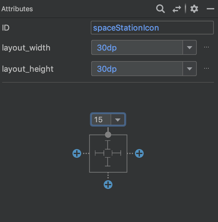
You can adjust the margin in the Design view as well. To do this, switch to Design view and click on the Attributes tab on the right, if it’s not already visible.
Next, click on the spaceStationIcon to reveal the attributes for that image. After ID, layout_width and layout_height, you’ll see a graphic representation of the margins.
You can pick a new value for the margin by choosing it from the drop-down menu or by clicking on the number and entering a new value.