ConstraintLayout Tutorial for Android: Complex Layouts
In this ConstraintLayout tutorial, you’ll learn how to dynamically position UI elements in relation to other elements on the screen and to animate your views. By Fuad Kamal.
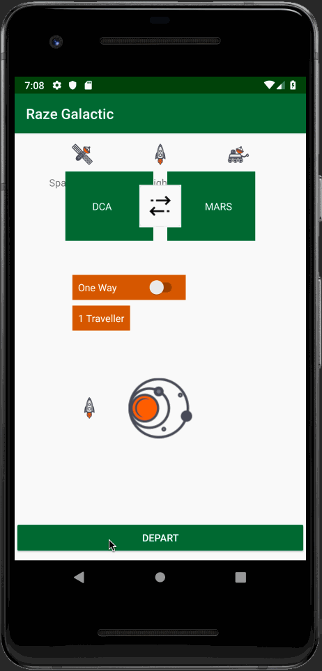
Adding Constraints to Guidelines
Now that your guidelines are set up, you can start adding constraints to them.
First, for the double arrows icon:
- Constrain the bottom to the horizontal guideline.
- Set the bottom margin to 40dp.
For the switch:
- Set the width to 160dp.
- Constrain the left side to the vertical guideline.
- Constrain the top to the parent (top of the screen).
- Set the margin at the top to 200dp.
For the label beneath the switch listing the number of travelers:
- Constrain the left side to the vertical guideline.
- Constrain the top to the bottom of the switch.
For the galaxy icon (id is galaxyIcon):
- Set the width and height to 90dp.
- Constrain the top to the horizontal guideline.
- Constrain the bottom to the bottom of the parent (bottom of the screen). This will center it between the horizontal guideline and the bottom of the screen.
- Center it horizontally in the parent view.
For the rocket icon to the left of the galaxy icon (ID is rocketIcon):
- Set the width and height to 30dp.
- Constrain the rocket icon’s top, bottom, and right sides to the top, bottom, and left sides of the galaxy icon, respectively.
Finally, for the DEPART button at the bottom:
- Change the width from
wrap_contenttomatch_parent. - Constrain its bottom to the bottom of the parent (bottom of the screen).
At this point, you should have set all the constraints Android Studio needs to figure out the layout; there should be no errors in the Component Tree. Your layout should now look similar to this:

Build and run the app:

Your layout looks great now! But clicking the button doesn’t do anything… so it’s time to add some pizzaz with a few simple animations!
Circular Position Constraints
In addition to the methods that you’ve already learned, you can also constrain UI elements relative to each other using distance and an angle. This allows you to position them on a circle, where one UI element is at the center of the circle and the other is on the perimeter.

To do this, select the rocket icon next to the galaxy icon and update its code in Code view as follows:
<ImageView
  android:id="@+id/rocketIcon"
  android:layout_width="30dp"
  android:layout_height="30dp"
  android:src="@drawable/rocket_icon"
  app:layout_constraintCircle="@id/galaxyIcon"
  app:layout_constraintCircleAngle="270"
  app:layout_constraintCircleRadius="100dp" />
The first constraint attribute, layout_constraintCircle, indicates the ID of the UI element that will be on the center of the circle. The other two attributes indicate the angle and radius.
Why would you want to use such an unusual type of constraint, you ask? Stay tuned, in a moment you’ll use this technique to animate the rocket to fly around the screen!
Note: You can ignore the error in Component Tree for the view using circular constraint. Android Studio doesn’t seem to recognize circular constraint yet.
Build and run the app. Everything should still appear properly positioned onscreen:

Animating the UI Elements on the Screen
Now that you’re a master of laying things out onscreen using ConstraintLayout, it’s time to add some rocket fuel into the mix and take off to the next level!
In this section, you’ll start with the complex layout you created and add some cool UI animations in just a few steps.
Constraint Sets
Using ConstraintLayouts, you can use Keyframe Animations to animate your views. To do this, you’ll provide a pared-down copy of your layout file, known as a ConstraintSet. A ConstraintSet only needs to contain the constraints, margins and padding of the elements within a given ConstraintLayout.
In your Kotlin code, you can then apply ConstraintSet to your ConstraintLayout to update its layout.
To build an animation, you need to specify a single layout file and a ConstraintSet to act as the starting and ending keyframes. You can also apply transitions to make your animations a bit fancier.
Setting up the Starting Layout for Your Animation
In your project, duplicate your layout file and name the duplicate keyframe1.xml. You’re going to need to alter the positions of elements in this new layout and set this new layout as the starting layout for the app.
To start, open keyframe1.xml and change the layout_constraintGuide_begin property of guideline1 from 200dp to 0dp. This moves the guide, the elements constrained to the guide, and all elements constrained to them higher up, so that some of them are are now offscreen.
Then change the layout_constraintGuide_percent property of guideline2 from .05 to 1. This moves the guide and the elements constrained to it to the far right so that they are offscreen as well.
Now, we’ve changed the layout by just moving a couple of guides, but we still need to make this new layout the starting layout for the app. To do this, open MainActivity.kt and modify the setContentView() call in the onCreate() function to pass in R.layout.keyframe1 instead of R.layout.activity_main:
setContentView(R.layout.keyframe1)
Build and run your app. The orange switch and label and the arrival and destination space ports no longer appear on the screen. Additionally, the rocket and universe icons have moved up:

Animating the View
Change the following import statement in your MainActivity.kt Kotlin class:
import import kotlinx.android.synthetic.main.activity_main.*
to the following:
import kotlinx.android.synthetic.main.keyframe1.*
This allows you to reference UI elements in the new layout XML without any findViewById() craziness from the pre-historic days of Android development. :]
Next, add the following private properties to the class. You may need to add the android.support.constraint.ConstraintSet import:
private val constraintSet1 = ConstraintSet()
private val constraintSet2 = ConstraintSet()

private var isOffscreen = true
The first two properties are the constraint sets that you’ll use to animate your view. You will use the boolean to keep track of the layout state.
Transition Manager
You can use the Transition Manager class to handle transitioning from one keyframe to another. To create a layout animation, you simply provide Transition Manager with the ConstraintSet you want to animate and it will handle the rest. Optionally, you can provide it with custom animations to perform.
Now, add the following to the onCreate() function, importing TransitionManager:
constraintSet1.clone(constraintLayout) //1
constraintSet2.clone(this, R.layout.activity_main) //2

departButton.setOnClickListener { //3
  //apply the transition
  TransitionManager.beginDelayedTransition(constraintLayout) //4
  val constraint = if (!isOffscreen) constraintSet1 else constraintSet2
  isOffscreen = !isOffscreen
  constraint.applyTo(constraintLayout) //5
}
- This pulls the layout information from the initial layout into one of the constraint sets,
constraintSet1. Since you added anIDto theConstraintLayoutearlier, you can refer to it directly from code now. - This pulls the layout information from the final layout into
constraintSet2. Since you are creating aConstraintSetand you never actually inflate the second layout file, you avoid the overhead and performance hit of dealing with a second layout. - This adds the animation in the listener for the button, for now, so that you can trigger the animation whenever it’s toggled.
- This calls Transition Manager’s
beingDelayedTransitionfunction. - This applies the new
ConstraintSetto the currently displayedConstraintLayout.
Build and run the app. Click the button at the bottom of the screen repeatedly to see how the animation works.
Voila! The app loads with a bunch of elements offscreen. When you tap the button, the guide positions animate, which causes everything constrained to them to animate as well.