ConstraintLayout Tutorial for Android: Complex Layouts
In this ConstraintLayout tutorial, you’ll learn how to dynamically position UI elements in relation to other elements on the screen and to animate your views. By Fuad Kamal.
Aligning the Top Three Icons Horizontally: Using Chains
Next, you want the three icons at the top of the screen to line up in a row with equal spacing between them. To achieve this, you could add a bunch of individual constraints for each icon. However, there’s a much faster way to do this, using chains.
Chains
A chain occurs whenever you have bi-directional constraints. You won’t necessarily see anything special in the XML; the fact that there are mutual constraints in the XML is enough to make a chain.
Whenever you use alignment controls from the menu, such as Align Horizontal Centers, Android Studio is actually applying a chain. You can apply different styles, weights and margins to chains.
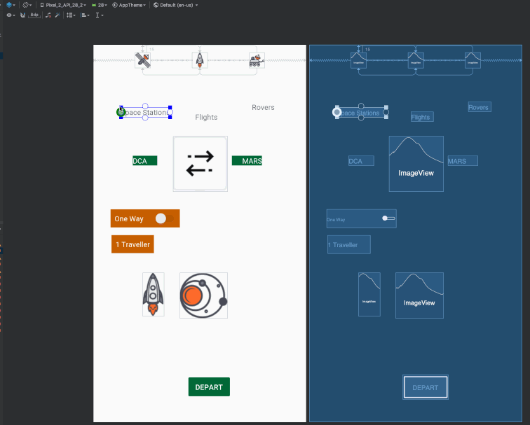
Start by switching back to Design view. Shift-click to select all three icons at the top of the screen: spaceStationIcon, flightsIcon and roverIcon. Then right-click to bring up the context menu and select Center ▸ Horizontally. This will automatically create a chain and generate constraints.
In the Design view, you can see that some of the lines representing the constraints look different than others. Some look like squiggly lines, while others resemble a chain.

Exploring Chains
To explore some of the chain modes, click the Cycle Chain Mode button that appears at the bottom of the icons when you select them.

The modes are:
- Packed: The elements display packed together.
- Spread: The elements spread out over the available space, as shown above.
- Spread inside: Similar to spread, but the endpoints of the chain are not spread out.

Make sure you end with spread as the selected chain mode. You’ll know this is selected one of two ways:
- The view will display with the icons spaced as they are in the example screenshot
- The attribute
app:layout_constraintHorizontal_chainStyle="spread"will be on one of the image views. Updating this attribute is another way to change the chain mode.
Aligning Views
Again, select the three icons. From the tool bar, select Align ▸ Vertical Centers. Android Studio should add constraints to the images to align the bottom and the top of each image to its neighbor.

Your layout should now look like this:
If your layout doesn’t match this image, check the Text and Design views. If you’ve lost the original constraint between flightsIcon and the top of the view, and if spaceStationIcon didn’t get the constraints you expected, press ⌘ + Z on Mac, or Control + Z on Windows to undo.
Then, manually add the constraints by clicking on the top constraint anchor of spaceStationIcon and dragging it to the top constraint anchor of flightsIcon, and so on, until you have added all of the constraints in the diagram above.
Your three icons should now have the following XML:
<ImageView
  android:id="@+id/spaceStationIcon"
  android:layout_width="30dp"
  android:layout_height="30dp"
  android:layout_marginTop="15dp"
  android:src="@drawable/space_station_icon"
  app:layout_constraintEnd_toStartOf="@+id/flightsIcon"
  app:layout_constraintHorizontal_chainStyle="spread"
  app:layout_constraintStart_toStartOf="parent"
  app:layout_constraintTop_toTopOf="parent" />

<ImageView
  android:id="@+id/flightsIcon"
  android:layout_width="30dp"
  android:layout_height="30dp"
  android:src="@drawable/rocket_icon"
  app:layout_constraintBottom_toBottomOf="@+id/spaceStationIcon"
  app:layout_constraintEnd_toStartOf="@+id/roverIcon"
  app:layout_constraintStart_toEndOf="@+id/spaceStationIcon"
  app:layout_constraintTop_toTopOf="@+id/spaceStationIcon" />

<ImageView
  android:id="@+id/roverIcon"
  android:layout_width="30dp"
  android:layout_height="30dp"
  android:src="@drawable/rover_icon"
  app:layout_constraintBottom_toBottomOf="@+id/flightsIcon"
  app:layout_constraintEnd_toEndOf="parent"
  app:layout_constraintStart_toEndOf="@+id/flightsIcon"
  app:layout_constraintTop_toTopOf="@+id/flightsIcon" />
Aligning the Text for Each of the Icons
Now that the icons are in place, you’ll need to set their text fields to appear in their proper places.
Select the TextView labeled Space Stations to reveal its constraint anchors. Constrain the left side of the Space Stations TextView to the left side of the space station icon and the right side of the Space Stations TextView to the right side of the space station icon. This centers it vertically with the icon.
Then change the default margins in the tool bar to 15dp and just drag from the top anchor of the label to the bottom anchor of the icon, which will set both the constraint and the margin in a single step. Do the same for the other labels to align them to their icons.
Now, the constraint errors for the top two rows of UI elements should be gone. The XML for the top three images and labels should look like this:
<TextView
  android:id="@+id/roverLabel"
  android:layout_width="wrap_content"
  android:layout_height="wrap_content"
  android:layout_marginTop="15dp"
  android:text="@string/rovers"
  app:layout_constraintEnd_toEndOf="@+id/roverIcon"
  app:layout_constraintStart_toStartOf="@+id/roverIcon"
  app:layout_constraintTop_toBottomOf="@+id/roverIcon" />

<TextView
  android:id="@+id/flightsLabel"
  android:layout_width="wrap_content"
  android:layout_height="wrap_content"
  android:layout_marginTop="15dp"
  android:text="@string/flights"
  app:layout_constraintEnd_toEndOf="@+id/flightsIcon"
  app:layout_constraintStart_toStartOf="@+id/flightsIcon"
  app:layout_constraintTop_toBottomOf="@+id/flightsIcon" />

<TextView
  android:id="@+id/spaceStationLabel"
  android:layout_width="wrap_content"
  android:layout_height="wrap_content"
  android:layout_marginTop="15dp"
  android:text="@string/space_stations"
  app:layout_constraintEnd_toEndOf="@+id/spaceStationIcon"
  app:layout_constraintStart_toStartOf="@+id/spaceStationIcon"
  app:layout_constraintTop_toBottomOf="@+id/spaceStationIcon" />
Using Guidelines
So far, you’ve constrained UI elements to their parent containers and to each other. Another option you have is to add invisible guidelines to the layout and constrain UI elements to those guidelines.
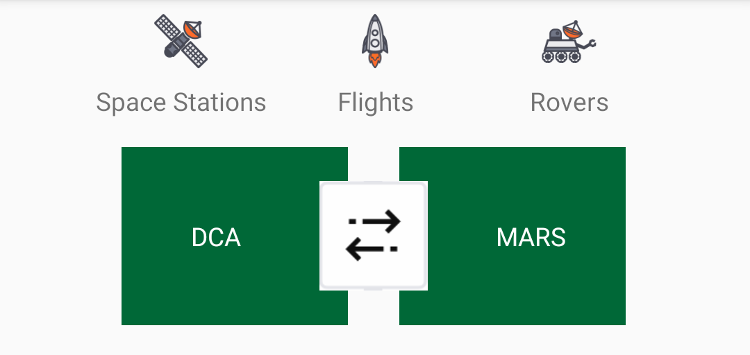
Recall that in the final layout, the double arrows image should be centered and should overlap the two green views.
Setting the Horizontal and Vertical Guidelines
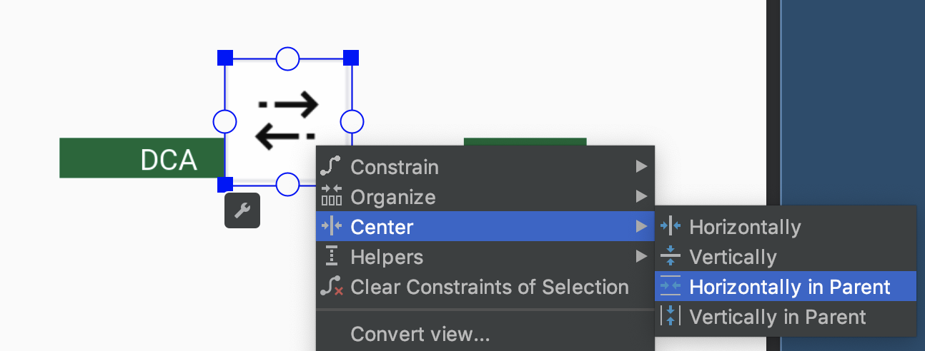
Select the double arrows icon and set the height and width to 60dp. Then right-click on it and choose Center ▸ Horizontally in Parent from the context menu.
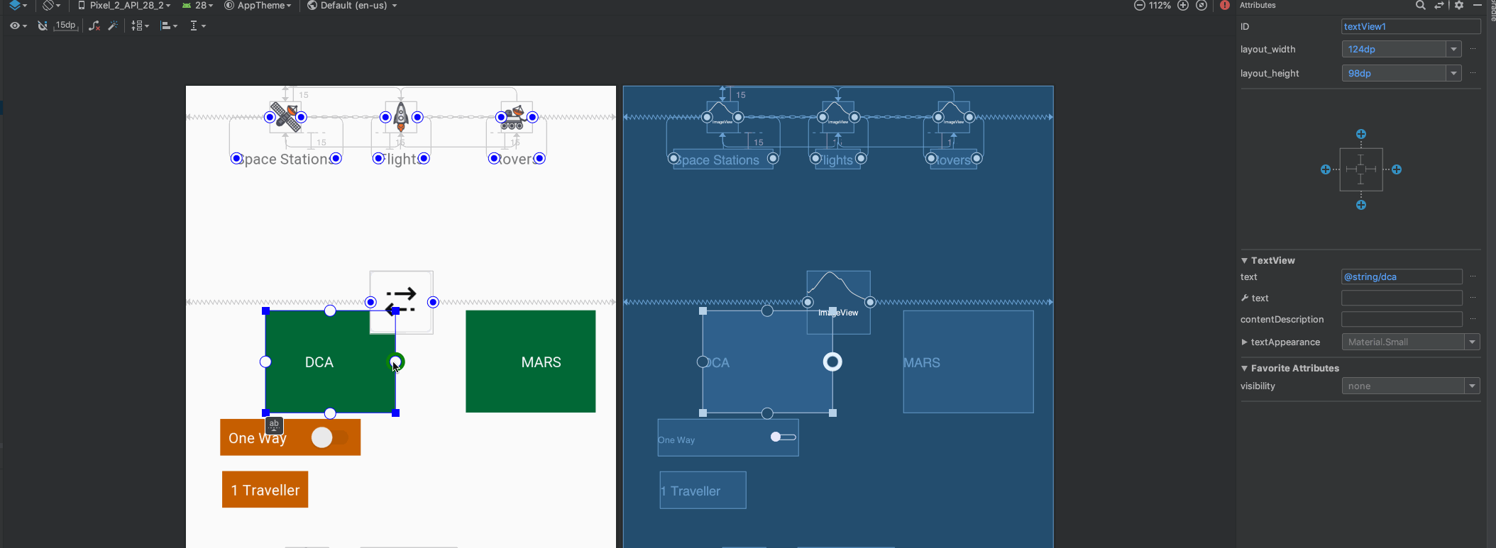
For each of the green TextViews, you’ll now set the width to 124dp and the height to 98dp.
To make the double arrows icon overlap the two green TextViews, you’ll constrain the right side of the left TextView to the right side of the double arrows icon and set the right margin to 40dp.
Similarly, constrain the left side of the right TextView to the left side of the double arrows icon and set the left margin to 40dp.
Lastly, constrain the top and bottom of the TextViews to the top and bottom of doubleArrowsIcon.
Next, click on the Guidelines menu in the toolbar and select Add Horizontal Guideline.

This will add a horizontal dashed line to the layout.
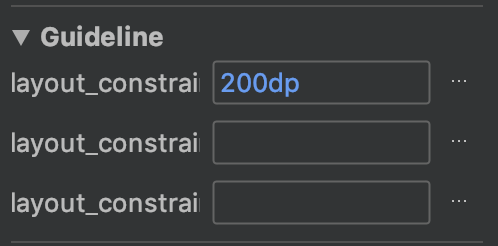
Select the horizontal guideline using the Component Tree in Design view. In the attributes inspector, change the ID of the guideline to guideline1. Note the guideline properties: layout_constraintGuide_begin and layout_constraintGuide_percent.
For the horizontal guideline, set layout_constraintGuide_begin to 200dp.
Finally, add a vertical guideline, ensure that you’ve set its ID to guideline2 and set its layout_constraintGuide_percent to 0.05. This positions guideline2 to 5% of the screen width from the left.
Positioning the Guidelines
You can position guidelines using one of these three attributes:
- layout_constraintGuide_begin: positions a guideline with a specific number of dp from the left (for vertical guides) or the top (for horizontal guides) of its parent.
- layout_constraintGuide_end: positions a guideline a specific number of dp from the right or bottom of its parent.
- layout_constraintGuide_percent: places a guideline at a percentage of the width or height of its parent.
After you constrain elements to the guidelines, you can constrain other elements to them. That way, if the guideline changes position, everything constrained to the guideline, or to the other elements fixed to the guideline, will adjust its position.
Hint: Later, you’ll use this feature to create some cool animations!