How to Create a Neumorphic Design With SwiftUI
In this neumorphic design tutorial, you’ll learn how to use SwiftUI’s powerful modifiers to craft beautiful custom elements. By Yono Mittlefehldt.
Making That Border Pop
Right now, you want the white sections of the border and the highlights to stand out. Time to change the background color of the element.
After the closing parenthesis for overlay, add the following lines:
.background(Color.lairBackgroundGray)
.cornerRadius(15)
Since a background can be any View and not just a color, you need to pass it Color.lairBackgroundGray. This is different from foregroundColor, which can only take a Color.

Changing the Border Shape
You may be asking yourself, “What’s up with the cornerRadius? Wasn’t that already taken care of with the border you created using the overlay?
Sort of. cornerRadius defined that the border would have a corner radius. However, the border is an overlay on top of the view. This means cornerRadius doesn’t change the shape of the view. You’ll still need to change the underlying shape yourself.
If you comment out cornerRadius, you’ll see your view still has sharp corners and your border is just an overlay.
That’s ugly. But uncomment the modifier again, and everything is back to normal.
AccessoryView looks much better. But it doesn’t pop now, and the symbol in the middle lacks depth. To add that depth to the view, use the same technique you used with the symbol: Highlights and shadows.
Just below cornerRadius, add the following:
.shadow(
  color: Color(white: 1.0).opacity(0.9),
  radius: 18,
  x: -18,
  y: -18)
.shadow(
  color: Color.lairShadowGray.opacity(0.5),
  radius: 14,
  x: 14,
  y: 14)
Since the first shadow is white, it acts as a highlight. The second shadow is your, well, shadow.
Troubleshooting AccessoryView
If you run the app, you’ll encounter two problems that prevent you from viewing AccessoryView in its full glory.

Here you see that:
- The background remains white, so the highlight cannot be seen against it.
-
AccessoryViewRowhas no vertical padding, so the shadow and highlight are cut off.
To fix the first problem, open LairView.swift and embed NavigationView‘s VStack in a ZStack. Command-click on VStack and select Embed in HStack (there’s no option to embed in a ZStack. Then change HStack to a ZStack.

Add the following as the first element in the new ZStack right above the VStack:
Color.lairBackgroundGray.edgesIgnoringSafeArea(.all)
This adds Color in the desired background color, allowing it to fill the screen by ignoring all safe area edges.
To fix the second problem, open AccessoryRowView.swift. Then add the following two modifiers to the entire HStack in ScrollView:
.padding(.top, 32)
.padding(.bottom, 38)
This code adds padding to the top and the bottom of the view. Very cool.
You’re now done with AccessoryView. Build and run.

That’s starting to look good!
Introducing Built-in Modifiers
You’ve used a couple of View modifiers to customize your first element. But SwiftUI sports a ton of built-in modifiers. For example:
- animation: This applies an animation to the view.
- clipShape: This sets a clipping shape for the view.
- onAppear: This allows some code to run when the view appears.
- rotationEffect: This rotates the view about a given point.
If you are interested in the full list, check out Apple’s documentation.
There’s a modifier for almost everything you could possibly want to do. Almost.
Discovering Inverse Masks
Before you can tackle the tab bar, you need to learn about inverse masks.
Since Apple included mask, you’d think it would also include inverseMask so everything opaque could cut a “hole” in the layer below. Well, Apple did not.
You will have to create your own modifier for this. Add a new Swift File to the Extensions group. Name it ViewExtension.swift.
Then replace the contents with the following code:
import SwiftUI

extension View {
  // 1
  func inverseMask<Mask>(_ mask: Mask) -> some View where Mask: View {
    // 2
    self.mask(mask
      // 3
      .foregroundColor(.black)
      // 4
      .background(Color.white)
      // 5
      .compositingGroup()
      // 6
      .luminanceToAlpha()
    )
  }
}
With this handful of lines, you have:
- Defined a new
inverseMaskthat mimicsmask. - Returned the current view masked with the input mask and modified.
- Set the foreground color of the input mask to black.
- Ensured the background of the input mask is solid white.
- Wrapped the input mask in a compositing group.
- Converted the luminance to alpha, turning the black foreground transparent and keeping the light background opaque — i.e., an inverse mask!
It’s worth stressing that this would not work without compositingGroup. Before creating the compositing group, the background was a solid white layer, and the foreground was a black image with a transparent background sitting on top of the white background.

If you call luminaceToAlpha, the black foreground becomes transparent, and the entire solid white background becomes visible.

But by using compositingGroup, you have a single-rendered layer composed of black and white pixels.
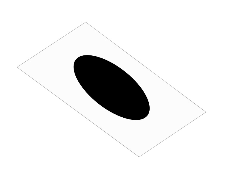
After running luminanceToAlpha, you get the dark foreground cut out from the view.

Phew! Time to use this new effect on the tab bar buttons!
Tackling Tab Bar Buttons
This step is the most involved in the tutorial. Part of the problem is the use of inverse masks as required by the designer. But, of course, you already solved that part.
The other part is the limited options you have for customizing tab bar buttons. Luckily, the previous developers of SmartLair didn’t know how to properly use TabView, so they implemented it manually. This makes your job easier! As for the previous developers, may they rest in peace.
Even so, you still need to design both a selected and unselected look for the buttons.
To get started, open TabBarItemView.swift and add the following constant above the definition of body:
let size: CGFloat = 32
Yes, that’s a hard-coded size. Don’t worry. This is just for the tutorial. You can fix it in a point release later. ;]
Just below the constant, add a helper function:
func isSelected() -> Bool {
  return selectedItem == smartView
}
This function does exactly what it says on the tin: It asks whether the current tab bar item is selected. It does so by checking if the bound selectedItem matches its defined SmartView.
Because this is a toggle button, the function can help you determine how to present the tab bar button.
Next, add the following stubs to the bottom of TabBarItemView:
var buttonUp: some View {
  EmptyView()
}

var buttonDown: some View {
  EmptyView()
}
You’ll use these to better organize how the tab bar items look when they’re up and down. For now, the EmptyViews are placeholders to prevent Xcode from nagging you.
Now, update the Button in the body to look like this:
Button(action: {
  self.selectedItem = self.smartView
}) {
  // This is the new stuff!
  if isSelected() {
    buttonDown
  } else {
    buttonUp
  }
}
You replaced the Image with a conditional to decide which button state to present to the user.
All that’s left is to design how the buttons look.