How to Create a Neumorphic Design With SwiftUI
In this neumorphic design tutorial, you’ll learn how to use SwiftUI’s powerful modifiers to craft beautiful custom elements. By Yono Mittlefehldt.
Designing the Unselected Tab Bar Button
You will start with the unselected button and design it similarly to AccessoryView. There’s one difference, though. Instead of making the symbol look raised above the surface, you will make it look cut from the surface. It’s inverse mask time!
Replace buttonUp with:
var buttonUp: some View {
  // 1
  var buttonMask: some View {
    // 2
    ZStack {
      // 3
      Rectangle()
        .foregroundColor(.white)
        .frame(width: size * 2, height: size * 2)
      // 4
      Image(systemName: self.icon)
        .resizable()
        .scaledToFit()
        .frame(width: size, height: size)
    }
  }

  // 5
  return buttonMask
}
In this code, you have:
- Defined a property within a property to store the mask you’ll use for the button. This will keep the code a little more readable.
- Used a
ZStackas the top-level view for the mask. - Defined a white
Rectangleto act as the background of the mask. - Created an
Imagethat is half the width and height of the background rectangle. This image will be what’s cut out when you turn this button into an inverse mask. - Returned the mask, so you can see what it looks like. You’ll replace this line after checking to make sure it looks right.
You should see a very simple icon in the middle of the canvas preview.
Next, replace return buttonMask with the following:
// 1
var button: some View {
  // 2
  ZStack {
    // 3
    Rectangle()
      .inverseMask(buttonMask)
      .frame(width: size * 2, height: size * 2)
      .foregroundColor(.lairBackgroundGray)
    }
  }

// 4
return button
Here, you have:
- Defined another property for the actual button.
- Used a
ZStackto contain all the elements. There will be more to come. - Created a
Rectanglethat usesbuttonMaskas an inverse mask! - Returned the button.
If you look at the canvas preview, you finally see the fruits of your inverse mask labor!
Adding Unselected Tab Bar Button Effects
A button with a hole isn’t spectacular on its own, so you’ll add some more effects to it!
Just above the button‘s Rectangle, but still within ZStack, add the following LinearGradient:
LinearGradient.lairHorizontalDarkReverse
  .frame(width: size, height: size)
This LinearGradient is just big enough to cover the symbol cutout in the button and be visible through the cutout.

Next, add the following modifiers to the button‘s Rectangle just after foregroundColor:
.shadow(color: .lairShadowGray, radius: 3, x: 3, y: 3)
.shadow(color: .white, radius: 3, x: -3, y: -3)
.clipShape(RoundedRectangle(cornerRadius: size * 8 / 16))
Here, you added highlights and shadows but in the opposite direction from before. That’s because you want them to affect the cutout in the middle of the button. The clipShape not only rounds the corners of the button; it also contains the highlights and shadows within those bounds. If they leaked out, it wouldn’t look right.

Finally, add these effects to the entire ZStack:
.compositingGroup()
.shadow(
  color: Color.white.opacity(0.9),
  radius: 10,
  x: -5,
  y: -5)
.shadow(
  color: Color.lairShadowGray.opacity(0.5),
  radius: 10,
  x: 5,
  y: 5)
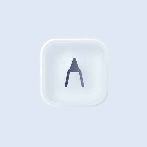
First, ensure all views within the ZStack are in a compositing group. Then add the typical highlight and shadow to give the button a raised look. Your unselected button now looks like this:

And when you get the correct background color behind it, it will look like this:
Designing the Select Tab Bar Button
An unselected state for a button is not enough. You’ll need to add the selected state, too.
Before you get started, scroll down to the bottom of TabBarItemView.swift to TabBarItemView_Previews. In the parameter list for the preview TabBarItemView, change the selectedItem to be .constant(SmartView.lair):
struct TabBarItemView_Previews: PreviewProvider {
  static var previews: some View {
    TabBarItemView(
      selectedItem: .constant(SmartView.lair),
      smartView: .lair,
      icon: "pencil.tip")
  }
}
This presents the button as selected in the preview canvas, so you can see the changes as you make them.
OK. Now, replace the current implementation of buttonDown with the following:
var buttonDown: some View {
  ZStack {
    Rectangle()
      .foregroundColor(.lairBackgroundGray)
      .frame(width: size * 2.25, height: size * 2.25)
      .cornerRadius(size * 8 / 16)
  }
}
Here, you defined the shape, color and size of the button when it is selected.

Unfortunately, it’s a bit larger than the unselected button. Here’s the cross-section effect you’re shooting for from a different angle:

As such, you need to make it slightly larger to account for the outer rim of the selected button. Previously, this would have been “hidden” in the highlights and shadows, but now it needs to be visible.
Add the following Rectangle below the one you just created:
Rectangle()
  .foregroundColor(.lairBackgroundGray)
  .frame(width: size * 2.25, height: size * 2.25)
  .cornerRadius(size * 8 / 16)
  .inverseMask(Rectangle()
    .cornerRadius(size * 6 / 16)
    .padding(size / 8)
  )
The preview looks exactly the same, but don’t adjust your screen. Instead, change foregroundColor of this Rectangle to .blue. See what happens.

You created a border around the button that’s invisible, but you didn’t use the same overlay trick from earlier. That’s because an inverse mask will allow you to create a shadow on the inside of the button, while the overlay will not.
Change the .blue back to .lairBackgroundGray.
Now, add these modifiers to the Rectangle after inverseMask‘s closing parenthesis:
.shadow(
  color: Color.lairShadowGray.opacity(0.7),
  radius: size * 0.1875,
  x: size * 0.1875,
  y: size * 0.1875)
.shadow(
  color: Color(white: 1.0).opacity(0.9),
  radius: size * 0.1875,
  x: -size * 0.1875,
  y: -size * 0.1875)
.clipShape(RoundedRectangle(cornerRadius: size * 8 / 16))
These add the typical inner shadow and highlight to the inverse mask and clip the outer shape of the button so that the shadows don’t bleed through to the other side.

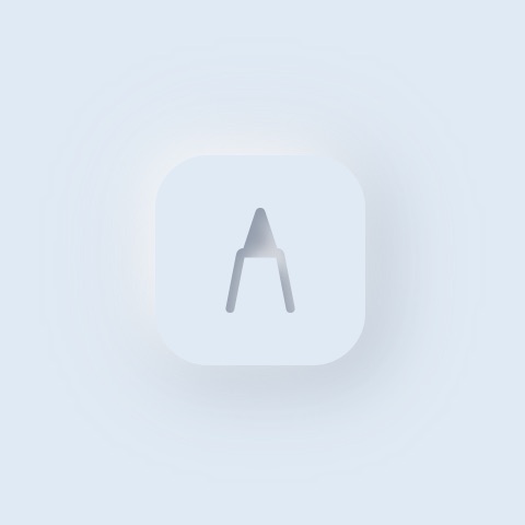
It’s starting to look like a button that’s been pressed!
Incorporating the Button Symbol
You’ll now add the button symbol. You’ll make it slightly heavier — that is, darker — to show the button has been selected. You’ll also skip the inverse mask this time.
Add the following below the last Rectangle and all of its modifiers:
LinearGradient.lairHorizontalDarkReverse
  .frame(width: size, height: size)
  .mask(Image(systemName: self.icon)
    .resizable()
    .scaledToFit()
  )
  .shadow(
    color: Color.lairShadowGray.opacity(0.5),
    radius: size * 0.1875,
    x: size * 0.1875,
    y: size * 0.1875)
  .shadow(
    color: Color(white: 1.0).opacity(0.9),
    radius: size * 0.1875,
    x: -size * 0.1875,
    y: -size * 0.1875)
With this view, you use the button icon to mask the LinearGradient at the appropriate size and then add highlights and shadows.
There’s one last effect to add: A nice gradient border around the button. After the closing brace of the ZStack, add the following overlay:
.overlay(
  RoundedRectangle(cornerRadius: size * 8 / 16)
    .stroke(LinearGradient.lairDiagonalLightBorder, lineWidth: 2)
  )
This overlay defines a border that’s a rounded rectangle with a width of two points and uses a diagonal linear gradient.

Again, here’s how it will look with the proper background color: