How to Create a Neumorphic Design With SwiftUI
In this neumorphic design tutorial, you’ll learn how to use SwiftUI’s powerful modifiers to craft beautiful custom elements. By Yono Mittlefehldt.
Tidying up the Details
Before you build and run, you’ll make some small changes to the code in ContentView.swift.
First, find and remove the following Rectangle:
Rectangle()
  .frame(height: 1.0 / UIScreen.main.scale)
  .foregroundColor(Color(white: 0.698))
This defined a one-pixel line between the tab bar and the rest of the screen, but it’s no longer necessary.
Now, change the padding and the backgroundColor of the TabBarView to this:
.padding(.bottom, geometry.safeAreaInsets.bottom / 2)
.background(Color.lairBackgroundGray)
Here, you halved the amount of padding to lower the tab bar buttons and give the rest of the content room. You also matched TabBarView‘s background color to that of the NavigationView.
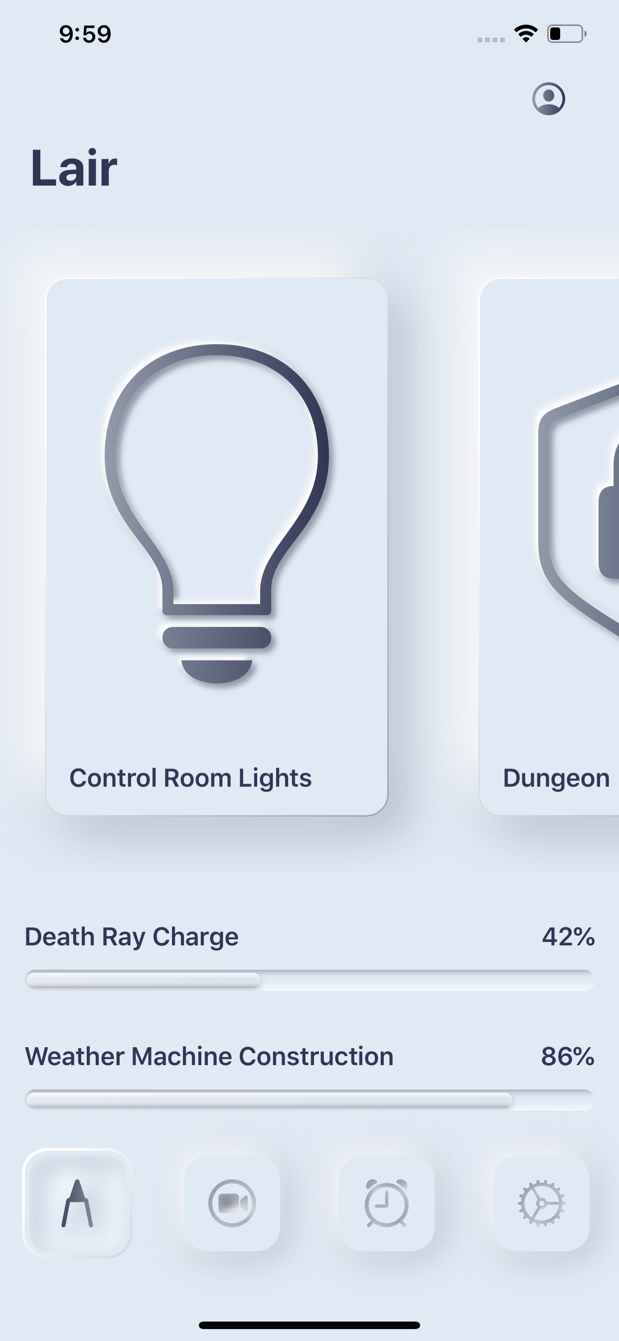
Build and run, and see out how far you’ve come.

Not too shabby!
Crafting the Progress Bar
You’re in the home stretch. There’s one final UI element to tackle.
To get that villainous look, the progress bar will rely less on shadows and more on linear gradients. The bar’s long, thin nature allows you to make this substitution.
Open ProgressBarView.swift and take a look at what’s currently there.
It’s divided into two main sections: An HStack that contains all the labels and a ZStack to draw the progress bar. If you look at the ZStack, you see it’s made of two Capsules. One is for the total bar length, the other for the progress. Capsule is a shape included in SwiftUI. Score!
First, update the two Text so that your HStack looks like this:
HStack {
  Text(self.title)
    .foregroundColor(.lairDarkGray)
    .bold()
  Spacer()
  Text("\(Int(self.percent * 100))%")
    .foregroundColor(.lairDarkGray)
    .bold()
}
The bold text gives the bar a more pronounced look, while the dark gray color removes some harsh contrast that the default black color had.

Next, in the progress bar ZStack section, embed the first Capsule in another ZStack, change the frame height to 14 and the foreground color to .lairBackgroundGray.
The first capsule should now look like this:
ZStack {
  Capsule()
    .frame(height: 14)
    .foregroundColor(.lairBackgroundGray)
}
You’ve used a slightly lighter color for the capsule to match your current color scheme. The increase in the height will soon make the progress bar feel like it’s sitting in a groove cut out for it.
Under that same Capsule, but still within the new ZStack, add this LinearGradient:
LinearGradient.lairHorizontalDarkToLight
  .frame(height: 14)
  .mask(Capsule())
  .opacity(0.7)
The LinearGradient.lairHorizontalDarkToLight starts dark at the top, goes to 100 percent clear color in the middle and ends with white at the bottom. You use this to simulate shadow and highlight effects. The clear color in the middle of the gradient allows the color of the Capsule to shine through. It now looks like it’s a groove cut out of the iPhone.
You also set the frame height to match the previous Capsule and used a Capsule as a mask to ensure it has the same shape. Finally, the opacity lets more of the lairBackgroundGray color through.
Modifying the Second Capsule
Next, check out the Capsule that draws the actual progress. It’s currently just a boring blue blob. Replace Capsule and its two modifiers with the following:
// 1
ZStack {
  // 2
  LinearGradient.lairHorizontalLight
    // 3
    .frame(
      width: (geometry.size.width - 32) * CGFloat(self.percent),
      height: 10)
    // 4
    .mask(
      Capsule()
        .padding(.horizontal, 2)
    )
}
- Created a
ZStackto contain theLinearGradientand the second one you’ll add next. - Added a horizontal gradient, which will showcase the importance of the length of the progress bar, going from light to dark.
- Used the same frame size as the
Capsuleyou deleted. It uses thepercentproperty and the size of the view to calculate how wide it should be. - Masked the gradient with a
Capsulesince, by default, aLinearGradientis a rectangle. You also padded theCapsuleto give it a pleasant offset from the groove it sits in.

Add the next LinearGradient just below the previous one, but still within the ZStack:
LinearGradient.lairVerticalLightToDark
  .frame(
    width: (geometry.size.width - 32) * CGFloat(self.percent),
    height: 10)
  .mask(
    Capsule()
      .padding(.horizontal, 2)
  )
  .opacity(0.7)
This gradient is very similar. The only differences are that the gradient is vertical and the opacity is 0.7. This gradient simulates the shadows and highlights but in the opposite direction to the groove gradient. It makes it look like the progress bar is resting inside the groove.

Deepening the Progress Bar
To give the progress bar some depth, you want to include a shadow to the entire shape within the groove. Add the following shadow to the ZStack containing the two LinearGradients:
.shadow(
  color: Color.lairShadowGray.opacity(0.5),
  radius: 2,
  x: 0,
  y: 1)
Because this shadow bleeds outside of the groove as well, you need to clip the top-level ZStack (the one with leading alignment, to help you match braces):
.clipShape(Capsule())
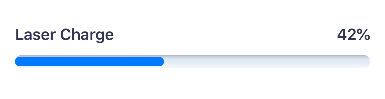
Here’s how the progress bar should look on the screen:

This was a complicated section, so if you’re not seeing the results you expect, check against the end project included in the materials.
Navigating the Navigation Bar
Two parts of the navigation view don’t yet fit your newly styled app: the navigation bar title and the profile icon.
For the navigation bar title, you need to use an appearance proxy. Open LairView.swift, and add this init to LairView:
init() {
  UINavigationBar.appearance().largeTitleTextAttributes =
    [.foregroundColor: UIColor.lairDarkGray]
}
Next is the profileView. This is your challenge! Change it to use a LinearGradient.lairHorizontalDark. After completing this tutorial, you know everything you need to do it yourself!
Hint: you’ll need to hard code the size to be 22×22 points.
[spoiler title=”Solution”]
var profileView: some View {
  LinearGradient.lairHorizontalDark
    .frame(width: 22, height: 22)
    .mask(
      Image(systemName: "person.crop.circle")
        .resizable()
        .scaledToFit()
    )
  .padding()
}
[/spoiler]
When you’re done, the finished app should be phenomenal!
Where to Go From Here?
Woohoo! You’ve reached the end of this tutorial. You clearly have a bright future ahead of you as the lead iOS engineer for all evil villains!
You can download the completed version of the project using the Download Materials button at the top or bottom of this tutorial.
While you’ve crafted a few elements in this modern skeuomorphic style, there are others to try. For example, you could tackle a switch, a slider or a search bar. You could also take this skeuomorphic design to the next level with haptics. That would really be something special!
If you’re interested in getting deeper into SwiftUI, check out How to Create a Splash Screen With SwiftUI, Getting Started With SwiftUI Animations or the SwiftUI by Tutorials book available on this site.
Thank you for trying this tutorial. If you have any questions or comments, please join the forum discussion below!