Core Graphics Tutorial: Gradients and Contexts
In this Core Graphics tutorial, learn how to develop a modern iOS app with advanced Core Graphics features like gradients and transformations. By Fabrizio Brancati.
Drawing the Data Points
At the end of draw(_:), add the following:
// Draw the circles on top of the graph stroke
for i in 0..<graphPoints.count {
  var point = CGPoint(x: columnXPoint(i), y: columnYPoint(graphPoints[i]))
  point.x -= Constants.circleDiameter / 2
  point.y -= Constants.circleDiameter / 2

  let circle = UIBezierPath(
    ovalIn: CGRect(
      origin: point,
      size: CGSize(
        width: Constants.circleDiameter,
        height: Constants.circleDiameter)
    )
  )
  circle.fill()
}
In the code above, you draw the plot points by filling a circle path for each of the elements in the array at the calculated x and y points.
Hmmm ... what's with those circles? They don't look very round!
Considering Context States
The reason for the odd appearance of the circles has to do with state. Graphics contexts can save states. So when you set many context properties, such as fill color, transformation matrix, color space or clip region, you're actually setting them for the current graphics state.
You can save a state by using context.saveGState(), which pushes a copy of the current graphics state onto the state stack. You can also make changes to context properties, but when you call context.restoreGState(), the original state is taken off the stack and the context properties revert. That's why you're seeing the weird issue with your points.
While you're still in GraphView.swift, in draw(_:), uncomment the context.saveGState() before you create the clipping path. Also, uncomment context.restoreGState() before you use the clipping path.
By doing this, you:
- Push the original graphics state onto the stack with
context.saveGState(). - Add the clipping path to a new graphics state.
- Draw the gradient within the clipping path.
- Restore the original graphics state with
context.restoreGState(). This was the state before you added the clipping path.
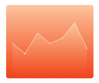
Your graph line and circles should be much clearer now:

At the end of draw(_:), add the code below to draw the three horizontal lines:
// Draw horizontal graph lines on the top of everything
let linePath = UIBezierPath()

// Top line
linePath.move(to: CGPoint(x: margin, y: topBorder))
linePath.addLine(to: CGPoint(x: width - margin, y: topBorder))

// Center line
linePath.move(to: CGPoint(x: margin, y: graphHeight / 2 + topBorder))
linePath.addLine(to: CGPoint(x: width - margin, y: graphHeight / 2 + topBorder))

// Bottom line
linePath.move(to: CGPoint(x: margin, y: height - bottomBorder))
linePath.addLine(to: CGPoint(x: width - margin, y: height - bottomBorder))
let color = UIColor(white: 1.0, alpha: Constants.colorAlpha)
color.setStroke()

linePath.lineWidth = 1.0
linePath.stroke()
Easy enough, right? You're just moving to a point and drawing a horizontal line.

Adding the Graph Labels
Now you'll add the labels to make the graph user-friendly.
Go to ViewController.swift and add these outlet properties:
// Label outlets
@IBOutlet weak var averageWaterDrunk: UILabel!
@IBOutlet weak var maxLabel: UILabel!
@IBOutlet weak var stackView: UIStackView!
This adds outlets for dynamically changing the text of the average water drunk label, the max water drunk label as well as the stack view's day name labels.
Now go to Main.storyboard and add the following views as subviews of the Graph View:
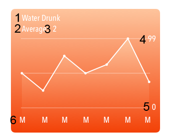
The first five subviews are UILabels. The fourth subview is right-aligned next to the top of the graph and the fifth is right-aligned to the bottom of the graph. The sixth subview is a horizontal StackView with labels for each day of the week. You'll change these in code.
Shift-click all the labels and then change the fonts to custom Avenir Next Condensed, Medium style.
If you have any trouble setting up those labels, check out the code in the final project by using the Download Materials button at the top or bottom of this tutorial.
Connect averageWaterDrunk, maxLabel and stackView to the corresponding views in Main.storyboard. Control-drag from View Controller to the correct label and choose the outlet from the pop-up:

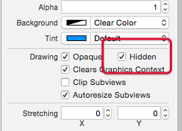
Now that you've finished setting up the graph view, in Main.storyboard select the Graph View and check Hidden so the graph doesn't appear when the app first runs.
Open ViewController.swift and add this method to set up the labels:
func setupGraphDisplay() {
  let maxDayIndex = stackView.arrangedSubviews.count - 1

  // 1 - Replace last day with today's actual data
  graphView.graphPoints[graphView.graphPoints.count - 1] = counterView.counter
  // 2 - Indicate that the graph needs to be redrawn
  graphView.setNeedsDisplay()
  maxLabel.text = "\(graphView.graphPoints.max() ?? 0)"

  // 3 - Calculate average from graphPoints
  let average = graphView.graphPoints.reduce(0, +) / graphView.graphPoints.count
  averageWaterDrunk.text = "\(average)"

  // 4 - Setup date formatter and calendar
  let today = Date()
  let calendar = Calendar.current

  let formatter = DateFormatter()
  formatter.setLocalizedDateFormatFromTemplate("EEEEE")

  // 5 - Set up the day name labels with correct days
  for i in 0...maxDayIndex {
    if let date = calendar.date(byAdding: .day, value: -i, to: today),
      let label = stackView.arrangedSubviews[maxDayIndex - i] as? UILabel {
      label.text = formatter.string(from: date)
    }
  }
}
This looks a little burly, but you need it to set up the calendar and retrieve the current day of the week. To do this, you:
- Set today's data as the last item in the graph's data array.
- Redraw the graph to account for any changes to today's data.
- Use Swift's
reduceto calculate the average glasses drunk for the week; it's a very useful method for summing all the elements in an array. - This section sets up
DateFormatterto return the first letter of each day. - This loop goes through all labels inside
stackView. From this, you set text for each label from date formatter.
Still in ViewController.swift, call this new method from counterViewTap(_:). In the else part of the conditional, where the comment says Show graph, add this code:
setupGraphDisplay()
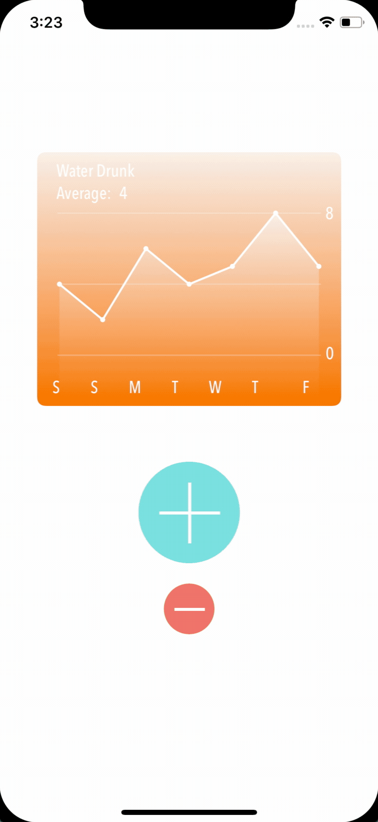
Build and run and click the counter. Hurrah! The graph swings into view in all its glory!
Mastering the Matrix
Your app is looking really sharp! Still, you could improve the counter view by adding markings to indicate each glass to drink:

Now that you've had a bit of practice with CG functions, you'll use them to rotate and translate the drawing context.
Notice that these markers radiate from the center:

As well as drawing into a context, you have the option to manipulate the context by rotating, scaling and translating the context's transformation matrix.
At first, this can seem confusing, but after you work through these exercises, it'll make more sense. The order of the transformations is important, so here are some diagrams to explain what you'll be doing.
The following diagram is the result of rotating the context and then drawing a rectangle in the center of the context.

The black rectangle is drawn before rotating the context followed by the green and the red one. Two things to notice:
- The context is rotated at the top left (0,0)
- The rectangle still shows in the center of the context after you rotate the context.
When you're drawing the counter view's markers, you'll translate the context first before you rotate it.
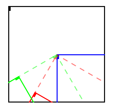
In this diagram, the rectangle marker is at the very top left of the context. The blue lines outline the translated context. The red dashed lines indicate the rotation. After this, you translate the context again.
When you draw the red rectangle into the context, you'll make it appear in the view at an angle.
After you rotate and translate the context to draw the red marker, you need to reset the center so that you can rotate and translate the context again to draw the green marker.
Just as you saved the context state with the clipping path in the Graph View, you'll save and restore the state with the transformation matrix each time you draw the marker.