Auto Layout Tutorial in iOS: Getting Started
In this Auto Layout tutorial, you’ll learn how to use constraints and apply them to making iOS apps. By Naeem Shaikh.
Time to Experiment
For fun, remove the Leading Alignment constraint. To do this, select it in the
Document Outline and press Delete on your keyboard. Then, select both buttons in Interface Builder and from the Align menu select the Trailing Edges option.

Now run the app again and notice the differences.

Now remove the Trailing Alignment constraint and, with both buttons selected, choose Align ‣ Horizontal Centers. That will center the top button with respect to the bottom button. Run the app and see how the buttons act when you tap them.

Sometimes the issue might be trickier to resolve. Select the Resolve Auto Layout Issues button all the way to the right to see a menu of options that can help by updating your existing constraints, adding missing constraints, resetting your constraints to constraints suggested by Xcode or clearing the constraints so that you can start over.

Using Intrinsic Content Size
The Add New Constraints menu has an Equal Widths option. If you set this constraint on two views, Auto Layout will make both views equally wide, based on which is the largest.
Select both buttons and choose Add New Constraints ‣ Equal Widths. This adds a new constraint to both buttons:

Even though there are two T-bars, in the Document Outline this shows up as a single Equal Widths constraint:

Run the app and tap the buttons. The buttons always have the same width, regardless of which has the largest label.

When both labels are short, the buttons will shrink equally. Unless a constraint prevents it, buttons will size themselves to fit their content. A button or label knows how wide and tall it is because it knows the length and font size of the text it displays or, in the case of a button, a combination of text with a background image and some padding. That’s the intrinsic content size, an important concept in Auto Layout.
You’ve already seen it in action with the buttons. Auto Layout asks your controls how big they need to be and lays out the screen based on that information. Usually, you want to use the intrinsic content size, but there are some cases where you may not want to do that. In these cases, you can set an explicit width or height constraint on a view.
Play around to get a feel for pinning and aligning views. Remember, you need enough constraints that Auto Layout can determine the position and size for all views.

Putting it Into Practice: Gallery Example
You should now understand constraints and how you can build your layouts by forging relationships between the different views. In the following sections, you’ll see how to use Auto Layout and constraints to create layouts that meet real-world scenarios.
Pretend you want to make an app that has a gallery of your favorite programmers. It looks like this in landscape and portrait:


The screen comprises four equal quarters. Each quarter has an image view and a label. How would you approach this?
If you haven’t already, download the Gallery Kit project using the Download Materials button at the top or bottom of this tutorial and open the starter project. The sample project includes the images you’ll need to display in the gallery.
Open Main.storyboard and select the iPhone SE size from the View As panel on the bottom-left.

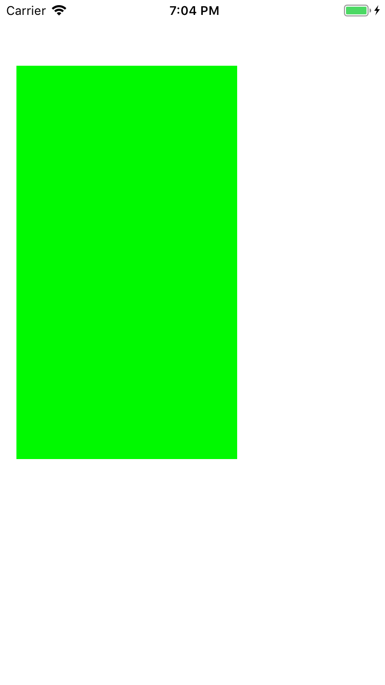
From the Library, drag a plain View object onto the canvas. With the view selected, open the Size inspector and set the Width to 160 and Height to 284 points.

Next, in the Attributes inspector, set the view’s background color to green:

There are two reasons why you would drop a plain UIView onto a storyboard. First, you’re going to use it as a container for other views, which helps with organizing the content of your scenes. Secondly, it’s a placeholder for a custom view or control. In the second case, you’ll also set its Class attribute to the name of your own UIView or UIControl subclass.
Select the green view, open the Add New Constraints menu and uncheck Constrain to margins. Create four constraints to all four of the green view’s nearest neighbors in each direction by clicking the red I-bars:

This will create four new constraints between the green view and its superview, one for each side of the view. The actual spacing values may be different, depending on where you placed the view. You don’t have to change the values to match the ones above. Click Add 4 Constraints to finish.
Your storyboard should now look something like this:

The Safe Area
Are you wondering why the constraint at the top of the view stops at the status bar instead of going all the way up to the top of the screen?

Since iOS 7, the status bar is always on top of the view controller — it’s no longer a separate bar — so what gives? When you created the constraint, it didn’t attach to the top of the screen but the top of an invisible rectangle called the Safe Area.
The Safe Area is the part of the view controller that isn’t obscured by any bars like the status, navigation or tab bar. Because the navigation bar has a different height in landscape, the Safe Area resizes with the bar when the device is rotated. That makes it easy to place views relative to the navigation bar. The same goes for tab bars.
This view needs four constraints to keep it in place. Unlike a button or label, a plain UIView does not have an intrinsic content size. You must add constraints to determine the position and size of each view.
In this case, the size of the view is implied by the size of the superview. This layout has leading, trailing, top and bottom constraints, and these all have fixed lengths. You can see this in the Document Outline:

The width of the green view is calculated by the formula: width of safe area minus (80 + 80); and its height by the formula: height of safe area minus (13 + 163). The constraints are fixed, so the view has no choice but to resize. Again, your values may be different, depending on where you put the view.
When you rotate the app, the dimensions of the superview change, so the view’s size changes with it. Build and run the app, then rotate the simulator to see how the view behaves.