How To Make a Custom Control Tutorial: A Reusable Slider
Controls are the bread and butter of iOS apps. UIKit provides many but this tutorial shows you how to make an iOS custom control in Swift. By Lea Marolt Sonnenschein.
Modifying Your Control With Core Graphics
First, you’ll update the graphics of the track that the slider thumbs move along.
In RangeSliderTrackLayer.swift, replace the code with the following:
import UIKit

class RangeSliderTrackLayer: CALayer {
  weak var rangeSlider: RangeSlider?
}
This code adds a reference back to the RangeSlider. Since the slider owns the track, the back reference is a weak variable to avoid a retain cycle.
Open RangeSlider.swift, locate the trackLayer property and modify it to be an instance of the new layer class:
private let trackLayer = RangeSliderTrackLayer()
Now, find init(frame:) and replace it with the following:
override init(frame: CGRect) {
  super.init(frame: frame)

  trackLayer.rangeSlider = self
  trackLayer.contentsScale = UIScreen.main.scale
  layer.addSublayer(trackLayer)

  lowerThumbImageView.image = thumbImage
  addSubview(lowerThumbImageView)

  upperThumbImageView.image = thumbImage
  addSubview(upperThumbImageView)
}
The code above ensures that the new track layer has a reference to the range slider and removes the default background color. Setting the contentsScale factor to match that of the device’s screen ensures everything is crisp on retina displays.
There’s just one more bit: removing the red background of the control.
Open ViewController.swift, locate the following line in viewDidLoad() and remove it:
rangeSlider.backgroundColor = .red
Build and run now. What do you see?

Floating thumbs? Great!
Don’t fret — you’ve just removed the gaudy test colors. Your controls are still there, but now you have a blank canvas to dress it up.
Since most developers like it when controls can be configured to emulate the look and feel of the particular app they are coding, you’ll add some properties to the slider to allow customization of the look of the control.
Open RangeSlider.swift and add the following properties just beneath the upperValue property:
var trackTintColor = UIColor(white: 0.9, alpha: 1)
var trackHighlightTintColor = UIColor(red: 0, green: 0.45, blue: 0.94, alpha: 1)
Next, open RangeSliderTrackLayer.swift.
This layer renders the track on which the two thumbs slide. It currently inherits from CALayer, which only renders a solid color.
To draw the track, you need to implement draw(in:) and use the Core Graphics APIs to perform the rendering.
Add the following method to RangeSliderTrackLayer:
override func draw(in ctx: CGContext) {
  guard let slider = rangeSlider else {
    return
  }

  let path = UIBezierPath(roundedRect: bounds, cornerRadius: cornerRadius)
  ctx.addPath(path.cgPath)

  ctx.setFillColor(slider.trackTintColor.cgColor)
  ctx.fillPath()

  ctx.setFillColor(slider.trackHighlightTintColor.cgColor)
  let lowerValuePosition = slider.positionForValue(slider.lowerValue)
  let upperValuePosition = slider.positionForValue(slider.upperValue)
  let rect = CGRect(x: lowerValuePosition, y: 0,
                    width: upperValuePosition - lowerValuePosition,
                    height: bounds.height)
  ctx.fill(rect)
}
Once the track shape is clipped, you fill in the background. After that, you fill in the highlighted range.
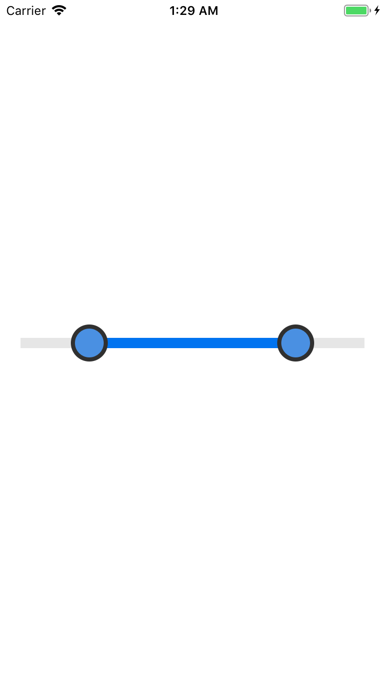
Build and run to see your new track layer rendered in all its glory! It’ll look like this:
Handling Changes to Control Properties
The control looks pretty snazzy now; The visual styling is versatile, and it supports target-action notifications.
It sounds like you’re done — or are you?
Think for a moment about what happens if one of the range slider properties is set in code after it’s been rendered. For example, you might want to change the slider range to some preset value or change the track highlight to indicate a valid range.
Currently, nothing is observing the property setters. You’ll need to add that functionality to your control. You need to implement property observers that update the control’s frame or drawing.
Open RangeSlider.swift and change the property declarations of the following properties like this:
var minimumValue: CGFloat = 0 {
  didSet {
    updateLayerFrames()
  }
}

var maximumValue: CGFloat = 1 {
  didSet {
    updateLayerFrames()
  }
}

var lowerValue: CGFloat = 0.2 {
  didSet {
    updateLayerFrames()
  }
}

var upperValue: CGFloat = 0.8 {
  didSet {
    updateLayerFrames()
  }
}

var trackTintColor = UIColor(white: 0.9, alpha: 1) {
  didSet {
    trackLayer.setNeedsDisplay()
  }
}

var trackHighlightTintColor = UIColor(red: 0, green: 0.45, blue: 0.94, alpha: 1) {
  didSet {
    trackLayer.setNeedsDisplay()
  }
}

var thumbImage = #imageLiteral(resourceName: "Oval") {
  didSet {
    upperThumbImageView.image = thumbImage
    lowerThumbImageView.image = thumbImage
    updateLayerFrames()
  }
}

var highlightedThumbImage = #imageLiteral(resourceName: "HighlightedOval") {
  didSet {
    upperThumbImageView.highlightedImage = highlightedThumbImage
    lowerThumbImageView.highlightedImage = highlightedThumbImage
    updateLayerFrames()
  }
}
You call setNeedsDisplay() for changes to the track layer, and you call updateLayerFrames() for every other change. When you change the thumbImage or the highlightedThumbImage you also change the property on their respective image views.
You also added a new property! highlightedThumbImage shows when the thumb image view is highlighted. It helps to give the user more feedback on how they’re interacting with the control.
Now, find updateLayerFrames() and add the following to the top of the method:
CATransaction.begin()
CATransaction.setDisableActions(true)
Add the following to the very bottom of the method:
CATransaction.commit()
This code wraps the entire frame update into one transaction to make the re-flow rendering smooth. It also disables implicit animations on the layer, just like you did before, so the layer frames are updated immediately.
Since you’re now updating the frames automatically every time the upper and lower values change, find the following code in continueTracking(_:with:) and delete it:
// 3
CATransaction.begin()
CATransaction.setDisableActions(true)

updateLayerFrames()

CATransaction.commit()
That’s all you need to do to make the range slider react to property changes.
However, you now need a bit more code to test your new property observers and make sure everything is hooked up and working as expected.
Open ViewController.swift and add the following code to the end of viewDidLoad():
let time = DispatchTime.now() + 1
DispatchQueue.main.asyncAfter(deadline: time) {
    self.rangeSlider.trackHighlightTintColor = .red
    self.rangeSlider.thumbImage = #imageLiteral(resourceName: "RectThumb")
    self.rangeSlider.highlightedThumbImage =
      #imageLiteral(resourceName: "HighlightedRect")
}
This updates some of the control’s properties after a one second pause. It also changes the track highlight color to red and the thumb images to a rectangle.
Build and run your project. After a second, you’ll see the range slider change from this:

To this:

Pretty cool, aye? :]
Where to Go From Here?
Your range slider is now fully functional and ready to use within your own applications! You can download the final version of the project using the Download Materials button at the top or bottom of this tutorial.
However, one of the key benefits of creating a generic iOS custom control is that you can share it across projects — and share it with other developers.
Is your control ready for prime time?
Not just yet. Here are a few other points to consider before sharing your custom controls:
Documentation – Every developer’s favorite job! :] While you might like to think your code is beautifully crafted and self-documenting, other developers will no doubt disagree. A good practice is to provide public API documentation, at a minimum, for all publicly shared code. This means documenting all public classes and properties.
For example, your RangeSlider needs documentation to explain what it is — a slider which is defined by four properties: minimumValue, maximumValue, lowerValue, and upperValue — and what it does — allows a user to visually define a range of numbers.
Robustness – What happens if you set the upperValue to a value greater than the maximumValue? Surely you would never do that yourself, but you can guarantee that someone eventually will! You need to ensure that the control state always remains valid — despite what some silly coder tries to do to it.
API Design – The previous point about robustness touches on a much broader topic — API design. Creating a flexible, intuitive and robust API ensures that your control can be widely used (and wildly popular).
API design is a topic of great depth and one which is out of scope for this tutorial. If you are interested, Matt Gemmell’s 25 rules of API design comes highly recommended.
There are many places to start sharing your custom controls with the world. Here are few suggestions of places to start:
- GitHub – One of the most popular places to share open source projects. There are already numerous custom controls for iOS on GitHub. It allows people to easily access your code and collaborate by forking your code for other controls or raising issues on your existing controls.
- CocoaPods – To allow people to easily add your control to their projects, you can share it via CocoaPods, which is a dependency manager for iOS and macOS projects.
- Cocoa Controls – This site provides a directory of both commercial and open source controls. Many of the open source controls covered by Cocoa Controls are hosted on GitHub, and it’s a great way of promoting your creation.
Hopefully, you’ve had fun creating this range slider control, and perhaps you have been inspired to create a custom control of your own. If you do, please share it in the comments thread for this article — we’d love to see your creations!