How To Make a Custom Control Tutorial: A Reusable Slider
Controls are the bread and butter of iOS apps. UIKit provides many but this tutorial shows you how to make an iOS custom control in Swift. By Lea Marolt Sonnenschein.
Adding thumbs to your custom control
Open RangeSlider.swift and add the following properties, just after the ones you defined above:
var thumbImage = #imageLiteral(resourceName: "Oval")

private let trackLayer = CALayer()
private let lowerThumbImageView = UIImageView()
private let upperThumbImageView = UIImageView()
The trackLayer, lowerThumbImageView and upperThumbImageView are used to render the various components of your slider control.
Still in RangeSlider, add an initializer:
override init(frame: CGRect) {
  super.init(frame: frame)

  trackLayer.backgroundColor = UIColor.blue.cgColor
  layer.addSublayer(trackLayer)

  lowerThumbImageView.image = thumbImage
  addSubview(lowerThumbImageView)

  upperThumbImageView.image = thumbImage
  addSubview(upperThumbImageView)
}

required init?(coder aDecoder: NSCoder) {
  fatalError("init(coder:) has not been implemented")
}
This initializer adds the layer and the views to the control.
To see the added elements, you’ll need to set their frames. Add the following code after the initializers:
// 1
private func updateLayerFrames() {
  trackLayer.frame = bounds.insetBy(dx: 0.0, dy: bounds.height / 3)
  trackLayer.setNeedsDisplay()
  lowerThumbImageView.frame = CGRect(origin: thumbOriginForValue(lowerValue),
                                     size: thumbImage.size)
  upperThumbImageView.frame = CGRect(origin: thumbOriginForValue(upperValue),
                                     size: thumbImage.size)
}
// 2
func positionForValue(_ value: CGFloat) -> CGFloat {
  return bounds.width * value
}
// 3
private func thumbOriginForValue(_ value: CGFloat) -> CGPoint {
  let x = positionForValue(value) - thumbImage.size.width / 2.0
  return CGPoint(x: x, y: (bounds.height - thumbImage.size.height) / 2.0)
}
Here’s what’s going on in these methods:
- In this first method, you center the
trackLayerand calculate the thumbs’ positions usingthumbOriginForValue(_:). - This method scales the given value to the bound’s context.
- Lastly,
thumbOriginForValue(_:)returns the position so that the thumb is centered given the scaled value.
Add the following code to the end of init(frame:) to invoke your update method:
updateLayerFrames()
Next, override frame and implement a property observer by adding the following to the top of the class:
override var frame: CGRect {
  didSet {
    updateLayerFrames()
  }
}
The property observer updates the layer frames when the frame changes. This is necessary when the control is initialized with a frame that’s not its final frame like in ViewController.swift.
Build and run your app. Your slider is starting to take shape!
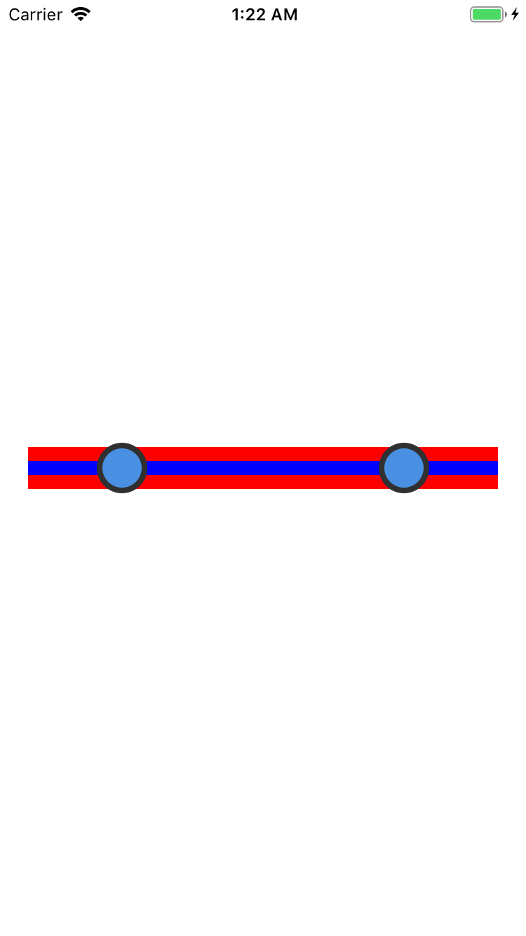
Red is the background color of the entire control; Blue is the track color for the slider; And the blue circles are the two thumbs for the upper and lower values.
Your control is starting to take shape visually, but you can’t interact with it!
For your control, the user must be able to drag each thumb to set the desired range of the control. You’ll handle those interactions and update both the UI and the properties exposed by the control.
Adding Touch Handlers
Open RangeSlider.swift and add the following property along with the others:
private var previousLocation = CGPoint()
You use this property to track the touch locations.
How are you going to track the various touch and release events of your control?
UIControl provides several methods for tracking touches. Subclasses of UIControl can override those methods to add their own interaction logic.
In your custom control, you’ll override three key methods of UIControl: beginTracking(_:with:), continueTracking(_:with:) and endTracking(_:with:).
Add the following code to the end of RangeSlider.swift file:
extension RangeSlider {
  override func beginTracking(_ touch: UITouch, with event: UIEvent?) -> Bool {
    // 1
    previousLocation = touch.location(in: self)

    // 2
    if lowerThumbImageView.frame.contains(previousLocation) {
      lowerThumbImageView.isHighlighted = true
    } else if upperThumbImageView.frame.contains(previousLocation) {
      upperThumbImageView.isHighlighted = true
    }

    // 3
    return lowerThumbImageView.isHighlighted || upperThumbImageView.isHighlighted
  }
}
iOS invokes this method when the user first touches the control. Here’s how it works:
- First, it translates the touch event into the control’s coordinate space.
- Next, it checks each thumb view to see whether the touch was within its frame.
- The return value informs the
UIControlsuperclass whether subsequent touches should be tracked. Tracking touch events continues if either thumb is highlighted.
Now that you have the initial touch event, you’ll need to handle the events as the user’s finger moves across the screen.
Add the following methods after beginTracking(_:with:):
override func continueTracking(_ touch: UITouch, with event: UIEvent?) -> Bool {
  let location = touch.location(in: self)

  // 1
  let deltaLocation = location.x - previousLocation.x
  let deltaValue = (maximumValue - minimumValue) * deltaLocation / bounds.width

  previousLocation = location

  // 2
  if lowerThumbImageView.isHighlighted {
    lowerValue += deltaValue
    lowerValue = boundValue(lowerValue, toLowerValue: minimumValue,
                            upperValue: upperValue)
  } else if upperThumbImageView.isHighlighted {
    upperValue += deltaValue
    upperValue = boundValue(upperValue, toLowerValue: lowerValue,
                            upperValue: maximumValue)
  }

  // 3
  CATransaction.begin()
  CATransaction.setDisableActions(true)

  updateLayerFrames()

  CATransaction.commit()

  return true
}

// 4
private func boundValue(_ value: CGFloat, toLowerValue lowerValue: CGFloat,
                        upperValue: CGFloat) -> CGFloat {
  return min(max(value, lowerValue), upperValue)
}
Here’s the code breakdown:
- First, you calculate a delta location, which determines the number of points the user’s finger traveled. You then convert it into a scaled delta value based on the minimum and maximum values of the control.
- Here, you adjust the upper or lower values based on where the user drags the slider to.
- This section sets the
disabledActionsflag inside aCATransaction. This ensures that the changes to the frame for each layer are applied immediately, and not animated. Finally,updateLayerFramesis called to move the thumbs to the correct location. -
boundValue(_:toLowerValue:upperValue:)clamps the passed in value so it’s within the specified range. Using this helper function is easier to read than a nestedmin/maxcall.
You’ve coded the dragging of the slider, but you still need to handle the end of the touch and drag events.
Add the following method after continueTracking(_:with:):
override func endTracking(_ touch: UITouch?, with event: UIEvent?) {
  lowerThumbImageView.isHighlighted = false
  upperThumbImageView.isHighlighted = false
}
This code resets both thumbs to a non-highlighted state.
Build and run your project, and play around with your shiny new slider! You should be able to drag the thumbs around.
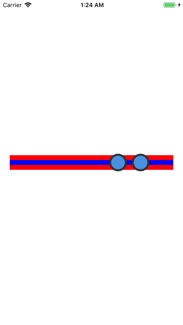
You’ll notice that when the slider is tracking touches, you can drag your finger beyond the bounds of the control, then back within the control without losing your tracking action. This is an important usability feature for small screen devices with low precision pointing devices — or as they’re more commonly known, fingers! :]
Notifying Changes
You now have an interactive control the user can manipulate to set upper and lower bounds. But how do you communicate these change notifications to the calling app so that the app knows the control has new values?
There are a number of different patterns you can implement to provide change notification:NSNotification, Key-value observing (KVO), the delegate pattern, the target-action pattern and many others. So many choices!
So, what to do?
If you look at the UIKit controls, you’ll find they don’t use NSNotification or encourage the use of KVO, so for consistency with UIKit you can exclude those two options. The other two patterns — delegates and target-action patterns — are used extensively in UIKit.
Here’s a detailed analysis of the delegate and the target-action patterns:
Delegate pattern: With the delegate pattern, you provide a protocol which contains methods that are used for a range of notifications. The control has a property, usually named delegate, which accepts any class that implements this protocol. A classic example of this is UITableView which provides the UITableViewDelegate protocol. Note that those controls only accept a single delegate instance. A delegate method can take any number of parameters so you can pass in as much information as you desire to such methods.
Target-action pattern: The UIControl base class provides the target-action pattern. When a change in control state occurs, the target is notified of the event which is described by one of the UIControlEvents enum values. You can provide multiple targets to control actions and, while it’s possible to create custom events (see UIControlEventApplicationReserved), you’re limited to no more than four custom events. Control actions cannot send any information with the event, so they can’t be used to pass extra information when the event is fired.
The key differences between the two patterns are as follows:
- Multicast: The target-action pattern multicasts its change notifications, while the delegate pattern is bound to a single delegate instance.
- Flexibility: You define the protocols yourself in the delegate pattern, meaning you can control exactly how much information you pass. Target-action provides no way to pass extra information and clients have to look it up themselves after receiving the event.
Your range slider control doesn’t have a large number of state changes or interactions that you need to provide notifications for. The only things that change are the upper and lower values of the control.
In this situation, the target-action pattern makes perfect sense. This is one of the reasons why you subclassed UIControl at the start of this iOS custom control tutorial.
Aha! It’s making sense now! :]
The slider values are updated inside continueTracking(_:with:), so this is where you need to add the notification code.
Open RangeSlider.swift, locate continueTracking(_:with:) and add the following just before the return true statement:
sendActions(for: .valueChanged)
That’s all you need to do to notify any subscribed targets of the changes.
Now that you have your notification handling in place, you should hook it up to your app.
Open ViewController.swift and add the following method to the bottom of the class:
@objc func rangeSliderValueChanged(_ rangeSlider: RangeSlider) {
  let values = "(\(rangeSlider.lowerValue) \(rangeSlider.upperValue))"
  print("Range slider value changed: \(values)")
}
This method logs the range slider values to the console as proof that your control is sending notifications as planned.
Now, add the following code to the end of viewDidLoad():
rangeSlider.addTarget(self, action: #selector(rangeSliderValueChanged(_:)),
                      for: .valueChanged)
This invokes rangeSliderValueChanged(_:) each time the range slider sends the valueChanged event.
Build and run your app, and move the sliders back and forth. You’ll see the control’s values in the console, similar to this:
Range slider value changed: (0.117670682730924 0.390361445783134)
Range slider value changed: (0.117670682730924 0.38835341365462)
Range slider value changed: (0.117670682730924 0.382329317269078)
You’re probably sick of looking at the multi-colored range slider UI by now. It looks like an angry fruit salad! It’s time to give the control a much-needed facelift.