20 Best Practices for Mobile App Search
Learn how to design a great UX experience for your mobile app search, by following these 20 best practices for entering queries and displaying results. By Lea Marolt Sonnenschein.
Showing No Results
After all this hard work both the user and the app have done, it’s time to reap the results!
Or not…

Whenever you’re designing a new feature in your app, follow the usability principle of “Help users recognize, diagnose, and recover from errors”. Basically, think of the worst-case scenario first, and take steps to allow the user to recover.
The great thing about the no-results page, is that it offers a great opportunity for you to reconnect with your users and gain their trust through several mechanisms.
Best practices #9-13 have to do with how you can make the most out of no results at all.
Rent the Runway lets anonymous users use the My Hearts category and helps them recover by letting them Sign Up or switch the category to Shop All.
-
Communicate the Problem. Be transparent that something went wrong, and if possible let the user know what the issue is.
Good Example: Etsy -
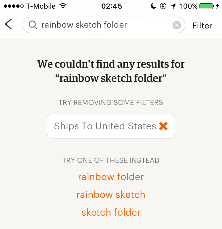
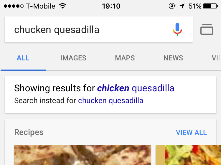
Correct and Fix Misspellings. This is one of the main causes of no results screens, so it’s a good idea to try to detect and fix misspellings.
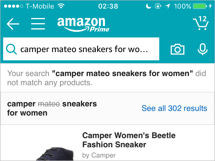
Good Example: Google - Make Search Less Specific. Another of the main causes of no results screens is that the user is overly specific. To resolve this, try removing part(s) of the search query to make it into something you can match. If the user was searching in a category, you can allow them to view the entire category.
- Fallback content. If there are still no results, you can provide curated content or popular searches as a fallback.
- Give Option to Login If Necessary. If they searched in a category that requires login, give them the option to login or signup.

Showing Results
If the user went down the happy path, they’ll have the results they were looking for. But beware, you can’t just dump all the results on the page and let the user figure it out.
Best practices #14-20 help your users have a sense of orientation and space with your search results.
Even though Google is generally awesome as far as searching goes, their default sort on Maps is a little confusing. Users expect the results to be sorted by distance, but the results say otherwise.


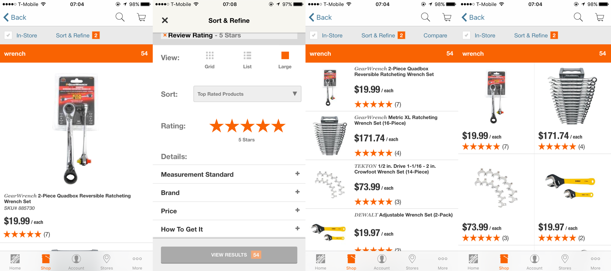
HomeDepot has three viewing options, but there’s not much value added from one option to the other. It also requires two taps from the user to change, so the options are both redundant and cumbersome.
Airbnb on the other hand lets the user switch between a scannable map view option and a fast booking view. Both options provide different, relevant value and information to the user.
As you type, Booking.com groups results into logical categories and displays the number of results for each one.
-
Consider Your Default Sort: When you display your search results, give them a default logical order that can be easily seen and recognized. This can be either alphabetical, by price, by date or by distance. Sort the results in a way that will be most relevant to your customer and your product.
Bad Example: Google 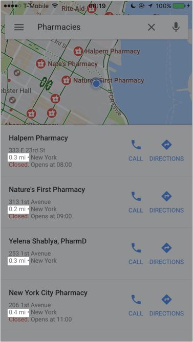
-
Categorize Your Results: If your app requires search, that almost always means you have content that fits in with a certain category; in the case of apparel, that would be clothes, accessories, and shoes. You can do this by simply adding headers to your search results.
Bad Example: Netflix Good Example: Spotify -
Offer Helpful View Options: Search results can be displayed in different modes: on a map, as a list, as a carousel or as thumbnails. Display them in the manner most appropriate for your context. Just because the results can be displayed in many different ways doesn’t mean they should be, especially when it requires multiple steps to change views.
Bad Example: HomeDepot 
Good Example: Airbnb 
- Prefer Infinite Scrolling to Pagination: Not many apps use paginated results screens. Nevertheless, it’s worth mentioning that you should favor the infinite scroll and lazy load pattern over a paginated results page. A Show More button also performs better than pagination.
- Show Search Progress: If the results don’t immediately pop up, the user might think something is wrong. Don’t just let them sit there! Instead show them a progress bar or HUD to tell them you’re still working on it.
-
Show Number of Results: If you decide to categorize the search results, it’s a good idea to show how many products are in each category before the user commits to any one of them.
Good Example: Booking.com 
-
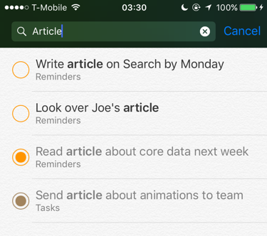
Highlight Keywords: Sometimes it’s hard to glance at results and understand how they pertain to the search query. You can help the user out by highlighting the search keywords.
Good Example: Reminders

Where to Go From Here?
Take a good, hard look at your app and see if some of the examples above could help your users have a better search experience. Are there any undesirable elements that some of the apps above share with your app? How could you change this?
App search is only one part of content discovery. Another huge part is filtering, which you can learn more about in “6 Best Practices for Mobile App Search Filtering”.
In the meantime, if you have any questions, comments or app experiences to share, please do so below!