6 Best Practices for Mobile App Search Filtering
Learn how to design a great UX for search filtering in your mobile apps via these 6 best practices. By Lea Marolt Sonnenschein.
However, that is only one piece of the content discovery puzzle.
Another huge component is search filtering: the ability to allow users to narrow down a huge set of results through a series of filters.
In this article, I’ll share a few UX design patterns for implementing search filtering into your apps, and then share 6 best practices you can use to make a great app search filtering experience.
3 Search Filtering UX Design Patterns
As more and more apps specialize in what they offer, and the attempts to place a user in a concrete search paradigm increase, pure “search” is becoming less prevalent. The amount of pre-filtering and post-filtering is starting to have greater importance.
The rationale behind this change is: “Why force the user to do the heavy lifting of figuring out how to narrow content, when you can offer them some predefined options yourself?” This mentality is especially important when designing for mobile, where text-entry interactions are less desirable than other gestures like tapping or swiping.
Here are 3 common best design patterns you can use for showing filtering options:
TodayTix uses a drawer panel to display filters and shows the results immediately.
Because apparel has so many possible attributes, Rent the Runway uses the fullscreen pattern to show all the possible filtering options.
Kayak uses a Filter Form to expose a great number of filtering options for booking a hotel room. It’s a nice bonus that the results let the user know what they’re missing out on by using so many filter.
-
Filter Overlays/Panels: These filters appear on the screen of the results. They can be presented from the sides as a panel or drawer or as a modal overlay. Usually, when the user taps on a filter, the results change immediately.
Good Example: TodayTix 
-
Fullscreen Filtering: These filters take up the whole screen of the results, and the user must dismiss them to see the results. While this design pattern is sometimes necessary to provide enough screen real estate and a more focused experience, it also takes the user out of the browsing context, which might not be the best idea.
Good Example: Rent the Runway 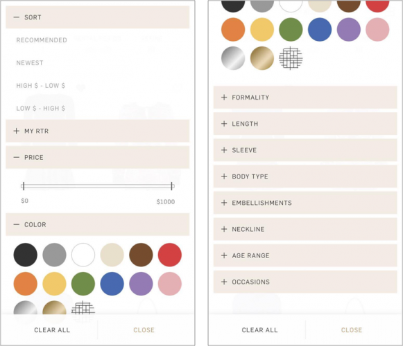
- Filter Form: These filters are used in apps with a very large dataset that need more advanced filtering options.


6 Search Filtering Best Practices
Here are a 6 rules to live by when creating your filtering options:
Amazon is good at being content aware and providing filters specific to the product.
Foursquare gives easy access to the most important filters at the top near the search bar, while hiding the rest of the filters under a Filters options.
Hotwire prominently displays the most important considerations in choosing a hotel room, and hides the long lists of other options under an expand control.
Keep Filters Visible and Easy To Change: As the user is browsing your content, they will most likely apply some filters…and then promptly forget about them. Make sure to keep the applied filters easy to find and easy to change.
For example, you can show a number of applied filters next to the filter button, show a screen-wide bar for their applied filters, and allow users to turn off all filters at once.
Both OpenTable and Events show the filters applied directly under the NavBar, where the user can hardly overlook them. Both offer an easy way to remove filters, but Events allows to remove them one-by-one as well. Events also makes changing important filters like Day and Time very easy and accessible.
ShopStyle price filters take up an entire screen for no good reason.
Etsy provides a slider UI control that makes it easy to define a custom range and takes up very little space.
Airbnb uses sliders, toggles, checkboxes and counters to illustrate what kind of input each parameter is asking for.
-
Only Show Relevant Filters: Due to the small real-estate of the phone screen it is best to present only the filters relevant to the content being displayed. If there are no relevant filters, don’t display them at all.
Good Example: Amazon 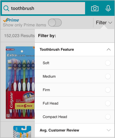
-
Promote Important Filters: If your content affords many filters, make sure that you put emphasis on the the most important ones. Base these on what you think is important about your products and what your users find important. You can promote important filters by separating them from the rest in a different view, putting them on top of all the filters, or giving them a different color.
Good Example: Foursquare 
-
Hide Less Important Filters: Hide less important filters under an option to expand them. This can both help users perform a more focused search by actively engaging only with the filters they want. And it can also help them easily scan what type of curation is available for the future.
Good Example: Hotwire 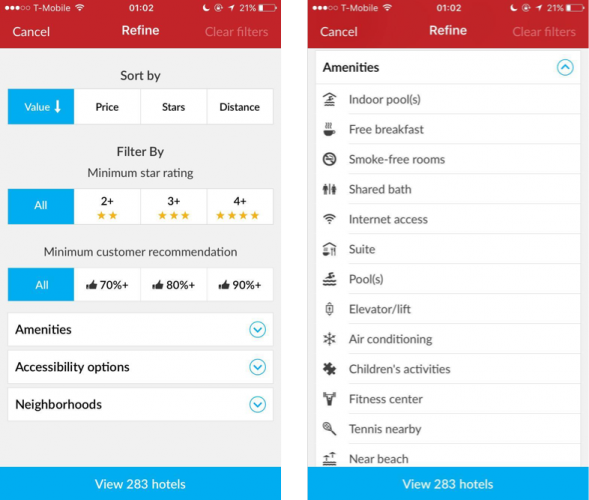
-
Good Examples: OpenTable and Events 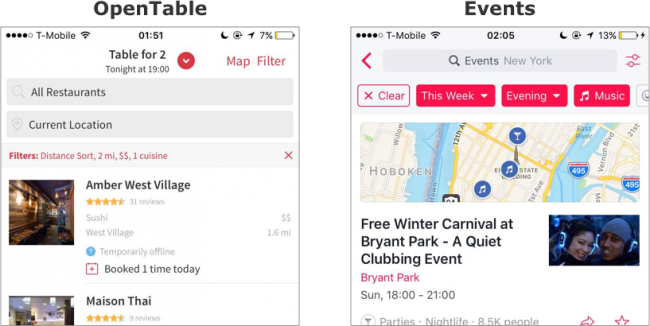
-
Keep the Number of Options Low: Who really needs an option to filter a price range between $10 and $20? No one. There’s no need to give users extremely nuanced options that take up valuable real-estate space.
Bad Example: ShopStyle 
Good Example: Etsy 
-
Use Appropriate UI Controls: Different filters require different controls to be activated. Some could only be in an on or off state, some could be a range, some can be expressed in quantity, and some are part of a checklist. Make sure that the UI controls you use for your filters match the perceived affordances they offer. This touches on usability heuristic #2: Match between system and the real world.
Good Example: Airbnb 


Search vs. Filtering: Key Takeaways
The best search experiences involve some sort of filtering, and the best filtering experiences involve some sort of search.
Creating a good search experience is difficult because there’s no one way to do it best, but there are some general steps you can follow to get a good start:
- Low-hanging fruit: Some search best practices apply to every app. Make the search controls obvious, design the no-results page first and offer suggestions before, during, and after the search.
- Understand your product: Take a deep hard look at your inventory to figure out what the most important and unique features of your products are to you. Then think about how they help your users.
- Listen to your users: When it comes to the more nuanced interactions and filtering options your best bet is to test with real users. On average, around 80% of your app’s problems will be discovered by only five users. And if you can’t get direct input from your users, look at the data on how they’re behaving already (in your app, or in similar ones) and act accordingly.
- Be intentional: If you don’t need to use a search feature, don’t use it. Less is more here. Everything you add should be added because you know it’s necessary and not as an afterthought.
- Don’t make a mobile site: If your app is a companion to a website, the reality is that you won’t be able to fit everything you have on the website in the app. Strip the search functionality to the most important and necessary functions. You can always add more later.