How To Make a Custom Control Tutorial: A Reusable Knob
Custom UI controls are extremely useful when you need some new functionality in your app — especially when they’re generic enough to be reusable in other apps. This custom control tutorial covers the creation of a control kind of like a circular slider inspired by a control knob, such as those found on a mixer. By Lorenzo Boaro.
Sending Action Notifications
As you move the pointer around, you'll notice that the UISlider doesn't update. You'll wire this up using the target-action pattern which is an inherent part of UIControl.
Open ViewController.swift and add the following code at the end of viewDidLoad():
knob.addTarget(self, action: #selector(ViewController.handleValueChanged(_:)), for: .valueChanged)
Here you're listening for value-changed events.
Now replace the contents of handleValueChanged(_:) with:
if sender is UISlider {
  knob.setValue(valueSlider.value)
} else {
  valueSlider.value = knob.value
}
updateLabel()
If the user changes the value on the knob, you update the slider. If they change the slider, you update the knob. You continue to update the label in either case.
Build and run. Now move the knob around and...nothing has changed. Whoops. You haven't actually fired the event from within the knob control itself.
To fix that, inside the Knob class, add the following code to the end of handleGesture(_:):
if isContinuous {
  sendActions(for: .valueChanged)
} else {
  if gesture.state == .ended || gesture.state == .cancelled {
    sendActions(for: .valueChanged)
  }
}
If isContinuous is true, then the event should be fired every time that the gesture sends an update, so call sendActions(for:).
If isContinuous is false, then the event should only fire when the gesture ends or is cancelled.
Since the control is only concerned with value changes, the only event you need to handle is UIControlEvents.valueChanged.
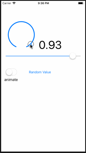
Build and run again. Move the knob once again and you'll see the UISlider move to match the value on the knob. Success!
Where to Go From Here?
Congrats, your knob control is now fully functional and you can drop it into your apps.
You can download the final version of the project using the Download Materials button at the top or bottom of this tutorial.
However, there are still a lot of ways to improve your control:
- Add extra configuration options to the appearance of the control — you could allow an image to be used for the pointer.
- Ensure that a user can only interact with the control if their first touch is on the pointer.
- At the moment, if you resize the knob control, the layers won't be re-rendered. You can add this functionality with just a few lines of code.
These suggestions are quite good fun, and will help you hone your skills with the different features of iOS you've encountered in this tutorial. You can also apply what you've learned in other controls that you build.
To learn how to make another custom UIControl, check out this tutorial on making a reusable UISlider.
I'd love to hear your comments or questions in the forums below!