Core Graphics: How to Make a Glossy Button
In this tutorial, you’ll learn how to create a customizable, reusable glossy button using only Core Graphics. By Lea Marolt Sonnenschein.
Constraining a Gradient to a Sub-area
The weird thing about that function, though, is that it fills up the entire drawing region with the gradient — there’s no way to set it to only fill a sub-area with the gradient!
Well, without clipping, that is!
Clipping is an awesome feature of Core Graphics that lets you restrict drawing to an arbitrary shape. All you have to do is add the shape to the context, but then instead of filling it like you usually would, you call clip(). Now, you’ve restricted all future drawing to that region!
So that’s what you do here:
- You add your rectangle to the context.
- Clip to that region.
- Then call
drawLinearGradient(_:start:end:options:), passing in all the variables that you set up before.
So what’s this stuff about saveGState()/restoreGState() all about?
Well, Core Graphics is a state machine. You configure a set of states you want, such as colors and line thickness, and then perform actions to actually draw them. That means that once you’ve set something, it stays that way until you change it back.
Well, you’ve just clipped to a region, so unless you do something about it, you’ll never be able to draw outside of that region again!
That’s where saveGState()/restoreGState() come to the rescue.
With these, you can save the current setup of your context to a stack and then pop it back later when you’re done to get back to where you were.
That’s it, now try it out!
Open CoolButton.swift and add this to the bottom of draw(_:) :
// Outer Path Gradient:
// 1
let outerTop = UIColor(hue: hue, saturation: saturation,
  brightness: brightness, alpha: 1.0)
let outerBottom = UIColor(hue: hue, saturation: saturation,
  brightness: brightness * 0.8, alpha: 1.0)

// 2
context.saveGState()
context.addPath(outerPath)
context.clip()
drawLinearGradient(context: context, rect: outerRect,
  startColor: outerTop.cgColor, endColor: outerBottom.cgColor)
context.restoreGState()
Build and run; you should see something like this:

- First, you define the top and bottom colors.
- Then, you draw the gradient by saving the current graphics state on the stack, adding your path, clipping it, drawing the gradient and restoring the state again.
Hooray, your button is looking pretty snazzy! How about some extra pizazz?!
Adding a Gloss Effect
Now it’s time to make this button shiny, because skeuomorphism should never have gone out of style!
When you add a gloss effect to a button in Core Graphics, things can get pretty complicated. If you’re feeling hardcore, check out some great work by Matt Gallagher and Michael Heyeck on the matter.
But to my poor eyes, you can get a pretty good-looking approximation of a gloss effect just by applying a gradient alpha mask, which is much simpler to understand and code. So you’re going to go with that.
This is something that you can apply to UIViews across the board, so add the following function to the UIView extension in Drawing.swift:
func drawGlossAndGradient(
  context: CGContext, rect: CGRect, startColor: CGColor, endColor: CGColor) {

  // 1
  drawLinearGradient(
    context: context, rect: rect, startColor: startColor, endColor: endColor)

  let glossColor1 = UIColor(red: 1.0, green: 1.0, blue: 1.0, alpha: 0.35)
  let glossColor2 = UIColor(red: 1.0, green: 1.0, blue: 1.0, alpha: 0.1)

  let topHalf = CGRect(origin: rect.origin,
    size: CGSize(width: rect.width, height: rect.height/2))

  drawLinearGradient(context: context, rect: topHalf,
    startColor: glossColor1.cgColor, endColor: glossColor2.cgColor)
}
This function is basically drawing a gradient over a rectangle from a start to end color, and then adding a gloss to the top half. Here’s a breakdown of what’s happening:
- To draw the gradient, you call the function you wrote earlier.
- To draw the gloss, you then draw another gradient on top of that, from pretty transparent (white with 0.35 alpha) to very transparent (white with 0.1 alpha).
Simple, eh? Plug it in and see how it looks. Go back to CoolButton.swift and make a small change in draw(_:). Replace this line, which is the second to last in draw(_:):
drawLinearGradient(context: context, rect: outerRect,
  startColor: outerTop.cgColor, endColor: outerBottom.cgColor)
with:
drawGlossAndGradient(context: context, rect: outerRect,
  startColor: outerTop.cgColor, endColor: outerBottom.cgColor)
In case you can’t spot the difference, you just changed drawLinearGradient(context:rect:startColor:endColor:) into drawGlossAndGradient(context:rect:startColor:endColor:), the newly added method in Drawing.swift.
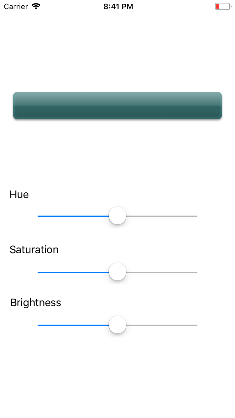
Build and run, and your button should now look like this:


Oooh, shiny!

Styling the Button
Now for the super-fine, nit-picky details. If you’re making a 3D button, you might as well go all out. To do that, you need a bevel.
To create a bevel-type effect, add an inner path that has a slightly different gradient than the outer path. Add this to the bottom of draw(_:) in CoolButton.swift:
// 1: Inner Colors
let innerTop = UIColor(
  hue: hue, saturation: saturation, brightness: brightness * 0.9, alpha: 1.0)
let innerBottom = UIColor(
  hue: hue, saturation: saturation, brightness: brightness * 0.7, alpha: 1.0)

// 2: Inner Path
let innerMargin: CGFloat = 3.0
let innerRect = outerRect.insetBy(dx: innerMargin, dy: innerMargin)
let innerPath = createRoundedRectPath(for: innerRect, radius: 6.0)

// 3: Draw Inner Path Gloss and Gradient
context.saveGState()
context.addPath(innerPath)
context.clip()
drawGlossAndGradient(context: context,
  rect: innerRect, startColor: innerTop.cgColor, endColor: innerBottom.cgColor)
context.restoreGState()
Here, you shrink the rectangle again with insetBy(dx:dy:), then get a rounded rectangle and run a gradient over it. Build and run and you’ll see a subtle improvement:

Highlighting the Button
Your button looks pretty cool, but it doesn’t act like a button. There’s no indication of whether the user has pressed the button or not.
To handle this, you need to override the touch events to tell your button to redisplay itself, since it might need an update after a user selects it.
Add the following to CoolButton.swift:
@objc func hesitateUpdate() {
  setNeedsDisplay()
}

override func touchesBegan(_ touches: Set<UITouch>, with event: UIEvent?) {
  super.touchesBegan(touches, with: event)
  setNeedsDisplay()
}

override func touchesMoved(_ touches: Set<UITouch>, with event: UIEvent?) {
  super.touchesMoved(touches, with: event)
  setNeedsDisplay()
}

override func touchesCancelled(_ touches: Set<UITouch>, with event: UIEvent?) {
  super.touchesCancelled(touches, with: event)
  setNeedsDisplay()

  perform(#selector(hesitateUpdate), with: nil, afterDelay: 0.1)
}

override func touchesEnded(_ touches: Set<UITouch>, with event: UIEvent?) {
  super.touchesEnded(touches, with: event)
  setNeedsDisplay()

  perform(#selector(hesitateUpdate), with: nil, afterDelay: 0.1)
}
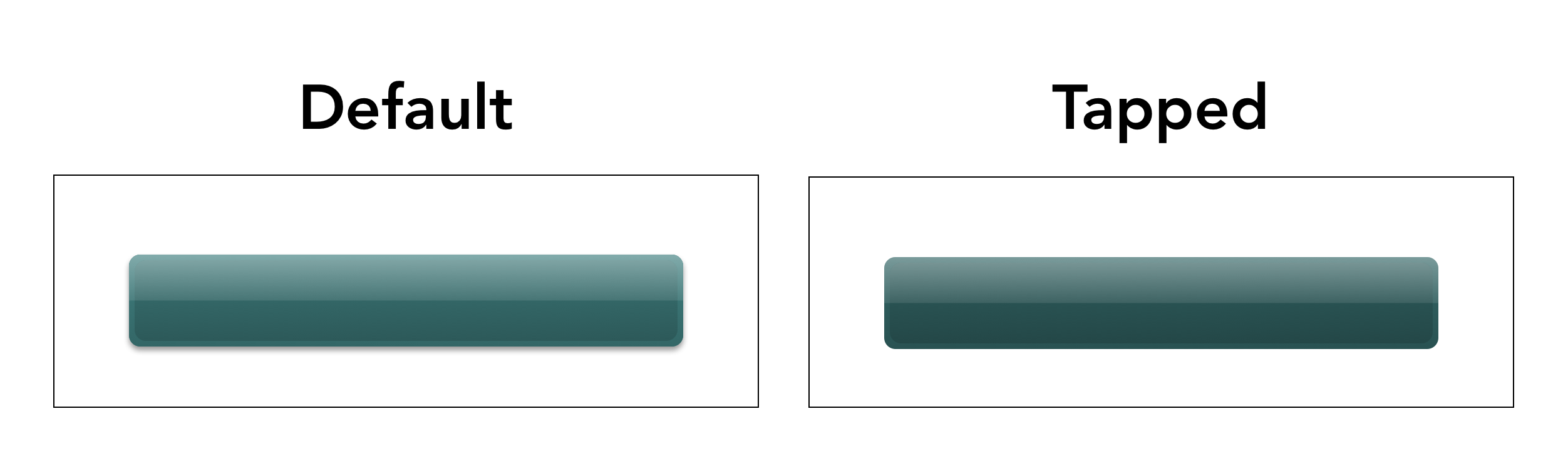
Build and run the project, and you’ll see that there’s a difference when you tap the button now — the highlight and bevel disappear.
But you can make the effect a bit better with one more change to draw(_:):
When a user presses the button, the overall button should become darker.
You can achieve this by creating a temporary variable for the brightness called actualBrightness, and then adjusting it appropriately based on the button’s state:
var actualBrightness = brightness

if state == .highlighted {
  actualBrightness -= 0.1
}
Then, inside draw(_:), replace all the instances of brightness with actualBrightness.
Altogether, the draw(_:) function now looks like this. It’s a little long, but the repetition is worth it:
override func draw(_ rect: CGRect) {
  guard let context = UIGraphicsGetCurrentContext() else {
    return
  }

  var actualBrightness = brightness

  if state == .highlighted {
    actualBrightness -= 0.1
  }

  let outerColor = UIColor(
    hue: hue, saturation: saturation, brightness: actualBrightness, alpha: 1.0)
  let shadowColor = UIColor(red: 0.2, green: 0.2, blue: 0.2, alpha: 0.5)

  let outerMargin: CGFloat = 5.0
  let outerRect = rect.insetBy(dx: outerMargin, dy: outerMargin)
  let outerPath = createRoundedRectPath(for: outerRect, radius: 6.0)

  if state != .highlighted {
    context.saveGState()
    context.setFillColor(outerColor.cgColor)
    context.setShadow(
      offset: CGSize(width: 0, height: 2), blur: 3.0, color: shadowColor.cgColor)
    context.addPath(outerPath)
    context.fillPath()
    context.restoreGState()
  }

  // Outer Path Gloss & Gradient
  let outerTop = UIColor(hue: hue, saturation: saturation,
    brightness: actualBrightness, alpha: 1.0)
  let outerBottom = UIColor(hue: hue, saturation: saturation,
    brightness: actualBrightness * 0.8, alpha: 1.0)

  context.saveGState()
  context.addPath(outerPath)
  context.clip()
  drawGlossAndGradient(context: context, rect: outerRect,
    startColor: outerTop.cgColor, endColor: outerBottom.cgColor)
  context.restoreGState()

  // Inner Path Gloss & Gradient
  let innerTop = UIColor(hue: hue, saturation: saturation,
    brightness: actualBrightness * 0.9, alpha: 1.0)
  let innerBottom = UIColor(hue: hue, saturation: saturation,
    brightness: actualBrightness * 0.7, alpha: 1.0)

  let innerMargin: CGFloat = 3.0
  let innerRect = outerRect.insetBy(dx: innerMargin, dy: innerMargin)
  let innerPath = createRoundedRectPath(for: innerRect, radius: 6.0)

  context.saveGState()
  context.addPath(innerPath)
  context.clip()
  drawGlossAndGradient(context: context, rect: innerRect,
    startColor: innerTop.cgColor, endColor: innerBottom.cgColor)
  context.restoreGState()
}
Build and run; now the button should look pretty good when you tap it!