Supporting Dark Mode: Adapting Your App to Support Dark Mode
In this tutorial, you’ll learn how to add support for Dark Mode in your app, making it look great in low-light environments. By Saeed Taheri.
Elevation
Elevation is the distance between two layers of user interface on the z-axis. In light mode, developers use shadows to enhance depth perception when one layer of user interface is above another.
But that doesn’t work in Dark Mode. While a black drop shadow isn’t visible enough, a lighter shadow for a dark layer doesn’t look right.
To solve this problem, Dark Mode uses two sets of background colors: base and elevated. Base colors are darker, so background interfaces look receded. In contrast, elevated colors are lighter which makes foreground interfaces look protruded.
You can see an excellent example of this concept in action in Modal sheets.
Open Main.storyboard. In Teacher Detail View Controller, set Background for the root View to System Background Color. This is exactly the same value you set for the list background in previous steps.
While you’re here, change the following as well:
- First, set the Color of Name to Label Color.
- Second, set the Color of Taught at Hogwarts to Tertiary Label Color.
- Third, set the Color of Years at Hogwarts to Secondary Label Color.

Build and run. Tap a row to see the details screen.

Look at the background colors of the view controller, which is on the back, and the detail screen, which is in front. Although you set both of them to the same .systemBackgroundColor, they look different. It’s more obvious in Dark Mode.
Remember, the list in the app had a pure black background in Dark Mode with .systemBackgroundColor. But in the details screen, when presented as a modal on top of its parent, it has a dark gray background color. This behavior is normal, and given to you without any extra effort.
Dark Mode is dynamic. That means the background color automatically changes from base to elevated when an interface, like a popover or modal sheet, is in the foreground.
Dynamic Colors
While these newly introduced system and semantic colors are useful, they won’t work in all situations. For example, they won’t help you if you need to use brand colors or your design calls for colors other than those Apple provides.
Before Dark Mode, you could incorporate custom colors in several ways. Developers often use code or Asset Catalogs when using UIColor initializers. Fortunately, Apple updated both to take Dark Mode into account.
You’ll tackle the in-code method first.
UITraitCollection
Before continuing, though, you first need to understand the concept of UITraitCollection.
iOS exposes interface environments for any app through the traitCollection property of the UITraitEnvironment protocol. UIWindow, UIViewController and UIView are all classes that conform to this protocol.
You can access many user interface characteristics in an iOS app, such as size classes, force touch capability and style. By taking those properties and related methods into account, you can adapt your user interface to what the system suggests.
Dark Mode is handled under the hood by the magic of trait collections. It’s a new trait, and you’ll learn how to use it next.
UIColor Dynamic Provider
To construct colors in code, you’ll use a closure based initializer.
Open TeacherDetailViewController.swift. Replace this line of code in viewDidLoad():
headerBackgroundView.backgroundColor = .white
With this:
headerBackgroundView.backgroundColor =
  // 1
  UIColor { traitCollection in
    // 2
    switch traitCollection.userInterfaceStyle {
    case .dark:
      // 3
      return UIColor(white: 0.3, alpha: 1.0)
    default:
      // 4
      return UIColor(white: 0.7, alpha: 1.0)
    }
  }
Here’s a breakdown:
- You call the new initializer of
UIColorwhich takes a closure with a single input of typeUITraitCollection. iOS calls this block and, based on the app’s user interface style, you get a specific color. If the user changes the system interface style, the callback is automatically called again and will change the color accordingly. - You switch on the
userInterfaceStyleproperty oftraitCollectionto know what appearance mode the app is in. - If the app is in Dark Mode, it returns a darker shade of gray.
- If the app is not in Dark Mode, it returns a lighter shade of gray.
Build and run. Tap a row to see the header for the detail screen. Then switch to Dark Mode and see the reflected changes.

Creating colors in code is fine if you don’t want to use them in Interface Builder. If you plan on using Interface Builder, you’ll need an Asset Catalog.
Asset Catalog
Since iOS 11, you can save your colors in Asset Catalogs and use them both in code and Interface Builder. You can make your colors dynamic with a simple tweak.
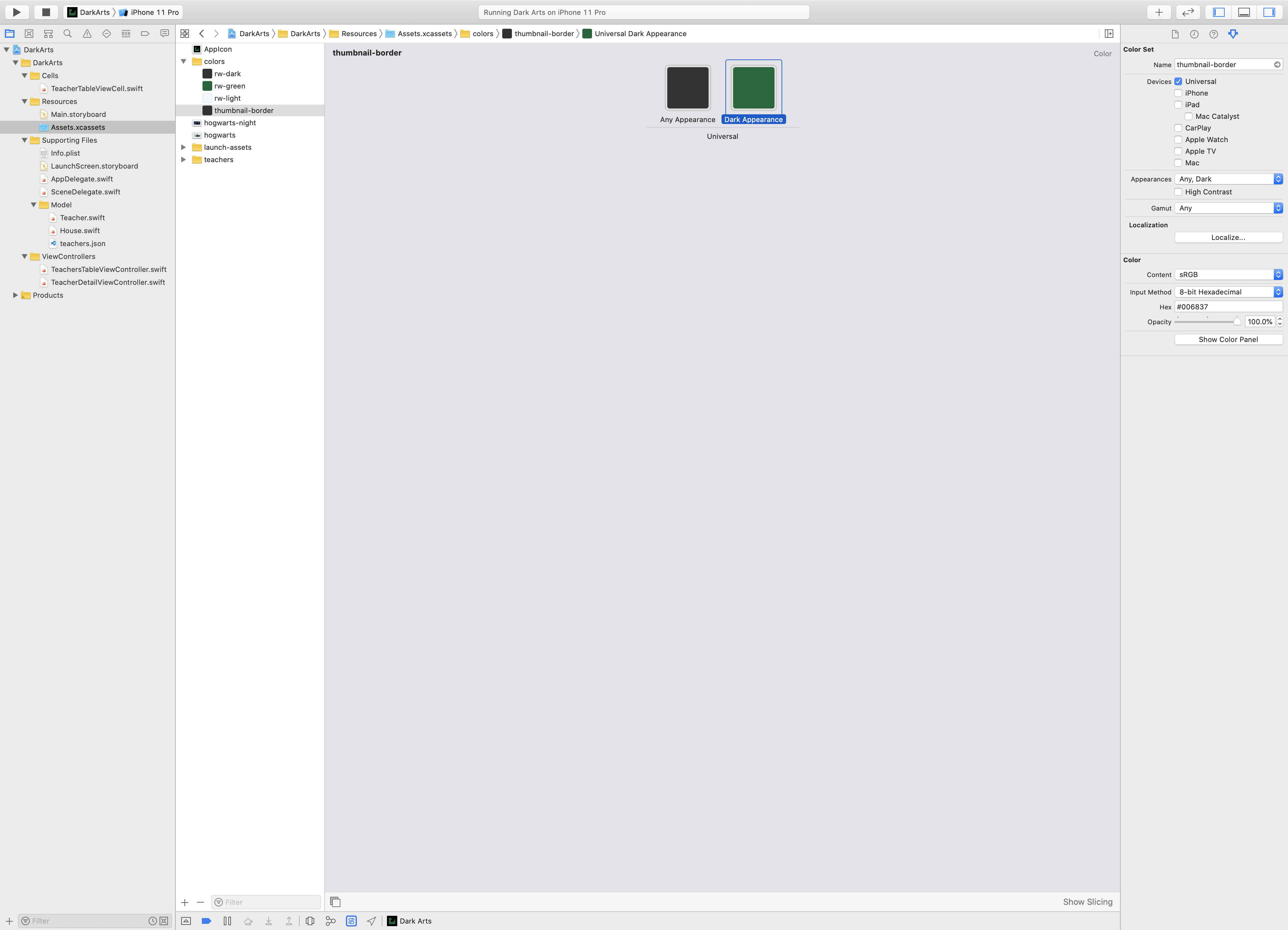
Open Assets.xcassets and look at the colors folder. In the Attributes inspector, under the new Appearances section, you can add variations for a color. The simplest option would be Any, Dark, where you provide a new color for the dark appearance. For colors you’ll find a dynamic color named thumbnail-border. It provides a green color for dark mode and a gray color for light mode.
Where are you going to use this color, you ask? You’ll soon see.
Open Main.storyboard. In the Dark Arts scene, there’s a Border View which acts as the stroke around the teachers’ avatars. Currently, its Background is set to a static color: rw-dark. Since you don’t leave the smallest detail behind, change it to thumbnail-border.

Now, build and run. See how the teachers pop even more in Dark Mode.

Dynamic Images
You might have noticed a beautiful painting of Hogwarts at the bottom of the detail page. Wouldn’t it be cool if it showed Hogwarts at night when the app is in Dark Mode?
Great news! You can do that with dynamic images.
Follow the same procedure you used to add a variation to a color in the Asset Catalog for images.
Open Assets.xcassets. You’ll see two images named hogwarts and hogwarts-night. Click hogwarts.
In the Attributes inspector, click Appearances and choose Any, Dark. A new empty slot appears.
Right-click hogwarts-night and click Show in Finder. Drag the image from Finder to the empty slot you created in hogwarts. Now delete hogwarts-night since you have both images under the name hogwarts.
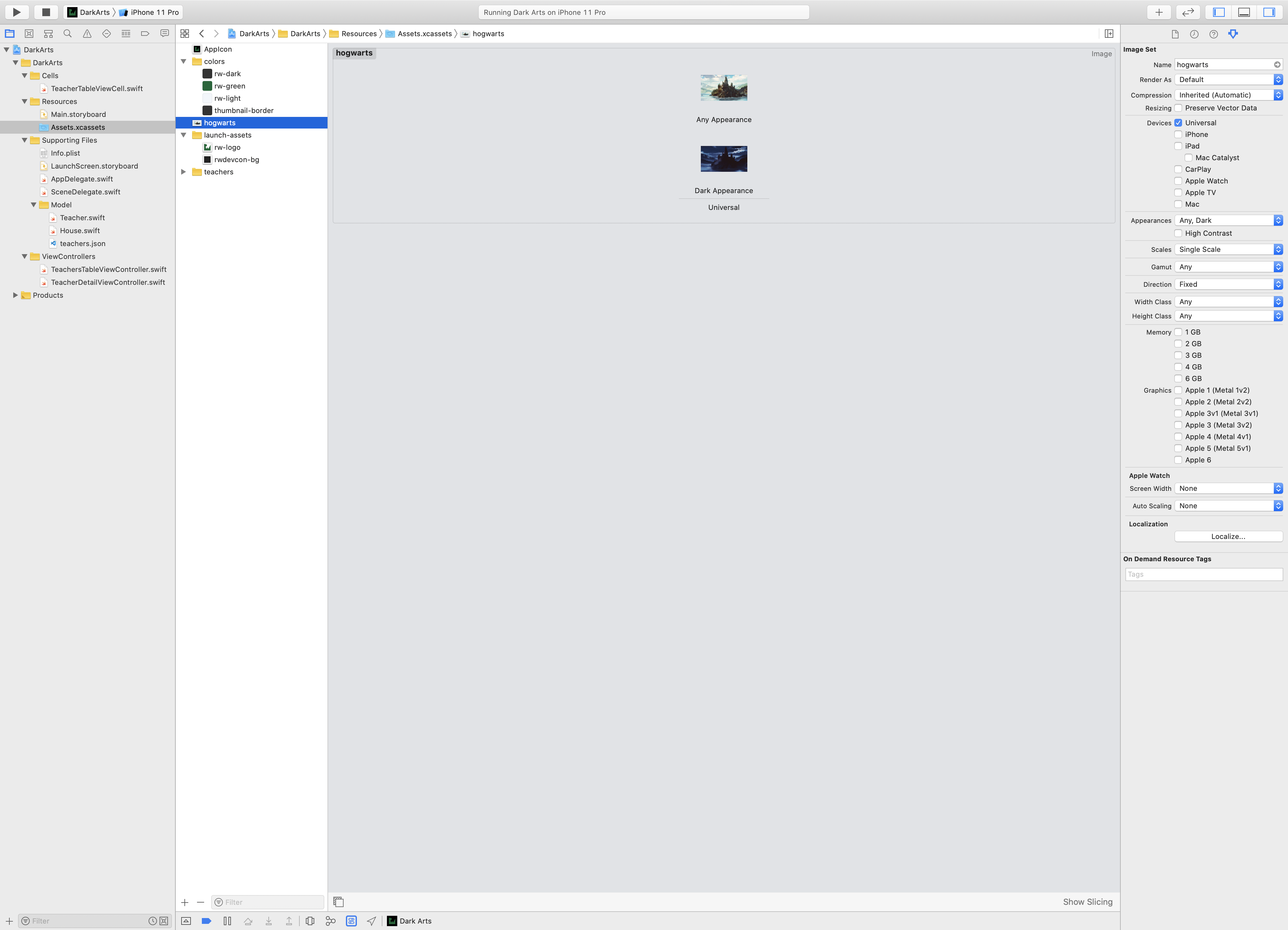
Build and run. Enjoy the beautiful moonlight of Hogwarts, but stay away from Lupin.
