Supporting Dark Mode: Adapting Your App to Support Dark Mode
In this tutorial, you’ll learn how to add support for Dark Mode in your app, making it look great in low-light environments. By Saeed Taheri.
When Apple introduced the modern and flat design of iOS7 in 2013, many people objected to its user interface’s excessive whiteness. They preferred the more natural-looking materials of previous versions of iOS.
In the years leading to up iOS 13, many apps added Dark Mode, a new color theme, to compensate for the system’s brightness. This theme helped people use apps in environments with lower light.
Fortunately, in iOS13, Apple decided to grant this feature system-level love. The engineers at Apple added a toggle for users to switch between light and dark appearance. They also updated all pre-installed apps to respect the user’s choice.
Maybe Jony Ive took all the white rooms when he left! Apple decided to embrace the darkness, so why don’t you?
In this tutorial, you’ll add Dark Mode to Dark Arts, an app with information about all the teachers of Defense Against the Dark Arts at Hogwarts.
Specifically, you’ll cover how to:
- Use colors; system, semantic, dynamic, background and foreground.
- Support elevation levels act in dark mode.
- Use different assets in light and dark mode.
- Utilize the power of SF Symbols.
- Opt out of dark mode, should you wish to do so.
- And more..
Getting Started
Download the starter project for this tutorial by clicking the Download Materials button at the top or the bottom of the page. Double-click DarkArts.xcodeproj to open the project in Xcode.
Get familiar with the source code and file structure of the project.
Build and run. You’ll see a list of all the Defense Against the Dark Arts teachers sorted by the year Harry Potter and friends studied with them. Tap any item to see more information.

The app’s user interface is shiny and bright. You’ll remove this as you move through the tutorial.
To see how the app currently looks in Dark Mode, run the app in the simulator and change the interface style as follows.
When you run your app via Xcode, a set of debugging buttons appears at the bottom. Click the Environment Overrides button and a pop-up will appear. There’s an Interface Style toggle at the top of the pop-up.
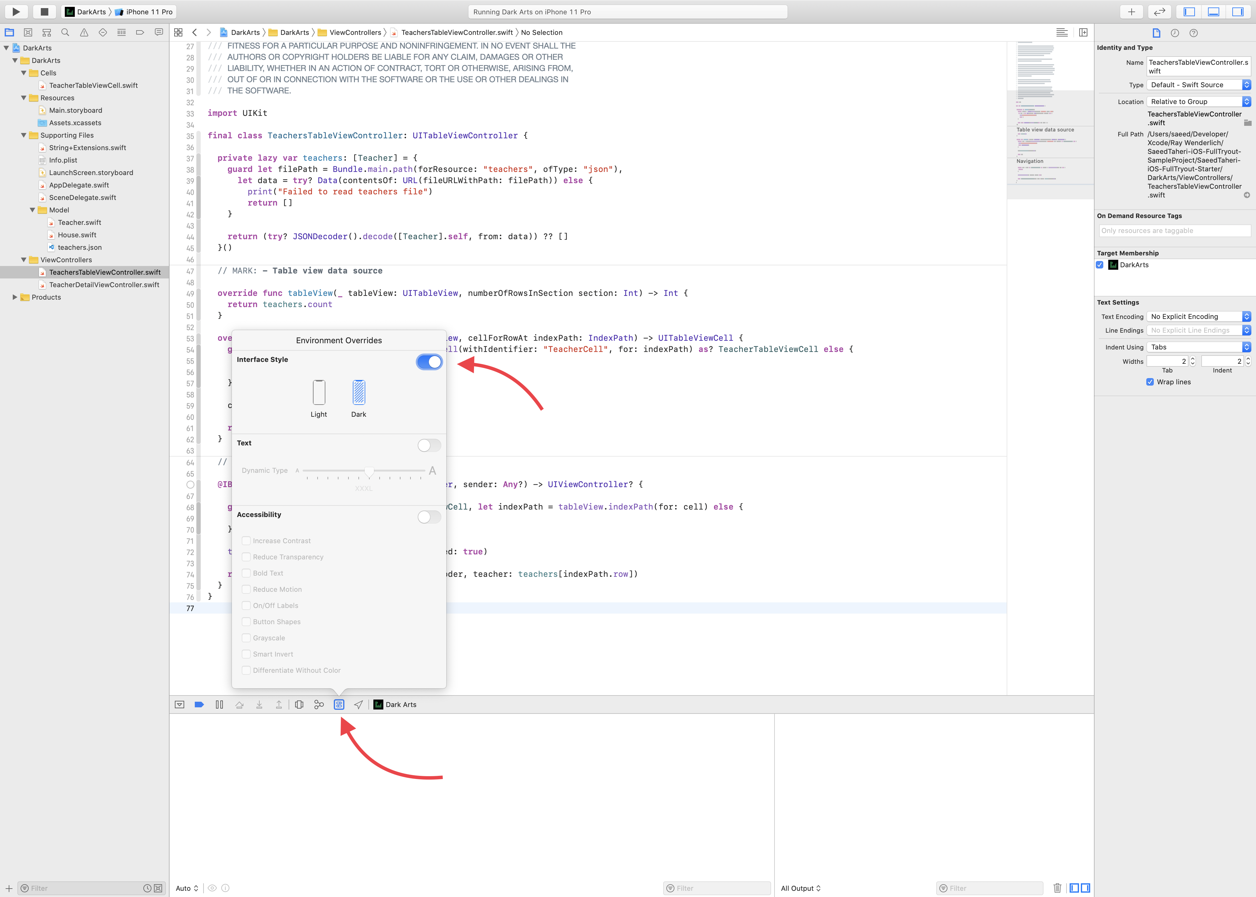
Now toggle the Interface Style switch and click Dark. The app will look like this:

Not as dark as you hoped, huh? At least the navigation bar background switched to black. But the list stayed white.
System Colors
The most important aspect of adopting a new theme is working with colors. In iOS 13, Apple overhauled colors and introduced a couple of new concepts.
For as long as UIKit has existed, it has provided some predefined colors, such as .red, .blue and .yellow, which you could access statically on UIColor.
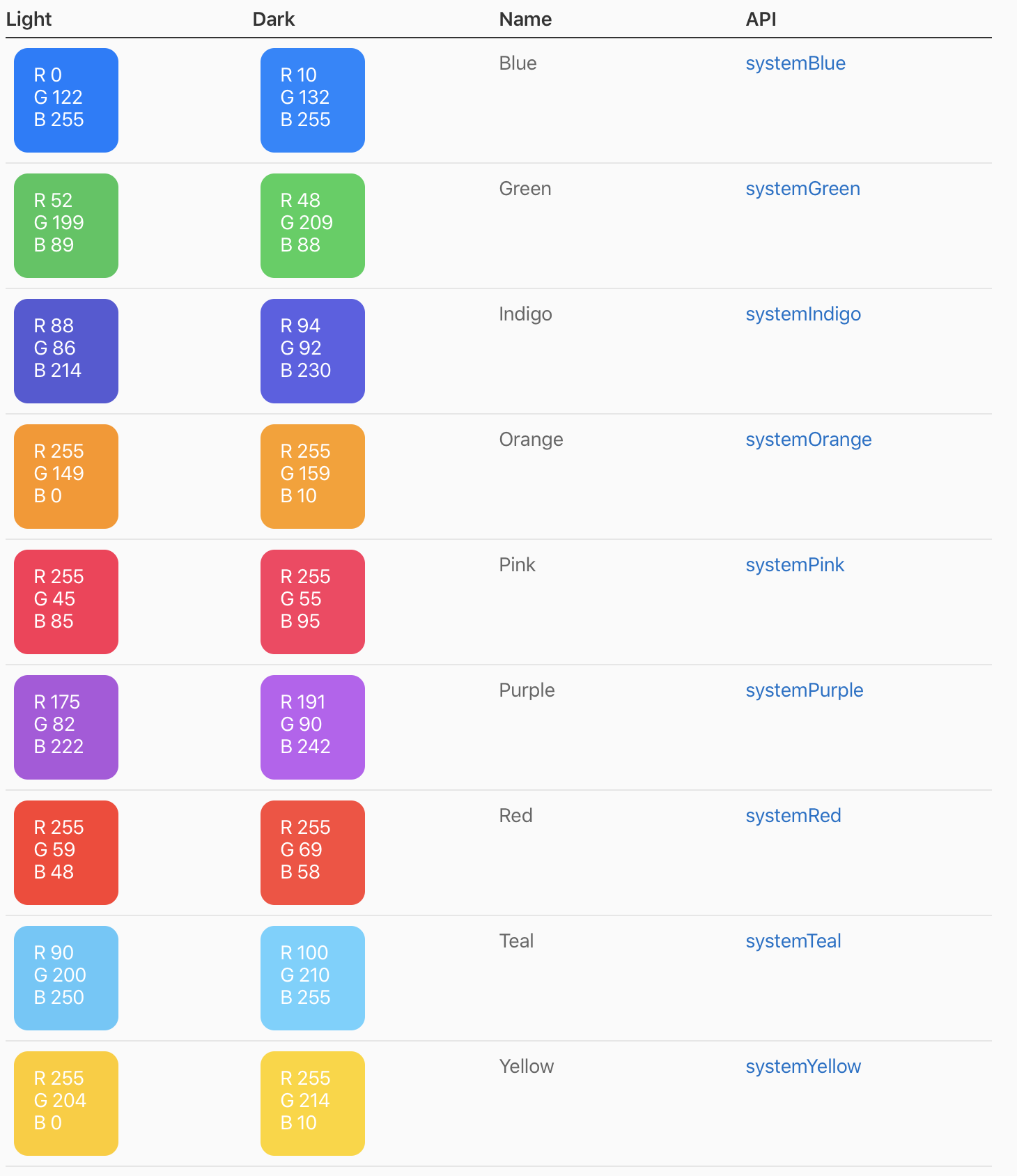
Now there’s a new palette of colors prefixed with the word system, including .systemRed and .systemBlue. These colors provide suitable and legible shades on both light and dark backgrounds.
Look at this table from Apple Human Interface Guidelines. As you can see, each system color, also known as a tint color, has a different RGB color code for light and dark modes.
Tap Alastor Moody in the app. In the detail screen, the name of the teacher’s Hogwarts house appears in the color of that house’s flag. For example, Alastor Moody is from Hufflepuff so the flag is yellow.
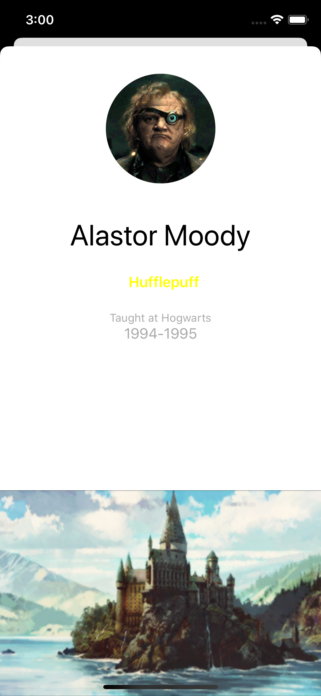
You probably can’t read the house name because the color is the old .yellow. It wasn’t adapted to look good on light and dark backgrounds, but you’ll soon fix that.
Open TeacherDetailViewController.swift. In viewDidLoad(), the text color of houseLabel is set.
Change all the colors to their respective system variant:
switch teacher.house {
case .gryffindor:
  houseLabel.textColor = .systemRed
case .hufflepuff:
  houseLabel.textColor = .systemYellow
case .ravenclaw:
  houseLabel.textColor = .systemBlue
case .slytherin:
  houseLabel.textColor = .systemGreen
}
Build and run. Once again, tap Alastor Moody. Now, you can see he’s from Hufflepuff.

Semantic Colors
In addition to the newly introduced system colors, iOS 13 also provides semantically defined colors. A semantic color conveys its purpose rather than its appearance or color values. Therefore, a semantic color also automatically adapts to Dark Mode.
You don’t have to know these colors’ real raw values. Instead, you use them based on their intention and access them as you would other colors: through static calls on UIColor. Examples of semantic colors include .label, .separator, .link, .systemBackground and .systemFill.
Background Colors
iOS defines two sets of background colors: system and grouped. Each contains primary, secondary and tertiary variants that help you convey a hierarchy of information.
In general, use the grouped set of background colors when you have a grouped table view. Otherwise, use the system set of background colors.
With both sets of background colors, you use the variants to show hierarchy in the following ways:
- Primary for the overall view.
- Secondary for grouping content or elements within the overall view.
- Tertiary for grouping content or elements within secondary elements.
To see these in action, you’ll now add background colors to the app — this time using a Storyboard.
Open Main.storyboard. In the Dark Arts scene, set the Background for both Table View and TeacherCell to System Background Color.

Build and run to see the effect in both light and dark modes. As you can see, the list’s background color automatically changes based on the appearance, but the texts aren’t visible in Dark Mode.
You’ll fix that next.

Foreground Colors
For foreground content, such as labels, you can also use various levels of semantic color to convey the importance of the content. Examples of leveled colors include .label, .secondaryLabel, .tertiaryLabel.
Once again, open Main.storyboard. Then in the Dark Arts scene, set the Color Name Label to Label Color.

Build and run. See the teachers’ names in both light and dark modes.
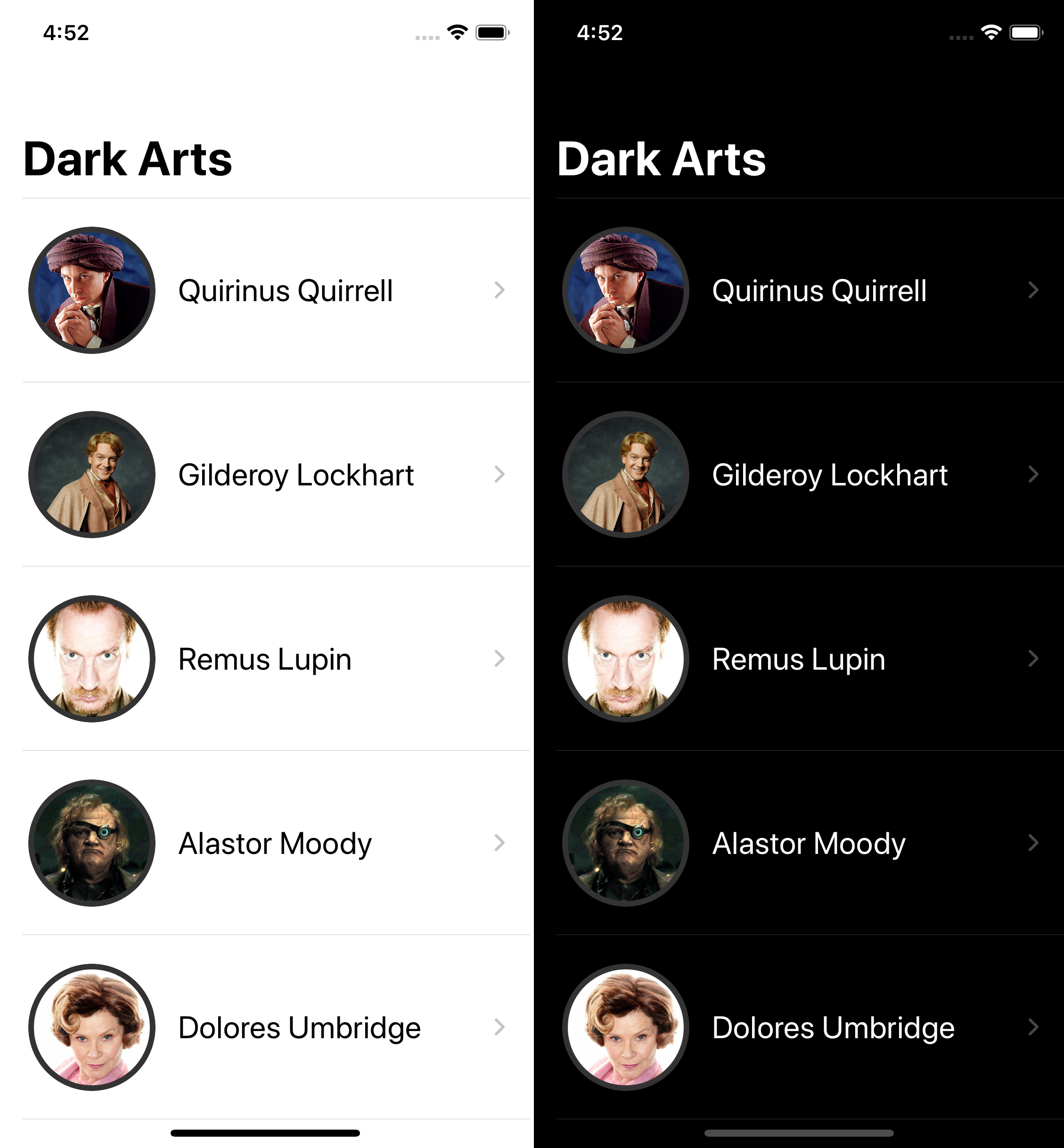
Nice! With only a few changes, your app is now infinitely better at supporting Dark Mode.
But you can do more!