Core Plot Tutorial: Getting Started
In this Core Plot tutorial you’ll learn how to plot your data on beautiful pie and scatter charts using Swift and the open source Core Plot framework. By Attila Hegedüs.
3.7 (3) · 1 Review
Plotting the Bar Graph
Now that the UI is all hooked up in this Core Plot tutorial, it’s time to plot the bar graph.
First, back in BarGraphViewController, you need a couple constant properties. Add the following right below the other properties:
let BarWidth = 0.25
let BarInitialX = 0.25
You’re also going to need a helper function to calculate the highest rate value. Add the following function right after updateLabels():
func highestRateValue() -> Double {
  var maxRate = DBL_MIN
  for rate in rates {
    maxRate = max(maxRate, rate.maxRate().doubleValue)
  }
  return maxRate
}
Next, add the following methods, right after highestRateValue():
override func viewDidLayoutSubviews() {
  super.viewDidLayoutSubviews()
  initPlot()
}

func initPlot() {
  configureHostView()
  configureGraph()
  configureChart()
  configureAxes()
}

func configureHostView() {
}

func configureGraph() {
}

func configureChart() {
}

func configureAxes() {
}
Does this look familiar? Yep, it’s nearly the exact same structure as before.
Add the following to configureHostView():
hostView.allowPinchScaling = false
Again, as you won’t be using pinch scaling, you should disable it.
Next, add the following lines to configureGraph():
// 1 - Create the graph
let graph = CPTXYGraph(frame: hostView.bounds)
graph.plotAreaFrame?.masksToBorder = false
hostView.hostedGraph = graph

// 2 - Configure the graph
graph.apply(CPTTheme(named: CPTThemeName.plainWhiteTheme))
graph.fill = CPTFill(color: CPTColor.clear())
graph.paddingBottom = 30.0
graph.paddingLeft = 30.0
graph.paddingTop = 0.0
graph.paddingRight = 0.0

// 3 - Set up styles
let titleStyle = CPTMutableTextStyle()
titleStyle.color = CPTColor.black()
titleStyle.fontName = "HelveticaNeue-Bold"
titleStyle.fontSize = 16.0
titleStyle.textAlignment = .center
graph.titleTextStyle = titleStyle

let title = "\(base.name) exchange rates\n\(rates.first!.date) - \(rates.last!.date)"
graph.title = title
graph.titlePlotAreaFrameAnchor = .top
graph.titleDisplacement = CGPoint(x: 0.0, y: -16.0)

// 4 - Set up plot space
let xMin = 0.0
let xMax = Double(rates.count)
let yMin = 0.0
let yMax = 1.4 * highestRateValue()
guard let plotSpace = graph.defaultPlotSpace as? CPTXYPlotSpace else { return }
plotSpace.xRange = CPTPlotRange(locationDecimal: CPTDecimalFromDouble(xMin), lengthDecimal: CPTDecimalFromDouble(xMax - xMin))
plotSpace.yRange = CPTPlotRange(locationDecimal: CPTDecimalFromDouble(yMin), lengthDecimal: CPTDecimalFromDouble(yMax - yMin))
Here’s a break down of what’s happening:
Lastly, you configure the CPTXYPlotSpace, which is responsible for mapping device coordinates to the coordinates of your graph.
For this graph, you’re plotting three exchange rates that use the same plot space. However, it’s also possible to have a separate plot space for each plot.
You also use an assumed minimum and maximum exchange rate range on the plot space. Later in the Core Plot tutorial, you’ll see how you can auto-size the plot space when you don’t know the range in advance.
- First, you instantiate a
CPTXYGraph, which is essentially a bar graph, and associate it with thehostView. - You then declare the default theme to be plain white and set the padding on the left and bottom to allow room for axes.
- You next setup the text style, set the chart’s title, and the title’s position.
Now that you have your graph, it’s time to add some plots to it! Add the following code to configureChart():
// 1 - Set up the three plots
plot1 = CPTBarPlot()
plot1.fill = CPTFill(color: CPTColor(componentRed:0.92, green:0.28, blue:0.25, alpha:1.00))
plot2 = CPTBarPlot()
plot2.fill = CPTFill(color: CPTColor(componentRed:0.06, green:0.80, blue:0.48, alpha:1.00))
plot3 = CPTBarPlot()
plot3.fill = CPTFill(color: CPTColor(componentRed:0.22, green:0.33, blue:0.49, alpha:1.00))

// 2 - Set up line style
let barLineStyle = CPTMutableLineStyle()
barLineStyle.lineColor = CPTColor.lightGray()
barLineStyle.lineWidth = 0.5

// 3 - Add plots to graph
guard let graph = hostView.hostedGraph else { return }
var barX = BarInitialX
let plots = [plot1!, plot2!, plot3!]
for plot: CPTBarPlot in plots {
  plot.dataSource = self
  plot.delegate = self
  plot.barWidth = NSNumber(value: BarWidth)
  plot.barOffset = NSNumber(value: barX)
  plot.lineStyle = barLineStyle
  graph.add(plot, to: graph.defaultPlotSpace)
  barX += BarWidth
}
Here’s what the above code does:
- You instantiate each bar plot and set each one’s fill color.
- You instantiate a
CPTMutableLineStyleinstance that represents the outer border of each bar plot. - You apply a “common configuration” to each bar plot. This configuration includes setting the data source and delegate, setting the width and relative (left-right) placement of each bar in the plot, setting the line style, and finally, adding the plot to the graph.
While you still won’t be able to see the bar graph in action yet, build the app to verify everything compiles correctly so far.
In order to actually display the data on the bar graph, you need to implement the delegate methods that provide the necessary data to the graph.
Replace numberOfRecordsForPlot(for:) with the following:
return UInt(rates.count)
This method returns the number of records that should be displayed.
Replace numberForPlot(for:field:record:) with the following:
if fieldEnum == UInt(CPTBarPlotField.barTip.rawValue) {
  if plot == plot1 {
    return 1.0 as AnyObject?
  }
  if plot == plot2 {
    return rates[Int(idx)].rates[symbols[0].name]!
  }
  if plot == plot3 {
    return rates[Int(idx)].rates[symbols[1].name]!
  }
}
return idx
The CPTBarPlotField.BarTip value indicates the relative size of the bar chart. You use the retained properties to figure out the exchange rate for which you need to retrieve the data. The idx corresponds to the index of the rate of interest.
Build and run, and you should see something similar to the following:
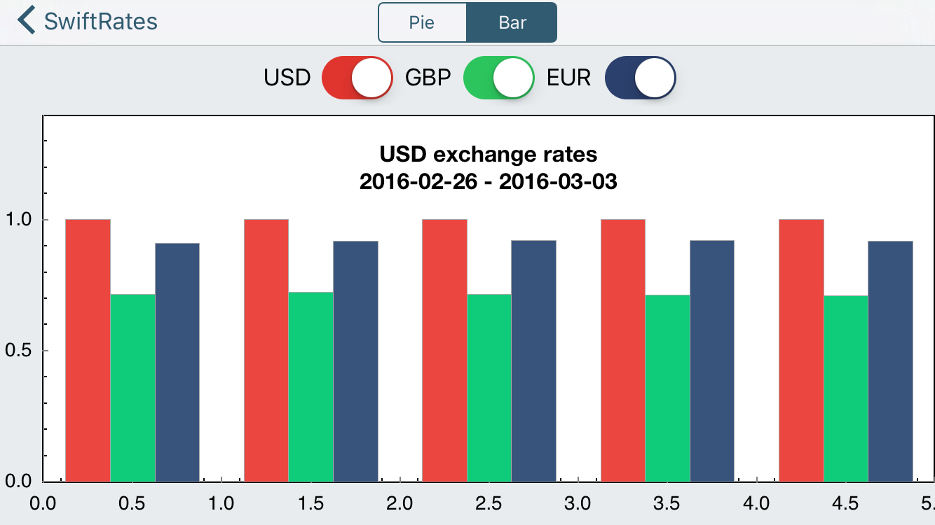
You’re getting there! However, notice isn’t any indication of what each axis represents.
To fix this, add the following to configureAxes():
// 1 - Configure styles
let axisLineStyle = CPTMutableLineStyle()
axisLineStyle.lineWidth = 2.0
axisLineStyle.lineColor = CPTColor.black()
// 2 - Get the graph's axis set
guard let axisSet = hostView.hostedGraph?.axisSet as? CPTXYAxisSet else { return }
// 3 - Configure the x-axis
if let xAxis = axisSet.xAxis {
  xAxis.labelingPolicy = .none
  xAxis.majorIntervalLength = 1
  xAxis.axisLineStyle = axisLineStyle
  var majorTickLocations = Set<NSNumber>()
  var axisLabels = Set<CPTAxisLabel>()
  for (idx, rate) in rates.enumerated() {
    majorTickLocations.insert(NSNumber(value: idx))
    let label = CPTAxisLabel(text: "\(rate.date)", textStyle: CPTTextStyle())
    label.tickLocation = NSNumber(value: idx)
    label.offset = 5.0
    label.alignment = .left
    axisLabels.insert(label)
  }
  xAxis.majorTickLocations = majorTickLocations
  xAxis.axisLabels = axisLabels
}
// 4 - Configure the y-axis
if let yAxis = axisSet.yAxis {
  yAxis.labelingPolicy = .fixedInterval
  yAxis.labelOffset = -10.0
  yAxis.minorTicksPerInterval = 3
  yAxis.majorTickLength = 30
  let majorTickLineStyle = CPTMutableLineStyle()
  majorTickLineStyle.lineColor = CPTColor.black().withAlphaComponent(0.1)
  yAxis.majorTickLineStyle = majorTickLineStyle
  yAxis.minorTickLength = 20
  let minorTickLineStyle = CPTMutableLineStyle()
  minorTickLineStyle.lineColor = CPTColor.black().withAlphaComponent(0.05)
  yAxis.minorTickLineStyle = minorTickLineStyle
  yAxis.axisLineStyle = axisLineStyle
}
Simply put, the above code first defines styles for the axis lines and titles. Then, the code retrieves the axis set for the graph and configures the settings for the x and y axes.
Build and run to see the result of this change.
