Core Plot Tutorial: Getting Started
In this Core Plot tutorial you’ll learn how to plot your data on beautiful pie and scatter charts using Swift and the open source Core Plot framework. By Attila Hegedüs.
3.7 (3) · 1 Review
Plotting the Pie Chart
The title looks great, but you know what would be even better in this Core Plot tutorial? Actually seeing the pie chart!
Add the following lines of code to configureChart():
// 1 - Get a reference to the graph
let graph = hostView.hostedGraph!

// 2 - Create the chart
let pieChart = CPTPieChart()
pieChart.delegate = self
pieChart.dataSource = self
pieChart.pieRadius = (min(hostView.bounds.size.width, hostView.bounds.size.height) * 0.7) / 2
pieChart.identifier = NSString(string: graph.title!)
pieChart.startAngle = CGFloat(M_PI_4)
pieChart.sliceDirection = .clockwise
pieChart.labelOffset = -0.6 * pieChart.pieRadius

// 3 - Configure border style
let borderStyle = CPTMutableLineStyle()
borderStyle.lineColor = CPTColor.white()
borderStyle.lineWidth = 2.0
pieChart.borderLineStyle = borderStyle

// 4 - Configure text style
let textStyle = CPTMutableTextStyle()
textStyle.color = CPTColor.white()
textStyle.textAlignment = .center
pieChart.labelTextStyle = textStyle

// 5 - Add chart to graph
graph.add(pieChart)
Here’s what this does:
- You first get a reference to the graph.
- You then instantiate a
CPTPieChart, set its delegate and data source to be the view controller, and configure its appearance. - You then configure the chart’s border style.
- And then, configure its text style.
- Lastly, you add the pie chart to the graph.
If you build and run the app right now, you’ll see that nothing has changed… This is because you still need to implement the data source and delegate for the pie chart.
First, replace current numberOfRecords(for:) with the following:
func numberOfRecords(for plot: CPTPlot) -> UInt {
  return UInt(symbols.count)
}
This method determines the number of slices to show on the graph; it will display one pie slice for each symbol.
Next, replace number(for:field:record:) with the following:
func number(for plot: CPTPlot, field fieldEnum: UInt, record idx: UInt) -> Any? {
  let symbol = symbols[Int(idx)]
  let currencyRate = rate.rates[symbol.name]!.floatValue
  return 1.0 / currencyRate
}
The pie chart uses this method to get the “gross” value for the currency symbol at the idx.
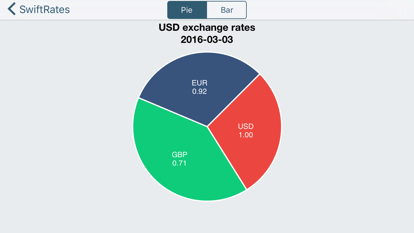
You should note that this value is not a percentage. Rather, this method calculates the currency exchange rate relative to the base currency: the return value of 1.0 / currencyRate is the exchange rate for “1 base currency per value of another comparison currency.”
CPTPieChart will take care of calculating the percentage value for each slice, which ultimately will determine how big each slice is, using these values.
Next, replace dataLabelForPlot(for:record:) with the following:
func dataLabel(for plot: CPTPlot, record idx: UInt) -> CPTLayer? {
  let value = rate.rates[symbols[Int(idx)].name]!.floatValue
  let layer = CPTTextLayer(text: String(format: "\(symbols[Int(idx)].name)\n%.2f", value))
  layer.textStyle = plot.labelTextStyle
  return layer
}
This method returns a label for the pie slice. The expected return type, CPTLayer is similar to a CALayer. However, a CPTLayer is abstracted to work on both Mac OS X and iOS and provides other drawing niceties used by Core Plot.
Here, you create and return a CPTTextLayer, which is a subclass of CPTLayer designed to display text.
Finally, you’ll add color to the slices by replacing sliceFillForPieChart(for:, record:) with the following:
func sliceFill(for pieChart: CPTPieChart, record idx: UInt) -> CPTFill? {
  switch idx {
  case 0:   return CPTFill(color: CPTColor(componentRed:0.92, green:0.28, blue:0.25, alpha:1.00))
  case 1:   return CPTFill(color: CPTColor(componentRed:0.06, green:0.80, blue:0.48, alpha:1.00))
  case 2:   return CPTFill(color: CPTColor(componentRed:0.22, green:0.33, blue:0.49, alpha:1.00))
  default:  return nil
  }
}
Build and run, and you’ll see a nifty-looking pie chart:
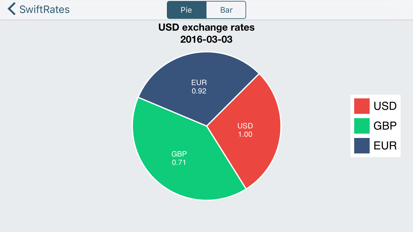
Legen … Wait For It… dary!
The chart looks pretty nice, but adding a legend would make it even better. You’ll now add a legend to the graph in this Core Plot tutorial.
First, replace configureLegend() with the following:
func configureLegend() {
  // 1 - Get graph instance
  guard let graph = hostView.hostedGraph else { return }

  // 2 - Create legend
  let theLegend = CPTLegend(graph: graph)

  // 3 - Configure legend
  theLegend.numberOfColumns = 1
  theLegend.fill = CPTFill(color: CPTColor.white())
  let textStyle = CPTMutableTextStyle()
  textStyle.fontSize = 18
  theLegend.textStyle = textStyle

  // 4 - Add legend to graph
  graph.legend = theLegend
  if view.bounds.width > view.bounds.height {
    graph.legendAnchor = .right
    graph.legendDisplacement = CGPoint(x: -20, y: 0.0)

  } else {
    graph.legendAnchor = .bottomRight
    graph.legendDisplacement = CGPoint(x: -8.0, y: 8.0)
  }
}
You also need to provide legend data for each slice.
To do this, replace legendTitleForPieChart(for:record:) with the following:
func legendTitle(for pieChart: CPTPieChart, record idx: UInt) -> String? {
  return symbols[Int(idx)].name
}
Build and run, and you’ll be greeted with a “legendary” graph.
Raising the Bar (Graph)
You’re plotting pie charts like a pro, but it’s time you raised the bar (graph)!
Open BarGraphViewController and add the following import:
import CorePlot
Next, add the following outlet:
@IBOutlet var hostView: CPTGraphHostingView!
Just like a pie chart, the host view will contain the bar graph.
Next, add the following properties:
var plot1: CPTBarPlot!
var plot2: CPTBarPlot!
var plot3: CPTBarPlot!
Here you declare three CPTBarPlot properties, which will correspond to each currency shown on the graph.
Note there are also three IBOutlet labels and three IBAction methods already defined, all of which have already been connected for you on the storyboard.
Lastly, add the following extension at the end of the file:
extension BarGraphViewController: CPTBarPlotDataSource, CPTBarPlotDelegate {

  func numberOfRecords(for plot: CPTPlot) -> UInt {
    return 0
  }

  func number(for plot: CPTPlot, field fieldEnum: UInt, record idx: UInt) -> Any? {
    return 0
  }

  func barPlot(_ plot: CPTBarPlot, barWasSelectedAtRecord idx: UInt, with event: UIEvent) {

  }
}
This too is similar to a pie chart: you provide the data for a bar chart via CPTBarPlotDataSource, and you get user interaction events via CPTBarPlotDelegate. You’ll write these in a bit.
Setting Up the Graph Host View (again!)
Again, just like you did for the pie chart in this Core Plot tutorial, you need to add the host view via Interface Builder.
Return to Main.storyboard, and select the BarGraphViewController scene.
Drag a new UIView onto the view; change its class to CPTGraphHostingView; and connect its outlet to the hostView on the controller.
Update its frame to the following via the Utilities\Size Inspector (the ruler tab):
X = 0, Y = 53, Width = 600, Height = 547
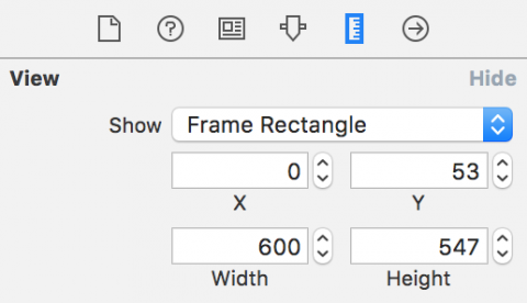
Add constraints to pin it to all of its neighbors, making sure that Constrain to margins is NOT set.

Lastly, set the background color to any color you like. Again, I used a gray scale color with an opacity of 92%.