Using Framer to Prototype iOS Animations
Learn how to use Framer to quickly and easily prototype iOS Animations. By Lea Marolt Sonnenschein.
Deselected

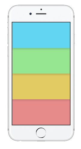
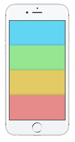
This is what the user sees initially:
- There are four tappable banners.
- Each banner has a different color, icon, and title.
- Each banner casts a shadow on the banner below it.
Selected

This is what the user sees when they tap a banner:
- The top bar with the main color, title and a smaller icon
- A white background
- The top bar casts a shadow on the layer underneath
- Four cards underneath, two on the top, two on the bottom, and spaced evenly
- The color of the cards depends on the selected banner
The user taps to transition between the two states. In the deselected state, the user taps on one of the colored banners. In the selected state, the user taps on the top bar.
Transitioning from Deselected to Selected

Here’s what happens as the UI transitions from deselected to the selected state:
- All four banners shrink to slightly less than half of their original height.
- The tapped banner goes on top, the others fold behind it.
- The banner animation starts slow, speeds up quite a bit, then slows down dramatically.
- The only remaining shadow is the one on the top banner.
- The icon on the quite suddenly shrinks from 100% of its size to nothing. The animation starts quickly but finishes with a lot of damping.
- The text in the middle of the tapped banner moves vertically to the middle of the top bar.
- The background cards have no real animation, but the colors of the cards match the tapped banner.
Transitioning from Selected to Deselected

Here’s what happens as the UI transitions from the selected to the deselected state:
- All four banners expand and move down, so that one begins where the other ends to cover the whole screen. Each banner is 1/4th of the height of the screen
- The banners are always in a specific order, so the banner you tap on doesn’t influence how the banners appear in the deselected state.
- The expanding banner animation starts off a little slow, speeds up quite significantly, then finishes with a lot of damping.
- Each banner casts its own shadow.
- The icon reappears; it grows from nothing to 100% of its size. The animation starts quickly, then finishes with damping.
- The text moves about 4/5ths of the way down the expanded banner.
Now that the visuals are broken down, you can move on to the fun part — building the animation!
Note: This particular animation wasn’t too difficult to dissect, but it’s usually helpful to record an animation with QuickTime and then slow it down with After Effects or Adobe Photoshop to pick out the finer details. For example, this technique helped me discern whether the icon should disappear immediately when you tap a banner, or if it’s a more gradual disappearing act.
Laying Things Out
First, download the starter assets for this tutorial. This package contains all the assets needed to recreate the animation — the icons, the text and the cards.
First, install the Archive font included in the starter assets. It’s important to do this before you open the Sketch file, otherwise it won’t display correctly.
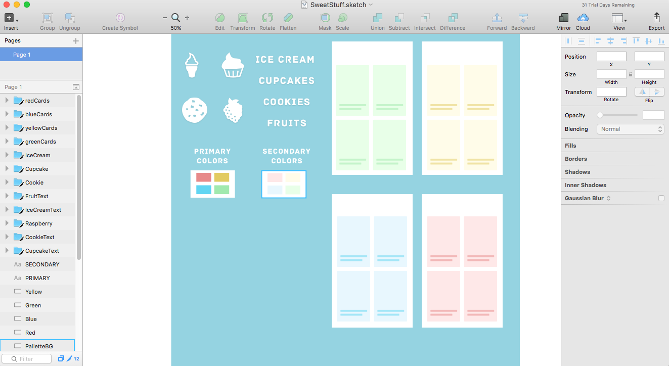
Next, open SweetStuff.sketch to see the assets I’ve created for you:
Go back to Framer and create a new file with File\New. Then click the Import button on the toolbar:
Leave the export size at @1x and press Import again. You should see something like this:

Framer just created a variable named sketch that holds references to all the layers in your Sketch file you’ll need to create your prototype. You can see all these layers in the Layers Panel.
Note: Make sure that you have the Sketch file opened before you press Import, or otherwise Framer won’t be able to detect your Sketch file.
By default, the device selected for your prototype is an iPhone 6S Silver. However, your prototype should work on lots of other devices as well. You’ll create a device variable as a reference to the selected device, and you’ll lay things out relative to the device’s screen.
Add the following after the sketch variable:
device = Framer.Device.screen
Color names can be verbose, so define the following color constants at the top to make them friendlier to use:
blue = "rgb(97,213,242)"
green = "rgb(150,229,144)"
yellow = "rgb(226,203,98)"
red = "rgb(231,138,138)"
Next, create a container layer to hold everything. Add the following:
container = new Layer
	width: device.width
	height: device.height
	backgroundColor: 'rgba(255, 255, 255 1)'
	borderRadius: 5
	clip: true
This creates a container layer and sets its size equal to that of the device. Finally, you set the backgroundColor to white; this will serve as the background color for the cards. You’ll add all subsequent layers to the container layer.
By setting clip to true, nothing outside the bounds of the container will show.
Deselected State
Onwards to the fun part! You’ll start by creating the deselected screen first.

Start with the menu layers. Since you know the width and height of the layers, define them as constants as follows:
menuHeight = container.height/4
menuWidth = container.width
Add the code below and observe what happens:
cookieMenu = new Layer
	height: menuHeight
	width: menuWidth
	x: 0
	y: 0
	backgroundColor: blue
This creates a new layer for your cookie menu, gives it the backgroundColor blue and sets the x origin, the y origin, the width and the height.
Now you’ll do the same thing for the other menus, but keep in mind that the y has to start at the end of the previous layer. The y-position of the current layer is y: previousMenu.y + previousMenu.height:
Add the following code to create the other menus:
cupcakeMenu = new Layer
	height: menuHeight
	width: menuWidth
	x: 0
	y: cookieMenu.y + cookieMenu.height
	backgroundColor: green

fruitMenu = new Layer
	height: menuHeight
	width: menuWidth
	x: 0
	y: cupcakeMenu.y + cupcakeMenu.height
	backgroundColor: yellow

iceCreamMenu = new Layer
	height: menuHeight
	width: menuWidth
	x: 0
	y: fruitMenu.y + fruitMenu.height
	backgroundColor: red
Next, add some shadow to create the illusion of the menus being on top of one another.
Add the following to the end of every layer definition:
	shadowY: 2
	shadowBlur: 40
	shadowSpread: 3
	shadowColor: "rgba(25,25,25,0.3)"
Hooray! Shadow! But… it’s going the wrong way. That’s because the layers were added on top of each other from top to bottom, with the ice cream menu on top, rather than the other way around.
Create a function to reposition the menus and bring them on top in the correct order. The signature for a function definition in Framer looks like this:
functionName = ([params]) ->
Add the following function to reposition the menus after your layer definitions:
repositionMenus = () ->
	iceCreamMenu.bringToFront()
	fruitMenu.bringToFront()
	cupcakeMenu.bringToFront()
	cookieMenu.bringToFront()

repositionMenus()
The repositionMenus function takes no parameters and brings the menus layers to the front in the order from bottom to top. At the end, you call the function.
Check out the prototype panel – now the shadows should appear in the proper order.