Core Graphics Tutorial: Getting Started
In this Core Graphics tutorial, you’ll learn about using Core Graphics to design pixel-perfect views and how to use Xcode’s interactive storyboards. By Andrew Kharchyshyn.
Introducing @IBInspectable
There may come a moment when you tap a button more than necessary to ensure it registers. As the app developer, you’ll need to provide a way to reverse such overzealous tapping. You need a minus button.
Your minus button will be identical to your plus button, except it will forgo the vertical bar and sport a different color. You’ll use the same PushButton for the minus button. You’ll declare what sort of button it is and its color when you add it to your storyboard.
@IBInspectable is an attribute you can add to a property that makes it readable by Interface Builder. This means that you will be able to configure the color for the button in your storyboard instead of in code.
At the top of PushButton, add these two properties:
@IBInspectable var fillColor: UIColor = .green
@IBInspectable var isAddButton: Bool = true
@IBInspectable, you must explicitly specify the type of your properties. Otherwise, you may face an issue with Xcode struggling to resolve the type.Locate the fill color code at the top of draw(_:). It looks like this:
UIColor.blue.setFill()
Change it to this:
fillColor.setFill()
The button will turn green in your storyboard view.
Surround the vertical line code in draw(_:) with this if statement:
//Vertical Line

if isAddButton {
  //vertical line code move(to:) and addLine(to:)
}
//existing code
//set the stroke color
UIColor.white.setStroke()
plusPath.stroke()
This makes it so you only draw the vertical line if isAddButton is set. This way, the button can be either a plus or a minus button.
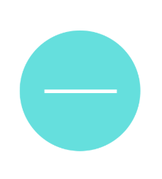
In your storyboard, select the push button view. The two properties you declared with @IBInspectable appear at the top of the Attributes inspector:
Turn Is Add Button to Off. Then change the color by going to Fill Color ▸ Custom… ▸ Color Sliders ▸ RGB Sliders. Enter the values in each input field next to the colors, RGB(87, 218, 213). It looks like this:

The changes will take place in your storyboard:
Pretty cool. Now change Is Add Button back to On to return the button to a plus button.
Adding a Second Button
Add a new Button to the storyboard and select it, placing it under your existing button.

Change its class to PushButton as you did it with previous one. You’ll see a green plus button under your old plus button.

In the Attributes inspector, change Fill Color to RGB(238, 77, 77), change Is Add Button to Off, and remove the default title Button.
Add the Auto Layout constraints for the new view. It’s similar to what you did before:
- With the button selected, Control-drag from the center of the button slightly to the left while staying within the button. Then choose Width from the pop-up menu.
- With the button selected, Control-drag from the center of the button slightly up while staying within the button. Choose Height from the pop-up menu.
- Control-drag left from inside the button to outside the button. Choose Center Horizontally in Container.
- Control-drag up from the bottom button to the top button. Choose Vertical Spacing.
After you add the constraints, edit their constant values in the Size inspector to match these:

Build and run.

You now have a reusable customizable view that you can add to any app. It’s also crisp and sharp on any size device.
Adding Arcs with UIBezierPath
The next customized view you’ll create is this one:

This looks like a filled shape, but the arc is a fat-stroked path. The outlines are another stroked path consisting of two arcs.
Create a new file by selecting File ▸ New ▸ File…. Then choose Cocoa Touch Class, and name the new class CounterView. Make it a subclass of UIView and ensure the language is Swift. Click Next, and then click Create.
Replace the code with:
import UIKit

@IBDesignable class CounterView: UIView {
  private struct Constants {
    static let numberOfGlasses = 8
    static let lineWidth: CGFloat = 5.0
    static let arcWidth: CGFloat = 76

    static var halfOfLineWidth: CGFloat {
      return lineWidth / 2
    }
  }

  @IBInspectable var counter: Int = 5
  @IBInspectable var outlineColor: UIColor = UIColor.blue
  @IBInspectable var counterColor: UIColor = UIColor.orange

  override func draw(_ rect: CGRect) {
  }
}
Here you created a struct with constants. You’ll use them when drawing. The odd one out, numberOfGlasses, is the target number of glasses to drink per day. When this figure is reached, the counter will be at its maximum.
You also created three @IBInspectable properties that you can update in the storyboard. counter keeps track of the number of glasses consumed. It’s an @IBDesignable property because it is useful to have the ability to change it in the storyboard, especially for testing the counter view.
Go to Main.storyboard and add a UIView above the plus PushButton. Add the Auto Layout constraints for the new view. It’s similar to what you did before:
- With the view selected, Control-drag from the center of the button slightly left while staying within the view. Choose Width from the pop-up menu.
- Similarly, with the view selected, Control-drag from the center of the button slightly up while staying within the view. Choose Height from the pop-up menu.
- Control-drag left from inside the view to outside the view. Choose Center Horizontally in Container.
- Control-drag down from the view to the top button. Choose Vertical Spacing.
Edit the constraint constants in the Size inspector to look like this:

In the Identity inspector, change the class of the UIView to CounterView. Any drawing that you code in draw(_:) will now appear in the view. But you haven’t added any…yet!
Enjoying an Impromptu Math Lesson
We interrupt this tutorial for a brief, and hopefully un-terrifying message from mathematics. As the The Hitchhiker’s Guide to the Galaxy advises us, Don’t Panic. :]
Drawing in the context is based on this unit circle. A unit circle is a circle with a radius of 1.0.

The red arrow shows where your arc will start and end, drawing in a clockwise direction. You’ll draw an arc from the position 3π/4 radians — that’s the equivalent of 135º — clockwise to π/4 radians — that’s 45º.
Radians are generally used in programming instead of degrees, and thinking in radians means you won’t have to convert to degrees every time you work with circles. Heads up: You’ll need to figure out the arc length later, and radians will come into play then.
An arc’s length in a unit circle with a radius of 1.0 is the same as the angle’s measurement in radians. Looking at the diagram above, for example, the length of the arc from 0º to 90º is π/2. To calculate the length of the arc in a real situation, take the unit circle arc length and multiply it by the actual radius.
To calculate the length of the red arrow above, you would calculate the number of radians it spans: 2π – end of arrow (3π/4) + point of arrow (π/4) = 3π/2.
In degrees that would be: 360º – 135º + 45º = 270º.
And that’s the end of our impromptu math lesson!
