Core Graphics Tutorial: Getting Started
In this Core Graphics tutorial, you’ll learn about using Core Graphics to design pixel-perfect views and how to use Xcode’s interactive storyboards.
Version
- Swift 5, iOS 13, Xcode 11

You just finished an app. It works fine, but the interface lacks style and grace. You could give it a makeover by drawing several sizes of custom control images in Photoshop and hope Apple doesn’t release a @4x retina screen. That plan, however, lacks strategy and sounds time-consuming. Alternatively, you could use Core Graphics to create an image that scales crisply for any device size.
Core Graphics is Apple’s vector drawing framework. It’s a big, powerful application programming interface (API) with many tools to master and cool features like @IBDesignable
and @IBInspectable
.
But never fear! This three-part series takes a modern approach to Core Graphics. It starts slow and eases you in with fun, engaging exercises. By the end, you’ll be able to create stunning graphics for your apps.
So sit back and relax with your favorite beverage. It’s time to learn Core Graphics!
Getting Into the Flo
Imagine a doctor recommends you drink eight glasses of water a day. No problem, you think. But after a few days, you realize how easy it is to lose track. Did you down three glasses this afternoon or two? Did you have your water bottle at your desk yesterday or the day before?
In this tutorial, you’ll create an app to track your drinking habits. With it, every time you polish off a refreshing glass of H2O, you tap a counter button. As data accumulate, the app will create a graph displaying your weekly consumption.
This app will be named Flo, and here it is in its completed glory:
Getting Started
Download the project materials by clicking the Download Materials button at the top or bottom of this tutorial. Open the starter project in Xcode.
Build and run. You’ll see the following:
You now have a starter project with a storyboard and a view controller, the rest is for you to build!
Creating a Custom Drawing on Views
There are three steps for custom drawings:
- Create a
UIView
subclass. - Override
draw(_:)
and add some Core Graphics drawing code. - Take pride in your work. :]
You’ll try this out by designing a custom plus button. It will look like this:
Create a new file by selecting File ▸ New ▸ File…. Then choose iOS ▸ Source ▸ Cocoa Touch Class. Click Next.
On this screen, name the new class PushButton, make it a subclass of UIButton, and ensure the language is Swift. Click Next and then Create.
UIButton
is a subclass of UIView
, all of the methods in UIView
, such as draw(_:)
, will be available in UIButton
.In Main.storyboard, drag a UIButton
into the view controller’s view, and select the button in Document Outline.
In the Identity inspector, change the class to use your own PushButton.
Setting Auto Layout Constraints
Next you’ll set up the Auto Layout constraints:
- With the button selected, Control-drag from the center of the button slightly left while staying within the button. Choose Width from the pop-up menu.
- With the button selected, Control-drag from the center of the button slightly up while staying within the button. Choose Height from the pop-up menu.
- Control-drag left from inside the button to outside the button. Choose Center Vertically in Container.
- Control-drag up from inside the button to outside the button. Choose Center Horizontally in Container.
This creates the four required Auto Layout constraints. You can now see them in the Size inspector:
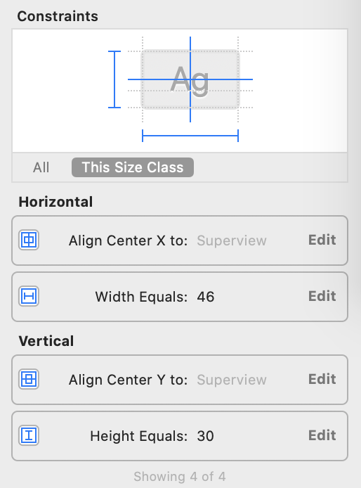
Click Edit on Align center Y to, and set its constant to 100. This change shifts the vertical position of the button from the center to 100 points below the center. Similarly, change Width and Height constants to 100. The final constraints should look like this:
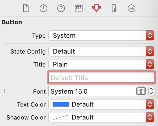
In the Attributes inspector, remove the default title Button.
You could build and run the app right now, but if you did, you’d see a blank screen. Time to fix that!
Drawing the Button
Recall the button you’re trying to make is circular:
To draw a shape in Core Graphics, you define a path that tells Core Graphics the line to trace — such as two straight lines for the plus — or the line to fill — such as the circle. If you’re familiar with Illustrator or the vector shapes in Photoshop, then you’ll understand paths.
There are three fundamentals to know about paths:
- A path can be stroked and filled.
- A stroke outlines the path in the current stroke color.
- A fill will fill a closed path with the current fill color.
An easy way to create a Core Graphics path is a handy class called UIBezierPath
. This class lets you develop paths with a user-friendly API. The paths can be based on lines, curves, rectangles or a series of connected points.
Start by using UIBezierPath
to create a path and then filling it with a green color. Open PushButton.swift and add this method:
override func draw(_ rect: CGRect) {
let path = UIBezierPath(ovalIn: rect)
UIColor.green.setFill()
path.fill()
}
You created an oval-shaped UIBezierPath
the size of the rectangle passed to it. In this case, it’ll be the size of the 100×100 button you defined in the storyboard, so the oval will be a circle.
Since paths don’t draw anything, you can define them without an available drawing context. To draw the path, you set a fill color on the current context and then fill the path. You’ll learn more about this later.
Build and run. You’ll see the green circle.
So far, you’ve discovered how to make custom-shaped views. You did this by creating a UIButton
, overriding draw(_:)
and adding UIButton
to your storyboard.
Peeking Behind the Core Graphics Curtain
Each UIView
has a graphics context. All drawing for the view renders into this context before being transferred to the device’s hardware.
iOS updates the context by calling draw(_:)
whenever the view needs to be updated. This happens when:
- The view is new to the screen.
- Other views on top of it move.
- The view’s
hidden
property changes. - You explicitly call
setNeedsDisplay()
orsetNeedsDisplayInRect()
on the view.
draw(_:)
goes into the view’s graphics context. Be aware that if you draw outside of draw(_:)
, you’ll have to create your own graphics context.You haven’t used Core Graphics yet in this tutorial, because UIKit has wrappers around many of the Core Graphics functions. A UIBezierPath
, for example, is a wrapper for a CGMutablePath
, which is the lower-level Core Graphics API.
draw(_:)
directly. If your view is not being updated, then call setNeedsDisplay()
.
setNeedsDisplay()
does not itself call draw(_:)
, but it flags the view as “dirty,” triggering a redraw using draw(_:)
on the next screen update cycle. Even if you call setNeedsDisplay()
five times in the same method, you’ll call draw(_:)
only once.
Introducing @IBDesignable
Creating code to draw a path and then running the app to see what it looks like is as exciting as an introductory course on 1920’s tax code. Thankfully, you’ve got options.
Live Rendering allows views to draw themselves more accurately in a storyboard by running draw(_:)
. What’s more, the storyboard will immediately update to changes in draw(_:)
. All you need is a single attribute!
Add the following just before the class declaration while in PushButton.swift:
@IBDesignable
This enables Live Rendering. Return to Main.storyboard. You’ll see that your button is a green circle, just like when you build and run.
Next, you’ll set up your screen to have the storyboard and code side-by-side.
Do this by selecting PushButton.swift to show the code. Then, Option-click Main.storyboard in Project navigator. You will see the two files side-by-side:
Close the document outline at the left of the storyboard. Do this either by dragging the edge of the document outline pane or clicking the button at the bottom of the storyboard:
When you’re done, your screen will look like this:
In draw(_:)
, locate the following code:
UIColor.green.setFill()
Then change that code to:
UIColor.blue.setFill()
In the storyboard, you’ll see fill color change from green to blue. Pretty cool!
Time to create the lines for that plus sign.
Drawing Into the Context
Core Graphics uses what’s called a “painter’s model”. When you draw into a context, it’s almost like making a painting. You lay down a path and fill it, and then lay down another path on top and fill it. You can’t change the pixels that have been laid down, but you can paint over them.
This image from Apple’s documentation shows how this works. Just like painting on a canvas, the order in which you draw is critical.
Your plus sign will go on top of the blue circle, so you must code the blue circle first and then the plus sign. Sure, you could draw two rectangles for the plus sign, but it’s easier to draw a path and then stroke it with the desired thickness.
Add this struct and these constants inside of PushButton
:
private struct Constants {
static let plusLineWidth: CGFloat = 3.0
static let plusButtonScale: CGFloat = 0.6
static let halfPointShift: CGFloat = 0.5
}
private var halfWidth: CGFloat {
return bounds.width / 2
}
private var halfHeight: CGFloat {
return bounds.height / 2
}
Next, add this code at the end of draw(_:)
to draw the horizontal dash of the plus sign:
//set up the width and height variables
//for the horizontal stroke
let plusWidth = min(bounds.width, bounds.height)
* Constants.plusButtonScale
let halfPlusWidth = plusWidth / 2
//create the path
let plusPath = UIBezierPath()
//set the path's line width to the height of the stroke
plusPath.lineWidth = Constants.plusLineWidth
//move the initial point of the path
//to the start of the horizontal stroke
plusPath.move(to: CGPoint(
x: halfWidth - halfPlusWidth,
y: halfHeight))
//add a point to the path at the end of the stroke
plusPath.addLine(to: CGPoint(
x: halfWidth + halfPlusWidth,
y: halfHeight))
//set the stroke color
UIColor.white.setStroke()
//draw the stroke
plusPath.stroke()
In this block, you set up a UIBezierPath
. You gave it a start position on the left side of the circle. You drew to the end position at the right side of the circle. Then you stroked the path outlined in white.
In your storyboard, you now have a blue circle sporting a dash in the middle:
That’s essentially what you did with the above code by using move(to:)
and addLine(to:)
.
Run the application on either an iPad 2 or an iPhone 8 Plus simulator, and you’ll notice the dash is not as crisp as it should be. It has a pale blue line encircling it.
What’s up with that?
Analyzing Points and Pixels
Back in the days of the first iPhones, points and pixels occupied the same space and were the same size. This made them basically the same thing. When retina iPhones came around, they sported four times the pixels on screen for the same number of points.
Similarly, the iPhone 8 Plus has again increased the number of pixels for the same points.
Below is a grid of 12×12 pixels with points shown in gray and white. The iPad 2 is a direct mapping of points to pixels, so 1x. The iPhone 8 is a 2x retina screen with 4 pixels to a point. Finally, the iPhone 8 Plus is a 3x retina screen with 9 pixels to a point.
The line you just drew is 3 points high. Lines stroke from the center of the path, so 1.5 points will draw on either side of the centerline of the path.
This picture shows drawing a 3-point line on each of the devices. You can see that devices with 1x and 2x resolutions resulted in the line being drawn across half a pixel — which, of course, can’t be done. So, iOS anti-aliases the half-filled pixels with a color halfway between the two colors. The resulting line looks fuzzy.
In reality, retina devices with 3x resolution have so many pixels you probably won’t notice the fuzziness. But if you’re developing for non-retina screens like the iPad 2, you should do what you can to avoid anti-aliasing.
If you have oddly sized straight lines, you need to position them at plus or minus 0.5 points to prevent anti-aliasing. If you look at the diagrams above, you’ll see that a half-point on 1x screen will move the line up half a pixel. Half a point will manage a whole pixel on 2x and one-and-a-half pixels on 3x.
In draw(_:)
, replace move(to:)
and addLine(to:)
with:
//move the initial point of the path
//to the start of the horizontal stroke
plusPath.move(to: CGPoint(
x: halfWidth - halfPlusWidth + Constants.halfPointShift,
y: halfHeight + Constants.halfPointShift))
//add a point to the path at the end of the stroke
plusPath.addLine(to: CGPoint(
x: halfWidth + halfPlusWidth + Constants.halfPointShift,
y: halfHeight + Constants.halfPointShift))
Because you’re now shifting the path by half a point, iOS will now render the lines sharply on all three resolutions.
UIBezierPath(rect:)
instead of a line. Then use the view’s contentScaleFactor
to calculate the width and height of the rectangle. Unlike strokes that draw outwards from the center of the path, fills only draw inside the path.Add the vertical stroke of the plus after the previous two lines of code, but before setting the stroke color in draw(_:)
.
//Vertical Line
plusPath.move(to: CGPoint(
x: halfWidth + Constants.halfPointShift,
y: halfHeight - halfPlusWidth + Constants.halfPointShift))
plusPath.addLine(to: CGPoint(
x: halfWidth + Constants.halfPointShift,
y: halfHeight + halfPlusWidth + Constants.halfPointShift))
As you can see, it is almost the same code you used to draw the horizontal line on your button.
You should now see the live rendering of the plus button in your storyboard. This completes the drawing for the plus button.
Introducing @IBInspectable
There may come a moment when you tap a button more than necessary to ensure it registers. As the app developer, you’ll need to provide a way to reverse such overzealous tapping. You need a minus button.
Your minus button will be identical to your plus button, except it will forgo the vertical bar and sport a different color. You’ll use the same PushButton
for the minus button. You’ll declare what sort of button it is and its color when you add it to your storyboard.
@IBInspectable
is an attribute you can add to a property that makes it readable by Interface Builder. This means that you will be able to configure the color for the button in your storyboard instead of in code.
At the top of PushButton
, add these two properties:
@IBInspectable var fillColor: UIColor = .green
@IBInspectable var isAddButton: Bool = true
@IBInspectable
, you must explicitly specify the type of your properties. Otherwise, you may face an issue with Xcode struggling to resolve the type.Locate the fill color code at the top of draw(_:)
. It looks like this:
UIColor.blue.setFill()
Change it to this:
fillColor.setFill()
The button will turn green in your storyboard view.
Surround the vertical line code in draw(_:)
with this if
statement:
//Vertical Line
if isAddButton {
//vertical line code move(to:) and addLine(to:)
}
//existing code
//set the stroke color
UIColor.white.setStroke()
plusPath.stroke()
This makes it so you only draw the vertical line if isAddButton
is set. This way, the button can be either a plus or a minus button.
In your storyboard, select the push button view. The two properties you declared with @IBInspectable
appear at the top of the Attributes inspector:
Turn Is Add Button to Off. Then change the color by going to Fill Color ▸ Custom… ▸ Color Sliders ▸ RGB Sliders. Enter the values in each input field next to the colors, RGB(87, 218, 213). It looks like this:
The changes will take place in your storyboard:
Pretty cool. Now change Is Add Button back to On to return the button to a plus button.
Adding a Second Button
Add a new Button to the storyboard and select it, placing it under your existing button.
Change its class to PushButton as you did it with previous one. You’ll see a green plus button under your old plus button.
In the Attributes inspector, change Fill Color to RGB(238, 77, 77), change Is Add Button to Off, and remove the default title Button.
Add the Auto Layout constraints for the new view. It’s similar to what you did before:
- With the button selected, Control-drag from the center of the button slightly to the left while staying within the button. Then choose Width from the pop-up menu.
- With the button selected, Control-drag from the center of the button slightly up while staying within the button. Choose Height from the pop-up menu.
- Control-drag left from inside the button to outside the button. Choose Center Horizontally in Container.
- Control-drag up from the bottom button to the top button. Choose Vertical Spacing.
After you add the constraints, edit their constant values in the Size inspector to match these:
Build and run.
You now have a reusable customizable view that you can add to any app. It’s also crisp and sharp on any size device.
Adding Arcs with UIBezierPath
The next customized view you’ll create is this one:
This looks like a filled shape, but the arc is a fat-stroked path. The outlines are another stroked path consisting of two arcs.
Create a new file by selecting File ▸ New ▸ File…. Then choose Cocoa Touch Class, and name the new class CounterView. Make it a subclass of UIView and ensure the language is Swift. Click Next, and then click Create.
Replace the code with:
import UIKit
@IBDesignable class CounterView: UIView {
private struct Constants {
static let numberOfGlasses = 8
static let lineWidth: CGFloat = 5.0
static let arcWidth: CGFloat = 76
static var halfOfLineWidth: CGFloat {
return lineWidth / 2
}
}
@IBInspectable var counter: Int = 5
@IBInspectable var outlineColor: UIColor = UIColor.blue
@IBInspectable var counterColor: UIColor = UIColor.orange
override func draw(_ rect: CGRect) {
}
}
Here you created a struct with constants. You’ll use them when drawing. The odd one out, numberOfGlasses
, is the target number of glasses to drink per day. When this figure is reached, the counter will be at its maximum.
You also created three @IBInspectable
properties that you can update in the storyboard. counter
keeps track of the number of glasses consumed. It’s an @IBDesignable
property because it is useful to have the ability to change it in the storyboard, especially for testing the counter view.
Go to Main.storyboard and add a UIView
above the plus PushButton
. Add the Auto Layout constraints for the new view. It’s similar to what you did before:
- With the view selected, Control-drag from the center of the button slightly left while staying within the view. Choose Width from the pop-up menu.
- Similarly, with the view selected, Control-drag from the center of the button slightly up while staying within the view. Choose Height from the pop-up menu.
- Control-drag left from inside the view to outside the view. Choose Center Horizontally in Container.
- Control-drag down from the view to the top button. Choose Vertical Spacing.
Edit the constraint constants in the Size inspector to look like this:
In the Identity inspector, change the class of the UIView
to CounterView. Any drawing that you code in draw(_:)
will now appear in the view. But you haven’t added any…yet!
Enjoying an Impromptu Math Lesson
We interrupt this tutorial for a brief, and hopefully un-terrifying message from mathematics. As the The Hitchhiker’s Guide to the Galaxy advises us, Don’t Panic. :]
Drawing in the context is based on this unit circle. A unit circle is a circle with a radius of 1.0.
The red arrow shows where your arc will start and end, drawing in a clockwise direction. You’ll draw an arc from the position 3π/4 radians — that’s the equivalent of 135º — clockwise to π/4 radians — that’s 45º.
Radians are generally used in programming instead of degrees, and thinking in radians means you won’t have to convert to degrees every time you work with circles. Heads up: You’ll need to figure out the arc length later, and radians will come into play then.
An arc’s length in a unit circle with a radius of 1.0 is the same as the angle’s measurement in radians. Looking at the diagram above, for example, the length of the arc from 0º to 90º is π/2. To calculate the length of the arc in a real situation, take the unit circle arc length and multiply it by the actual radius.
To calculate the length of the red arrow above, you would calculate the number of radians it spans: 2π – end of arrow (3π/4) + point of arrow (π/4) = 3π/2.
In degrees that would be: 360º – 135º + 45º = 270º.
And that’s the end of our impromptu math lesson!
Returning to Arcs
In CounterView.swift, add this code to draw(_:)
to draw the arc:
// 1
let center = CGPoint(x: bounds.width / 2, y: bounds.height / 2)
// 2
let radius = max(bounds.width, bounds.height)
// 3
let startAngle: CGFloat = 3 * .pi / 4
let endAngle: CGFloat = .pi / 4
// 4
let path = UIBezierPath(
arcCenter: center,
radius: radius/2 - Constants.arcWidth/2,
startAngle: startAngle,
endAngle: endAngle,
clockwise: true)
// 5
path.lineWidth = Constants.arcWidth
counterColor.setStroke()
path.stroke()
Here’s what each section does:
- Define the center point you’ll rotate the arc around.
- Calculate the radius based on the maximum dimension of the view.
- Define the start and end angles for the arc.
- Create a path based on the center point, radius and angles you defined.
- Set the line width and color before finally stroking the path.
Imagine drawing this with a compass. You’d put the point of the compass in the center, open the arm to the radius you need, load it with a pen and spin it to draw your arc.
In this code, center
is the point of the compass. radius
is the width the compass is open, minus half the width of the pen. And the arc width is the width of the pen.
Build and run. This is what you’ll see:
Outlining the Arc
When you indicate you’ve enjoyed a cool glass of water, an outline on the counter will show you your progress toward the eight-glass goal. This outline will consist of two arcs, one outer and one inner, and two lines connecting them.
In CounterView.swift , add this code to the end of draw(_:)
:
//Draw the outline
//1 - first calculate the difference between the two angles
//ensuring it is positive
let angleDifference: CGFloat = 2 * .pi - startAngle + endAngle
//then calculate the arc for each single glass
let arcLengthPerGlass = angleDifference / CGFloat(Constants.numberOfGlasses)
//then multiply out by the actual glasses drunk
let outlineEndAngle = arcLengthPerGlass * CGFloat(counter) + startAngle
//2 - draw the outer arc
let outerArcRadius = bounds.width/2 - Constants.halfOfLineWidth
let outlinePath = UIBezierPath(
arcCenter: center,
radius: outerArcRadius,
startAngle: startAngle,
endAngle: outlineEndAngle,
clockwise: true)
//3 - draw the inner arc
let innerArcRadius = bounds.width/2 - Constants.arcWidth
+ Constants.halfOfLineWidth
outlinePath.addArc(
withCenter: center,
radius: innerArcRadius,
startAngle: outlineEndAngle,
endAngle: startAngle,
clockwise: false)
//4 - close the path
outlinePath.close()
outlineColor.setStroke()
outlinePath.lineWidth = Constants.lineWidth
outlinePath.stroke()
A few things to go through here:
-
outlineEndAngle
is the angle where the arc should end; it’s calculated using the currentcounter
value. -
outlinePath
is the outer arc.UIBezierPath()
takes the radius to calculate the length of the arc as this arc is not a unit circle. - Adds an inner arc to the first arc. It has the same angles but draws in reverse. That’s why clockwise was set to false. Also, this draws a line between the inner and outer arc automatically.
- Closing the path automatically draws a line at the other end of the arc.
With counter
in CounterView.swift set to 5, your CounterView
will look like this in the storyboard:
Open Main.storyboard and select CounterView. In the Attributes inspector, change Counter to check out your drawing code. You’ll find it is completely interactive. Experiment by adjusting the counter to be more than eight and less than zero.
Change Counter Color to RGB(87, 218, 213), and change Outline Color to RGB(34, 110, 100).
Making it All Work
Congrats! You have the controls. Next, you’ll wire them up so the plus button increments the counter and the minus button decrements the counter.
In Main.storyboard, drag a UILabel to the center of Counter View. Make sure it is a subview of Counter View. Add constraints to center the label vertically and horizontally. When you finish, it will have constraints that look like this:
In the Attributes inspector, change Alignment to center, font size to 36 and the default label title to 8.
Go to ViewController.swift and add these properties to the top of the class:
//Counter outlets
@IBOutlet weak var counterView: CounterView!
@IBOutlet weak var counterLabel: UILabel!
While still in ViewController.swift, add this method to the end of the class:
@IBAction func pushButtonPressed(_ button: PushButton) {
if button.isAddButton {
counterView.counter += 1
} else {
if counterView.counter > 0 {
counterView.counter -= 1
}
}
counterLabel.text = String(counterView.counter)
}
Here you increment or decrement the counter depending on the button’s isAddButton
. Though you could set the counter to fewer than zero, it probably won’t work with Flo. Nobody can drink negative water. :]
You also updated the counter value in the label.
Next, add this code to the end of viewDidLoad()
to ensure that the initial value of the counterLabel
will be updated:
counterLabel.text = String(counterView.counter)
In Main.storyboard, connect CounterView outlet and UILabel outlet. Connect the method to Touch Up Inside event of the two PushButton
s.
Build and run.
See if your buttons update the counter label. They should. But you may notice the counter view isn’t updating. Think way back to the beginning of this tutorial. Remember, you only called draw(_:)
when other views on top of it moved, its hidden property changed, the view was new to the screen or the app called the setNeedsDisplay()
or setNeedsDisplayInRect()
on the view.
However, the counter view needs to be updated whenever the counter property is updated; otherwise, it looks like the app is busted.
Go to CounterView.swift and change the declaration of counter
to:
@IBInspectable var counter: Int = 5 {
didSet {
if counter <= Constants.numberOfGlasses {
//the view needs to be refreshed
setNeedsDisplay()
}
}
}
This code refreshes the view only when the counter is less than or equal to the user's targeted glasses.
Build and run. Everything should now be working properly.
Where to Go From Here?
You can download the completed version of the project using the Download Materials button at the top or bottom of this tutorial.
Amazing! You've covered basic drawing in this tutorial. You can now change the shape of views in your UIs. But wait — there's more!
In Part 2 of this series, you'll explore Core Graphics contexts in more depth and create a graph of your water consumption over time.
If you'd like to learn more about custom layouts, consider the following resources:
- Check out this page with list of resources provided by Apple.
- Follow our video course on Core Graphics if you prefer the video format.
If you have any questions or comments, please join the forum discussion below.
Comments