iOS Accessibility in SwiftUI Tutorial Part 2: Organizing
In this accessibility tutorial, you’ll organize the accessibility information of a SwiftUI app by restructuring its accessibility tree. By Audrey Tam.
Combining Child Elements
To reduce your VoiceOver user’s workload, you’ll combine the elements in the HStack, so VoiceOver will read all three labels without stopping to wait for the user to swipe.

You’ll merge the three HStack children into one, making the HStack the accessible element.
Replace the .accessibilityElement(children:) modifier on the HStack with this:
.accessibilityElement(children: .combine)
The .combine argument of .accessibilityElement(children:) combines all the accessible elements of the HStack into one set of properties, hiding the individual child elements from VoiceOver.
Build and run on your device, turn on VoiceOver, then navigate to the first list item, and swipe-right after Edit colors. Button. VoiceOver says for Text color … on Background color … Ratio … with no further interaction from you.
So less swiping, but this .combine argument breaks the Ratio sortPriority.
Until Apple fixes the way .accessibilityElement(children:) interacts with .accessibility(sortPriority:), you’ll probably opt to move the Ratio Text element to be first in the HStack, to provide more help to your VoiceOver users. But the next section suggests yet another alternative.
Ignoring Child Elements
After all that relabeling, you decide that your VoiceOver users don’t need to hear the text and background colors. It’s enough to tell them just the ratio value for each list item.
But maybe you’re not absolutely sure the ratio value is enough information for VoiceOver users. Just in case, you’ll put the color values into a hint that VoiceOver says after a short pause, if the user doesn’t immediately swipe to the next item.
.accessibility(hint:) is to tell VoiceOver users what will happen if they activate a control, but it’s also useful for providing succinct labels with additional just-in-case information.
First, add these modifiers to the HStack, below the accessibilityElement(children:) modifier:
.accessibility(label: Text("Ratio " + contrast.ratio()))
.accessibility(
  hint: Text("for Text color \(contrast.text.accDescription),"
    + " on Background color \(self.contrast.bkgd.accDescription)."))
You’re replacing the combined labels with just the Ratio label, and combined the old labels for Text and Background into a hint.
Next, replace the accessibilityElement(children:) modifier, to change .combine to .ignore:
.accessibilityElement(children: .ignore)
This emphasizes that you’re not using the accessibility content of the HStack. If you delete the label and hint, VoiceOver won’t say anything at all for this part of the list item.

The accessibility inspector doesn’t read out hints, so build and run the app on your device. Navigate VoiceOver to a color description line to hear Ratio …, pause, then for Text … on Background ….
Challenge: Reordering Exercise
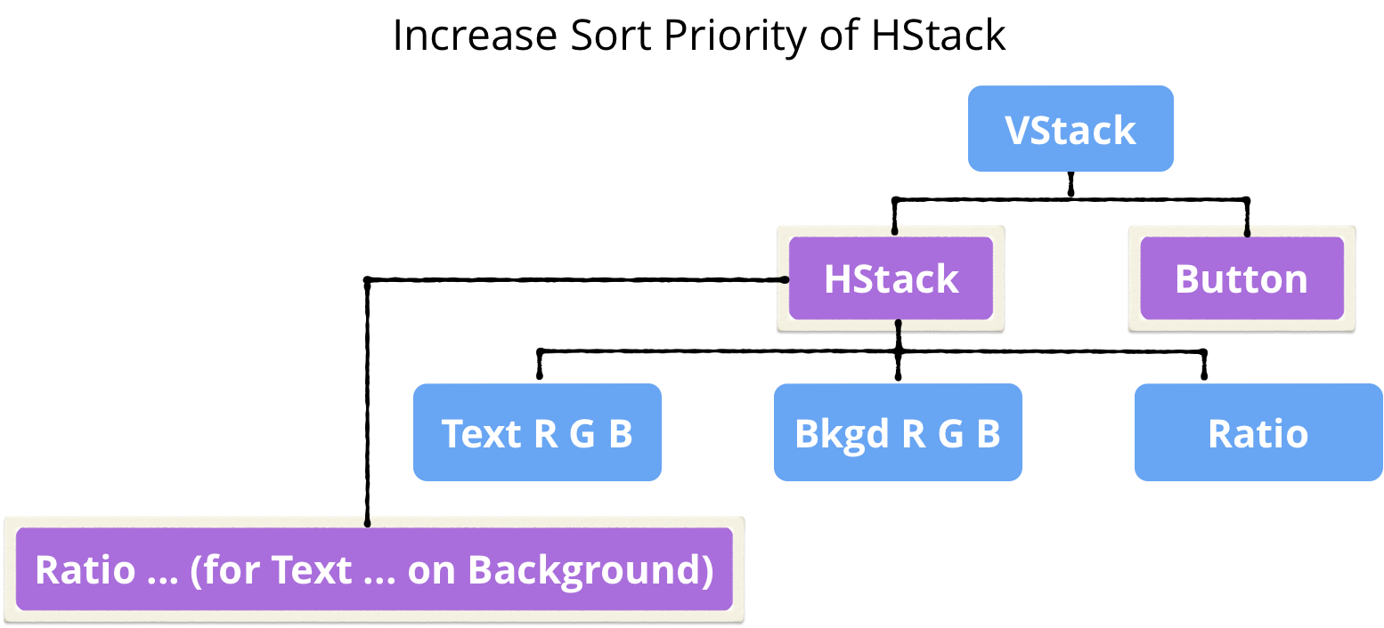
For a VoiceOver user, it might actually make more sense to hear the ratio value before Edit colors button: VoiceOver first reads the value, then offers the action. Within the VStack, increase the priority of the HStack, so VoiceOver says Ratio … [pause] Text … before Edit colors button. You’ll modify the accessibility tree to look like this:
Click Reveal to see the solution.
[spoiler title=”Solution”]
First, add this modifier to the HStack, below the accessibilityElement(children:) line:
.accessibility(sortPriority: 1)
You’re ordering the HStack ahead of the Button. The order of modifiers is important: if you set sortPriority before accessibilityElement(children:), it doesn’t change the ordering.
Then add this modifier to the VStack:
.accessibilityElement(children: .contain)
You’re setting up the VStack to pay attention to sortPriority.
Build and run to confirm that this works. Turn on VoiceOver, then swipe right to move to the first item — VoiceOver reads Ratio … first. Swipe right: VoiceOver moves to that item’s button and reads Edit button.
[/spoiler]
You’ve done a great job fixing up the list view. Now to tackle the ColorPicker view.
Making Sense of Sliders
On your device, tap a list item to open its color-editing view:

Turn off VoiceOver on your device. Instead, select your device in the accessibility inspector. Your device should be connected to your Mac, but the app doesn’t have to be running in Xcode.
Now click the Play button to auto-navigate VoiceOver over the view — it sounds like this, but with different numbers:
1.85 Text. Red: 169, 66 per cent, adjustable. Green: 35, 14 per cent, adjustable. Blue: 109, 43 per cent, adjustable. Background. Red: 204, 80 per cent, adjustable. Green: 80, 31 per cent, adjustable. Blue: 225, 89 per cent, adjustable.
Here are the problems:
- The contrast ratio value 1.85 has no context.
- The Accessibility Inspector doesn’t use the sliders’ labels. This is probably a bug. If it’s fixed by the time you read this article, then skip fix #2 below.
- The sliders express their accessibility values as percentages, which aren’t useful in this app’s context. Labels like Red: 169 provide the necessary info, but aren’t adjustable, so you can’t just hide the sliders from VoiceOver.
And here’s what you’ll do to fix these problems:
- Add an accessibility label to the contrast ratio
Textelement. - Duplicate the sliders’ labels in accessibility labels.
- Add accessibility values (integers) to the sliders, to hide the percentage values.
Fixing the Contrast Ratio View
The first job is easy: In ColorPicker.swift, in the ZStack, add this modifier to the Text element:
.accessibility(label: Text("Contrast ratio: " + contrast.ratio() + "."))
You’re adding context to the ratio value, as well as some punctuation, to make VoiceOver pause before and after the ratio value. VoiceOver will read out this label instead of the Text element’s content.
Fixing the Sliders
Next, to stop VoiceOver speaking the slider value as a percentage, you’ll add an accessibility label and value to the Slider. But first, SliderBlock needs one more property.
Add the following property to struct SliderBlock. To continue copying code from this article, add this property below the existing four properties.
@Binding var contrast: ContrastModel
The order of properties must match the order of parameters in the SliderBlock initializer.
Now you have to add this parameter to all the SliderBlock elements in the body of struct ColorPicker.
Replace the SliderBlock elements in the “Text” VStack:
SliderBlock(colorString: "Red", colorInt: contrast.text.rInt,
  colorValue: $contrast.text.r, bkgdOrText: "Text",
  contrast: $contrast)
SliderBlock(colorString: "Green", colorInt: contrast.text.gInt,
  colorValue: $contrast.text.g, bkgdOrText: "Text",
  contrast: $contrast)
SliderBlock(colorString: "Blue", colorInt: contrast.text.bInt,
  colorValue: $contrast.text.b, bkgdOrText: "Text",
  contrast: $contrast)
Then replace the SliderBlock elements in the “Background” VStack:
SliderBlock(colorString: "Red", colorInt: contrast.bkgd.rInt,
  colorValue: $contrast.bkgd.r, bkgdOrText: "Background",
  contrast: $contrast)
SliderBlock(colorString: "Green", colorInt: contrast.bkgd.gInt,
  colorValue: $contrast.bkgd.g, bkgdOrText: "Background",
  contrast: $contrast)
SliderBlock(colorString: "Blue", colorInt: contrast.bkgd.bInt,
  colorValue: $contrast.bkgd.b, bkgdOrText: "Background",
  contrast: $contrast)
Finally, add these two modifiers to the Slider element in struct SliderBlock:
.accessibility(label: Text(bkgdOrText + " " + colorString))
.accessibility(value: Text(colorInt + ". Ratio " + contrast.ratio()))
Slider label is working in VoiceOver by the time you read this article, then you don’t need to add the accessibility(label:) line.
You’re adding an accessibility label and replacing the default accessibility value. And you’re actually adding more context to these accessibility attributes than you display in your UI for sighted users.
For each slider, you’re telling your VoiceOver user which color — text or background — and component — red, green or blue — the slider changes.
You’re also telling them the updated contrast ratio. Your sighted users can see the ratio change when they move a slider, and use this feedback to decide their next action. And now your VoiceOver users can also use this feedback.
Now that you’ve added accessibility information that includes what’s in the Text element, you don’t want VoiceOver to read it out anymore. So add this modifier to the Text element in struct SliderBlock:
.accessibility(hidden: true)
You’re hiding this Text element from VoiceOver, so it won’t read out its content.
Build and run, then listen to your ColorPicker in Accessibility Inspector with auto-navigate:
Contrast ratio 5.51. Text. Text Red: 224, ratio 5.51, adjustable. Text Green: 245, ratio 5.51, adjustable. Text Blue: 232, ratio 5.51, adjustable. Background. Background Red: 158, ratio 5.51, adjustable. Background Green: 11, ratio 5.51, adjustable. Background Blue: 202, ratio 5.51, adjustable.
That sounds much better, but what’s it like to use? Once again, you’ll need to use VoiceOver on your device to get the real experience.