iOS Accessibility in SwiftUI Tutorial Part 2: Organizing
In this accessibility tutorial, you’ll organize the accessibility information of a SwiftUI app by restructuring its accessibility tree. By Audrey Tam.
Accessibility matters. Making sure every UI element has a meaningful label is a good start, but you’ll probably need to organize some of the accessibility information, to help VoiceOver users understand and navigate your app.
In Part 1 of this article, you fixed the accessibility of a simple master-detail SwiftUI app by creating informative labels for various types of images. In this part, you’ll fix the accessibility of a more interactive app by organizing the accessibility information in a way that differs from what your non-VoiceOver users see: You’ll restructure your app’s accessibility tree.
In this part of the article, you’ll learn how to:
- Improve VoiceOver information by reordering, combining or ignoring child elements.
- Streamline VoiceOver navigation with headings.
- Provide context for a SwiftUI control like
Slider.
You’ll also learn how color contrast ratios affect accessibility and how improving accessibility can lead to improvements to your app’s visual UI.
The future is accessible, and SwiftUI will help you make it happen!
Getting Started
Get started by downloading the materials for this article — you can find the link at the top or bottom of this article. Open the ContrastPicker project in the begin folder. Build and run the app in an iPhone simulator.

This app displays sample text in different text colors on different background colors. The sample-text-on-background element is a button. Tapping this button shows a modal sheet that lets the user edit the colors to increase the color contrast ratio:

Swipe down to dismiss the modal sheet.
NavigationLink to the ColorPicker view. I changed to a modal sheet because, at the time of writing this article, NavigationLink blocks the .accessibilityElement(children:) behavior that you’ll learn about in this article.
Color Contrast Ratio
Color contrast plays an important role in accessibility. Strong contrast between UI elements in your app makes it easier for all your users to see your content.
The amount of contrast between foreground and background colors falls under Guideline 1.4 Distinguishable of the Web Content Accessibility Guidelines (WCAG) 2.0
Make it easier for users to see … content including separating foreground from background.
The color contrast ratio measures the contrast between two colors. It’s roughly the relative brightness of the lighter color divided by the relative brightness of the darker color. It’s often expressed as something like 21:1 — this is the largest possible color contrast ratio, between white and black.
The Level AA Minimum guidelines recommend a contrast ratio of at least 4.5:1, although a 3:1 contrast ratio is OK for large-scale text (18pt or larger) or bold text of any size.
The Level AAA Enhanced guidelines recommend higher contrast values — at least 7:1, or 4.5:1 for large-scale text.
Look at the ContrastPicker list view in your simulator: Most items have ratio values less than 4.5, and it’s pretty hard to read items whose ratio value is less than 2.
Calculating Color Contrast Ratio
There are online color contrast calculators, but Accessibility Inspector has its own. However, for any pair of colors, Accessibility Inspector’s Color Contrast Calculator produces a slightly higher value than the WCAG formula used by online calculators. This issue was raised in an Apple forum thread in December 2018. At the time of writing this article, there’s been no official response. I tried a few different color pairs to see if there’s a constant multiplier, but there isn’t one.
Check out the difference for yourself: Open contrastchecker.com in a browser, then use its Foreground and Background color pickers to enter Text and Background hexadecimal values from the app — don’t enter the last two hexadecimal digits FF, as that’s just the alpha value.
Next, reopen the color pickers to get the Red, Green and Blue values that you need to enter into Accessibility Inspector’s Color Contrast Calculator.
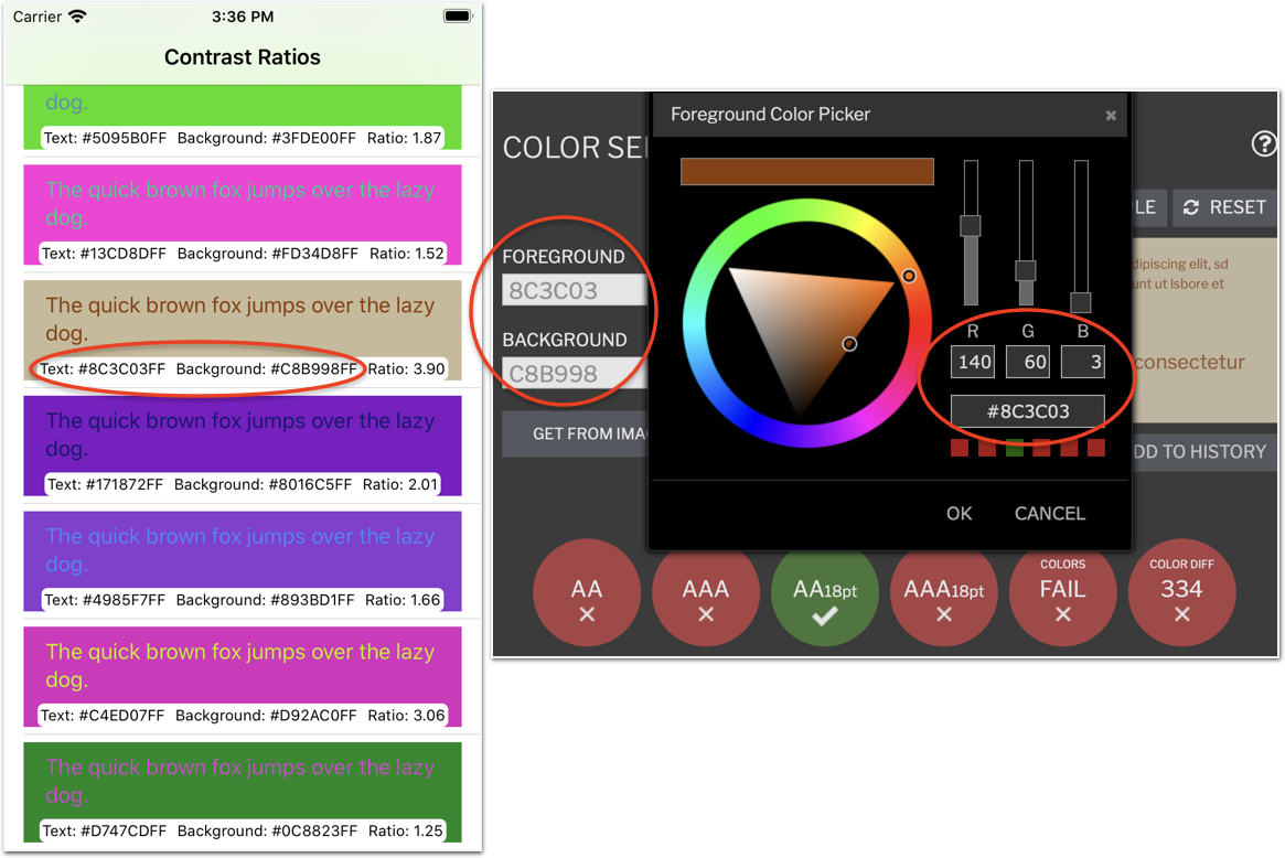
The example uses 8C3C03 for Foreground and C8B998 for Background. These translate to Red 140 Green 60 Blue 3 and Red 200 Green 185 Blue 152.
Now open Accessibility Inspector: Xcode▸Open Developer Tool▸Accessibility Inspector. Then open its Color Contrast Calculator: Windows▸Show Color Contrast Calculator.
Finally, enter the Text and Background Red, Green and Blue values from contrastchecker.com:

In this example, Apple’s contrast ratio 4.3 is slightly higher than the WCAG value 3.93, but both calculators agree this amount of contrast is OK for 18pt text.
ContrastPicker uses the WCAG formula for color contrast ratio, implemented in ContrastModel.swift. The formula uses RGB values between 0 and 1, so its contrast ratio values are slightly different from the online calculators, which use integer RGB values between 0 and 255.
Better Labels for All Users
Each list item displays sample text in a randomly-generated text color against a randomly-generated background color. Below this are the text and background Color descriptions and the contrast ratio. If you’re a sighted person scanning this, it looks OK: You don’t really read the sample text, you recognize the Color descriptions as hex values, and your eyes quickly zoom in on the ratio value at the end.
Now stop and think how this will sound in VoiceOver — actually, use the accessibility inspector’s VoiceOver simulator to listen to it. Select your simulator as the target, then use the Fast-Forward button to navigate to the first item. Click the Play button to auto-navigate this item.
It sounds similar to this:
The quick brown fox jumps over the lazy dog. Button. Text: number D37F5EFF Background: number C80C56FF Ratio: 1.91.
Ugh! VoiceOver reads # as number if the next character is a digit, otherwise it just skips it. If part of the hex number spells something pronounceable like EFF, VoiceOver reads it as a word eff, not as E-F-F. At least, VoiceOver pauses after each Text element, even though there’s no punctuation there.
The first main problem is: This is gobbledygook to listen to. The second main problem is: The most important information — the ratio — comes at the end. Also, VoiceOver users won’t want to listen to the sample text over and over, but they do need to know that this is an edit button.
So how do you fix these problems?