Modern Collection Views with Compositional Layouts
In this tutorial, you’ll learn how to build beautiful, modern UICollectionView layouts using iOS 13’s new declarative UICollectionViewCompositionalLayout API. By Tom Elliott.
Browsing Albums
The album detail view is starting to look good. Of course, most people have more than one album so, in this next section, you’ll add an album viewing view to the app.
Open AppDelegate.swift and replace the four lines that fetch the bundle and set the initial view controller with the following code:
guard let bundleURL = Bundle.main.url(
  forResource: "PhotoData",
  withExtension: "bundle") else {
    return false
}
let initialViewController =
  AlbumsViewController(withAlbumsFromDirectory: bundleURL)
This sets AlbumsViewController as the initial view controller. Open AlbumsViewController.swift. Structurally this class is very similar to the AlbumDetailViewController class you already modified.
The primary difference is this class displays three sections rather than just one. snapshotForCurrentState() handles the logic for adding each section and the relevant items. Build and run the project.
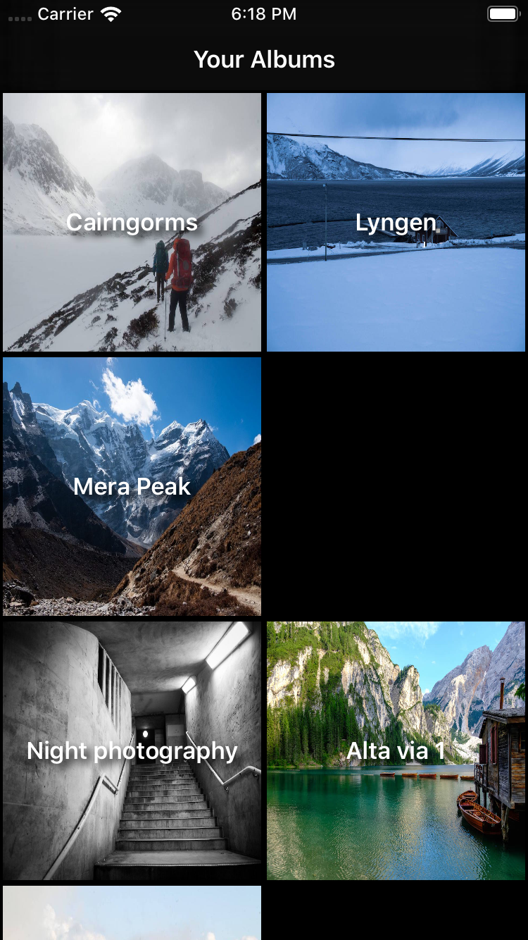
The initial view controller shows a list of six albums, with each album representing a folder in the PhotoData bundle. Some albums appear in multiple sections. Tapping on a thumbnail opens the album detail view as you would expect.
As it currently stands, there is no way of telling what each section represents. To fix that, you’re going to add a header to each section. In configureCollectionView(), register the HeaderView class by adding the following code after registering the AlbumItemCell:
collectionView.register(
  HeaderView.self,
  forSupplementaryViewOfKind: AlbumsViewController.sectionHeaderElementKind,
  withReuseIdentifier: HeaderView.reuseIdentifier)
As before, with the supplementary syncing view, you need to tell the collection view’s data source how to generate the header. Add the following to configureDataSource() after it is initialized:
dataSource.supplementaryViewProvider = { (
  collectionView: UICollectionView,
  kind: String,
  indexPath: IndexPath)
    -> UICollectionReusableView? in

  guard let supplementaryView = collectionView.dequeueReusableSupplementaryView(
    ofKind: kind,
    withReuseIdentifier: HeaderView.reuseIdentifier,
    for: indexPath) as? HeaderView else {
      fatalError("Cannot create header view")
  }

  supplementaryView.label.text = Section.allCases[indexPath.section].rawValue
  return supplementaryView
}
As before, you set the supplementary view provider to a closure that returns a supplementary view given a collection view, a kind and an index path. In this case, it returns HeaderView — another simple view from the starter project.
Finally, replace the section initialization code in generateMyAlbumsLayout() with:
let headerSize = NSCollectionLayoutSize(
  widthDimension: .fractionalWidth(1.0),
  heightDimension: .estimated(44))
let sectionHeader = NSCollectionLayoutBoundarySupplementaryItem(
  layoutSize: headerSize,
  elementKind: AlbumsViewController.sectionHeaderElementKind,
  alignment: .top)

let section = NSCollectionLayoutSection(group: group)
section.boundarySupplementaryItems = [sectionHeader]
This code sets up a layout size for your header of the full width and estimated to be 44 points high. You use an estimated height because Dynamic Type settings mean users may see the heading text larger than you expect.
Next, the code defines a section header and, finally, sets it as a supplementary item on the section. Build and run the project to see the headers added to the top of each section:

More Complex Layouts
Cast your mind back to the very beginning of this tutorial, and you’ll remember the album browsing view used different layouts for each section. Time to add that!

Start by registering two new cell classes in configureCollectionView(), directly after registering AlbumItemCell.
collectionView.register(
  FeaturedAlbumItemCell.self,
  forCellWithReuseIdentifier: FeaturedAlbumItemCell.reuseIdentifer)
collectionView.register(
  SharedAlbumItemCell.self,
  forCellWithReuseIdentifier: SharedAlbumItemCell.reuseIdentifer)
Replace the contents of the data source trailing closure in configureDataSource() with the following code:
let sectionType = Section.allCases[indexPath.section]
switch sectionType {
case .featuredAlbums:
  guard let cell = collectionView.dequeueReusableCell(
    withReuseIdentifier: FeaturedAlbumItemCell.reuseIdentifer,
    for: indexPath) as? FeaturedAlbumItemCell
  else { fatalError("Could not create new cell") }

  cell.featuredPhotoURL = albumItem.imageItems[0].thumbnailURL
  cell.title = albumItem.albumTitle
  cell.totalNumberOfImages = albumItem.imageItems.count
  return cell

case .sharedAlbums:
  guard let cell = collectionView.dequeueReusableCell(
    withReuseIdentifier: SharedAlbumItemCell.reuseIdentifer,
    for: indexPath) as? SharedAlbumItemCell
  else { fatalError("Could not create new cell") }

  cell.featuredPhotoURL = albumItem.imageItems[0].thumbnailURL
  cell.title = albumItem.albumTitle
  return cell

case .myAlbums:
  guard let cell = collectionView.dequeueReusableCell(
    withReuseIdentifier: AlbumItemCell.reuseIdentifer,
    for: indexPath) as? AlbumItemCell
  else { fatalError("Could not create new cell") }

  cell.featuredPhotoURL = albumItem.imageItems[0].thumbnailURL
  cell.title = albumItem.albumTitle
  return cell
}
This looks like a lot of code, but in reality, it’s fairly simple. A switch statement treats each section independently, returning the appropriate cell after dequeuing and configuring it.
Next, add a method to generate the first section layout for featured albums under generateMyAlbumsLayout():
func generateFeaturedAlbumsLayout(isWide: Bool) -> NSCollectionLayoutSection {
  let itemSize = NSCollectionLayoutSize(
    widthDimension: .fractionalWidth(1.0),
    heightDimension: .fractionalWidth(2/3))
  let item = NSCollectionLayoutItem(layoutSize: itemSize)

  // Show one item plus peek on narrow screens,
  // two items plus peek on wider screens
  let groupFractionalWidth = isWide ? 0.475 : 0.95
  let groupFractionalHeight: Float = isWide ? 1/3 : 2/3
  let groupSize = NSCollectionLayoutSize(
    widthDimension: .fractionalWidth(CGFloat(groupFractionalWidth)),
    heightDimension: .fractionalWidth(CGFloat(groupFractionalHeight)))
  let group = NSCollectionLayoutGroup.horizontal(
    layoutSize: groupSize,
    subitem: item,
    count: 1)
  group.contentInsets = NSDirectionalEdgeInsets(
    top: 5,
    leading: 5,
    bottom: 5,
    trailing: 5)

  let headerSize = NSCollectionLayoutSize(
    widthDimension: .fractionalWidth(1.0),
    heightDimension: .estimated(44))
  let sectionHeader = NSCollectionLayoutBoundarySupplementaryItem(
    layoutSize: headerSize,
    elementKind: AlbumsViewController.sectionHeaderElementKind,
    alignment: .top)

  let section = NSCollectionLayoutSection(group: group)
  section.boundarySupplementaryItems = [sectionHeader]
  section.orthogonalScrollingBehavior = .groupPaging

  return section
}
The first half of the method might look familiar. The code sets up an item and a group, with the added functionality of changing how wide the group is depending on an isWide parameter passed into the method. It then adds a header.
The most interesting part of the method comes right at the end. A collection view has a primary axis that determines its scroll direction. In our case, vertically. The orthogonal axis, then, is at right angles — horizontal in this case. You configure this section layout with a scrolling behavior on the orthogonal axis, which pages through the groups. More on this later, after configuring the third and final section.
Add the following method to generate the layout for the shared albums:
func generateSharedlbumsLayout() -> NSCollectionLayoutSection {
  let itemSize = NSCollectionLayoutSize(
    widthDimension: .fractionalWidth(1.0),
    heightDimension: .fractionalWidth(1.0))
  let item = NSCollectionLayoutItem(layoutSize: itemSize)

  let groupSize = NSCollectionLayoutSize(
    widthDimension: .absolute(140),
    heightDimension: .absolute(186))
  let group = NSCollectionLayoutGroup.vertical(
    layoutSize: groupSize,
    subitem: item,
    count: 1)
  group.contentInsets = NSDirectionalEdgeInsets(
    top: 5,
    leading: 5,
    bottom: 5,
    trailing: 5)

  let headerSize = NSCollectionLayoutSize(
    widthDimension: .fractionalWidth(1.0),
    heightDimension: .estimated(44))
  let sectionHeader = NSCollectionLayoutBoundarySupplementaryItem(
    layoutSize: headerSize,
    elementKind: AlbumsViewController.sectionHeaderElementKind,
    alignment: .top)

  let section = NSCollectionLayoutSection(group: group)
  section.boundarySupplementaryItems = [sectionHeader]
  section.orthogonalScrollingBehavior = .groupPaging

  return section
}
The shared albums layout is fairly straight forward, exhibiting the same paging behavior as the featured albums but with a smaller, square item size.
Finally, replace generateLayout() to call the two new methods you just added:
func generateLayout() -> UICollectionViewLayout {
  let layout = UICollectionViewCompositionalLayout { (sectionIndex: Int,
    layoutEnvironment: NSCollectionLayoutEnvironment)
      -> NSCollectionLayoutSection? in
    let isWideView = layoutEnvironment.container.effectiveContentSize.width > 500

    let sectionLayoutKind = Section.allCases[sectionIndex]
    switch (sectionLayoutKind) {
    case .featuredAlbums: return self.generateFeaturedAlbumsLayout(
      isWide: isWideView)
    case .sharedAlbums: return self.generateSharedlbumsLayout()
    case .myAlbums: return self.generateMyAlbumsLayout(isWide: isWideView)
    }
  }
  return layout
}
Note the use of the layoutEnvironment variable to modify the layout based on the width of the content.
Build and run the project.

Rotate the device to see how the layout changes with different widths:

Remember the paging orthogonal scroll behavior added to the featured and shared albums? Try scrolling these sections from left to right.

Prior to UICollectionViewCompositionalLayout, implementing this sort of functionality would have required adding another collection view inside the main one and handling all sorts of complex interaction logic. Now, it’s a single line of code!