Implicit Animations in Flutter: Getting Started
Learn how to make smooth-flowing and beautiful apps by adding implicit animations to your Flutter project’s buttons, containers and screen transitions. By Yogesh Choudhary.
Animating Page Transitions
A smooth, unique transition from one screen to another provides a good user experience and can make your app stand out. It's preferable to have a smooth transition from one screen to another, rather than an abrupt jump.
In Flutter, you have a variety of options to customize page transitions. To keep things simple for this tutorial, you'll work with CupertinoPageRoute to add a sliding animation to the app.
While still in greeting_screen.dart, import the cupertino library:
import 'package:flutter/cupertino.dart';
Inside _welcomeMessage, find the // TODO: navigation comment inside onPressed. Replace the navigator there with the following:
Navigator.of(context).pushReplacement(
  CupertinoPageRoute(
    builder: (context) => const OverviewScreen(),
  ),
);
Your app now has an iOS-like slide transition. Save your file and hot reload the app to see the changes:

Creating a Radial Menu
A radial menu is a button that you can press that then expands to show menu options in a circular pattern out from the button. You're going to add one to the app now!
Radial menus are a great way to make your app more appealing. Some nice benefits of using a radial menu include:
- You don't need to scroll too long to look for all the options, since they're equally spaced and accessible at the same time.
- The actions are natural for touchscreen-based devices.
- Radial menu actions are more convenient than traditional methods. Over time, interacting with the menu takes little effort.
Start off by updating the floating action button in the app to toggle between open and closed states.
Open overview_screen.dart. Delete _radialMenuCenterButton and replace it with the following:
bool _opened = false;

Widget _radialMenuCenterButton() {
  //1
  return InkWell(
    //2
    key: UniqueKey(),
    child: Padding(
      padding: const EdgeInsets.all(8.0),
      child: Container(
        height: 80.0,
        width: 80.0,
        decoration: BoxDecoration(
            borderRadius: BorderRadius.circular(40.0),
            color: Colors.green[600]),
        child: Center(
          child: Icon(_opened == false ? Icons.add : Icons.close,
              color: Colors.white),
        ),
      ),
    ),
    onTap: () {
      //3
      setState(() {
        _opened == false ? _opened = true : _opened = false;
      });
    },
  );
}
Here's what you just did:
- You created a responsive area with the help of
InkWell. -
UniqueKey()provides a unique key every time this widget rebuilds. You'll learn why you need this shortly. - Whenever a user clicks the
RadialMenuCenterButton, the value of the Boolean_openedflips. The framework will then rebuild this widget and its child widgets.
Adding AnimatedSwitcher to Your Radial Menu
To implement the radial menu, you'll use another powerful implicit animation widget — AnimatedSwitcher. It animates switching between two widgets. In this case, you're going to be switching between two versions of the floating action button - one that shows an add icon, and one that shows a close icon.
By default, the transition between the widgets is a cross-fade, which is the same animation that you get from AnimationCrossFade. You can read about other transitions in the Animation and motion widgets documentation. Look for FooTransition, where Foo is the property you're animating.
To implement AnimatedSwitcher, add _getRadialMenu to OverviewScreenState in overview_screen.dart, as shown below:
Widget _getRadialMenu() {
  return AnimatedSwitcher(
    // 1
    duration: const Duration(milliseconds: 300),
    // 2
    transitionBuilder: (child, animation) {
      return ScaleTransition(child: child, scale: animation);
    },
    // 3
    child: radialMenuCenterButton(),
  );
}
Here's what this code does:
- Similar to the other widgets, you assigned the duration over which the animation will happen.
- One thing that makes
AnimatedSwitcherbetter thanAnimationCrossFadeis you can choose which type of transition you need when switching between widgets. Here, you useScaleTransition. - The
childcontains the widget that displays onscreen. When this widget changes, the transition triggers. For the animation to happen, both the widgets need to be different. Since you have the same kind of widget here, you use theUniqueKey()to differentiate between the two states.
You're almost done; just one more step. Go to build and look for the comment // TODO: Radial menu. Replace the line radialMenuCenterButton(); with the following code:
Align(
  alignment: Alignment.bottomRight,
  child: _getRadialMenu(),
),
Save and hot restart the app to see the changes:
Note that the icon switches between add and close.
Creating the Radial Menu Widget
Next up, you're going to add the actual radial menu buttons. You're almost there!
Begin by creating a new file named radial_button.dart in widgets and add the following:
import 'package:flutter/material.dart';

class RadialButton extends StatefulWidget {
  final double hiddenHorizontalPlacement;
  final double hiddenVerticalPlacement;
  final double visibleHorizontalPlacement;
  final double visibleVerticalPlacement;
  final Color color;
  final IconData image;
  final Function onTap;
  final bool opened;
  const RadialButton(
      {Key key,
      this.hiddenHorizontalPlacement,
      this.hiddenVerticalPlacement,
      this.visibleHorizontalPlacement,
      this.visibleVerticalPlacement,
      this.color,
      this.image,
      this.onTap,
      this.opened})
      : super(key: key);
  @override
  State createState() {
    return RadialButtonState();
  }
}

class RadialButtonState extends State<RadialButton> {
  @override
  Widget build(BuildContext context) {
    return Positioned(
      left: widget.opened == false
          ? widget.hiddenHorizontalPlacement
          : widget.visibleHorizontalPlacement,
      bottom: widget.opened == false
          ? widget.hiddenVerticalPlacement
          : widget.visibleVerticalPlacement,
      child: InkWell(
          child: Padding(
            padding: const EdgeInsets.all(8.0),
            child: Container(
              height: 60.0,
              width: 60.0,
              decoration: BoxDecoration(
                  borderRadius: BorderRadius.circular(40.0),
                  color: widget.color),
              child: Center(
                child: Icon(widget.image, color: Colors.white),
              ),
            ),
          ),
          onTap: widget.onTap),
    );
  }
}
That's a big chunk of code! Ultimately, RadialButton accepts a set of positions as constructor arguments that can be used to position the button somewhere on the screen. It also accepts some styling attributes as well as a tap listener and a boolean to tell whether it's opened or not.
Next, head back to overview_screen.dart and add the following imports:
import 'package:green_stationery/data/services/plant_statiotionery_convertor.dart';
import 'package:green_stationery/widgets/radial_button.dart';
import 'package:flutter_icons/flutter_icons.dart';
You'll add radial buttons as children of the Stack widget right before the Align widget that you added previously. You'll find the place by looking in build for the // TODO: Radial menu comment.
RadialButton(
  // 1
  hiddenHorizontalPlacement: _screenWidth - 90.0,
  visibleHorizontalPlacement: _screenWidth - 250.0,
  // 2
  hiddenVerticalPlacement: 10.0,
  visibleVerticalPlacement: 10.0,
  color: Colors.green[400],
  image: FontAwesome.book,
  opened: _opened,
  onTap: () {
    setState(() {
      //3
      PlantStationeryConvertor.addStationery(stationeryType: 'Books');
    });
  },
),

RadialButton(
  hiddenHorizontalPlacement: _screenWidth - 90.0,
  visibleHorizontalPlacement: _screenWidth - 90.0 - 139.0,
  hiddenVerticalPlacement: 10.0,
  visibleVerticalPlacement: 10.0 + 80,
  color: Colors.green[400],
  image: Entypo.brush,
  opened: _opened,
  onTap: () {
    setState(() {
      PlantStationeryConvertor.addStationery(stationeryType: 'Pens');
    });
  },
),

RadialButton(
  hiddenHorizontalPlacement: _screenWidth - 90.0,
  visibleHorizontalPlacement: _screenWidth - 90.0 - 80.0,
  hiddenVerticalPlacement: 10.0,
  visibleVerticalPlacement: 10.0 + 139.0,
  color: Colors.green[400],
  image: SimpleLineIcons.notebook,
  opened: _opened,
  onTap: () {
    setState(() {
      PlantStationeryConvertor.addStationery(
          stationeryType: 'Notebooks');
    });
  },
),

RadialButton(
  hiddenHorizontalPlacement: _screenWidth - 90.0,
  visibleHorizontalPlacement: _screenWidth - 90.0,
  hiddenVerticalPlacement: 10.0,
  visibleVerticalPlacement: 10.0 + 160.0,
  color: Colors.green[400],
  image: FontAwesome.archive,
  opened: _opened,
  onTap: () {
    setState(() {
      PlantStationeryConvertor.addStationery(
          stationeryType: 'Assiting Materials');
    });
  },
),
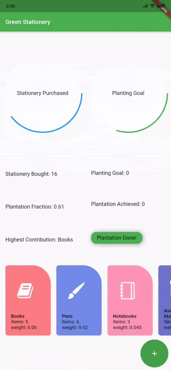
This may seem like a lot of code, but all that you're doing is adding four RadialButtons placed in an arc pattern around the floating action button.
Note the numbered comments in that code:
- Horizontal placement implies the distance from the left based on the width of the screen. Vertical placement implies the distance from the bottom based on the height of the screen.
- Being visible implies the radial button appears on the screen. Hidden implies that the radial button hides below the radial menu button.
-
PlantStationeryConvertor.addStationerytakes thestationeryTypeargument and increments the item number by one.
Build and run the app. Navigate to the overview screen and then tap the floating action button. You should see four additional buttons appear around the floating action button.