Core Graphics Tutorial: Lines, Rectangles, and Gradients
In this tutorial, you’ll learn how to use Core Graphics to draw lines, rectangles, and gradients — starting by beautifying a table view! By Tom Elliott.
Fixing the Theme
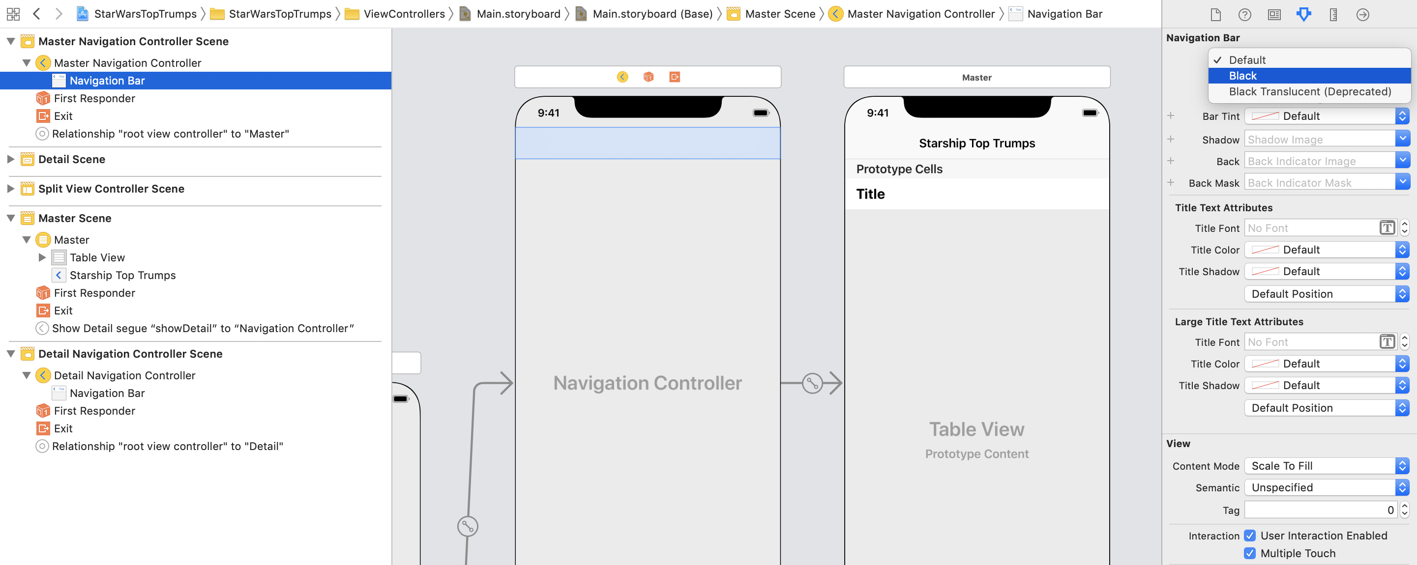
Open Main.storyboard and select the table view in the Master scene. In the Attributes inspector, set Separator to None.

Then, select the Navigation Bar in the Master Navigation Controller scene and set the Navigation Bar Style to Black and deselect Translucent. Repeat for the Navigation Bar in the Detail Navigation Controller scene.
Next, open MasterViewController.swift. At the end of viewDidLoad(), add the following:
tableView.backgroundColor = .starwarsSpaceBlue
Then in tableView(_:cellForRowAt:), just before returning the cell, set the color of the text:
cell.textLabel!.textColor = .starwarsStarshipGrey
Finally, open AppDelegate.swift and in application(_:didFinishLaunchingWithOptions:) add the following just before returning:
// Theming
UINavigationBar.appearance().tintColor = .starwarsYellow
UINavigationBar.appearance().barTintColor = .starwarsSpaceBlue
UINavigationBar.appearance().titleTextAttributes =
  [.foregroundColor: UIColor.starwarsStarshipGrey]
Build and run the app.
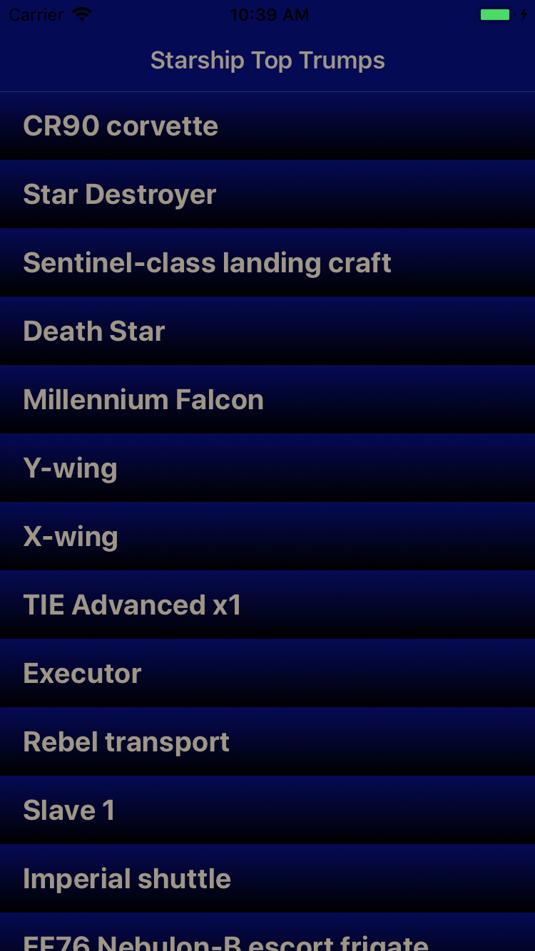
That’s better! Your master table view is starting to look very space age. :]
Stroking Paths
Stroking in Core Graphics means drawing a line along a path, rather than filling it, as you did before.
When Core Graphics strokes a path, it draws the stroke line on the middle of the exact edge of the path. This can cause a couple of common problems.
Outside the Bounds
First, if you are drawing around the edge of a rectangle, a border, for example, Core Graphics won’t draw half the stroke path by default.
Why? Because the context set up for a UIView only extends to the bounds of the view. Imagine stroking with a one point border around the edge of a view. Because Core Graphics strokes down the middle of the path, the line will be half a point outside the bounds of the view and half a point inside the bounds of the view.
A common solution is to inset the path for the stroke rect half the width of the line in each direction so that it sits inside the view.
The diagram below shows a yellow rectangle with a red stroke one point wide on a grey background, which is striped at one point intervals. In the left diagram, the stroke path follows the bounds of the view and has been cropped. You can see this because the red line is half the width of the grey squares. On the right diagram, the stroke path has been inset half a point and now has the correct line width.

Anti-Aliasing
Second, you need to be aware of anti-aliasing effects that can affect the appearance of your border. Anti-aliasing, if you are unfamiliar with what it is (even if you may have heard about it on a computer game settings screen!), is a technique rendering engines use to avoid “jagged” appearances of edges and lines when graphics being displayed don’t map perfectly to physical pixels on a device.
Take the example of a one point border around a view from the previous paragraph. If the border follows the bounds of the view, then Core Graphics will attempt to draw a line half a point wide on either side of the rectangle.
On a non-retina display one point is equal to one pixel on the device. It is not possible to light up just a half of a pixel, so Core Graphics will use anti-aliasing to draw in both pixels, but in a lighter shade to give the appearance of only a single pixel.
In the following sets of screenshots, the left image is a non-retina display, the middle image a retina display with a scale of two and the third image is a retina display with a scale of three.
For the first diagram, notice how the 2x image doesn’t show any anti-aliasing, as the half point either side of the yellow rectangle falls on a pixel boundary. However in the 1x and 3x images anti-aliasing occurs.

In this next set of screenshots, the stroke rect has been inset half a point, such that the stroke line aligns exactly with point, and thus pixel, boundaries. Notice how there are no aliasing artifacts.
Adding a Border
Back to your app! The cells are starting to look good but you’re going to add another touch to really make them stand out. This time, you’re going to draw a bright yellow frame around the edges of the cell.
You already know how to easily fill rectangles. Well, stroking around them is just as easy.
Open StarshipsListCellBackground.swift and add the following to the bottom of draw(_:):
let strokeRect = backgroundRect.insetBy(dx: 4.5, dy: 4.5)
context.setStrokeColor(UIColor.starwarsYellow.cgColor)
context.setLineWidth(1)
context.stroke(strokeRect)
Here, you create a rectangle for stroking that is inset from the background rectangle by 4.5 points in both the x and y directions. Then you set the stroke color to yellow, the line width to one point and, finally, stroke the rectangle. Build and run your project.
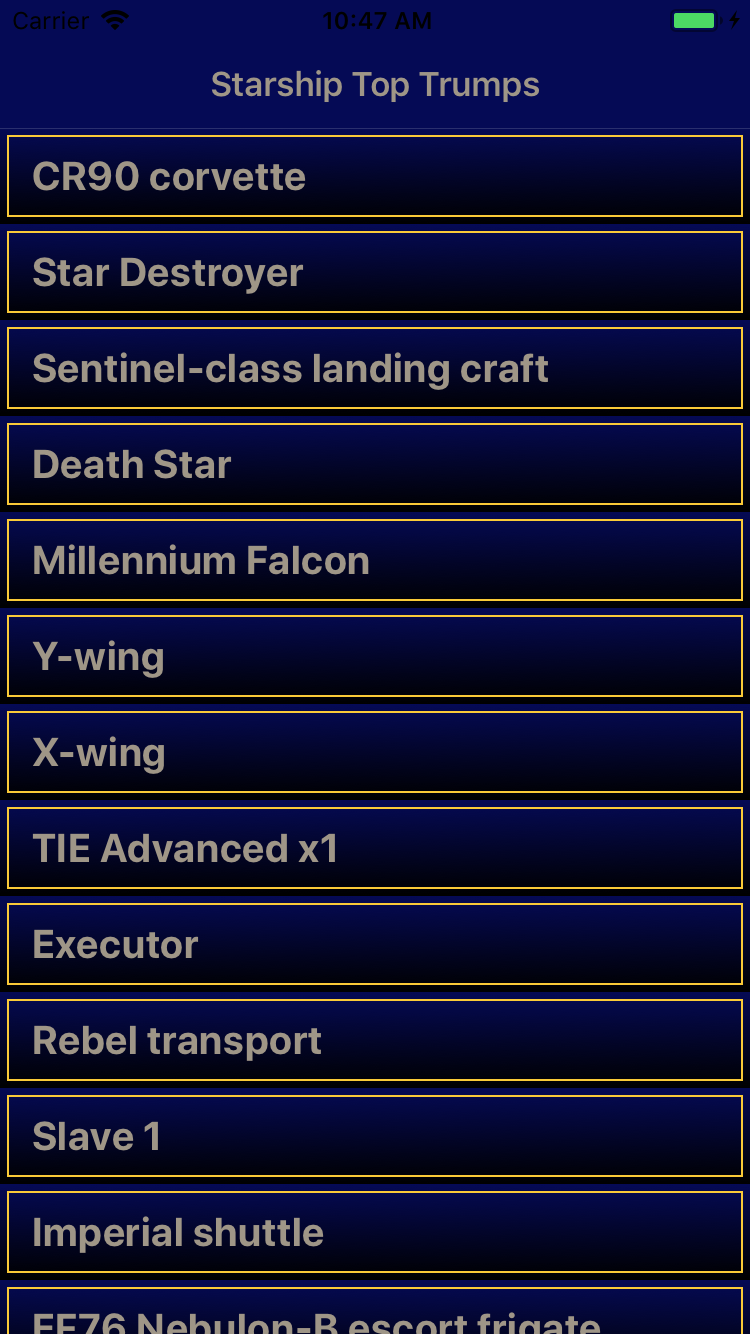
Now your starship list really looks like it comes from a galaxy far, far away!
Building a Card Layout
While your master view controller is looking fancy, the detail view controller is still in need of some sprucing up!

For this view, you are going to start by drawing a gradient on the table view background by using a custom UITableView subclass.
Create a new Swift File called StarshipTableView.swift. Replace the generated code with the following:
import UIKit

class StarshipTableView: UITableView {
  override func draw(_ rect: CGRect) {
    guard let context = UIGraphicsGetCurrentContext() else {
      return
    }

    let backgroundRect = bounds
    context.drawLinearGradient(
      in: backgroundRect,
      startingWith: UIColor.starwarsSpaceBlue.cgColor,
      finishingWith: UIColor.black.cgColor
    )
  }
}
This should be starting to look familiar by now. In the draw(_:) method of your new table view subclass you get the current CGContext then draw a gradient in the bounds of the view, starting from blue at the top and heading into black at the bottom. Simple!
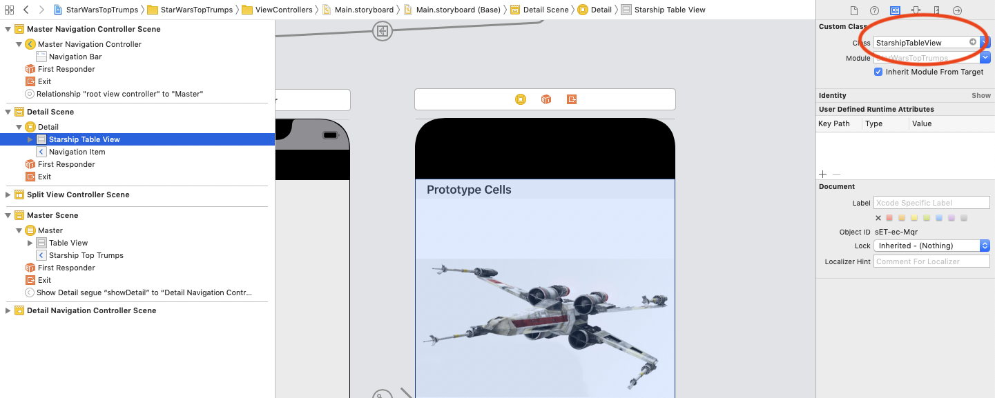
Open Main.storyboard and click on the TableView in the Detail scene. In the Identity inspector, set the class to your new StarshipTableView.
Build and run the app, then tap the X-wing row.

Your detail view now has a nice full screen gradient running from top to bottom, but the cells in the table view obscure the best parts of the effect. Time to fix this and add a bit more flair to the detail cells.
Back in Main.storyboard, select FieldCell in the Detail Scene. In the Attributes inspector, set the background to Clear Color. Next, open DetailViewController.swift and, at the very bottom of tableView(_:cellForRowAt:), just before returning the cell, add the following:
cell.textLabel!.textColor = .starwarsStarshipGrey
cell.detailTextLabel!.textColor = .starwarsYellow
This simply sets the cells’ field name and value to more appropriate colors for your Stars Wars theme.
Then, after tableView(_:cellForRowAt:) add the following method to style the table view header:
override func tableView(
  _ tableView: UITableView,
  willDisplayHeaderView view: UIView,
  forSection section: Int
) {
    view.tintColor = .starwarsYellow
    if let header = view as? UITableViewHeaderFooterView {
      header.textLabel?.textColor = .starwarsSpaceBlue
    }
  }
Here, you’re setting the tint color of the table views’ header’s view to the theme yellow, giving it a yellow background, and its text color to the theme blue.