Beginning Auto Layout Tutorial in iOS 7: Part 1
An Auto Layout tutorial that is fully up-to-date with Xcode 5 and iOS 7! By Matthijs Hollemans.
It takes two to tango
Guides do not appear only between a view and its superview, but also between views on the same level of the view hierarchy. To demonstrate this, drag a new button onto the canvas. If you drag this button close to the others, then their guides start to interact.
Put the new button next to the existing one so that it snaps into place:
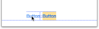
There are quite a few dotted guidelines here. Interface Builder recognizes that these two buttons can align in different ways – at their tops, centers and baselines.
Xcode 4 would have turned one of these snapping guides into a new constraint. But with Xcode 5, if you want to have a constraint between these two buttons, you have to make it yourself. You’ve seen that you can use the Editor\Pin menu to make a constraint between two views, but there is an easier way too.
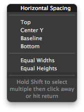
Select the new button and Ctrl-drag to the other button, like so:

When you let go of the mouse button, a popup appears. Choose the first option, Horizontal Spacing.
This creates a new constraint that looks like this:
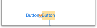
It is orange, meaning that this button needs at least one other constraint. The size of the button is known — it uses the intrinsic content size — and there is a constraint for the button’s X-position. That leaves only the Y-position without a constraint.
Here the missing constraint is pretty easy to determine but for more complicated designs it may not always be immediately obvious. Fortunately, you don’t have to guess. Xcode has been keeping score and can tell you exactly what is missing.
There is small a red arrow in the Document Outline, next to View Controller Scene. Click that arrow to see a list of all Auto Layout issues:

Sweet! Let’s add that missing Y-position constraint. Ctrl-drag from the new button downwards:

The popup menu has different options this time. The items in this menu depend on the context — which views are you dragging between — and the direction you moved the mouse. Choose Bottom Space to Bottom Layout.
The new button now has a Vertical Space to the bottom of the screen, but also a Horizontal Space that links it with the other button. Because this space is small (only 8 points), the T-bar may be a bit hard to see, but it is definitely there.
Click on the Horizontal Space (8) constraint in the Document Outline to select it:

When you select a constraint, it lights up the controls it belongs to. This particular constraint sits between the two buttons. What you’ve done here is say:
“The second button always appears on the left of the first one, no matter where the first button is positioned or how big it is.”
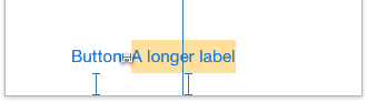
Select the button with the yellow background and type something long into its label like “A longer label”. When you’re done, the button resizes to make room for the new text, and the other button shifts out of the way. After all, it is attached to the first button’s left edge, so that is exactly what you intended to happen:
Just to get a better feel for how this works, play with this some more. Drag another button into the canvas and put it above the yellow one, so that they snap into place vertically (but don’t try to align the left edges of the two buttons):
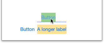
Give the new button a background color (green) so you can more easily see its extents.
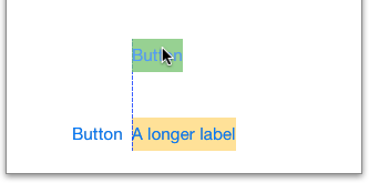
Because you snapped the two buttons together, there is now a standard space of 8 points between them that is recommended by the HIG. Turn this into a constraint by Ctrl-dragging between the two buttons. Select Vertical Spacing from the popup menu.
Note: The “HIG”, which is short for iOS Human Interface Guidelines, contains Apple’s recommendations for designing good user interfaces. It is mandatory reading for any iOS developer. The HIG explains which UI elements are appropriate to use under which circumstances, and best practices for using them. You can find this document here.
You are not limited to standard spacing between controls, though. Constraints are full-fledged objects, just like views, and therefore have attributes that you can change.
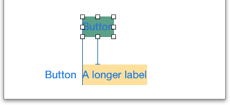
Select the Vertical Space constraint between the two buttons. You can do this in the canvas by clicking the T-bar, although that tends to be a bit finicky. By far the easiest method is to click on the constraint in the Document Outline. Once you have it selected, switch to the Attributes inspector:

Type 40 into the Constant field to change how big the constraint is. Now the two buttons will be further apart, but they are still connected:

Run the app and flip to landscape to see the effect:

The buttons certainly keep their vertical arrangement, but not their horizontal one! The reason should be obvious: the green button does not have a constraint for its X-position yet.
Adding a Horizontal Space from the green button to the left edge of the canvas won’t solve this problem. With such a constraint the green button always keeps the same X-coordinate, even in landscape. That doesn’t look very nice, so instead you are going to express the following intention:
“The yellow button will always be horizontally centered, and the green button will align its left edge with the left edge of the yellow button.”
You already have a constraint for the first condition, but not for the second. Interface Builder shows guides for alignment, so you can drag the top button until its left edge snaps with the yellow button:
If you also dragged the button vertically, the frame of the button and the Vertical Space constraint may no longer agree on the correct distance. You will see an orange badge on the T-bar:
If this happens, simply use the arrow keys to nudge the button into place again until the badge disappears.
Finally, Ctrl-drag between the two buttons and from the popup menu choose Left. This creates an alignment constraint that says: “The left edges of these two views are always aligned”. In other words, the two buttons will always have the exact same X-position. That solves the layout problem and the T-bars turn blue:
Run the app and rotate to landscape to verify that it works:
