Beginning Auto Layout Tutorial in iOS 7: Part 1
An Auto Layout tutorial that is fully up-to-date with Xcode 5 and iOS 7! By Matthijs Hollemans.
Designing like you mean it
The big advantage of using constraints is that you no longer have to fiddle with coordinates to get your views to appear in the proper places. Instead, you can describe to Auto Layout how the views are related to each other and Auto Layout will do all the hard work for you. This is called designing by intent.
When you design by intent, you’re expressing what you want to accomplish but not necessarily how it should be accomplished. Instead of saying: “the button’s top-left corner is at coordinates (20, 230)”, you now say:
“The button is centered vertically in its superview, and it is placed at a fixed distance from the left edge of the superview.”
Using this description, Auto Layout can automatically calculate where your button should appear, no matter how big or small that superview is.
Other examples of designing with intent (and Auto Layout can handle all of these instructions):
“These two text fields should always be the same size.”
“These two buttons should always move together.”
“These four labels should always be right-aligned.”
This makes the design of your user interfaces much more descriptive. You simply define the constraints, and the system calculates the frames for you automatically.
You saw in the first section that even a layout with just a few views needs quite a bit of work to layout properly in both orientations. With Auto Layout you can skip all that effort. If you set up your constraints properly, then the layout should work without any changes in both portrait and landscape.
Another important benefit of using Auto Layout is internationalization. Text in German, for example, is infamous for being very long and getting it to fit into your labels can be a headache. Again, Auto Layout takes all this work out of your hands, because it can automatically resize your labels based on the content they need to display – and have everything else adapt with constraints.
Adding support for German, French, or any other language is now simply a matter of setting up your constraints, translating the text, and… that’s it!

The best way to get the hang of Auto Layout is to play with it, so that’s exactly what you will do in the rest of this tutorial.
Note: Auto Layout is not just useful for rotation; it can also easily scale your UI up and down to accommodate different screen sizes. It is no coincidence that this technology was added to iOS at the same time that the iPhone 5 and its taller screen came out! Auto Layout makes it a lot easier to stretch your apps’ user interfaces to fill up that extra vertical space on the iPhone 5. And with Dynamic Type in iOS 7, Auto Layout has become even more important. Users can now change the global text size setting — with Auto Layout this is easy to support in your own apps.
Courting constraints
Close your current project and create a new iPhone project using the Single View Application template. Name it “Constraints”. Any new projects that you create with Xcode 5 automatically assume that you will be using Auto Layout, so you do not need to do anything special to enable it.
Click on Main.storyboard to open Interface Builder. Drag a new Button onto the canvas. Notice that while you’re dragging, dashed blue lines appear. These lines are known as the guides:
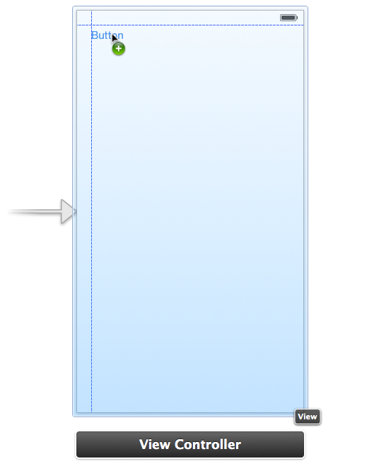
There are guides around the margins of the screen, as well as in the center:
If you have used Interface Builder before, then you have no doubt seen these guides. They are helpful hints that make it easier to align stuff.
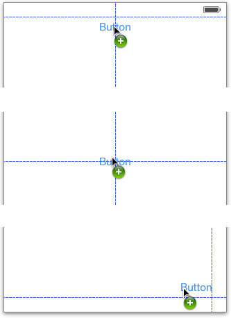
In Xcode 4 with Auto Layout enabled, the guides had a different purpose. You still used them for alignment, but they also told you where the new constraints would go. If you dropped the button in the top-left corner against the blue guides, the storyboard in Xcode 4 would look like this:

There are two blue thingies attached to the button. These T-bar shaped objects are the constraints. No matter where you placed your UI controls in Xcode 4’s Interface Builder, they always were given valid constraints. That sounded like a good idea in theory but in practice it made Auto Layout incredibly hard to use from Interface Builder.
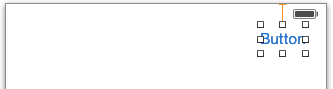
Fortunately, that has changed for the better with Xcode 5. After you drop the button into the canvas, there are no T-bars to be seen:

Notice that there is no Constraints section in the Document Outline pane either. Conclusion: this button does not have any constraints set on it.
But how can this work? You just learned that Auto Layout always needs enough constraints to determine the size and position of all the views, but here you have no constraints at all. Surely this is an incomplete layout?
This is where Xcode 5 is a big improvement over Xcode 4: it no longer forces you to always have a valid layout.
Note: It is a bad idea to run an app with an invalid layout because Auto Layout cannot properly compute where the views should go. Either the positions of the views will be unpredictable (not enough constraints) or the app will crash (too many constraints). Yikes!
Xcode 4 tried to prevent this from happening by making sure there were always exactly enough constraints to create a valid layout. Unfortunately, it often did this by removing your own constraints and replacing them by constraints you did not actually want. That could be very frustrating and many developers gave up on Auto Layout for this reason.
Xcode 5 is not nearly as rude. It allows you to have incomplete layouts while you’re editing the storyboard but it also points out what you still need to fix. Using Interface Builder to create Auto Layout-driven user interfaces has become a lot more fun — and a lot less time-consuming — with Xcode 5.
If you don’t supply any constraints at all, Xcode automatically assigns a set of default constraints, known as the automatic constraints. It does this at compile time when your app is built, not at design time. Auto Layout in Xcode 5 works hard to stay out of your way while you’re designing your user interfaces, and that’s just how we like it.
The automatic constraints give your views a fixed size and position. In other words, the view always has the same coordinates as you see in the storyboard. This is very handy because it means you can largely ignore Auto Layout. You simply don’t add constraints if the default ones are sufficient and only create constraints for those views that need special rules.
OK, let’s play around a bit with constraints and see what they can do. Right now, the button is in the top-left corner and has no constraints. Make sure the button is aligned with the two corner guides.
Add two new constraints to the button using the Editor\Pin menu, so that it looks like this:

If you hadn’t guessed already, that is the Leading Space to Superview and the Top Space to Superview options.
All the constraints are also listed in the Document Outline pane on the left-hand side of the Interface Builder window:

There are currently two constraints, a Horizontal Space between the button and the left edge of the main view, and a Vertical Space between the button and the top edge of the main view. The relationship that is expressed by these constraints is:
“The button always sits at 20 points from the top-left corner in its superview.”
Note: These aren’t actually very useful constraints to make because they’re the same as the automatic ones. If you always want your button to be relative to the top-left corner of its superview, then you might as well not provide any constraints at all and let Xcode make them for you.
Now pick up the button and place it in the scene’s top-right corner, again against the blue guides:

Whoa, what has happened here? In Xcode 4 this would have broken the old constraints and assigned new ones based on the blue guides, but in Xcode 5 the button keeps the existing constraints. The problem here is that the size and position of the button in Interface Builder no longer correspond with the size and position that Auto Layout expects based on the constraints. This is called a misplaced view.
Run the app. The button will still appear in the top-left corner of the screen:

When it comes to Auto Layout, orange is bad. Interface Builder drew two orange boxes: one with a dashed border and one with a solid border. The dashed box displays the view’s frame according to Auto Layout. The solid orange box is the view’s frame according to how you placed it in the scene. These two should match up, but here they don’t.
How you fix this depends on what you want to achieve:
- Do you want the button to be attached to the left edge of the screen at a distance of 254 points? In that case you need to make the existing Horizontal Space constraint 234 points bigger. That’s what the orange badge with “+234” means.
- Do you want the button to be attached to the right edge of the screen instead? Then you need to remove the existing constraint and create a new one.
Delete the Horizontal Space constraint. First select it in the canvas or in the Document Outline, and then press the Delete key on your keyboard.
Notice that this turns the Vertical Space constraint orange. Until now it was blue. There is nothing wrong with that particular constraint; it just means there are not enough constraints left to determine the complete position of the button. You still need to add a constraint for the X-position.
Note: You may be wondering why Xcode does not add an automatic constraint for the X-position. The rule is that Xcode only creates automatic constraints if you did not set any constraints of your own. As soon as you add a single constraint, you tell Xcode that you’re now taking responsibility for this view. Xcode will no longer make any automatic constraints and expects you to add any other constraints this view needs.
Select the button and choose Editor\Pin\Trailing Space to Superview. This puts a new constraint between the right edge of the button and the right edge of the screen. This expresses the relationship:
“The button always sits at 20 points from the top-right corner in its superview.”
Run the app and rotate to landscape. Notice how the button keeps the same distance from the right screen edge:

When you place a button (or any other view) against the guides and make a constraint, you get a spacing constraint with a standard size that is defined by the “HIG”, Apple’s iOS Human Interface Guidelines document. For margins around the edges, the standard size is a space of 20 points.
Now drag the button over to the left a little:
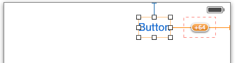
Again you get a dashed orange box because the view is misplaced. Let’s say this new button position is indeed what you want. It’s not uncommon to make a constraint and then nudge the view by a few pixels, making the orange boxes appear. One way to fix this is to remove the constraint and make a new one, but there is an easier solution.
The Editor menu has a Resolve Auto Layout Issues submenu. From that menu, choose Update Constraints. In my case, this tells Interface Builder it should make the constraint 64 points larger, as so:

Great, the T-bars turn blue again and the layout is valid. In the Document Outline, you can see that the Horizontal Space constraint no longer has a standard space:

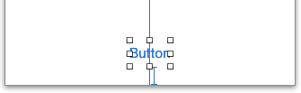
So far you’ve played with Horizontal Space and Vertical Space constraints. There is also a “center” constraint. Drag a new Button object to the bottom center of the canvas, so that it snaps into place with the guides:

To keep the button always center-aligned with its superview, on the horizontal axis, you need to add a Center X Alignment constraint. From the Editor menu choose Align\Horizontal Center in Container. This adds a long orange line:

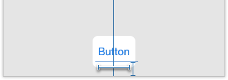
The line is orange because you’ve only specified what happens to the X-coordinate of the button, not its Y-coordinate. Use the Editor\Pin menu to add a Vertical Space constraint between the button and the bottom of the view. It should look like this:
In case you didn’t know how, it is the Bottom Space to Superview option. The Vertical Space constraint keeps the button away from the bottom of the view (again, using the standard margin).
Run the app and rotate it to landscape. Even in landscape mode, the button stays at the bottom center of the screen:

That’s how you express intent: “This button should always be at bottom center.” Notice that nowhere did you have to tell Interface Builder what the button’s coordinates are, only where you want it anchored in the view.
With Auto Layout, you’re no longer supposed to care about the exact coordinates of where you place your views on the canvas or what their size is. Instead, Auto Layout derives these two things from the constraints that you set.
You can see this paradigm shift in the Size inspector for the button, which is now quite different:
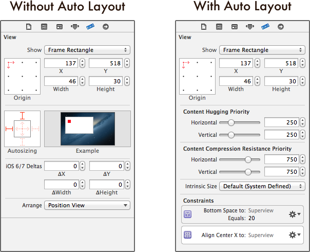
With Auto Layout disabled, typing into the X, Y, Width or Height fields will change the position and size of the selected view. With Auto Layout enabled you can still type new values into these fields, but if you already have constraints set on the view it may now become misplaced. You also have to update the constraints to make them match the new values.
For example, change the Width value of the button to 100. The canvas turns into something like this:

Xcode 4 would have replaced the Center X Alignment constraint with a Horizontal Space and a new constraint on the button itself that forces it to have a width of 100 points. However, Xcode 5 simply says, “It’s fine with me if you want the width to be 100 points but just so you know, that’s not what the constraints say.”
In this case you do want the button to be 100 points wide. There is a special type of constraint for this: the Fixed Width constraint. First press Undo so that the button is centered again and the T-bars are all blue. Select the button and choose Editor\Pin\Width. This puts a new T-bar below the button:
Select that T-bar and in the Attributes inspector change Constant to 100. This forces the button to always be 100 points wide, no matter how large or small its title. To see this a bit better you can give the button a background color:

You can also see this new Width constraint in the Document Outline on the left:

Unlike the other constraints, which are between the button and its superview, the Width constraint only applies to the button itself. You can think of this as a constraint between the button and… the button.
You may wonder why the button did not have a Width constraint before. How did Auto Layout know how wide to make the button without it?
Here’s the thing: the button itself knows how wide it must be. It calculates this based on its title text plus some padding. If you set a background image on the button, it also takes that into account.
This is known as the intrinsic content size. Not all controls have this, but many do (UILabel is another example). If a view can calculate its own preferred size, then you do not need to set specific Width or Height constraints on it. You will see more of this later.

To return the button to its optimal size, first remove the Width constraint. Then select the button and choose Size to Fit Content from the Editor menu. This restores the button’s intrinsic content size.