Beginning Auto Layout Tutorial in iOS 7: Part 2
An Auto Layout tutorial that is fully up-to-date with Xcode 5 and iOS 7! By Matthijs Hollemans.
Painting the portraits
Drag a Label onto the green view. Notice that now the guides appear within that green view, because it will be the superview for the label.

Position the label against the bottom margin, horizontally centered against the guides. Add a space constraint to anchor the label against the bottom of the green view, at 20 points distance. The quickest way is to use the Pin button and just select the T-bar at the bottom:

Now add a constraint to center the label horizontally. You’ve seen how to do this with the Editor\Align menu but you can also use the Align button from the floating Auto Layout menu. Select the label and click the Align button to bring up the popup:

Put a checkbox in front of Horizontal Center in Container and then click Add 1 Constraint. The storyboard should now look like this:
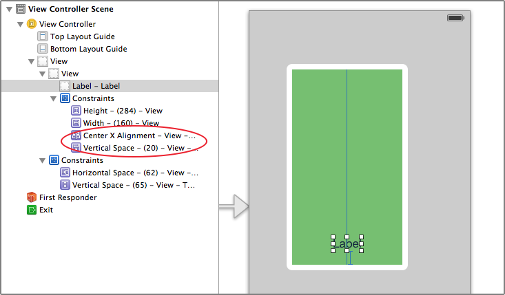
Notice that these two new Horizontal and Vertical Space constraints are listed under the green view’s own Constraints section, not in the main view.
Drag a new Image View object onto the storyboard, and make the layout look like this:

The image view is pinned to the top, left, and right edges of its superview, but its bottom is connected to the top of the label with a standard spacing of 8 points. If you’re unsure of how to do this, then follow these steps.
1. Drag the image view into the green view but don’t worry too much about its size or position:

2. With the image view selected, press the Pin button and choose the following options:

The top, left, and right T-bars are set to 20 points but the bottom one is set to 8 points. Important: For Update Frames you should choose Items of New Constraints. If you had left this to the default of None, the storyboard would look something like this:

The constraints you chose result in a different frame than the image view’s current position and size. But if you choose Items of New Constraints, Interface Builder will automatically adjust the frame as it adds the constraints and everything looks dandy:

Of course, if you do end up with a misplaced frame, you can use the Resolve Auto Layout Issues button to fix it:

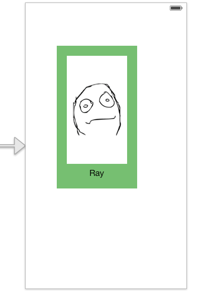
Download the resources for this tutorial and unzip the file. You will find an Images folder – add this folder into your project. Set Ray.png as the image for the image view, change the image view’s mode to Aspect Fit and set its background color to white. Change the label’s text to say “Ray”.
Your layout should now look like this:
Notice that the constraints inside the green view turned to orange. This happened the moment you set the image on the image view. How come your layout is suddenly invalid? Fortunately you can take the guesswork out of it and let Xcode tell you exactly what’s wrong.
Click the small red arrow next to View Controller Scene in the Document Outline to view the issues:
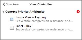
You have a Content Priority Ambiguity error. That’s quite the mouthful. This is what it means: If neither the image view nor the label has a fixed height, then Auto Layout doesn’t know by how much to scale each if the height of the green view should change. (Interface Builder seems to ignore for now that the green view actually has a fixed Height constraint set on it.)
Let’s say at some point in your app the green view becomes 100 points taller. How should Auto Layout distribute these new 100 points among the label and the image view? Does the image view become 100 points taller while the label stays the same size? Or does the label become taller while the image view stays the same? Do they both get 50 points extra, or is it split 25/75, 40/60, or in some other possible combination?
If you don’t solve this problem somehow then Auto Layout is going to have to guess and the results may be unpredictable.
The proper solution is to change the “Content Compression Resistance Priority” of the label. You will learn more about that later on. For now, go into the Size inspector for the label and set the vertical Content Compression Resistance Priority to 751. That makes it one higher than the priority of the image view. While you’re at it, set Content Hugging Priority to 252.

The T-bars should turn blue again and the Auto Layout warnings are gone.
Adding the other heads
Drag the green view into the main view’s top-left corner. Recall that the green view had Horizontal Space and Vertical Space constraints that determined its position in the parent view. It still has those and they cause the frame of the view to be misaligned.

To fix this, use the Resolve Auto Layout Issues button and choose Update Constraints. Previously you used Update Frames, which moved and resized the view the match the constraints. Here you want to do the opposite: you want the constraints to update to match the frame.
Note that the Vertical Space at the top is now negative. That happens because this constraint is connected to the Top Layout Guide. But there’s no reason why constraints cannot have negative values, so you can leave this as is. (If it bothers you, delete that “Vertical Space (-20)” constraint and pin the view to the top of the window.)
The Horizontal Space now has size 0 and is represented by a thick blue line at the left edge of the window. So even though the view sits completely in the corner, it still needs constraints to anchor it there:

Select the green view and tap ⌘D to duplicate it. Move the duplicate into the top-right corner:

Notice that the T-bars are orange. When you made the duplicate, it apparently lost its constraints for the X and Y position. To fix that, pin the view to the top and the right edges of the window.
Duplicate two more times and put these copies in the bottom-left and bottom-right corners, respectively. Again, pin these views to their corners.
Change the screen design to the following:

Those are some good-looking programmers! :-)
Run the app. It looks good in portrait, but not so much in landscape:

It should be pretty obvious what went wrong: you’ve set a fixed width and height on the four brightly-colored container views, so they will always have those sizes, regardless of the size of their superview.
Select the Width (160) and Height (284) constraints from all four views and delete them (this is easiest in the Document Outline). If you run the app now, you’ll get something like this:

Note: If you’re wondering why some of the views are larger than others, this is again related to the intrinsic content size. The size of the image determines how large the image view is; the size of the text determines how large the label is. Taken together with the constraints for the margins — 20 points on all sides — this determines the total size of each view.
This looks very much like the problem you solved in the introduction in part 1, so if you think back to how you solved that, you’ll recall that you gave the views equal widths and heights.
Select all four colored views. This is easiest in the Document Outline; hold ⌘ and click on the four views. You can add the constraints in one go. In the Pin popup put checkmarks in front of Equal Widths and Equal Heights and then press Add 6 Constraints.

Run the app again and rotate the device. Hmm… still no good:

All the views do have the same height, and they also appear to have the same width, so your constraints are being met. It’s just not the width and height that you want them to have.
Just saying that all four views must have equal sizes is not enough to determine what those sizes should actually be, because Auto Layout does not know how these four views are connected to each other. They appear side-by-side in the design, but there are no actual constraints between them. Auto Layout does not know that it needs to split the window width between the “Ray” and “Matthijs” boxes.
If Auto Layout can’t figure this out by itself, you have to tell it.

Select the Ray and Matthijs boxes and choose Pin\Horizontal Spacing from the Editor menu. Because the boxes are side-by-side, this adds a Horizontal Space constraint with size 0 between them, and that is enough to let Auto Layout know how these two views are related. Also put a Vertical Space between the Ray and Dennis Ritchie boxes using Editor\Pin\Vertical Spacing.
Run the app again, and this time it looks all right:

Note: Interface Builder still complains about misplaced views at this point. I’m not sure why that happens but it appears to be a bug in Xcode. If these warnings bother you, then select the main view (or the view controller) and from the Resolve Auto Layout Issues menu choose Update All Frames in View Controller. It does not change how the app works at runtime but at least it makes Xcode happy.
A quick note on the image views: they stretch out because you have not given them a fixed size. You may not know it, but that’s intentional on your part. ☺ The image views wouldn’t fit in landscape mode otherwise. However, if you want an image view to keep its original aspect ratio, then you’re out of luck. You cannot achieve the following effect using Interface Builder:

Unfortunately, Interface Builder does not currently provide a way to make constraints that keep the aspect ratio of a view intact. To do that, you need to create and set the constraints programmatically. You will learn how to do that in “Intermediate Auto Layout” in iOS 6 by Tutorials.