Adaptive Layout Tutorial in iOS 12: Getting Started
In this tutorial, you’ll learn how to use Adaptive Layout in Xcode 10 with iOS 12, enabling you to reuse the same storyboard for multiple devices and orientations. By Adam Rush.
Adaptive Fonts
The current font sizes in your TextContainer look pretty good in the iPad view using a container with regular size classes, but the font size is too large for compact size classes. Fear not — you can also override font sizes within your size classes!
Click Done Varying at the right of the Trait chooser menu. The bottom bar of your view turns gray to indicate that you’re back to the base layout.
Select the Cupertino text label and open the Attributes inspector. Click the small + to the left of the Font:

This reveals a menu for selecting the size class combination that you’ll use to override the font size. Select Compact for the Width and Any for the Height like so:
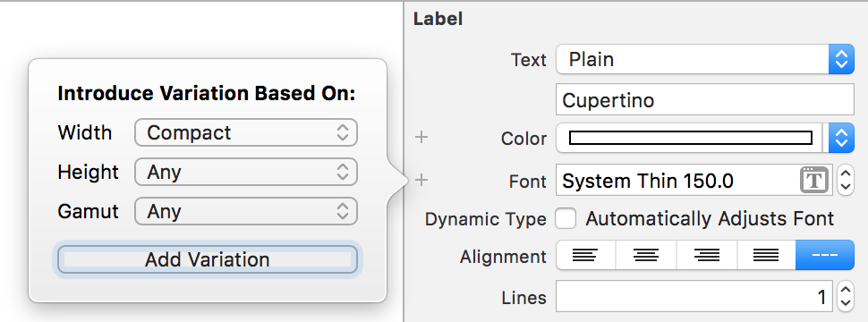
This creates a second font selector box that applies to the specified size class combination. Update the font size in the new selector box to 90:

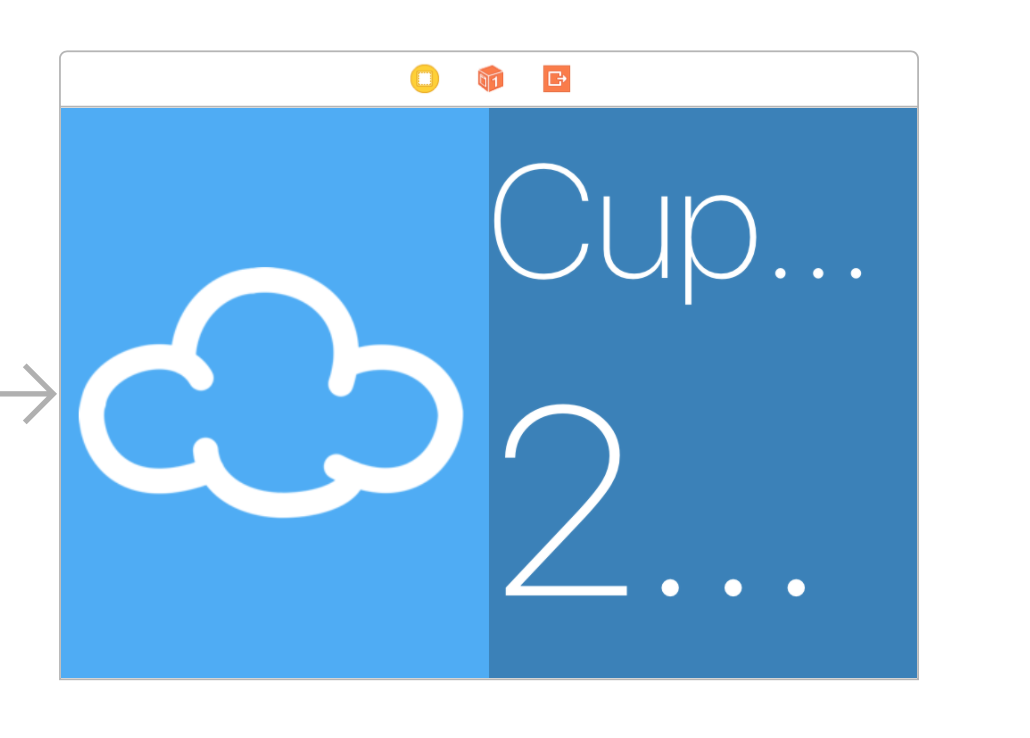
Now, select the temperature text label and repeat the same process. This time, set a font size override of 150 for Compact Width, Any Height.
Interface Builder updates automatically to show the effect of the changes you made:

Well, it’s looking a little better, but the view cuts off the Cupertino label. Fiddling with the font sizes until the label fits perfectly isn’t a particularly scalable option. Cupertino is quite a long place name, but Washington, D.C. is longer — and Kleinfeltersville, PA is longer still! What’s a designer to do?
Using Auto Layout to Resize the Fonts
Once again, Auto Layout comes to the rescue! You simply need to limit the width of the two text labels to match the width of the TextContainer. Control-drag from the Cupertino label to the TextContainer, and select Equal Widths.
Repeat the process with the temperature label. The canvas updates to show the effects of your changes as follows:
Hmm, having the text truncate is not exactly what you want. This is the default behavior for labels that contain more text than will fit in the available space; however, there’s also an option to adjust the font size automatically to fit the content.
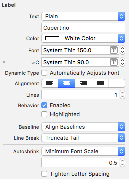
Select the Cupertino label and open the Attributes inspector. Change the AutoShrink drop-down to Minimum Font Scale and ensure that it’s set to 0.5.
Also, update the Text Alignment to Centered. Your Attributes inspector should now look like this:
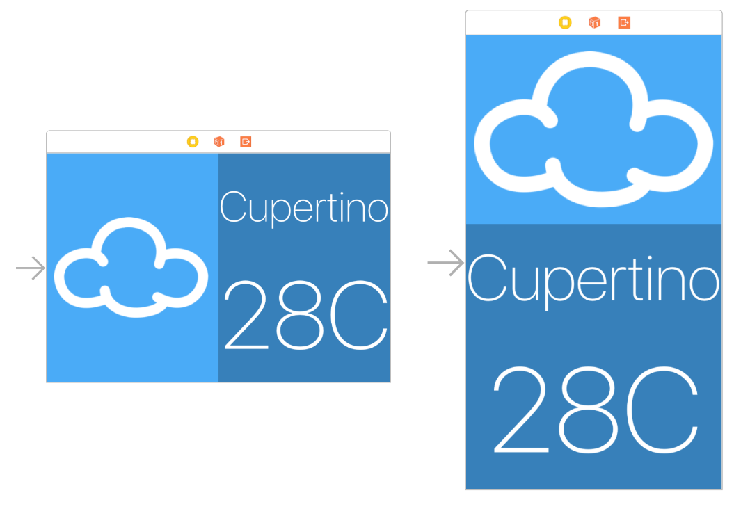
Repeat the same procedure for the temperature label.
Take a look at the Interface Builder canvas; the iPhone layouts look much better now:
Working with the preview editor is great, but it’s a good idea to check that everything is still working correctly, so build and run your project. The iPhone screens look like everything is sizing correctly:


Safe Area Guides
In iOS 11, Apple replaced top and bottom layout guides with a single Safe Area Guide. This helped with the introduction of the iPhone X, which has the notch and the bottom indicator view.

By default on new projects, Interface Builder will choose the Safe Area Guide. For this example, that’s not the expected behavior you want.
Open the Size inspector for your TextContainer and update two constraints as follows:
- In Align Trailing to:, change Safe Area.Trailing to Superview.Trailing.
- In Align Bottom to:, change Safe Area.Bottom to Superview.Bottom.
As you can see, your constraints now override the Safe Area Guide and display their expected behavior.

Congrats, you’ve learned the basic techniques of Adaptive Layout!
Where to Go From Here?
Take a moment to think about the app you’ve built (or the completed project you’ve downloaded). In particular, consider that your app looks really good on all devices, in both orientations, using only one storyboard file!
If nothing else convinces you that Adaptive Layout is the way of the future, consider the fact that this layout will also look good on devices that haven’t even been released yet.
The takeaway from this tutorial is that, as a developer, you’ll need to change your approach to app design. Rather than working towards pixel-based layouts, you should consider the relationship between the UI elements on the screen.
If you want to learn more about Adaptive Layout, check out our Adaptive Layout video tutorial series, which takes you all the way from a beginner to an Adaptive Layout master! It’s also useful to watch Part 1, and Part 2 of Making Apps Adaptive from WWDC 2016.
In the meantime, if you have any questions or comments about this tutorial or Adaptive Layout in general, please join the forum discussion below!