Adaptive Layout Tutorial in iOS 12: Getting Started
In this tutorial, you’ll learn how to use Adaptive Layout in Xcode 10 with iOS 12, enabling you to reuse the same storyboard for multiple devices and orientations. By Adam Rush.
Size Classes and You
What does that mean for you and the design of your app? Although your app is aware of size classes, the layout you’ve built is size class agnostic — that is, your layout remains the same for all size classes.
This is an important point when it comes to the design phase of your adaptive layout. You should build a base layout first and then customize each specific size class based on its individual needs.
Don’t treat each of the size classes as a completely separate design. Think of an adaptive layout as a hierarchy, where you put all of the shared design into the parent and then make any necessary changes in the child size classes.
In this tutorial, there’s been almost no mention of configuring layouts for specific devices so far. That’s because a core concept of an adaptive layout is that you can differentiate size classes from device-specific characteristics. You can use a view that supports adaptive layout in a full-screen view controller as well as in a container view controller, and it will appear differently in each.
This also benefits Apple, as it can expand the range and characteristics of its devices without forcing developers and designers to re-engineer their apps.
You’ll use size classes to customize the landscape layout for iPhone, since the current layout doesn’t cope well with vertical restrictions.
Working With Size Classes
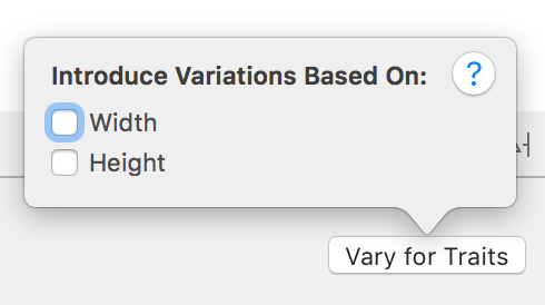
Now, it’s time to introduce trait variations to your app. To start, select a Compact Height configuration such as an an iPhone SE in landscape, then click Vary for Traits to the right of the Trait chooser menu.
Here, you can choose a size class to customize and you can introduce variations based on width and height:
Your current layout doesn’t work properly for devices with compact heights. To fix this, choose Height in the Vary for Traits menu:

You’ll notice that the bottom bar immediately turns a fetching shade of blue. This indicates that you’re now working on a size-class-specific layout.
Customizing the Constraints for Different Size Classes
In order to change the layout, you’ll need to temporarily change a few constraints. In Auto Layout terminology, this is known as installing and uninstalling constraints. An installed constraint is currently active, whereas an uninstalled constraint is not active within the current size class.
Click the image view to select it, then open the Size inspector. You’ll see a summary of the constraints which affect this view:

Select the Align Center X to: Superview constraint by single-clicking it, then press the Delete key on the keyboard to uninstall the constraint for the current size class.
The constraint immediately disappears from the storyboard view and becomes grayed out in both the Document Outline and the view’s Size inspector:

Double-click on the uninstalled constraint in the Size inspector to select the constraint. You’ll see an additional line at the bottom as shown below:

This indicates that you’ve installed the constraint for the base layout, but not for the Compact Height layout — that is, the one you’re currently editing.
Repeat the same procedure to uninstall the other three constraints associated with the image view. When you’re done, your document outline and image view’s Size inspector should resemble the following:

Now you can add the constraints required for this size class. Use the Align and Pin menus to Vertically Center in the Container:

Set left spacing to nearest neighbor to 10:

Control-drag from the image view to the view controller’s view and then select Equal Widths in the popup menu.
Open the Size inspector for the image view and double-click the Equal Width to: Superview constraint to reveal its properties.
If the First Item isn’t cloud_small.Width, use the drop down menu to Reverse First and Second Item. Now, update the Multiplier to equal 0.45.
The constraints for the image view are now set up correctly for all size classes, but the text container still needs a bit of attention. You’ll need to alter the constraints for this size class to move the labels to the right-hand side.
Positioning the Labels
The TextContainer view has internal constraints to position the labels, which work just fine. However, the three external constraints, which pin the TextContainer to the left, right and bottom sides of the view, aren’t working properly right now.
To pin the view to the bottom right-hand side of the parent view, you’ll need to uninstall the left-hand constraint.
Select TextContainer in the document outline and uninstall the Leading Space constraint in the size inspector. To verify that you have uninstalled the constraint for compact heights, select it in the document outline, and check the Size inspector:

You now need to add two constraints to your TextContainer to position it correctly. The view should be half the width of its superview and pinned to the top.
In theory, you can simply Control-drag from the TextContainer view to the view controller’s Safe Area, as you’ve been doing all along. However, in practice, it’s often difficult to grab the view when content is in the way. It’s much easier to use the document outline to do your dirty work.
Control-drag from TextContainer in the document outline up to the view controller’s Safe Area.
Shift-click on Vertical Spacing and Equal Widths to create the new constraints:

Open the Size inspector for your TextContainer and update the two new constraints you’ve just created as follows:
- Top Space to: set Constant of 0 and change Safe Area.Bottom to Safe Area.Top.
- Equal Width to: set Multiplier to 0.5. Note that you might have to switch the first and second items in this constraint, as you have done before. Simply double-click on the constraint and choose Reverse First and Second Item.
The storyboard will update and display the new layout:

The layout has changed completely now, and you’re closer to the finished product. There are still a few issues to correct with the font sizes, which you’ll address in the next section.