Introduction to Metrics in Server-Side Swift
In this Server-Side Swift tutorial you will learn how to use Vapor built-in metrics and how to create custom ones. The data is pulled and stored by Prometheus and visualized in beautiful graphs using Grafana. By Jari Koopman.
Creating and Using Custom Metrics
The metrics Vapor provides out of the box are great, but they can never relate to your application’s specific use case and business logic. For this, use custom metrics.
Measuring Time
In Xcode, open BirdSightingController.swift. This is the app’s main controller with operations to register new bird sightings, get a list of sightings or retrieve information about a specific sighting. All these routes contain a database query, which you’ll time. Starting with the index route, replace the contents with:
return Timer.measure(label: "sighting_query_time_nanoseconds",
                     dimensions: [("op", "get_all")]) {
  return BirdSighting.query(on: req.db).all()
}
Here, your database query is wrapped in a Timer.measure call. Timer.measure is a utility API provided by Swift Metrics for timing blocks of code. You give it a label, which will be the metric’s name and a set of dimensions, that Prometheus will use as labels. Here, you record to a metric called sighting_query_time_nanoseconds, with a label of op="get_all". Record to the same metric at different points in your code, which you’ll do in the get method. Change its contents to the following:
let id = req.parameters.get("sightingID", as: UUID.self)

return Timer.measure(label: "sighting_query_time_nanoseconds",
                     dimensions: [("op", "get_single")]) {

  return BirdSighting.find(id, on: req.db).unwrap(or: Abort(.notFound))
}
Here, almost the same thing happens, writing to the same metric but using different labels.
Using a Counter
For the last method, create, you’ll add a similar timer as well as a counter. Replace the method contents with the following:
try BirdSighting.Body.validate(content: req)

let sighting = try req.content.decode(BirdSighting.Body.self)

Counter(label: "birds_spotted_total",
        dimensions: [
          ("bird", sighting.bird),
          ("section", "\(sighting.section)")
        ])
  .increment(by: sighting.amount ?? 1)

return Timer.measure(label: "sighting_query_time_nanoseconds",
                     dimensions: [("op", "save")]) {
  return sighting.save(on: req.db)
}
The Timer.measure is the same as before. What’s new this time is the Counter. It will add the number of birds spotted, dynamically labeled based on the type of bird, as well as the section of the park where the birds were seen. This will allow for some pretty cool dashboard panels!
Make sure to save these changes in Xcode by pressing cmd-s or Menu-Bar > Save.
Then, go to the Terminal window running docker-compose and restart and rebuild it by pressing ctrl-c and typing docker-compose up --build.
When that’s done, make sure you’ve implemented the changes correctly by navigating to /sightings. This will return an empty array [] and produce some metrics, prefixed with sighting_query_time at /metrics.
Updating Your Dashboards With Custom Metrics
Now that the metrics are in place, it’s time to add new panels to your dashboard. Back in your Grafana dashboard, start adding a new panel by clicking the Add panel button in the top bar. When the menu opens, select Add a new row instead of Add an empty panel. Use rows to group panels and collapse sets of panels.
new row in Grafana
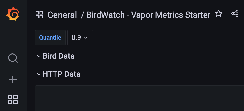
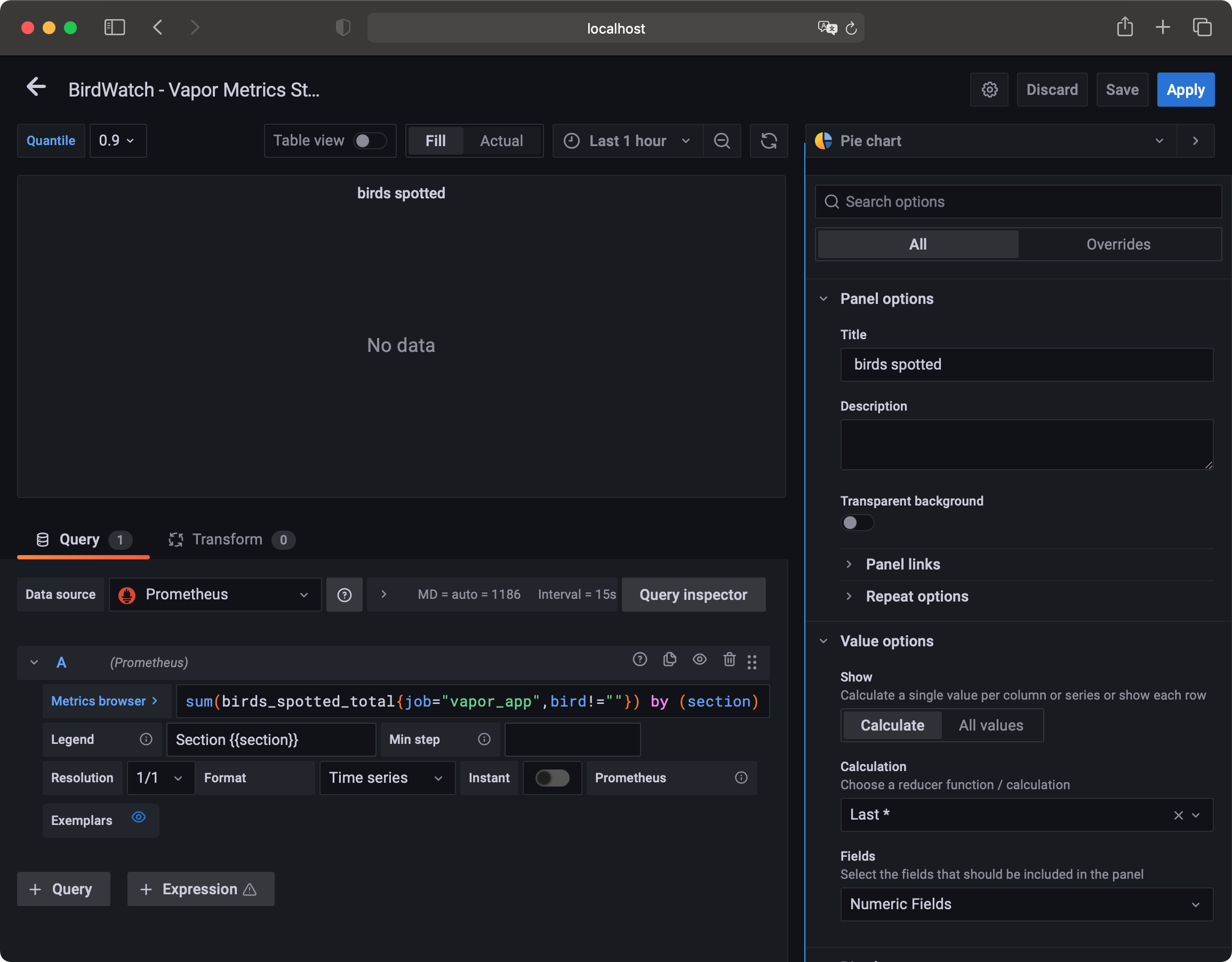
Hovering over the row title will make a cog icon appear. Click it to open the row options, where you can input a title. Name the row Bird Data. Now, start adding a panel and select Add an empty panel. This panel will show the number of birds per section of the national park and use a different panel type. At the top right of the screen, click the Time series dropdown and, instead, select Pie chart. The query for this panel will be quite simple and like ones you’ve used before:
sum(birds_spotted_total{job="vapor_app",bird!=""}) by (section)
Input the query into the query editor and set the Legend format to Section {{section}}.
Panel Settings for Pie chart
Adding Data
There might not be data yet, but that’s an easy fix. You can register a new bird sighting by using the following cURL command in Terminal:
curl --location --request POST 'http://localhost:8080/sightings' \
--header 'Content-Type: application/json' \
--data-raw '{
    "bird": "Swift",
    "section": 1
}'
Execute the command a couple of times, changing the section between 1, 2, 3 and 4. To register multiple birds seen at once, add an optional amount field to the JSON body.
Pie chart panel in Grafana
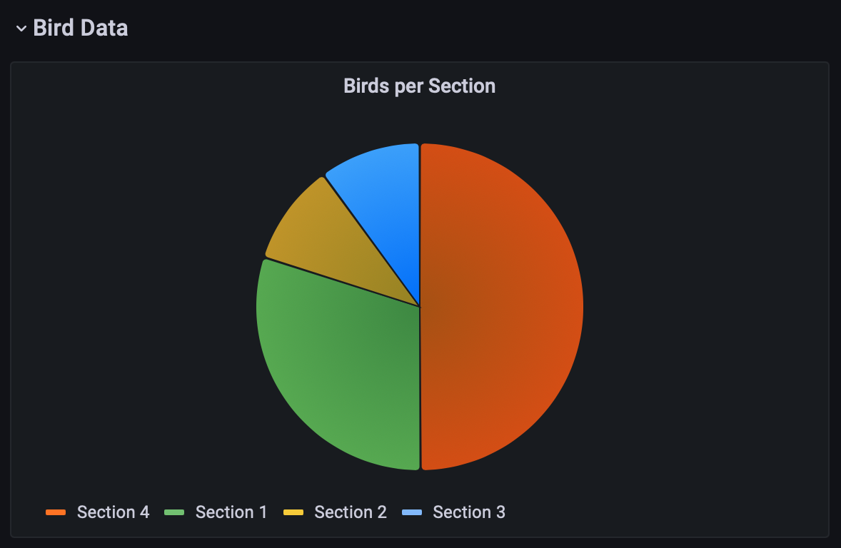
Now, refresh your dashboard and your pie chart should appear. Excellent! To wrap up this panel, set the panel title to Birds per section, add the legend as a right-side table and add Value as a legend value. Under the Pie Chart section in the sidebar, also add Value into the Labels field. Save your dashboard and exit the panel editor by clicking Apply in the top-right corner.
Charting by Breed
Along with the number of birds per section, add a chart showing the number of birds per breed across the entire park. Because this panel will be mostly like the one you just created, hover over its title, click the downward arrow and select More… -> Duplicate. You’ll now see your “Birds per Section” panel show up twice. Using the same dropdown menu, go to edit the duplicated panel. Once in edit mode, change the grouping of the query from section to bird and update the legend format to {{bird}}. Next, update the panel title to Total birds per breed and change the pie chart label from Value to Percent to show the share of each bird.
Don’t forget to save and apply your changes! To wrap up the dashboard, add two more panels: one showing the trend of bird spots over time and another showing the average time taken by the database queries.
The first panel will be like the ones used for the HTTP metrics section. Create a panel, with the following query:
sum(increase(birds_spotted_total{job="vapor_app",bird!=""}[2m])) by (section, bird) / 2
Set the legend format to {{bird}} - Section {{section}} and add a table legend to the right side of the graph, with Mean added as legend value. Set the panel title to Bird spots over time and save your changes.
Visualizing DB Query Duration
Return to your dashboard and add the final panel. This panel will use the avg function to display average time taken by database queries. Input the following query:
avg(sighting_query_time_nanoseconds{quantile="$quantile",job="vapor_app",op!=""}) by (op)
Here, you’ll also see the new quantile label that’s filtered on. If you look at the code added before, you only added the op label, so where does this quantile come from? Swift Prometheus adds quantiles automatically, and Prometheus uses them to bucket results. For example, using the 0.5 quantile would show you the median value, suppressing any outliers.
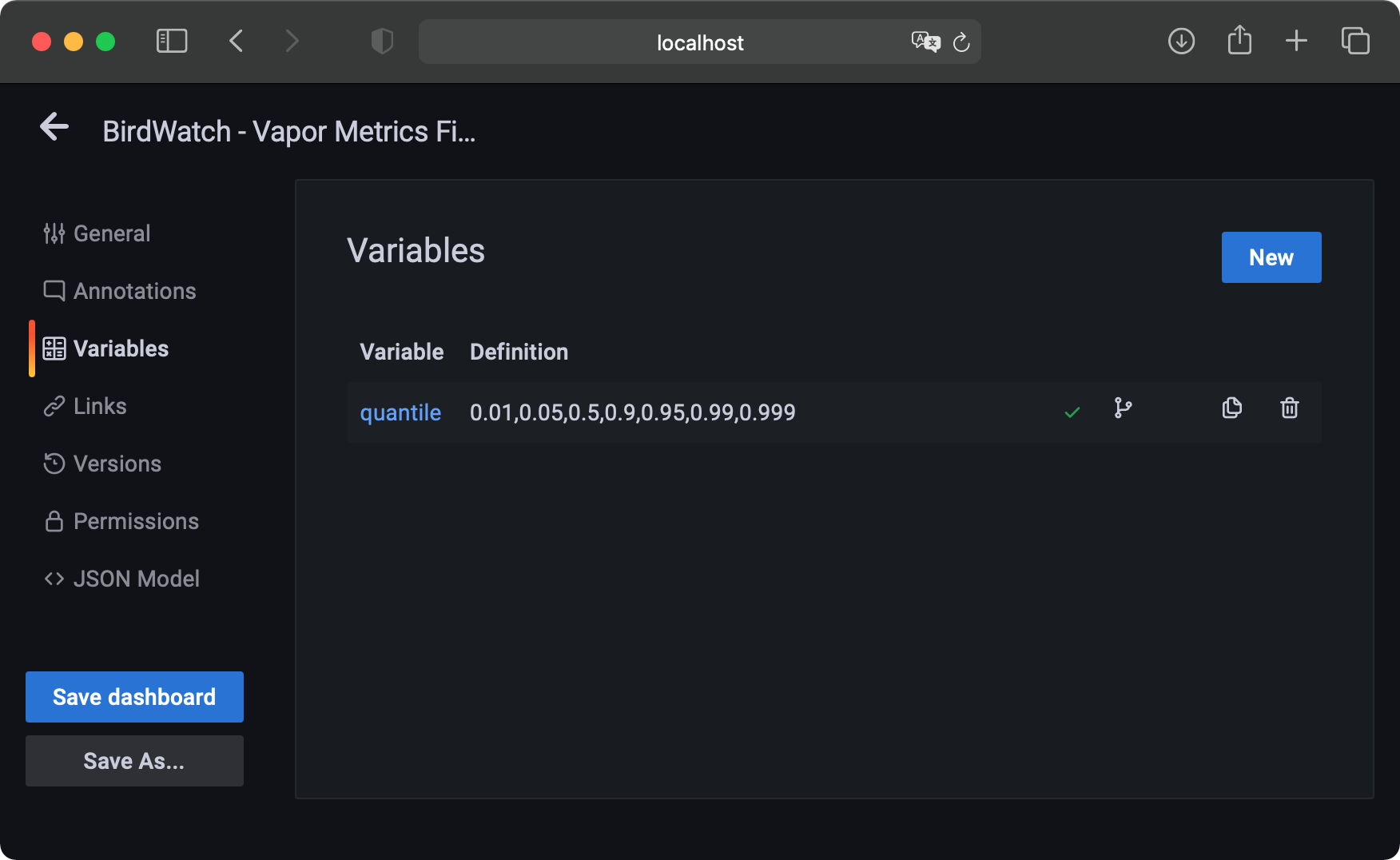
Using Dashboard Variables
In the query, instead of passing a value between 0 and 1 as the quantile, $quantile is used. This is a dashboard variable. You can configure variable by going into the dashboard settings, using the cog icon at the top right and selecting Variables in the left menu. If you’re extending on the starter dashboard, the quantile variable already exists. If not, you can add a variable named quantile, of type Custom, label Quantile and value 0.01,0.05,0.5,0.9,0.95,0.99,0.999.
Configure the Variables in Grafana
After saving your variable and returning to editing your panel, you’ll see a Quantile dropdown at the top left. Using the dropdown, select the 0.9 option, making your dashboard show only the middle 90 percent of data, excluding the top and bottom 5 percent outliers. Feel free to select different quantiles and see how they change your timing graphs.
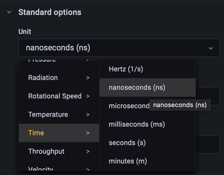
Changing the Unit
As the metric name suggests, the query time is reported in nanoseconds. By default, Grafana will assume metrics are in seconds, making your values show up as millions of times too big. To fix this, find the Standard options section in the sidebar and, in the Unit field, select Time -> nanoseconds (ns). Now, Grafana will correctly interpret the values and your legend will automatically change to use ns, ms or full seconds when and where appropriate.
Configure the Unit of the values
Configuring the Legend
To finish the panel, set the legend format to Operation: {{op}}, add a legend table to the right containing the Mean and Min values and name the panel Average query timings. Save and apply your changes, and return to your main dashboard. Resize and drag around your panels however you’d like. Drag all panels you just created into the Bird Data row so they can easily be collapsed.
Importing Prebuilt Dashboard
The final dashboard containing the graphs created in this tutorial, as well as extra graphs created using the same principles, can be imported from dashboard_final.json in the starter project. Feel free to open it and play around with the panels to find out about all the excellent options Grafana has available.