UIAppearance Tutorial: Getting Started
In this UIAppearance tutorial, you’ll learn how to make your app stand out by using Swift to customize the look and feel of standard UIKit controls. By Essan Parto.
Customizing the Navigation Bar
Open Theme.swift and add the following two methods to Theme:
var barStyle: UIBarStyle {
  switch self {
  case .Default, .Graphical:
    return .Default
  case .Dark:
    return .Black
  }
}

var navigationBackgroundImage: UIImage? {
  return self == .Graphical ? UIImage(named: "navBackground") : nil
}
These methods simply return an appropriate bar style and background image for the navigation bar for each theme.
Next, add the following lines to the bottom of applyTheme():
UINavigationBar.appearance().barStyle = theme.barStyle
UINavigationBar.appearance().setBackgroundImage(theme.navigationBackgroundImage, forBarMetrics: .Default)
Okay — why does this work here, and not earlier when you set barStyle on your UINavigationBar instance?
UIKit has an informal protocol called UIAppearance that most of its controls conform to. When you call appearance() on UIKit classes— not instances —it returns a UIAppearance proxy. When you change the properties of this proxy, all the instances of that class automatically get the same value. This is very convenient as you don’t have to manually style each control after it’s been instantiated.
Build and run. Select the Dark theme and the navigation bar should now be much darker:

This looks a little better, but you still have some work to do.
Next, you’ll customize the back indicator. iOS uses a chevron by default, but you can code up something far more exciting! :]
Customizing the Navigation Bar Back Indicator
This change applies to all themes, so you only need to add the following lines to applyTheme() in Themes.swift:
UINavigationBar.appearance().backIndicatorImage = UIImage(named: "backArrow")
UINavigationBar.appearance().backIndicatorTransitionMaskImage = UIImage(named: "backArrowMask")
Here you’re simply setting the image and transition mask image to be used as the back indicator.
Build and run. Tap one of the pets and you should see the new back indicator:
Open Images.xcassets and find the backArrow image in the Navigation group. The image is all black, but in your app it takes on the tint color of your window and it just works.

But how can iOS just change the bar button item’s image color, and why doesn’t it do that everywhere?
As it turns out, images in iOS have three rendering modes:
- Original: Always use the image “as is” with its original colors.
- Template: Ignore the colors, and just use the image as a stencil. In this mode, iOS uses only the shape of the image, and colors the image itself before rendering it on screen. So when a control has a tint color, iOS takes the shape from the image you provide and uses the tint color to color it.
- Automatic: Depending on the context in which you use the image, the system decides whether it should draw the image as “original” or “template”. For items such as back indicators, navigation control bar button items and tab bar images, iOS ignores the image colors by default unless you change the rendering mode.
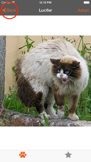
Head back to the app, tap one of the pets and tap Adopt. Watch the animation of the back indicator in the navigation bar carefully. Can you see the problem?

When the Back text transitions to the left, it overlaps the indicator and looks pretty bad:
To fix this, you’ll have to change the transition mask image.
Update the line where you set backIndicatorTransitionMaskImage in applyTheme(), in Themes.swift, to the following:
UINavigationBar.appearance().backIndicatorTransitionMaskImage = UIImage(named: "backArrow")
Build and run. Once again tap one of the pets and then tap Adopt. This time the transition looks much better:

The text is no longer cut off and looks like it goes underneath the indicator. So, what’s happening here?
While iOS uses all the non-transparent pixels of the back indicator image to draw the indicator, it does something entirely different with the transition mask image: it masks the indicator with the non-transparent pixels of the transition mask image so that when the text moves to the left, the indicator is only visible in the those areas.
In the original implementation, you provided an image that covered the entire surface of the back indicator so the text remained visible through the transition. But now you’re using the indicator image itself as the mask, but the text disappeared at the far right edge of the mask, not under the indicator proper.
Look at the indicator image and the “fixed” version of the mask in your image assets catalog; you’ll see they they line up perfectly with each other:

The black shape is your back indicator and the red shape is your mask. You want the text to only be visible when it’s passing under the red area and hidden everywhere else.
Change the last line of applyTheme() once again, this time to use the updated mask:
UINavigationBar.appearance().backIndicatorTransitionMaskImage = UIImage(named: "backArrowMaskFixed")
Build and run. For the last time, tap one of the pets and then tap Adopt. You’ll see that the text now disappears under the image, just as you anticipated it would:

Now that your navigation bar is pixel perfect, it’s time to give the tab bar some much-needed love.
Customizing the Tab Bar
Still in Theme.swift, add the following properties to Theme:
var tabBarBackgroundImage: UIImage? {
  return self == .Graphical ? UIImage(named: "tabBarBackground") : nil
}

var backgroundColor: UIColor {
  switch self {
  case .Default, .Graphical:
    return UIColor(white: 0.9, alpha: 1.0)
  case .Dark:
    return UIColor(white: 0.8, alpha: 1.0)
  }
}

var secondaryColor: UIColor {
  switch self {
  case .Default:
    return UIColor(red: 242.0/255.0, green: 101.0/255.0, blue: 34.0/255.0, alpha: 1.0)
  case .Dark:
    return UIColor(red: 34.0/255.0, green: 128.0/255.0, blue: 66.0/255.0, alpha: 1.0)
  case .Graphical:
    return UIColor(red: 140.0/255.0, green: 50.0/255.0, blue: 48.0/255.0, alpha: 1.0)
  }
}
These properties provide appropriate tab bar background images, background colors, and secondary colors for each theme.
To apply these styles, add the following lines to applyTheme().
UITabBar.appearance().barStyle = theme.barStyle
UITabBar.appearance().backgroundImage = theme.tabBarBackgroundImage

let tabIndicator = UIImage(named: "tabBarSelectionIndicator")?.imageWithRenderingMode(.AlwaysTemplate)
let tabResizableIndicator = tabIndicator?.resizableImageWithCapInsets(
    UIEdgeInsets(top: 0, left: 2.0, bottom: 0, right: 2.0))
UITabBar.appearance().selectionIndicatorImage = tabResizableIndicator
Setting the barStyle and backgroundImage should be familiar by now; it’s done in exactly the same you did for UINavigationBar previously.
In the final three lines of code above, you retrieve an indicator image from the asset catalog and set its rendering mode to .AlwaysTemplate. This is an example of one context where iOS doesn’t automatically use the template rendering mode.
Finally, you create a resizable image and set it as the tab bar’s selectionIndicatorImage.
Build and run. You’ll see your newly themed tab bar:

The dark theme is starting to look more, well, dark! :]
See the line below the selected tab? That’s your indicator image. Although it’s only 6 points high and 49 points wide, iOS stretches this to the full width of the tab at run time.
The next section covers resizeable images and how they work.