Chameleon on iOS: Getting Started
Learn how you can use the Chameleon framework to easily create, update, and manage your app’s color scheme – even if you’re not a graphic designer! By Keegan Rush.
Adding a Random Color to the Picker
Currently, the button titled “Random” in the color picker doesn’t actually do anything. However, with the help of Chameleon, that’s about to change!
Open ColorPickerViewController.swift and import Chameleon at the top of the file, like this:
import ChameleonFramework
Now, locate randomColorTapped(_:), and update the selected color to a random color by adding the following implementation:
let randomColor = UIColor.randomFlat
updateAndPop(color: randomColor)
This generates a random color from Chameleon’s palette. It then passes this color back to the initial view controller.
Build and run the app. Now, tap one of the furniture items to navigate to the color picker. Then, tap on the Random button. Cool! Your imaginary living room is now painted with the creativity of a random color generator. Huzzah!

Hex Color Codes
You may have noticed the button, Ray Wenderlich Green, doesn’t work either. You’ll fix that next — because honestly, who doesn’t want their furniture to be Ray’s favorite shade of green, right? :]
The hex color code for Ray Wenderlich Green is #0B560E. But there’s no need to find a hex-to-RGB converter in order to use the standard UIColor initializer.
Inside ColorPickerViewController, locate rayWenderlichGreenTapped(_:), and add this bit of code:
let rayWenderlichGreen = UIColor(hexString: "0B560E")!
updateAndPop(color: rayWenderlichGreen)
This creates a UIColor straight from the hex string, which is then used to update the selected color.
Build and run the app, and marvel at what your living room will look like after you paint it Ray Wenderlich Green!

Color Schemes
Whenever you’re working with more than one color, you want to make sure they work together. Let’s face it, the wrong combination of colors can lead to a UI that’s either too bland or too glaring. Luckily, for less artistic people such as myself, you can make use of color schemes.
A color scheme is a selection of colors that share a particular relationship. Chameleon can generate color schemes of three types:
- Analogous
- Complementary
- Triadic
Analogous colors are those that sit next to each other on a color wheel.
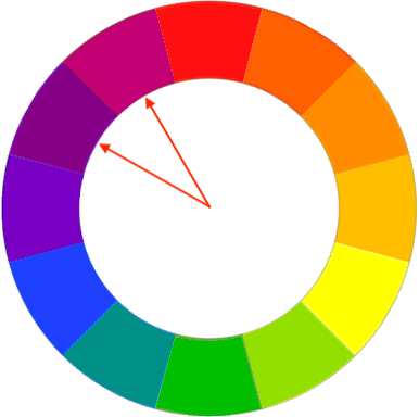
They live close to each other on the light spectrum. They also blend well together.
Complementary colors sit across from each other on a color wheel.

Their contrast makes for a striking UI.
Triadic colors are evenly spaced on a color wheel.

Use them to create a vivid, colorful design.
Creating Color Schemes from the Selected Color
Open Main.storyboard and find the first view controller. It has a segmented control with the default First, Second, Third segment titles:

Click on the segmented control and select the Attributes inspector. Change the titles for each segment as follows:
- Segment 0: Analogous
- Segment 1: Complementary
- Segment 2: Triadic

Changing button titles is fun and all, but the functionality is unaffected. To change this, open ViewController.swift and start by importing Chameleon.
import ChameleonFramework
Next, add this property beneath selectedColor:
var selectedColorScheme = ColorScheme.analogous {
  didSet {
    paintImages()
  }
}
This defines a color scheme with the initial value of ColorScheme.analogous. Whenever the scheme updates, it calls paintImages().
Now, find the method stub for colorSchemeSelectionChanged(_:), and add the following code to update the selected scheme:
switch sender.selectedSegmentIndex {
case 0:
  selectedColorScheme = .analogous
case 1:
  selectedColorScheme = .complementary
case 2:
  selectedColorScheme = .triadic
default:
  return
}
The switch statement sets the selectedColorScheme based on the selected segment.
Great work! The selected scheme is updated, and now you can use it to paint the images.
paintImages() creates UIImages for the image views and paints them with the selected color. It’s time to change it so that it paints the images with colors from a color scheme. Update paintImages() to the following:
func paintImages() {
  let baseColor = selectedColor

  // 1
  let colorsFromScheme = ColorSchemeOf(selectedColorScheme,
                                       color: baseColor,
                                       isFlatScheme: false)

  // 2
  imageView.image = imagePainter.paint(image: UIImage(named: "sofa"),
                                       color: colorsFromScheme[1])
  imageView2.image = imagePainter.paint(image: UIImage(named: "armchair"),
                                        color: colorsFromScheme[2])
  imageView3.image = imagePainter.paint(image: UIImage(named: "bookshelf"),
                                        color: colorsFromScheme[3])
}
Here’s a closer look at what’s happening:
- Generate an array of colors from the selected scheme.
- For each image, grab a color from the
colorsFromSchemearray and use it to paint the image. Index 2 is theselectedColor. You then use it to paint the center image.
Build and run the app. Select your favorite color, and take a look at your new interior design abilities! :]

Shades
The variety of colors for the living room grew three-fold by introducing schemes. Now you’ll add even more possibilities by adding shades :]
In Main.storyboard, take a look at the Shade Stepper.

Its initial value is 0, and it can range from -100 to 100. It steps in values of 10s. You’ll use this value to shade the selected color by a certain percentage.
In ViewController.swift, find selectedColor, and create a new property below it:
var selectedColorWithShade: UIColor {

// 1
  let shadePercentage = CGFloat(abs(stepperValue / 100))

  if stepperValue >= 0 {
// 2
    return selectedColor.lighten(byPercentage: shadePercentage)!
  } else {
// 3
    return selectedColor.darken(byPercentage: shadePercentage)!
  }
}
Here’s what’s happening:
-
stepperValueholds the value of the stepper. Use its value to create aCGFloatbetween 0.0 and 1.0 representing the shade percentage. - If the stepper’s value is positive, use
lighten(byPercentage:)to shade the color lighter. - If the stepper’s value is negative, use
darken(byPercentage:)to shade the color darker.
Now, back to paintImages() where all the magic happens. The first line of the method sets the color you’ll use to create the color scheme for the images.
let baseColor = selectedColor
Change this line to use the shaded color as the base color instead:
let baseColor = selectedColorWithShade
Great! Now build and run the app, and play around with the stepper. Now you can design a living room set for even the most pickiest of couch potatoes :]

Theming the App
The color picker has reached its final form! But the app itself is still looking rather dull. Luckily, Chameleon still has a few tricks up its sleeves.
In ViewController.swift find updateAppTheme(), which fires whenever you update selectedColor. Give the method the following implementation:
Chameleon.setGlobalThemeUsingPrimaryColor(selectedColor, with: .contrast)
And before you can say Voilà, you’ve updated the entire app’s theme!
Build and run the app. Now, select a new color, and see how this simple bit of code adds some liveliness to the app.

There are a few problems, though. For instance, the stock-standard UIButtons in the Color Picker don’t look so great with the new theming.
Fortunately, you can fix that with a bit of styling. In ColorPickerViewController.swift, locate styleButtons(). Add the following code to make the buttons a bit more pleasing to the eye:
buttons.forEach {
  $0.layer.cornerRadius = 10
  $0.contentEdgeInsets = UIEdgeInsets(top: 8, left: 8, bottom: 8, right: 8)
}
buttons is an IBOutletCollection that contains the offending Random and Ray Wenderlich Green buttons. styleButtons() rounds the borders of each button and applies an inset to give them some padding. Build and run to see the difference.

There’s another interesting thing to note with the global app theming. Were you wondering what .contrast does in the line of code you added to updateAppTheme()? That’s the UIContentStyle.
It can be one of three values:
UIContentStyle.contrastUIContentStyle.lightUIContentStyle.dark
Build and run the app, and select a dark color from the color picker. Take a look at the text color of the buttons in the color picker:

Now, select a light color.

UIContentStyle.contrast ensures that the text is always readable; you get white text on dark backgrounds, and black text on light backgrounds.
Setting the global app theme gets you most of the way to a snazzy app, but there’s still some work to do! Such as, the navigation bar is still white. It’d look much better if it matched the app’s theme. To do this, inside ViewController.swift you can update its tint color in updateAppTheme() by adding:
navigationController?.navigationBar.barTintColor = selectedColor
Do a build and run. Then select a few different colors.
Uh-oh! The navigation bar still isn’t correct. The title doesn’t update to contrast the bar’s tint color. The status bar also stays the same, making it difficult to read.

Thankfully, Chameleon can fix that too!