Adaptive Layout Tutorial in iOS 12: Getting Started
In this tutorial, you’ll learn how to use Adaptive Layout in Xcode 10 with iOS 12, enabling you to reuse the same storyboard for multiple devices and orientations. By Adam Rush.
Adding Content to Your View
You’ll notice a few orange and red constraints on your view; this indicates there are issues with these constraints that need your attention.
You could have the storyboard automatically update the frames of the contained views to make these issues disappear, but if you do this right now, your image view will shrink to size zero.
That’s because your image view doesn’t have any content yet, which means it has an intrinsic height and width of zero. Auto Layout relies on a view’s intrinsic size to determine its width and height if physical width or height constraints are not supplied.
Instead, you’ll add some images to your app.
In the Project navigator, open Assets.xcassets. If you haven’t already, use the Download Materials button at the top or bottom of this tutorial to download the image files.
Inside the AdaptiveWeather folder is a folder named cloud_images. Inside, you’ll find three files. Select all three of them in Finder, and drag them to the empty pane on the right-hand side of the asset catalog:

This creates a new image set and assigns the three images appropriately:

You can now use your image set to populate your image view.
Head back to Main.storyboard and select your image view.
Switch to the Attributes inspector, type cloud_small into the Image field and select Aspect Fit in the Content Mode drop down list, like so:

Your storyboard should now look like this:
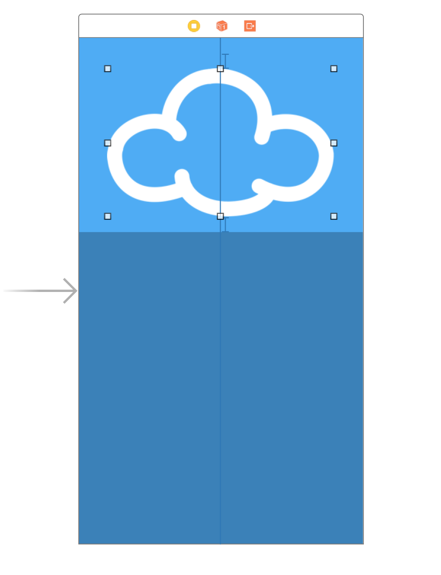
There’s your image, and everything seems to be in place. The view controller automatically rearranged the views to match the new constraints.
Previewing Layouts
Normally, you’d now build and run your project on each of the different simulator versions — in both orientations — to test this new universal storyboard. That process is laborious at best; fortunately, Xcode gives you a better option with its trait variation previews.
To see how they work, open Main.storyboard, find the View as button at the bottom of the canvas and click on it. This expands the Trait chooser menu:

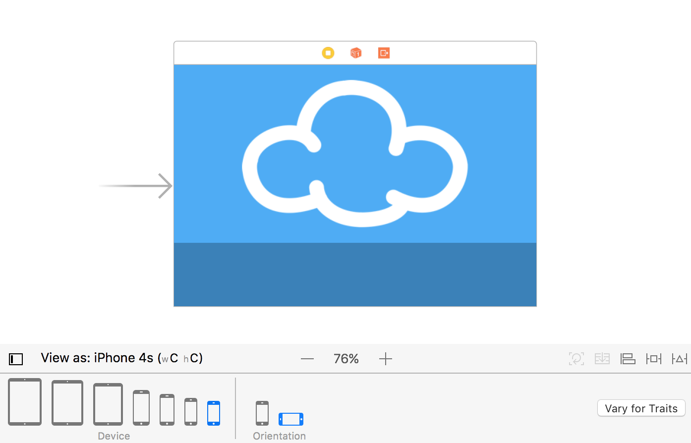
In the Devices section, select iPhone 4s, which is the right-most icon shown in the Device area.
You’ll notice that the canvas has switched to a different configuration: Your views are now on a four-inch iPhone screen, as shown below:

To view your layout in landscape mode, select Landscape in the Orientation area of the Trait chooser:
This is a huge improvement over firing up multiple simulators! With the click of a button, you can check if your layout still works on a different device.
Notice anything odd about the landscape iPhone preview? That’s right — the cloud image is far too big. To fix this, you’ll add a new constraint to the image view.
Constraining the Image to the Right Size
Head back to the storyboard. Control-drag from the image view to the view controller’s view to create a new constraint. From the context menu, select Equal Heights:

Several constraints on the storyboard are now colored red. This is because the constraint you added conflicts with the existing constraints. The image view can’t have the same height as the view controller’s view and still maintain the vertical margins you created earlier.
To fix the conflicts, select the constraint you added in the Document Outline and open the Attributes inspector. If the First Item is not cloud_small.Height, then select Reverse First and Second Item in the First Item drop-down as shown below:

Next, set the Relation to Less Than or Equal, then set Multiplier to 0.4 as shown below:
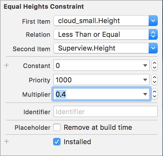
This sets the cloud image to either the intrinsic size of the image or 40% of the height of the screen, whichever is smaller.
You’ll notice that the canvas automatically refreshes as soon as you update the constraint, as demonstrated below:

Perfect!
Since this is a weather app, you’ll now add some labels to show the city name and the current temperature.
Adding Content to the TextContainer
In Main.storyboard, switch back to the Portrait iPhone 8 trait and drag two labels from the Object Library onto the TextContainer view. Then arrange them roughly as shown below:

Select the top label and use the Align and Add New Constraints menus to center the label horizontally.

Add a top spacing to nearest neighbor of 10, as shown below:

Next, select the Attributes inspector and set Text to Cupertino, Color to White Color, and the font to System, Thin with a Size of 150.
You’ve probably noticed the text is illegible. This is due to the label’s frame; you’ll resolve this problem shortly.
Now, select the other label, again use the Align and Pin menus to center it horizontally. Set a bottom space to nearest neighbor of 10 and check that the Size inspector matches the following:

Use the Attributes inspector to set the Text to 28C, the color to White Color, and the font to System, Thin with a size of 250.

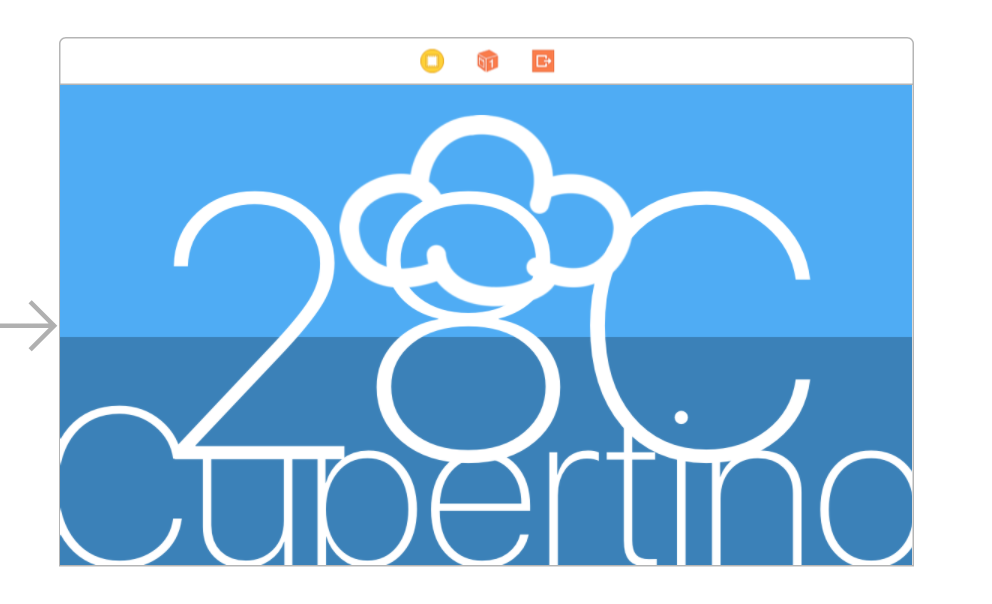
The labels reach out of bounds and overlap in the storyboard, which isn’t the look you’re going for. However, take a look at a different trait before you fix anything; the iPad Pro 9.7″ version is looking pretty good:

Whereas, predictably, the font size is far too big for the iPhone:
You’ll correct these sizing issues in the next section of this Adaptive Layout tutorial.
Size Classes
Universal storyboards are great, but you’ve already discovered that creating one single layout for all displays is a bit of a challenge. However, Adaptive Layout has a few more tools and tricks to solve these issues.
Size classes are one of the core concepts behind Adaptive Layout. You can use the size class property to represent the amount of content that you’ll display in a given horizontal or vertical dimension in any view or view controller.
Xcode provides two size classes: Regular and Compact. Although they affect the physical dimensions of a view, they also represent the semantic size of the view.
The following table shows how the size classes apply to different devices and orientations:

These are the size classes that the device passes to the app. However, you can override these size classes at any point in the view hierarchy. This is useful when using a view controller in a container which is significantly smaller than the screen.