How To Make a Custom Control
In this tutorial, you will implement your very own custom control. You’ll touch on such concepts as extending existing controls, designing and implementing your control’s API, and even how to share your new control with the development community. By Colin Eberhardt.
Adding Touch Handlers
Change Notifications
Modifying Your Control With CoreGraphics
Handling Changes to Control Properties
Where To Go From Here?
Next, change the type of the _upperKnobLayer and _lowerKnobLayer instance variables, by finding the @implementation block and replacing their definitions with the following:
These layers can now be instances of the newly created CERangeSliderKnobLayer class.
Still working in CERangeSlider.m, find initWithFrame: and replace the upperKnobLayer and lowerKnobLayer layer creation code with the following:
The above code simply makes use of the newly added class to create the layers, and sets the layer’s slider property to reference self.
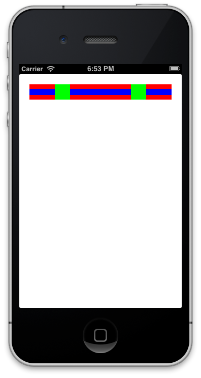
Build and run your project; check to see if everything still looks the same as detailed in the following screenshot:
Now that you have the slider layers in place using CERangeSliderKnobLayer, you need to add the ability for the user to drag the sliders around.
Open CERangeSlider.m and near the top of the file where the instance variables are defined, add the following, below the declaration of _useableTrackLength:
This variable will be used to track the touch locations.
How are you going to track the various touch and release events of your control?
UIControl provides several methods for tracking touches. Subclasses of UIControl can override these methods in order to add their own interaction logic.
In your custom control, you will override three key methods of UIControl: beginTrackingWithTouch, continueTrackingWithTouch and endTrackingWithTouch.
Add the following method to CERangeSlider.m:
The method above is invoked when the user first touches the control.
First, it translates the touch event into the control’s coordinate space. Next, it checks each knob to see whether the touch was within its frame. The return value for the above method informs the UIControl superclass whether subsequent touches should be tracked.
Tracking touch events continues if either knob is highlighted. The call to setNeedsDisplay ensures that the layers redraw themselves — you’ll see why this is important later on.
Now that you have the initial touch event, you’ll need to handle the events as the user moves their finger across the screen.
Add the following method to CERangeSlider.m:
Here’s a breakdown of the code above, comment by comment:
You’ve coded the dragging of the slider — but you still need to handle the end of the touch and drag events.
Add the following method to CERangeSlider.m:
The above code simply resets both knobs to a non-highlighted state.
Build and run your project, and play around with your shiny new slider! It should resemble the screenshot below:

You’ll notice that when the slider is tracking touches, you can drag your finger beyond the bounds of the control, then back within the control without losing your tracking action. This is an important usability feature for small screen devices with low precision pointing devices — or as they’re more commonly known, fingers! :]
So you now have an interactive control that the user can manipulate to set upper and lower bounds. But how do you communicate these change notifications to the calling app so that the app knows the control has new values?
There are a number of different patterns that you could implement to provide change notification: NSNotification, Key-Value-Observing (KVO), the delegate pattern, the target-action pattern and many others. There are so many choices!
What to do?
If you look at the UIKit controls, you’ll find they don’t use NSNotification or encourage the use of KVO, so for consistency with UIKit you can exclude those two options. The other two patterns — delegates and target-action patterns — are used extensively in UIKit.
Here’s a detailed analysis of the delegate and the target-action pattern:
Delegate pattern – With the delegate pattern you provide a protocol which contains a number of methods that are used for a range of notifications. The control has a property, usually named delegate, which accepts any class that implements this protocol. A classic example of this is UITableView which provides the UITableViewDelegate protocol. Note that controls only accept a single delegate instance. A delegate method can take any number of parameters, so you can pass in as much information as you desire to such methods.
Target-action pattern – The target-action pattern is provided by the UIControl base class. When a change in control state occurs, the target is notified of the action which is described by one of the UIControlEvents enum values. You can provide multiple targets to control actions and while it is possible to create custom events (see UIControlEventApplicationReserved) the number of custom events is limited to 4. Control actions do not have the ability to send any information with the event. So they cannot be used to pass extra information when the event is fired.
The key differences between the two patterns are as follows:
Your range slider control doesn’t have a large number of state changes or interactions that you need to provide notifications for. The only things that really change are the upper and lower values of the control.
In this situation, the target-action pattern makes perfect sense. This is one of the reasons why you were told to subclass UIControl right back at the start of this tutorial!
Aha! It’s making sense now! :]
The slider values are updated inside continueTrackingWithTouch:withEvent:, so this is where you’ll need to add your notification code.
Open up CERangeSlider.m, locate continueTrackingWithTouch:withEvent:, and add the following just before the “return YES” statement:
That’s all you need to do in order to notify any subscribed targets of the changes.
Well, that was easier than expected!
Now that you have your notification handling in place, you should hook it up to your app.
Open up CEViewController.m and add the following code to the end of viewDidLoad:
The above code invokes the slideValueChanged each time the range slider sends the UIControlEventValueChanged action.
Now add the following method to CEViewController.m:
This method simply logs the range slider values to the console window as proof that your control is sending notifications as planned.
Build and run your app, and move the sliders back and forth. You should see the control’s values in the output window, as in the screenshot below:

You’re probably sick of looking at the multi-coloured range slider UI by now. It looks like an angry fruit salad!
It’s time to give the control a much-needed facelift!
First, you’ll update the graphics of the “track” that the sliders move along.
Right-click the CERangeSlider group in the Project Navigator and select New File…. Next, select the iOS\Cocoa Touch\Objective-C class template and add a class called CERangeSliderTrackLayer, making it a subclass of CALayer.
Open up the newly added file CERangeSliderTrackLayer.h, and replace its contents with the following:
The code above adds a reference back to the range slider, just as you did previously for the knob layer.
Open up CERangeSlider.m and add the following import to the top of the file:
A little further down CERangeSlider.m, locate the _trackLayer instance variable and modify it to be an instance of the new layer class, as below:
Now find initWithFrame: in CERangeSlider.m and update the layer creation code to match the following:
The code above ensures that the new track layer is used — and that the hideous background colors are no longer applied. :]
There’s just one more bit — remove the red background of the control.
Open up CEViewController.m, locate the following line in viewDidLoad and remove it:
Build and run now…what do you see?

Do you see nothing? That’s good!
Good? What’s good about that? All of your hard work — gone?!?!
Don’t fret — you’ve just removed the gaudy test colors that were applied to the layers. Your controls are still there — but now you have a blank canvas to dress up your controls!
Since most developers like it when controls can be configured to emulate the look and feel of the particular app they are coding, you will add some properties to the slider to allow customization of the “look” of the control.
Open up CERangeSlider.h and add the following code just beneath the properties you added earlier:
The purposes of the various colour properties are fairly straightforward. And curvaceousness? Well, that one is in there for a bit of fun — you’ll find out what it does shortly! :]
Finally, positionForValue: is a method you wrote earlier. Here you’re just making it publicly accessible from the various layers.
You now need some default values for your control’s properties.
Open up CERangeSlider.m and add the following code to initWithFrame:, just below the code that initializes the max, min, upper and lower values:
Next, open up CERangeSliderTrackLayer.m and add the following import to the top of the file:
This layer renders the track that the two knobs slide on. It currently inherits from CALayer, which only renders a solid color.
In order to draw the track, you need to implement drawInContext: and use the Core Graphics APIs to perform the rendering.
Note: To learn about Core Graphics in depth, the Core Graphics 101 tutorial series from this site is highly recommended reading, as exploring Core Graphics is out of scope for this tutorial.
Add the following method to CERangeSliderTrackLayer.m, just below the @implementation statement:
As you can see, this has quite a sizeable chunk of Core Graphics code!
Have a look at the graphic below which shows how each of the commented sections are layered together:

The numbered sections above refer to the numbered code comments, which are explained as follows:
When it’s all broken out step-by-step, you can easily see how the various properties of CERangeSlider affect the rendering of the track layer.
Build and run to see your shiny new track layer rendered in all its glory! It should look like the following:

Play around with the various values for the exposed properties to see how they affect the rendering of the control.
If you’re still wondering what curvaceousness does, try changing that as well!
You’ll use a similar approach to render the knobs.
Open up CERangeSliderKnobLayer.m and add the following import to the top of the file:
Add the following method to CERangeSliderKnobLayer.m, just below the @implementation statement:
Here’s another breakdown of the rendering steps, with each commented section explained below:

Build and run once again; it’s looking pretty sharp and should resemble the screenshot below:

You can easily see that rendering your control using Core Graphics is really worth the extra effort. Using Core Graphics results in a much more versatile control compared to one that is rendered from images alone.
So what’s left? The control now looks pretty snazzy, the visual styling is versatile, and it supports target-action notifications.
It sounds like you’re done — or are you?
Think for a moment about what happens if one of the range slider properties is set in code after it has been rendered. For example, you might want to change the slider range to some preset value, or change the track highlight to indicate a valid range.
Currently there is nothing observing the property setters. You’ll need to add that functionality to your control.
In order to detect when the control’s properties have been externally set, you’ll have to write your own setter implementation.
Your first inclination might be to add some code that looks like this:
When the trackColor property is set, the above code informs the track layer that it needs to redraw itself.
But with eight properties on the range slider API, writing the same repetitive code over and over again is going to be somewhat of a chore.
However, you’re a custom control ninja — and code ninjas look to refactor and re-use code at every opportunity!
This looks like a job for a macro.
Open up CERangeSlider.m and add the following code just above initWithFrame::
The above defines a macro which takes 4 parameters, and uses those parameters to generate a synthesized property and a property setter.
Again in CERangeSlider.m, add the following code directly below the previous macro:
The above code generates the setters for all eight in one fell swoop. As well, it invokes the setter method that updates each individual property. redrawLayers is called for the properties that affect the control’s visuals, and setLayerFrames is invoked for properties that affect the control’s layout.
That’s all you need to do in order to ensure the range slider reacts to property changes.
However, you now need a bit more code to test your new macros and make sure everything is hooked up and working as expected.
Open up CEViewController.m and add the following code to the end of viewDidLoad:
This will invoke updateState after a 1 second pause.
Add the following implementation of updateState to CEViewController.m:
The above method changes the track highlight colour to red, and changes the shape of the range slider and its knobs.
Build and run your project, and watch the range slider change from this:

to this:

How easy was that?
Note: The code you just added to the view controller illustrates one of the most interesting, and often overlooked, points about developing custom controls – testing.
When you are developing a custom control, it’s your responsibility to exercise all of its properties and visually verify the results. A good way to approach this is to create a visual test harness with various buttons and sliders, each of which connected to a different property of the control. That way you can modify the properties of your custom control in real time — and see the results in real time.
Your range slider is now fully functional and ready to use within your own applications!
However, one of the key benefits of creating generic custom controls is that you can share them across projects — and share them with other developers.
Is your control ready for prime time?
Not just yet. Here are a few other points to consider before sharing your custom controls:
Documentation – Every developer’s favourite job! :] While you might like to think your code is beautifully crafted and self-documenting, other developers will no doubt disagree. A good practice is to provide public API documentation, at a minimum, for all publicly shared code. This means documenting all public classes and properties.
For example, your CERangeSlider needs documentation to explain what it is — a slider which is defined by four properties: max, min, upper, and lower — and what it does — allows a user to visually define a range of numbers.
Robustness – What happens if you set the upperValue to a value greater than the maximumValue? Surely you would never do that yourself – that would be silly, wouldn’t it? But you can guarantee that someone eventually will! You need to ensure that the control state always remains valid — despite what some silly coder tries to do to it.
API Design – The previous point about robustness touches on a much broader topic — API design. Creating a flexible, intuitive and robust API will ensure that your control can be widely used, as well as wildly popular. At my company, ShinobiControls, we hold meetings that can last for hours where we debate every minor detail of our APIs!
API design is a topic of great depth, and one which is out of scope for this tutorial. If you are interested, Matt Gemmell’s 25 rules of API design comes highly recommended.
There are a number of places to start sharing your controls with the world. Here are few suggestions of places to start:
Hopefully you’ve had fun creating this range slider control, and perhaps you have been inspired to create a custom control of your own. If you do, please share it in the comments thread for this article — we’d love to see your creations!
The source code for this control is available on GitHub with one commit for each ‘build and run’ step for this article. If you get lost, you can pick things up from the last step you were on! Neat! :]
You can download the complete range slider control project here.
- Multicast — the target-action pattern multicasts its change notifications, while the delegate pattern is bound to a single delegate instance.
- Flexibility — you define the protocols yourself in the delegate pattern, meaning you can control exactly how much information you pass. Target-action provides no way to pass extra information and clients would have to look it up themselves after receiving the event.
- GitHub – GitHub has become one of the most popular places to share open source projects. There are already numerous custom controls for iOS on GitHub. What’s great about GitHub is that it allows people to easily access your code and potentially collaborate by forking your code for other controls, or to raise issues on your existing controls.
- CocoaPods – To allow people to easily add your control to their projects, you can share it via CocoaPods, which is a dependency manager for iOS and OSX projects.
- Cocoa Controls – This site provides a directory of both commercial and open source controls. Many of the open source controls covered by Cocoa Controls are hosted on GitHub, and it’s a great way of promoting your creation.
- Binpress – This site provides both free and paid-for controls. You can often find what you’re looking for here, but if you don’t then why not make your control and then put it on here. You never know, people might be willing to buy it if you’ve written a clean, easy-to-use API!
- First you calculate a delta, which determines the number of pixels the user’s finger travelled. You then convert it into a scaled value delta based on the minimum and maximum values of the control.
- Here you adjust the upper or lower values based on where the user drags the slider to. Note that you’re using a
BOUNDmacro which is a little easier to read than a nestedMIN/MAXcall. - This section sets the
disabledActionsflag inside aCATransaction. This ensures that the changes to the frame for each layer are applied immediately, and not animated. Finally,setLayerFramesis called to move the knob to the correct location.
- Once the track shape is clipped, the background is filled in.
- The highlighted range is filled in next.
- A subtle highlight is added to the control to give it some depth.
- An inner shadow is painted inside the track.
- Finally, the shaded border of the track is rendered.
- Once a path is defined for the shape of the knob, the shape is filled in. Notice the subtle shadow which gives the impression the knob hovers above the track.
- The border is rendered next.
- A subtle gradient is applied to the knob.
- Finally, if the button is highlighted — that is, if it’s being moved — a subtle grey shading is applied.
CERangeSliderKnobLayer* _upperKnobLayer;
CERangeSliderKnobLayer* _lowerKnobLayer;
_upperKnobLayer = [CERangeSliderKnobLayer layer];
_upperKnobLayer.slider = self;
_upperKnobLayer.backgroundColor = [UIColor greenColor].CGColor;
[self.layer addSublayer:_upperKnobLayer];

_lowerKnobLayer = [CERangeSliderKnobLayer layer];
_lowerKnobLayer.slider = self;
_lowerKnobLayer.backgroundColor = [UIColor greenColor].CGColor;
[self.layer addSublayer:_lowerKnobLayer];
CGPoint _previousTouchPoint;
- (BOOL)beginTrackingWithTouch:(UITouch *)touch withEvent:(UIEvent *)event
{
    _previousTouchPoint = [touch locationInView:self];

    // hit test the knob layers
    if(CGRectContainsPoint(_lowerKnobLayer.frame, _previousTouchPoint))
    {
        _lowerKnobLayer.highlighted = YES;
        [_lowerKnobLayer setNeedsDisplay];
    }
    else if(CGRectContainsPoint(_upperKnobLayer.frame, _previousTouchPoint))
    {
        _upperKnobLayer.highlighted = YES;
        [_upperKnobLayer setNeedsDisplay];
    }
    return _upperKnobLayer.highlighted || _lowerKnobLayer.highlighted;
}
#define BOUND(VALUE, UPPER, LOWER)	MIN(MAX(VALUE, LOWER), UPPER)

- (BOOL)continueTrackingWithTouch:(UITouch *)touch withEvent:(UIEvent *)event
{
    CGPoint touchPoint = [touch locationInView:self];

    // 1. determine by how much the user has dragged
    float delta = touchPoint.x - _previousTouchPoint.x;
    float valueDelta = (_maximumValue - _minimumValue) * delta / _useableTrackLength;

    _previousTouchPoint = touchPoint;

    // 2. update the values
    if (_lowerKnobLayer.highlighted)
    {
        _lowerValue += valueDelta;
        _lowerValue = BOUND(_lowerValue, _upperValue, _minimumValue);
    }
    if (_upperKnobLayer.highlighted)
    {
        _upperValue += valueDelta;
        _upperValue = BOUND(_upperValue, _maximumValue, _lowerValue);
    }

    // 3. Update the UI state
    [CATransaction begin];
    [CATransaction setDisableActions:YES] ;

    [self setLayerFrames];

    [CATransaction commit];

    return YES;
}
- (void)endTrackingWithTouch:(UITouch *)touch withEvent:(UIEvent *)event
{
    _lowerKnobLayer.highlighted = _upperKnobLayer.highlighted = NO;
    [_lowerKnobLayer setNeedsDisplay];
    [_upperKnobLayer setNeedsDisplay];
}
[self sendActionsForControlEvents:UIControlEventValueChanged];
[_rangeSlider addTarget:self
                     action:@selector(slideValueChanged:)
           forControlEvents:UIControlEventValueChanged];
- (void)slideValueChanged:(id)control
{
    NSLog(@"Slider value changed: (%.2f,%.2f)",
          _rangeSlider.lowerValue, _rangeSlider.upperValue);
}
#import <QuartzCore/QuartzCore.h>

@class CERangeSlider;

@interface CERangeSliderTrackLayer : CALayer

@property (weak) CERangeSlider* slider;

@end
#import "CERangeSliderTrackLayer.h"
CERangeSliderTrackLayer* _trackLayer;
_trackLayer = [CERangeSliderTrackLayer layer];
_trackLayer.slider = self;
[self.layer addSublayer:_trackLayer];

_upperKnobLayer = [CERangeSliderKnobLayer layer];
_upperKnobLayer.slider = self;
[self.layer addSublayer:_upperKnobLayer];

_lowerKnobLayer = [CERangeSliderKnobLayer layer];
_lowerKnobLayer.slider = self;
[self.layer addSublayer:_lowerKnobLayer];
_rangeSlider.backgroundColor = [UIColor redColor];
@property (nonatomic) UIColor* trackColour;
@property (nonatomic) UIColor* trackHighlightColour;
@property (nonatomic) UIColor* knobColour;
@property (nonatomic) float curvaceousness;

- (float) positionForValue:(float)value;
_trackHighlightColour = [UIColor colorWithRed:0.0 green:0.45 blue:0.94 alpha:1.0];
_trackColour = [UIColor colorWithWhite:0.9 alpha:1.0];
_knobColour = [UIColor whiteColor];
_curvaceousness = 1.0;
_maximumValue = 10.0;
_minimumValue = 0.0;
#import "CERangeSlider.h"
- (void)drawInContext:(CGContextRef)ctx
{
    // clip
    float cornerRadius = self.bounds.size.height * self.slider.curvaceousness / 2.0;
    UIBezierPath *switchOutline = [UIBezierPath bezierPathWithRoundedRect:self.bounds
                                                             cornerRadius:cornerRadius];
	CGContextAddPath(ctx, switchOutline.CGPath);
    CGContextClip(ctx);

    // 1) fill the track
    CGContextSetFillColorWithColor(ctx, self.slider.trackColour.CGColor);
    CGContextAddPath(ctx, switchOutline.CGPath);
    CGContextFillPath(ctx);

    // 2) fill the highlighed range
    CGContextSetFillColorWithColor(ctx, self.slider.trackHighlightColour.CGColor);
    float lower = [self.slider positionForValue:self.slider.lowerValue];
    float upper = [self.slider positionForValue:self.slider.upperValue];
    CGContextFillRect(ctx, CGRectMake(lower, 0, upper - lower, self.bounds.size.height));

    // 3) add a highlight over the track
    CGRect highlight = CGRectMake(cornerRadius/2, self.bounds.size.height/2,
                                  self.bounds.size.width - cornerRadius, self.bounds.size.height/2);
    UIBezierPath *highlightPath = [UIBezierPath bezierPathWithRoundedRect:highlight
                                                             cornerRadius:highlight.size.height * self.slider.curvaceousness / 2.0];
    CGContextAddPath(ctx, highlightPath.CGPath);
    CGContextSetFillColorWithColor(ctx, [UIColor colorWithWhite:1.0 alpha:0.4].CGColor);
    CGContextFillPath(ctx);

    // 4) inner shadow
    CGContextSetShadowWithColor(ctx, CGSizeMake(0, 2.0), 3.0, [UIColor grayColor].CGColor);
    CGContextAddPath(ctx, switchOutline.CGPath);
    CGContextSetStrokeColorWithColor(ctx, [UIColor grayColor].CGColor);
    CGContextStrokePath(ctx);

    // 5) outline the track
    CGContextAddPath(ctx, switchOutline.CGPath);
    CGContextSetStrokeColorWithColor(ctx, [UIColor blackColor].CGColor);
    CGContextSetLineWidth(ctx, 0.5);
    CGContextStrokePath(ctx);
}
#import "CERangeSlider.h"
- (void)drawInContext:(CGContextRef)ctx
{
    CGRect knobFrame = CGRectInset(self.bounds, 2.0, 2.0);

    UIBezierPath *knobPath = [UIBezierPath bezierPathWithRoundedRect:knobFrame
                                                        cornerRadius:knobFrame.size.height * self.slider.curvaceousness / 2.0];

    // 1) fill - with a subtle shadow
    CGContextSetShadowWithColor(ctx, CGSizeMake(0, 1), 1.0, [UIColor grayColor].CGColor);
    CGContextSetFillColorWithColor(ctx, self.slider.knobColour.CGColor);
    CGContextAddPath(ctx, knobPath.CGPath);
    CGContextFillPath(ctx);

    // 2) outline
    CGContextSetStrokeColorWithColor(ctx, [UIColor grayColor].CGColor);
    CGContextSetLineWidth(ctx, 0.5);
    CGContextAddPath(ctx, knobPath.CGPath);
    CGContextStrokePath(ctx);


    // 3) inner gradient
    CGRect rect = CGRectInset(knobFrame, 2.0, 2.0);
    UIBezierPath *clipPath = [UIBezierPath bezierPathWithRoundedRect:rect
                                                        cornerRadius:rect.size.height * self.slider.curvaceousness / 2.0];

    CGGradientRef myGradient;
    CGColorSpaceRef myColorspace;
    size_t num_locations = 2;
    CGFloat locations[2] = { 0.0, 1.0 };
    CGFloat components[8] = { 0.0, 0.0, 0.0 , 0.15,  // Start color
        0.0, 0.0, 0.0, 0.05 }; // End color

    myColorspace = CGColorSpaceCreateDeviceRGB();
    myGradient = CGGradientCreateWithColorComponents (myColorspace, components,
                                                      locations, num_locations);

    CGPoint startPoint = CGPointMake(CGRectGetMidX(rect), CGRectGetMinY(rect));
    CGPoint endPoint = CGPointMake(CGRectGetMidX(rect), CGRectGetMaxY(rect));

    CGContextSaveGState(ctx);
    CGContextAddPath(ctx, clipPath	.CGPath);
    CGContextClip(ctx);
    CGContextDrawLinearGradient(ctx, myGradient, startPoint, endPoint, 0);

    CGGradientRelease(myGradient);
    CGColorSpaceRelease(myColorspace);
    CGContextRestoreGState(ctx);

    // 4) highlight
    if (self.highlighted)
    {
        // fill
        CGContextSetFillColorWithColor(ctx, [UIColor colorWithWhite:0.0 alpha:0.1].CGColor);
        CGContextAddPath(ctx, knobPath.CGPath);
        CGContextFillPath(ctx);
    }
}
- (void)setTrackColour:(UIColor *)trackColour
{
    if (_trackColour != trackColour) {
        _trackColour = trackColour;
        [_trackLayer setNeedsDisplay];
    }
}
#define GENERATE_SETTER(PROPERTY, TYPE, SETTER, UPDATER) \
- (void)SETTER:(TYPE)PROPERTY { \
    if (_##PROPERTY != PROPERTY) { \
        _##PROPERTY = PROPERTY; \
        [self UPDATER]; \
    } \
}
GENERATE_SETTER(trackHighlightColour, UIColor*, setTrackHighlightColour, redrawLayers)

GENERATE_SETTER(trackColour, UIColor*, setTrackColour, redrawLayers)

GENERATE_SETTER(curvaceousness, float, setCurvaceousness, redrawLayers)

GENERATE_SETTER(knobColour, UIColor*, setKnobColour, redrawLayers)

GENERATE_SETTER(maximumValue, float, setMaximumValue, setLayerFrames)

GENERATE_SETTER(minimumValue, float, setMinimumValue, setLayerFrames)

GENERATE_SETTER(lowerValue, float, setLowerValue, setLayerFrames)

GENERATE_SETTER(upperValue, float, setUpperValue, setLayerFrames)

- (void) redrawLayers
{
    [_upperKnobLayer setNeedsDisplay];
    [_lowerKnobLayer setNeedsDisplay];
    [_trackLayer setNeedsDisplay];
}
[self performSelector:@selector(updateState) withObject:nil afterDelay:1.0f];
- (void)updateState
{
    _rangeSlider.trackHighlightColour = [UIColor redColor];
    _rangeSlider.curvaceousness = 0.0;
}