Core Graphics: How to Make a Glossy Button
In this tutorial, you’ll learn how to create a customizable, reusable glossy button using only Core Graphics. By Lea Marolt Sonnenschein.
Core Graphics is one of those frameworks that’s easy to avoid as an iOS developer. It’s a little obscure, the syntax is not super modern and Apple doesn’t give it as much love at WWDC as they should! Plus, you can avoid it very easily by just using images instead.
However, Core Graphics is an insanely powerful tool to master! You can free yourself from the shackles of graphic designers and wield the mighty CG sword to create amazing UI beauty on your own.

In this tutorial, you’ll learn how to create a customizable, reusable glossy button using only Core Graphics. Haven’t you heard skeuomorphism is back in style? ;]
In the process, you’ll learn how to draw rounded rectangles, how to easily tint your Core Graphics drawings and how to create gradient and gloss effects.
There are many options for customizing UIButtons already, from full-fledged custom UIButton classes to smaller extensions. But what’s been missing in this discussion is a detailed Core Graphics tutorial for how to customize the buttons yourself, from start to finish. It’s pretty simple; you can wield it to get the exact look you want in your app.
It’s time to get started!
Getting Started
Use the Download Materials button at the top or bottom of this tutorial to download the starter project.
Open the starter project: CoolButton Starter.
The project structure is very simple, consisting of only the files created when choosing the Single View App Xcode template. The only two major exceptions are:
- A couple of images in the Assets.xcassets catalog.
- You can find a pre-designed UI for
ViewControllerin Main.storyboard.

Now go to File ▸ New ▸ File…, choose the iOS ▸ Cocoa Touch Class and click Next.
In the next menu, enter CoolButton as the class name. In the subclass field, type UIButton. For language, choose Swift. Now click Next and then Create.
Open CoolButton.swift and replace the class definition with the following:
class CoolButton: UIButton {
  var hue: CGFloat {
    didSet {
      setNeedsDisplay()
    }
  }

  var saturation: CGFloat {
    didSet {
      setNeedsDisplay()
    }
  }

  var brightness: CGFloat {
    didSet {
      setNeedsDisplay()
    }
  }
}
Here, you create three properties that you’ll use to customize the color’s hue, saturation and brightness.
When the properties are set, you trigger a call to setNeedsDisplay to force your UIButton to redraw the button when the user changes its color.
Now, paste the following code at the bottom of CoolButton, right before the last curly bracket:
required init?(coder aDecoder: NSCoder) {
  self.hue = 0.5
  self.saturation = 0.5
  self.brightness = 0.5

  super.init(coder: aDecoder)

  self.isOpaque = false
  self.backgroundColor = .clear
}

override func draw(_ rect: CGRect) {
  guard let context = UIGraphicsGetCurrentContext() else {
    return
  }

  let color = UIColor(hue: hue,
    saturation: saturation,
    brightness: brightness,
    alpha: 1.0)

  context.setFillColor(color.cgColor)
  context.fill(bounds)
}
Here, you initialize the variables and fill the button with a pre-configured color to make sure everything’s working from the start.
Configuring the Button’s UI
Open Main.storyboard to configure the UI. There’s one view controller containing three sliders — one for hue, one for saturation and one for brightness.

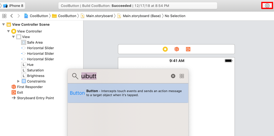
You’re missing the UIButton, so add that to the top of the screen. Go to Object Library, type in UIButton, and drag it into the screen.
Time for some auto-layout! Control-drag from the button to the view and choose Center Horizontally in Safe Area.


Control-drag from the button to the hue label and choose Vertical Spacing.

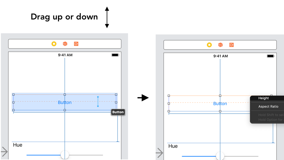
Now, resize the button to a size that you like. Control-drag left or right from the button and choose Width.

Control-drag up or down from the button and choose Height.
Next, delete the text that says “Button” by double clicking it and pressing the Delete key.
With the button still selected, go to the Inspectors sidebar on the right-hand side of the screen and click on the Identity inspector. In Custom Class ▸ Class, enter CoolButton to make your button an instance of the CoolButton class.

With the button in place, you’re ready to start hooking the UI up to the code!
Making Your Button Functional
Open ViewController.swift and replace the class definition with the following:
class ViewController: UIViewController {
  @IBOutlet weak var coolButton: CoolButton!
  @IBAction func hueValueChanged(_ sender: Any) { }
  @IBAction func saturationValueChanged(_ sender: Any) { }
  @IBAction func brightnessValueChanged(_ sender: Any) { }
}
Here, you’re declaring a reference to the button that you just created in your storyboard. You’re also declaring the callbacks that occur when the values of the configuration sliders change.
Now, open Main.storyboard again and choose Assistant Editor in the top bar to show ViewController.swift and Main.storyboard side by side.

Control-drag from the button in View Controller Scene ▸ ViewController on the left and connect it to the coolButton outlet.

Similarly, control-drag from the sliders in View Controller Scene ▸ ViewController on the left and connect each one to the appropriate value-changed callback on the right.

Next, switch to ViewController.swift and implement the value-changed callbacks of the sliders:
@IBAction func hueValueChanged(_ sender: Any) {
  guard let slider = sender as? UISlider else { return }
  coolButton.hue = CGFloat(slider.value)
}

@IBAction func saturationValueChanged(_ sender: Any) {
  guard let slider = sender as? UISlider else { return }
  coolButton.saturation = CGFloat(slider.value)
}

@IBAction func brightnessValueChanged(_ sender: Any) {
  guard let slider = sender as? UISlider else { return }
  coolButton.brightness = CGFloat(slider.value)
}
By default, UISliders have a range of 0.0 to 1.0. This is perfect for your hue, saturation and brightness values, which also range from 0.0 to 1.0, so you can just set them directly.
Phew, after all this work, it’s finally time to build and run! If all works well, you can play around with the sliders to fill the button with various colors:
