Material You in Jetpack Compose
Learn how to use the amazing features that come with the new Material Design 3 to create better-looking apps with a more personal feel. By Harun Wangereka.
Applying Material Theme Builder Colors
You’ll now add the colors generated in the Material Theme Builder tool to your app. First, you’ll start with the light theme colors.
CamelCase. However, the Material Theme Builder tool provides color names in the snake_case form. To simplify next steps and skip renaming a bunch of variables, you’ll use predefined names.
Navigate to presentation/theme/Color.kt. Replace // TODO ADD Material Theme Builder Colors with:
// Material Theme Light Builder Colors
val md_theme_light_primary = Color(0xFF006d37)
val md_theme_light_onPrimary = Color(0xFFffffff)
val md_theme_light_primaryContainer = Color(0xFF96f7b2)
val md_theme_light_onPrimaryContainer = Color(0xFF00210c)
val md_theme_light_secondary = Color(0xFF506353)
val md_theme_light_onSecondary = Color(0xFFffffff)
val md_theme_light_secondaryContainer = Color(0xFFd2e8d3)
val md_theme_light_onSecondaryContainer = Color(0xFF0d1f12)
val md_theme_light_tertiary = Color(0xFF3a656f)
val md_theme_light_onTertiary = Color(0xFFffffff)
val md_theme_light_tertiaryContainer = Color(0xFFbeeaf6)
val md_theme_light_onTertiaryContainer = Color(0xFF001f26)
val md_theme_light_error = Color(0xFFba1b1b)
val md_theme_light_errorContainer = Color(0xFFffdad4)
val md_theme_light_onError = Color(0xFFffffff)
val md_theme_light_onErrorContainer = Color(0xFF410001)
val md_theme_light_background = Color(0xFFfbfdf7)
val md_theme_light_onBackground = Color(0xFF1a1c1a)
val md_theme_light_surface = Color(0xFFfbfdf7)
val md_theme_light_onSurface = Color(0xFF1a1c1a)
val md_theme_light_surfaceVariant = Color(0xFFdde5db)
val md_theme_light_onSurfaceVariant = Color(0xFF414941)
val md_theme_light_outline = Color(0xFF717971)
val md_theme_light_inverseOnSurface = Color(0xFFf0f1ec)
val md_theme_light_inverseSurface = Color(0xFF2e312e)
val md_theme_light_inversePrimary = Color(0xFF7bda98)
val md_theme_light_shadow = Color(0xFF000000)
These are the colors from the Material Theme Builder tool for your light scheme.
After that, you’ll add dark scheme colors, which are still from the Material Theme Builder tool.
Below your light scheme colors, add:
// Material Theme Dark Builder Colors
val md_theme_dark_primary = Color(0xFF7bda98)
val md_theme_dark_onPrimary = Color(0xFF00391a)
val md_theme_dark_primaryContainer = Color(0xFF005228)
val md_theme_dark_onPrimaryContainer = Color(0xFF96f7b2)
val md_theme_dark_secondary = Color(0xFFb6ccb8)
val md_theme_dark_onSecondary = Color(0xFF223527)
val md_theme_dark_secondaryContainer = Color(0xFF384b3c)
val md_theme_dark_onSecondaryContainer = Color(0xFFd2e8d3)
val md_theme_dark_tertiary = Color(0xFFa2ceda)
val md_theme_dark_onTertiary = Color(0xFF023640)
val md_theme_dark_tertiaryContainer = Color(0xFF204d56)
val md_theme_dark_onTertiaryContainer = Color(0xFFbeeaf6)
val md_theme_dark_error = Color(0xFFffb4a9)
val md_theme_dark_errorContainer = Color(0xFF930006)
val md_theme_dark_onError = Color(0xFF680003)
val md_theme_dark_onErrorContainer = Color(0xFFffdad4)
val md_theme_dark_background = Color(0xFF1a1c1a)
val md_theme_dark_onBackground = Color(0xFFe2e3de)
val md_theme_dark_surface = Color(0xFF1a1c1a)
val md_theme_dark_onSurface = Color(0xFFe2e3de)
val md_theme_dark_surfaceVariant = Color(0xFF414941)
val md_theme_dark_onSurfaceVariant = Color(0xFFc1c9bf)
val md_theme_dark_outline = Color(0xFF8b938a)
val md_theme_dark_inverseOnSurface = Color(0xFF1a1c1a)
val md_theme_dark_inverseSurface = Color(0xFFe2e3de)
val md_theme_dark_inversePrimary = Color(0xFF006d37)
val md_theme_dark_shadow = Color(0xFF000000)

val seed = Color(0xFF00753e)
val error = Color(0xFFba1b1b)
These are the colors from the Material Theme Builder tool for the dark scheme. Your color schemes are ready for use now.
Head over to presentation/theme/Theme.kt and replace your LightThemeColors variable with:
private val LightThemeColors = lightColorScheme(
  primary = md_theme_light_primary,
  onPrimary = md_theme_light_onPrimary,
  primaryContainer = md_theme_light_primaryContainer,
  onPrimaryContainer = md_theme_light_onPrimaryContainer,
  secondary = md_theme_light_secondary,
  onSecondary = md_theme_light_onSecondary,
  secondaryContainer = md_theme_light_secondaryContainer,
  onSecondaryContainer = md_theme_light_onSecondaryContainer,
  tertiary = md_theme_light_tertiary,
  onTertiary = md_theme_light_onTertiary,
  tertiaryContainer = md_theme_light_tertiaryContainer,
  onTertiaryContainer = md_theme_light_onTertiaryContainer,
  error = md_theme_light_error,
  errorContainer = md_theme_light_errorContainer,
  onError = md_theme_light_onError,
  onErrorContainer = md_theme_light_onErrorContainer,
  background = md_theme_light_background,
  onBackground = md_theme_light_onBackground,
  surface = md_theme_light_surface,
  onSurface = md_theme_light_onSurface,
  surfaceVariant = md_theme_light_surfaceVariant,
  onSurfaceVariant = md_theme_light_onSurfaceVariant,
  outline = md_theme_light_outline,
  inverseOnSurface = md_theme_light_inverseOnSurface,
  inverseSurface = md_theme_light_inverseSurface,
  inversePrimary = md_theme_light_inversePrimary,
)
In this code, you add the color values for all lightColorScheme attributes available in the new Material Design 3 library.
Next, replace the DarkThemeColors variable with:
private val DarkThemeColors = darkColorScheme(
  primary = md_theme_dark_primary,
  onPrimary = md_theme_dark_onPrimary,
  primaryContainer = md_theme_dark_primaryContainer,
  onPrimaryContainer = md_theme_dark_onPrimaryContainer,
  secondary = md_theme_dark_secondary,
  onSecondary = md_theme_dark_onSecondary,
  secondaryContainer = md_theme_dark_secondaryContainer,
  onSecondaryContainer = md_theme_dark_onSecondaryContainer,
  tertiary = md_theme_dark_tertiary,
  onTertiary = md_theme_dark_onTertiary,
  tertiaryContainer = md_theme_dark_tertiaryContainer,
  onTertiaryContainer = md_theme_dark_onTertiaryContainer,
  error = md_theme_dark_error,
  errorContainer = md_theme_dark_errorContainer,
  onError = md_theme_dark_onError,
  onErrorContainer = md_theme_dark_onErrorContainer,
  background = md_theme_dark_background,
  onBackground = md_theme_dark_onBackground,
  surface = md_theme_dark_surface,
  onSurface = md_theme_dark_onSurface,
  surfaceVariant = md_theme_dark_surfaceVariant,
  onSurfaceVariant = md_theme_dark_onSurfaceVariant,
  outline = md_theme_dark_outline,
  inverseOnSurface = md_theme_dark_inverseOnSurface,
  inverseSurface = md_theme_dark_inverseSurface,
  inversePrimary = md_theme_dark_inversePrimary,
)
Here, you add darkColorScheme attributes for your theme. These colors, in combination, enable dynamic color support and personalization. Great job!
Now, build and run your app.

The app now has the right combination of your brand colors that maps perfectly with Material You. You can customize them as much as you want, taking advantage of the Material Theme Builder that lets you see all your color changes. The app now looks awesome, you should be proud of yourself! :]
Applying Dynamic Color
To support Material You even more deeply, you can make your app ready for dynamic colors. This is a color extraction mechanism that allows your app to use an auto-generated color scheme that resembles the user’s set wallpaper, but this only works for Android 12 devices.
Navigate to presentation/theme and open Theme.kt. This class is where you set your themes for your app.
Now, change colors in ComposeMaterialYou by replacing the colorScheme variable, just below // TODO Add Dynamic Color Support, with the following:
  // 1
  val dynamicColor = Build.VERSION.SDK_INT >= Build.VERSION_CODES.S
  // 2
  val colorScheme = when {
    dynamicColor && darkTheme -> dynamicDarkColorScheme(LocalContext.current)
    dynamicColor && !darkTheme -> dynamicLightColorScheme(LocalContext.current)
    darkTheme -> DarkThemeColors
    else -> LightThemeColors
  }
Add any missing imports by pressing Option-Enter on Mac or Alt-Enter on Windows PC.
Here’s what the code above does:
- This is a check for the device version. Dynamic color only works for devices running Android 12 and above, so you check the device version before using dynamic colors.
- You add support for a user-generated color scheme using the newly added
dynamicDarkColorSchemeanddynamicLightColorSchemeAPIs. Devices that don’t support dynamic color default to the normal themes.
Build and run your app. Notice the colors changed depending on the set wallpaper. Now, use different wallpaper to see how the colors will change.
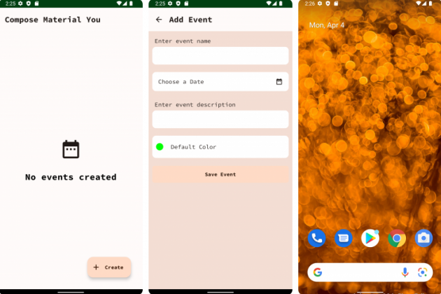

Without any addition to the component colors, you can see the color scheme in your app changes to resemble the dominant color in your wallpaper. :]
API Level 31 doesn’t adhere to dynamic colors based on the actual emulator’s wallpaper. To see dynamic colors change based on the emulator’s wallpaper, use a system image with API Level 32 or an Android 12-powered physical device. Be aware that, as of the time of writing, only Google Pixel devices have this feature for sure. All other devices running Android 12 shouldn’t have it yet. However, Google says this feature “will soon be available on more Android 12 phones globally”.
Now that you understand how to use Material You in your app, it’s time to add a bit of excitement to it! To do that, you’ll use Material Motion.