Google Material Design Tutorial for iOS: Getting Started
Learn how Google’s Material Design can be used on iOS to write apps that provide an interface that feels familiar and makes switching devices much easier. By Nick Bonatsakis.
Getting Started
Material Design
Material Design in Practice on iOS
Adding an App Bar
Adding a Tab Bar
Adding Article Cards
Where to Go From Here?
Flexible header height
Adding more effectst
Ripple effect on tap
Upon reading the title of this tutorial, you may be wondering how the terms “Google Material Design” and “iOS” ended up alongside each other. After all, Material Design is widely known for being the face of Google, and particularly on Android.
It turns out however, that Google has a much broader vision for Material Design that extends across many platforms, including iOS. Google has even gone as far as open-sourcing the components they’ve used to build Material Design-powered apps on iOS.
In this tutorial, you’ll get a primer on Material Design and build a simple app that displays articles from a number of different news sources via the newsapi.org API.
Using Google Material Design Components for iOS, you will beautify the app with a flexible header, standard material colors, typography, sliding tabs, and cards with ink.
Download the starter project for News Ink, and take a look around to familiarize yourself.
You may notice that the project is using CocoaPods. In your Terminal, navigate to the project’s root folder and run pod install.
Note: If you’re not familiar with CocoaPods we have a good introductory tutorial you can read to get familiar with the dependency manager.
Before you start working with the app, you’ll need to obtain a free newsapi.org key by signing up at https://newsapi.org/register.
Once you’ve got your key, open NewsClient.swift and insert your key in the Constants struct like so:
Then build and run.

There’s nothing terribly interesting yet: just a basic list of articles with photo and basic information. You can tap on an item in the list to go to a web view of the full article, but that’s about it.
Before diving into some code, it’s worth learning a little about Material Design.
Google introduced Material Design in 2014, and it’s quickly become the UI/UX standard across all of Google’s web and mobile products. The Google Material Design Guidelines is a great place to start, and I’d recommend having a quick read through before you go any further.
But why is Material Design a good idea, and more importantly, why would you want to use it for an iOS app? After all, Apple has its own UI/UX guidelines in the form of the Human Interface Guidelines.
The answer lies in how we use the devices around us. From mobile phones, to tablets, to desktop PCs, to the television; our daily lives are now a journey from one screen to the next. A single interface design that feels the same across all screens and devices makes for a smooth user experience and greatly reduces the cognitive load of jumping from one device to the next.
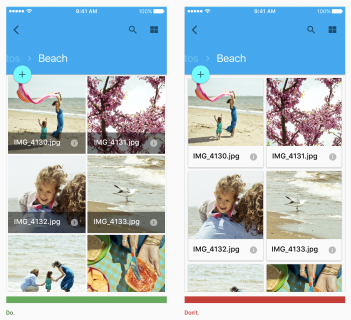
An example of dos and don’ts from Google’s Material Design Guidelines.
Using a metaphor that humans are already familiar with — material, in this case, paper — makes approaching each new screen somewhat easier. Moreover, when the design guidelines are extremely opinionated, specific, and supported by actual UI components at the platform level, apps built using those design guidelines easily fall in line with each other.
There’s nothing in the Material specification about only applying to Google’s platforms. All of the benefits of a unified design system are as relevant on iOS as they are on any other platform. If you compare Apple’s Human Interface Guidelines to Google’s Material Design Guidelines, you’ll notice that the Material spec is much deeper and more opinionated. In contrast, Apple’s guidelines are not nearly as prescriptive, particularly when it comes to visual aspects such as typography, color and layouts.
Google is so committed to making Material Design a cross platform standard that it’s created a Platform Adaptation guide that walks you through implementing Material in a way that feels at home on any platform.
That was a lot of info up front! Rest assured, none of it was… immaterial. Now you’re going to have some fun working with the Google Material Components for iOS.
When you’re done with this section, your app will open with a large header, including a full-bleed photo background and large word mark text. As you scroll, the photo will move and fade out, while the word mark label shrinks until the entire header magically morphs into a more traditional navigation bar.
To start, there’s no navigation bar, title, or anything else to tell the user which app they’re using. You’ll fix that that by introducing an app bar with flexible header, hero image, and fluid scroll effects.
The first, and probably coolest Material Design component you’ll add is an App Bar. In this case, you’ll get a lot of bang for your buck, since the App Bar combines three components in one: Flexible Header, Header Stack View, and Navigation Bar. Each of these components is powerful on its own, but as you will see, when combined, you get something really special.
Open HeroHeaderView.swift. To keep things clean, you’re going to build a UIView subclass that contains all the subviews that make up the flexible header, as well as the logic for how those subviews change in relation to the scroll position.
First add the following struct inside the HeroHeaderView class:
Here you add a number of constants that will be useful as you build out the header view.
statusBarHeight represents the height of the status bar and minHeight and maxHeight represent the minimum (fully collapsed) and maximum (fully expanded) height of the header.
Now add the following properties to HomeHeaderView:
Nothing too complicated here; you add a UIImageView to house the header’s background and a UILabel that represents the app title word mark.
Next, add the following code to initialize HomeHeaderView, add the subviews, and specify the layout:
There’s a bit more going on here:
Now that you have the basic header view with subviews in place, it’s time to configure the App Bar and use your header view as the content.
Open ArticlesViewController.swift and import the Material Components by adding the following import statement at the top of the file, below the existing imports:
Now add the following property declarations above the existing properties:
You have a property for the App Bar (an instance of MDCAppBar) and one for the HeroHeaderView you created in previous steps.
Next, add the following method to the ArticlesViewController extension marked as // MARK: UI Configuration:
There’s quite a lot going on here, so let’s break it down:
Now invoke configureAppBar() by adding it to viewDidLoad(), right after calling super.viewDidLoad():
Build and run, and you should see the following:

Sweet, the header is there! But there are a few problems.
First, the title logo’s font is small, and as a result, looks awful. Try scrolling the collection view, and you’ll also notice that the flexible header doesn’t seem so flexible yet.
Both of these problems are tied to the fact that there is still some configuration needed to fully wire up the app bar to the collection view’s scroll events.
It turns out that simply setting the flexible header’s trackingScrollView is not enough. You also have to explicitly inform it of scroll events by passing them via the UIScrollViewDelegate methods.
Add the following to the same UI Configuration extension on ArticlesViewController, below where you added configureAppBar():
In each of these methods, you check if the scroll view is the one you care about (e.g. the header view’s trackingScrollView), and if it is, pass along the event.
Build and run, and you should now see that the header’s height has become flexible.
Now that the flexible header is appropriately tied to the collection view’s scrolling, it’s time to have your HeroHeaderView respond to header scroll position changes in order to create some neat effects.
Open HeroHeaderView.swift once more, and add the following method to HeroHeaderView:
This is a short, but very important method.
To start, the method takes a scrollPhase value as its only parameter. The scroll phase is a number from 0.0 to 1.0, where 0.0 is when the flexible header is at minimum height, and 1.0 represents, you guessed it, the header at maximum height.
Through the use of a scaled utility extension in the starter project, the scroll phase is mapped to values appropriate for each of the two header components:
To connect the method you just added, open ArticlesViewController.swift once more and add the following extension:
This passes the header scroll phase event straight to your hero header view by invoking the method you just added to HeroHeaderView.
Last but not least, add the following line to configureAppBar() in order to wire up the header layout delegate:
Build and run, and you should see the following:

As you scroll, the header should collapse, fading the background image and shrinking the title logo. The flexible header even applies its own effects to stretch its content if you pull down when the collection view is at the top most content offset.
Next up, you’ll add a Material-style scrolling tab bar to let you choose from different news sources.
Being able to see a single list of news articles from CNN is already making this app feel pretty useful, but wouldn’t it be even better if you could choose from a bunch of different news sources? Material Design includes just the right component for presenting such a list: the tab bar.
“But wait!” you cry, “iOS already has its own tab bar component!”
Indeed it does, but in Material Design the tab bar can function both as a bottom-style bar with icons and titles (much like the iOS tab bar), or as part of a flexible header, where tabs appear as a horizontally scrolling list of titles.
The second mode is more suited to a list where you might not know the number of values until runtime, and the titles are dynamic to the extent that you wouldn’t be able to provide a unique icon for each. It sounds like this fits the bill perfectly for your news sources navigation.
Open ArticlesViewController.swift and add the following property for the tab bar:
You’re going to add the tab bar as the app bar’s “bottom bar”, which means it will stick to the bottom of the flexible header so that it’s always visible, regardless whether the header is expanded or collapsed. To do this, add the following method right below configureAppBar():
This doesn’t look too complicated:
At this point the tab bar can be configured, but you need to actually call this method first. Find viewDidLoad() and call this new method right below configureAppBar():
The bar is now configured, but it still won’t do much because you haven’t implemented the delegate methods yet. Implement its delegate by adding the following extension:
This code refreshes the content every time the selected tab changes. This won’t do much unless you update refreshContent() to take the selected tab into account.
Change refreshContent() to look like the following:
The above code looks similar to that in the starter project — with one key difference. Instead of hard-coding the news source to .cnn, you obtain the selected tab bar item via tabBar.selectedItem. You then grab the corresponding news source enum via the tab bar item’s tag — remember, you set it to the news source index above. Finally, you pass that news source to the API client method that fetches the articles.
You’re almost there! There’s one more thing to do before achieving tab bar nirvana.
When you configured the app bar, you set the absolute minimum and maximum heights. Without changing anything, you haven’t provided any extra room for the tab bar when the app bar is in the collapsed state. Build and run right now, and you’ll see something like the following when you scroll down into the content:

This would look much snazzier if the app bar allotted space for both the title and the tab bar.
Open HeroHeaderView.swift and change the Constants enum to the following:
Here you add a new constant for tabBarHeight and then add it to the minHeight constant. This will make sure there is enough room for both the title and the tab bar when in the collapsed state.
Finally, there’s one last problem to contend with. Since you added a new component to the flexible header, the title will no longer look centered vertically. You can resolve this by changing layoutSubviews() in HeroHeaderView.swift to the following:
The only difference is that you’re now subtracting Constants.tabBarHeight when calculating the title label’s height.
This centers the title label vertically between the status bar at the top and the tab bar at the bottom. It’ll look much nicer and will prevent one of those pesky UX designers from throwing a brick through your window while you sleep.
Build and run, and you can now choose from a number of news sources, all while expanding or collapsing the header to your heart’s content.

Now that you’ve done a number on the header and navigation, it’s time to give the content a magnificent material makeover.
One of the core tenets of Material Design is the idea of using material as a metaphor. Cards are an excellent implementation of this metaphor, and are used to group content, indicate hierarchy or structure, and denote interactivity, all through the use of varying levels of elevation and movement.
The individual news items in your app are rather dull. But you’re about to change that and turn each news item into a card with a ripple touch effect.
Open ArticleCell.swift and add the familiar import statement to pull in Material Components:
To give the cell a shadow, add the following code to the bottom of ArticleCell:
Here you override the UIView class var layerClass in order to force the view’s backing layer to be of type MDCShadowLayer.
This layer lets you set a shadow elevation and will then render a nice-looking shadow. You then expose a convenience variable named shadowLayer so it’s easier to access the shadow layer for configuration purposes.
Now that the shadow layer is in place, add the following code to awakeFromNib():
Taking each commented section in turn:
Build and run once again. You should now see a classy shadow surrounding each piece of content, giving it a very defined card look.

Your app is now looking decidedly more Material. Those cards almost scream “please tap me”, but alas, when you do so, nothing happens to indicate your tap before you’re ushered away to the article detail.
Material Design has a universal method of indicating interactivity, through the use of an “ink” component that causes a very subtle ripple to occur whenever something is tapped or clicked on.
Let’s pour some ink onto these cards. Add a variable for an MDCInkTouchController to ArticleCell like so:
The ink touch controller manages an underlying ink view and deals with handling input. The only other thing to do is initialize the ink touch controller and add it to the view.
Add the following code to awakeFromNib():
The ink touch controller maintains a weak reference to the view, so don’t worry about causing a retain cycle here.
Build and run, then tap on a card to see ink in action.

And that’s it! You’ve have yourself a fully armed and operational Material Design news app.
You can download the finished project here.
The Material Design spec is extremely broad, and the iOS library includes many components that are beyond the scope of this tutorial. If you like what you’ve seen in this tutorial, you’re encouraged to give it a read.
Moreover, you can find a complete list of all iOS material design components here. They all include very complete documentation and are a great place to start if you want to incorporate more aspects of Material Design into your next iOS app.
If you have any comments or questions about this tutorial, please join the forum discussion below!
- Here you add some basic initialization code that sets a resizing mask, configures clipping mode, then calls the
configureViewmethod to, well, configure the view. TheMDCAppBarand its cohorts don’t support Auto Layout, so for this section of the tutorial, it’s frame math or bust. - This view is only intended for use via code, so here you prevent it from being loaded via XIB or Storyboards.
- To configure the view, you set the background color to
.darkGray. As the view collapses, the background image will become transparent, leaving this dark gray color to serve as the navigation bar color. You also added the background image and label as subviews. - The layout code here does two things. First, it assures that the background image fills the frame of the header view. Second, it also fills the label to the header frame, but accounts for the status bar height so that the label is vertically centered between the lower edge of the status bar and the bottom edge of the header frame.
- To start, you add the app bar’s header view controller as a child view controller of the
ArticlesViewController. This is required so that the header view controller can receive standardUIViewControllerevents. - Next, you configure the background color of the app bar to be clear, since you’ll be relying on the hero header view subclass to provide the color. You also set the
titleViewproperty tonilbecause the hero header view also provides a custom title. - Now you configure the app bar’s flexible header view, first by setting it’s background to
.clear, again because your hero header view subclass will handle the background. Then you set the min and max heights to the values you defined in theHeroHeaderView.Constantsstruct. When the collection view is at scroll position zero (e.g. the top), the app bar will be at max height. As you scroll the content, the app bar will collapse until it reaches min height, where it will stay until the collection view is scrolled back towards the top. - Here you set up the initial frame of the hero header view to match the app bar’s header view, then insert it as the bottom-most subview of the header view. This effectively sets the hero header view as the primary content of the app bar’s flexible header view.
- Next, you set the header view’s
trackingScrollViewto the collection view. The flexible header needs to know whichUIScrollViewsubclass to use for tracking scroll events so that it can adjust its size, position, and adjust its subviews as the user scrolls. - Finally, you call
addSubviewsToParenton the app bar as required byMDCAppBarin order to add a few of its views to your view controller’s view.
- By mapping
0...0.8to0...1, the alpha of the background goes from0when the header is completely collapsed, to1.0once the phase hits0.8as it is expanded. This prevents the image from fading away as soon as the user starts scrolling the content. - You map the font size range for the title logo as
22.0...60.0. This means that the title logo will start at font size60.0when the header is fully expanded, then shrink as it is collapsed.
- First, you set the item appearance to
.titles. This causes the tab bar items to only show titles, without icons. - Here you map all of the news sources, represented by the
NewsSourceenum, into instances ofUITabBarItem. Just as in aUITabBar, this is how the individual tabs are defined. You set the tab on the tab bar item as the index of the news source in the list. This is so that later, when you handle the tab bar selection, you’ll know which news source to select for a given tab. - Next, you set the selected item to the first item in the list. This will set the first news source as the selected news source when the app first starts.
- You simply set the tab bar’s delegate to
self. You’ll implement this delegate in the next section. - Finally, set the tab bar as the header stack view’s bottom bar to make it “stick” to the bottom of the flexible header.
- First, you set the shadow layer’s elevation to
MDCShadowElevationCardResting. This is the standard elevation for a card in the “resting” state. There are other elevations that correspond to various types of components and interactions. - Next, you configure the rasterization mode for the view’s layer in order to improve scrolling performance.
- Finally, you set
clipsToBoundstofalseon the cell so the shadow can escape the bounds of the cell, and set theclipsToBoundstotruefor the image view. Because you’re using the.scaleAspectFillmode, this will ensure the image content stays confined to the view.
static let apiKey = "REPLACE_WITH_NEWSAPIORG_KEY"
struct Constants {
  static let statusBarHeight: CGFloat = UIApplication.shared.statusBarFrame.height
  static let minHeight: CGFloat = 44 + statusBarHeight
  static let maxHeight: CGFloat = 400.0
}
// MARK: Properties

let imageView: UIImageView = {
  let imageView = UIImageView(image: #imageLiteral(resourceName: "img-hero"))
  imageView.contentMode = .scaleAspectFill
  imageView.clipsToBounds = true
  return imageView
}()

let titleLabel: UILabel = {
  let label = UILabel()
  label.text = NSLocalizedString("News Ink", comment: "")
  label.textAlignment = .center
  label.textColor = .white
  label.shadowOffset = CGSize(width: 1, height: 1)
  label.shadowColor = .darkGray
  return label
}()
// MARK: Init

// 1
init() {
  super.init(frame: .zero)
  autoresizingMask = [.flexibleWidth, .flexibleHeight]
  clipsToBounds = true
  configureView()
}

// 2
required init?(coder aDecoder: NSCoder) {
  fatalError("init(coder:) has not been implemented")
}

// MARK: View

// 3
func configureView() {
  backgroundColor = .darkGray
  addSubview(imageView)
  addSubview(titleLabel)
}

// 4
override func layoutSubviews() {
  super.layoutSubviews()
  imageView.frame = bounds
  titleLabel.frame = CGRect(
    x: 0,
    y: Constants.statusBarHeight,
    width: frame.width,
    height: frame.height - Constants.statusBarHeight)
}
import MaterialComponents
let appBar = MDCAppBar()
let heroHeaderView = HeroHeaderView()
func configureAppBar() {
  // 1
  self.addChildViewController(appBar.headerViewController)

   // 2
  appBar.navigationBar.backgroundColor = .clear
  appBar.navigationBar.title = nil

   // 3
  let headerView = appBar.headerViewController.headerView
  headerView.backgroundColor = .clear
  headerView.maximumHeight = HeroHeaderView.Constants.maxHeight
  headerView.minimumHeight = HeroHeaderView.Constants.minHeight

   // 4
  heroHeaderView.frame = headerView.bounds
  headerView.insertSubview(heroHeaderView, at: 0)

   // 5
  headerView.trackingScrollView = self.collectionView

   // 6
  appBar.addSubviewsToParent()
}
override func viewDidLoad() {
  super.viewDidLoad()
  configureAppBar()
  configureCollectionView()
  refreshContent()
}
// MARK: UIScrollViewDelegate

override func scrollViewDidScroll(_ scrollView: UIScrollView) {
  let headerView = appBar.headerViewController.headerView
  if scrollView == headerView.trackingScrollView {
    headerView.trackingScrollDidScroll()
  }
}

override func scrollViewDidEndDecelerating(_ scrollView: UIScrollView) {
  let headerView = appBar.headerViewController.headerView
  if scrollView == headerView.trackingScrollView {
    headerView.trackingScrollDidEndDecelerating()
  }
}

override func scrollViewDidEndDragging(_ scrollView: UIScrollView, willDecelerate decelerate: Bool) {
  let headerView = appBar.headerViewController.headerView
  if scrollView == headerView.trackingScrollView {
    headerView.trackingScrollDidEndDraggingWillDecelerate(decelerate)
  }
}

override func scrollViewWillEndDragging(_ scrollView: UIScrollView, withVelocity velocity: CGPoint,
                                        targetContentOffset: UnsafeMutablePointer<CGPoint>) {
  let headerView = appBar.headerViewController.headerView
  if scrollView == headerView.trackingScrollView {
    headerView.trackingScrollWillEndDragging(withVelocity: velocity,
                                             targetContentOffset: targetContentOffset)
  }
}
func update(withScrollPhasePercentage scrollPhasePercentage: CGFloat) {
  // 1
  let imageAlpha = min(scrollPhasePercentage.scaled(from: 0...0.8, to: 0...1), 1.0)
  imageView.alpha = imageAlpha

  // 2
  let fontSize = scrollPhasePercentage.scaled(from: 0...1, to: 22.0...60.0)
  let font = UIFont(name: "CourierNewPS-BoldMT", size: fontSize)
  titleLabel.font = font
}
// MARK: MDCFlexibleHeaderViewLayoutDelegate
extension ArticlesViewController: MDCFlexibleHeaderViewLayoutDelegate {

  public func flexibleHeaderViewController(_ flexibleHeaderViewController: MDCFlexibleHeaderViewController,
    flexibleHeaderViewFrameDidChange flexibleHeaderView: MDCFlexibleHeaderView) {
    heroHeaderView.update(withScrollPhasePercentage: flexibleHeaderView.scrollPhasePercentage)
  }
}
appBar.headerViewController.layoutDelegate = self
let tabBar = MDCTabBar()
func configureTabBar() {
  // 1
  tabBar.itemAppearance = .titles
  // 2
  tabBar.items = NewsSource.allValues.enumerated().map { index, source in
    return UITabBarItem(title: source.title, image: nil, tag: index)
  }
  // 3
  tabBar.selectedItem = tabBar.items[0]
  // 4
  tabBar.delegate = self
  // 5
  appBar.headerStackView.bottomBar = tabBar
}
configureTabBar()
// MARK: MDCTabBarDelegate
extension ArticlesViewController: MDCTabBarDelegate {

  func tabBar(_ tabBar: MDCTabBar, didSelect item: UITabBarItem) {
    refreshContent()
  }
}
func refreshContent() {
  guard inProgressTask == nil else {
    inProgressTask?.cancel()
    inProgressTask = nil
    return
  }

  guard let selectedItem = tabBar.selectedItem else {
    return
  }

  let source = NewsSource.allValues[selectedItem.tag]

  inProgressTask = apiClient.articles(forSource: source) { [weak self] (articles, error) in
    self?.inProgressTask = nil
    if let articles = articles {
      self?.articles = articles
      self?.collectionView?.reloadData()
    } else {
      self?.showError()
    }
  }
}
struct Constants {
  static let statusBarHeight: CGFloat = UIApplication.shared.statusBarFrame.height
  static let tabBarHeight: CGFloat = 48.0
  static let minHeight: CGFloat = 44 + statusBarHeight + tabBarHeight
  static let maxHeight: CGFloat = 400.0
}
override func layoutSubviews() {
  super.layoutSubviews()
  imageView.frame = bounds
  titleLabel.frame = CGRect(
    x: 0,
    y: Constants.statusBarHeight,
    width: frame.width,
    height: frame.height - Constants.statusBarHeight - Constants.tabBarHeight)
}
import MaterialComponents
override class var layerClass: AnyClass {
  return MDCShadowLayer.self
}

var shadowLayer: MDCShadowLayer? {
  return self.layer as? MDCShadowLayer
}
// 1
shadowLayer?.elevation = MDCShadowElevationCardResting

 // 2
layer.shouldRasterize = true
layer.rasterizationScale = UIScreen.main.scale

 // 3
clipsToBounds = false
imageView.clipsToBounds = true
var inkTouchController: MDCInkTouchController?
inkTouchController = MDCInkTouchController(view: self)
inkTouchController?.addInkView()