Debugging Layout Issues Using the Widget Inspector
In this article, you’ll see how layouts are constructed as well as learn about the Widget Inspector and how to use it to solve common layout errors in an app. By Ayush.
You can construct a large variety of complex layouts in Flutter. Because of this flexibility, you’ll also face UI issues that hinder app development. Dart devtool’s Widget Inspector page is a versatile tool to understand and tackle these errors. In this tutorial, you’ll learn:
- The relationship between different widgets in a layout.
- The Widget Inspector.
- Common layout errors and solutions.
- Responsive app design.
Getting Started
Click the Download Materials button at the top or bottom of this tutorial to download the starter project. The project is a basic app that displays the solar system members in the proper order. Click any of them to open its corresponding details page. The project has a simple folder structure and includes all the required images.
Build and run the app to see the output:
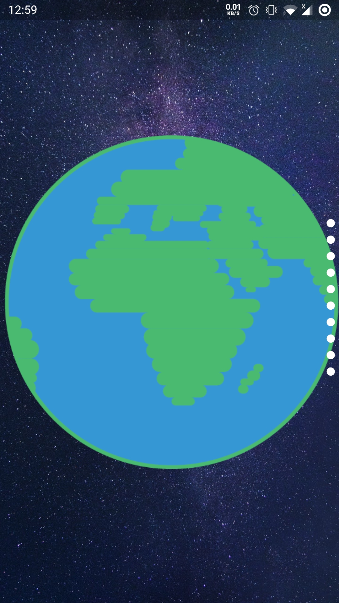
Click the planet Jupiter to navigate to its details page. Do this by scrolling the PageView down or clicking the sixth page indicator.
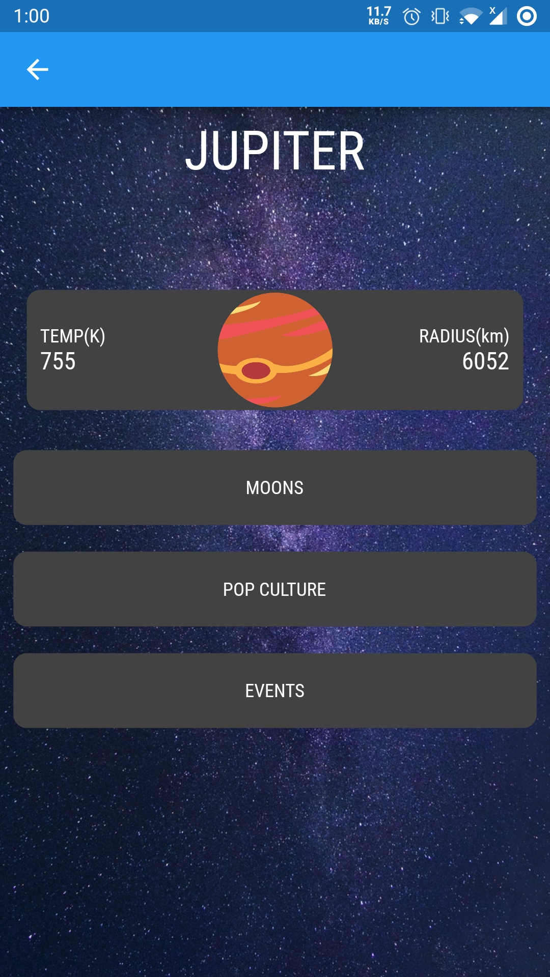
Feel free to explore the app. Notice the layout issues and visual inconsistencies in both pages. Don’t worry. You’ll learn about different options available to fix them in this article.
Using the Widget Inspector
Because you have seen the app’s issues, now is an excellent time to introduce the debugging tool used for Flutter, known as the Dart devtools. It’s a collection of inspection tools used to check the app’s layouts and performance. You’ll focus on the Widget Inspector page of the devtools in this article.
To open the Widget Inspector, you can either click the Dart devtools icon or use the key combination Control-Shift-P in VS Code.

The first column (red) displays the current state of the widget tree. Clicking any of its elements will allow you to explore two tabs in the second column (orange). The first tab (Layout Explorer in blue) shows the dimensions of the currently selected element in the widget’s tree and its parent. The second tab (Details Tree in green) shows the selected widget’s properties and all the widgets around it.
Click the Container widget under BodySurfaceData in the widget tree. If you switch to the Details Tree, you see the Container widget actually consists of two widgets. The Padding and DecoratedBox widgets, as padding and decoration properties, are specified in the Container widget.

Understanding Constraint Flow
This Container also has an interesting relation with its parent widget. If you switch to the Layout Explorer tab, you see the Container has a range below its width. The parent of the Container determines this range, which represents the minimum/maximum values for the width. Starting with the Column, you can see it has the same width range as the Container. This is true for the FutureBuilder and DecoratedBox above it as well.

The transfer of this minimum/maximum range is an important rule to understand when it comes to Flutter layouts. Looking at the widgets from the DecoratedBox to Column, you’ll see this rule still applies for height as well. But Column, by design, gives its children unconstrained height.
BoxConstraint class represents this combination of width and height ranges.
But why do these constraints start only from the DecoratedBox and not above it? Well, they do exist, but the constraints above DecoratedBox are a special kind known as tight constraints. These constraints have equal minimum and maximum values.
Displaying Overflowing Content
In contrast to tight constraints, loose constraints have different minimum and maximum values. Because the child of the Container is a Row widget, it also inherits these constraints for its width. Further, because Row is a child of Container, which has an unconstrained height, it will behave the same. This means it can adjust its height freely according to its contents.
Open lib/widgets/body_surface_data.dart and replace the width and height next to //TODO increase size with the following code snippet.
width: 90,
height: 90,
Build and run, and you’ll see that the Row height has auto-adjusted as the planet image size has increased.

You can also observe this behavior in the Widget Inspector. View the Row containing the Jupiter illustration in the Layout Explorer and notice both the Row height and Expanded have jumped to 90.

It would be better if the planet grew out of the Row boundaries. You can achieve this look in two steps. First, add further constraints to the Row height using a ConstrainedBox.
Replace //TODO add constraints with the following snippet:
constraints: const BoxConstraints(maxHeight: 70),
ConstrainedBox you can verify using the Widget Inspector.
Hot reload, and the Row height is now constrained. It won’t adjust according to its child anymore and remains at the constant height specified in maxHeight. Layout Explorer will also reflect the effects of the constraints, with height now having maximum and minimum values.

Next, apply a different set of constraints to the Container child so it can go beyond the Row boundary. You can use the OverflowBox widget for this usecase.
Replace the Expanded widget below //TODO add OverflowBox with the following code snippet:
Expanded(
 child: OverflowBox(
   maxHeight: 100,
   child: SizedBox(
     width: 100,
     height: 100,
     child: _body,
   ),
 ),
),
Expanded later in this article. Hold tight.
Hot reload and see that Jupiter finally goes beyond the Row boundary.

Making Fitting Content
OverflowBox is used primarily to render overflowing content. Sometimes you need to make sure content fits perfectly within a parent boundary as well.
Click the “Moons” card and see the grid of moons for the current planet. Most of the moon names fit the box perfectly. However, certain names, such as Philophrosyne, are too long to fit in the box and get wrapped to the following line.
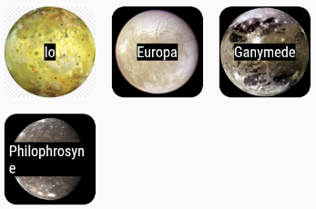
Look at the Details Tree for the Text widget to see the reason for this wrap.

The Text widget has a softWrap property that controls how a text content behaves when it no longer fits its parent boundary. By default, softWrap is set to true, causing the excess content to be wrapped into the next line. A better alternative in this case would be to scale the name so it fits perfectly. This is exactly the usecase for FittedBox.
softWrap property to false causes the excess text to clip.
Open lib/widgets/moons_grid.dart and replace the child below //TODO add FittedBox with the following code snippet:
child: FittedBox(
   child: Padding(
   padding: const EdgeInsets.all(5.0),
   child: Container(
       color: Colors.black,
       child: Text(
         _item.name,
         style: const TextStyle(fontSize: 18.0, color: Colors.white),
      ),
    ),
  ),
),
Hot reload and observe that now the name fits perfectly without wrapping, thanks to the FittedBox.
