SF Symbols 3 for iOS: What’s New
Learn how to use the new features on SF Symbols 3, which allows you to customize colors, shading, accessibility and localization, as well as add custom symbols more easily.
Version
- Swift 5.5, iOS 15, Xcode 13

SF Symbols 3 is a curated set of icons and symbols designed by Apple and available starting in iOS 13. The symbols are also available for macOS, iPadOS, tvOS and watchOS. Each SF Symbol is highly configurable and designed to align with text in all weights and sizes with the San Francisco system font. Many of the symbols provide built-in icons for common tasks and content types so your users will effortlessly understand them. They add elegance and intuition to your apps.
With the latest update, Apple added more than 600 new symbols and icons. This brings the total to over 3,100 different symbols! This version supports customizing colors and shading in new ways and also includes new accessibility and localization capabilities. It even has new localized symbols for specific languages, including Arabic, Chinese, Devanagari, Hebrew, Japanese, Korean, Latin and Thai. Finally, the newest export template for symbols allows you to more easily add custom symbols and use most of these new capabilities for them.
In this tutorial, you’ll learn about the latest improvements to SF Symbols, including:
- New hierarchical and palette rendering modes.
- Symbol variants.
- How to use font weights with symbols.
- How to add a custom symbol to your SF Symbols app and your iOS app.
Finally, you’ll learn how to use the SF Symbols 3 Mac app to examine the symbols’ new capabilities without coding.
Getting Started
To get started, download the project materials using Download Materials at the top or bottom of this tutorial. Then, open the starter project in Xcode.
The app displays the current status of Tube lines in London, UK. You’ll spice up its interface with new SF Symbols capabilities, and you’ll take advantage of the new rendering modes, symbol variants and font weights. Then, you’ll add a custom symbol to add clarity to one of the status codes.
Before you build and run the app, it’s important to understand that this project has two different build schemes: TubeStatus and Debug Data. The TubeStatus scheme attempts to connect to a live API and display real-time status information. This won’t work until you register an account with the API near the end of this tutorial. The bulk of this tutorial uses the Debug Data scheme, with a fixed status for each stop that displays each different status symbol used by the app.
Choose the Debug Data scheme. Then build and run the app in the simulator.
Getting Acquainted With TubeStatus
The TubeStatus app is an updated version of the app from the SF Symbols for iOS: Getting Started tutorial.
In this tutorial, you’ll work with:
-
TubeStatusView.swift, which has a
TubeStatusView
that displays aLineStatusRow
for each tube line. -
LineStatusRow.swift and
LineStatusRow
. Each line status uses an SF Symbol icon that corresponds to its status.TFLLineStatus
instances control the status symbols and colors. -
TFLLineStatus.swift, the
static tflLineStatus(from:)
function looks up the status by name from a dictionary of all the defined statuses. Each status definition includes a name, color and symbol.
Viewing Symbols in the SF Symbols 3 App
Time to look at what’s new in SF Symbols 3 in more detail. You’ll do this in the SF Symbols App for macOS. If you don’t have this installed or don’t have the latest version, download it from Apple.
Open SF Symbols 3 and click What’s New. You can peruse the 600+ new symbols added since SF Symbols 2. Scroll through them to see the rich variety of symbols representing actions, devices, connectivity and much more.
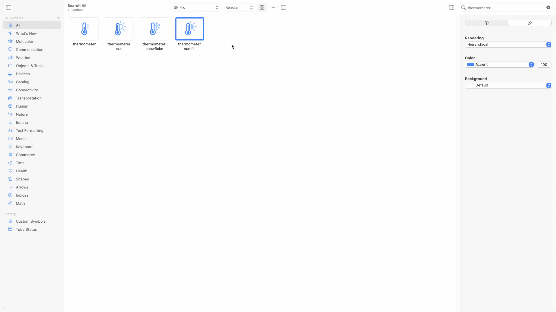
To see some of the richness of the new symbols, type thermometer into the search bar in the top-right corner. Then, tap thermometer.sun.fill to open the right-hand side panel. In that panel, tap the ⓘ tab. The info tab displays information about which renderings are available for the symbol. The info tab also indicates in which version of SF Symbols they became available. This is important if you have to support earlier iOS versions.
Before moving on, tap thermometer.sun. Notice that this symbol doesn’t have a multicolor option. It pays to explore these things in the app before attempting to use them in your own app.
Rendering Modes
Tap thermometer.sun.fill again. Next, tap the paintbrush tab in the right-hand side panel. Preview each rendering mode for a symbol. For Rendering, choose Monochrome. This defaults to showing you the monochrome version of the symbol. Choose different colors to see how it might look in your app. Note that you have the option of the system’s Primary, Secondary, Tertiary, Quaternary or Accent colors in addition to named or custom colors. You can also experiment with different background colors to get a feel for Light or Dark mode appearances.
Next, choose Hierarchical rendering. This is a new rendering mode as of SF Symbols 3. This rendering uses a strong primary color for the thermometer and a lighter shade for the sun. Hierarchical rendering can add emphasis to part of the symbol. One such use is in a weather app where the thermometer is the more important part of the symbol. It uses only one primary color, and the shading then uses a shade of that same color. Choose different colors to see how this works.
Now, choose Palette rendering. Palette rendering mode is also new to SF Symbols 3. In palette rendering, you have separate control of the colors for different parts of the symbol. Experiment with changing the first and second colors to see the different possibilities.
Symbol Localization
Symbol localization is another enhancement in SF Symbols 3. In the search bar, type book and tap the book.closed.circle symbol that appears. Then, choose the ⓘ tab. As you can see, this symbol adapts itself to left-to-right languages such as English or French or right-to-left languages such as Hebrew or Arabic.
Now, tap the character.book.closed symbol. This symbol has variations for Latin, Arabic, Hebrew, Hindi, Japanese, Korean, Thai and Chinese languages.
Now, it’s time to get back to the TubeStatus app.
Adding a Symbol to a Button
One good use of symbols is on buttons to help make their intended use more intuitive. You can use either the symbol by itself or combine it with text. Time to add a symbol to the Refresh button.
Open TubeStatusView.swift. Scroll down to navigationBarItems and find Text("Refresh")
. Replace it with the following code:
//1
HStack(spacing: 10) {
//2
Image(systemName: "arrow.triangle.2.circlepath")
Text("Refresh")
}
Here’s what this code does:
- Create a horizonal stack for the image you’re adding and the original text label.
- Use the SF Symbol name arrow.triangle.2.circlepath to fetch the symbol image.
Build and run. Now, the Refresh button has a refresh symbol on it. Nice!
Using Hierarchical Rendering
Now, you can put that new hierarchical shading option to use. Many of the Tube status symbols used in LineStatusRow
have hierarchical rendering options. Why not use it for all status rows?
Open LineStatusRow.swift. In body
, find status.uiImage()
and place the following code below .padding(.trailing)
:
.symbolRenderingMode(.hierarchical)
This code simply invokes the hierarchical rendering mode.
Build and run. Scroll through the different Tube lines. Notice the shading applied to many of the symbols. Nice, huh? Symbols that don’t have hierarchical rendering simply ignore the modifier and continue to render as monochrome.
Using Palette Rendering
Now, it’s time to give palette rendering a try. Run the app and scroll to the bottom — you’ll see the label indicating when the data was last updated. Plain text is so boring! Time to spice it up with a colorful symbol.
Open TubeStatusView.swift. Inside ScrollView
, replace Text("\(tubeStatus.lastUpdated)")
as well as the .font(.footnote)
and .padding()
modifiers with the following:
//1
HStack {
//2
Image(systemName: "clock.badge.checkmark")
.imageScale(.large)
.padding()
//3
.symbolRenderingMode(.palette)
//4
.foregroundStyle(Color(uiColor: .systemGreen), Color(uiColor: .label))
Text("\(tubeStatus.lastUpdated)")
.font(.footnote)
.padding()
}
Here’s what this code does:
- Define a horizontal stack to hold both the symbol and the text label.
- Load the clock.badge.checkmark image.
- Set the rendering mode to
.palette
so you can specify the colors to use. - Use the
.foregroundStyle()
modifier to specify system colors to use for the two layers in the image.
In .foregroundStyle()
, you can specify up to three colors. If you specify more colors than there are layers in the image, any unused colors are simply ignored. clock.badge.checkmark has two layers.
Build and run the app. Scroll to the bottom to see the new symbol.
Understanding Symbol Variants
Symbol variants are another new feature of SF Symbols 3. Examples of variants are:
- circle — example: play.circle
- square — example: play.square
- slash — example: play.slash
- fill — example: play.fill
- rectangle — example: play.rectangle
In many cases, the view that displays a symbol chooses a variant for you. For example, an iOS tab bar prefers the fill variant, and a navigation bar prefers the default variant. If you don’t specify the variant, the view may choose for you.
Open the SF Symbols 3 app and type play in the search bar. This displays all the symbol’s variants.
Using Symbol Variants
You can use different variants to spice up the clock.badge.checkmark symbol you used with the Last updated footnote.
Go back to Xcode and open TubeStatusView.swift. Add the following code just below the .padding()
modifier for the clock.badge.checkmark Image
.
.symbolVariant(.fill)
Build and run. Scroll down to the footnote and notice how the clock part of the symbol is now filled in.
Using Font Weights
Since SF Symbols is a font, you can use font stylings to alter their appearance. Next, you’ll add some font stylings to tweak the appearance of clock.badge.checkmark. The goal is to better match the footnote text.
Open TubeStatusView.swift. Add the following code just below the .padding()
modifier for the clock.badge.checkmark.
.font(Font.title2.weight(.regular))
Build and run. Scroll down to the footnote and notice how the symbol is a little bit larger and heavier. Nice touch and so easy to do! For extra credit, feel free to try other font sizes and weights to see how the symbol renders.
Customizing a Symbol
Adding your own custom symbols isn’t new in SF Symbols 3. However, new template formats make it much easier to add the full complement of symbol sizes, variants and localization capabilities.
Look at the status of the Picadilly stop, about midway down the list. exclamationmark.square represents No Step-Free Access — it’s not especially intuitive. You can do better! For example, a symbol showing someone walking on steps would better communicate that this stop requires using stairs.
Assets.xcassets has a custom.figure.steps symbol. This symbol is based on the figure.walk symbol. The process below shows how to create this symbol.
First, export the figure.walk symbol template using the SF Symbols 3 app. Choose File ▸ Export Template…, specifying the Variable Template Setup. This allows you to modify only three variants and let SF Symbols duplicate the rest. Name the file custom.figure.steps.
Edit in Sketch or any drawing app of your choice. Be sure to use vectors to draw shapes so they’re scalable. The variable template only has three symbols to modify: Ultralight-S, Regular-S and Black-S. From those, SF Symbols 3 creates the other size and weight variations for you. What a time saver! Export your modified or custom symbol as an SVG from your drawing app.
Next, in the SF Symbols app, choose Custom Symbols in the left-side panel. Drag and drop the .svg file from Finder into the SF Symbols 3 app. Now, you can separate the symbol into layers for hierarchical or palette rendering. Use drag-and-drop to create a new layer. Assign primary and secondary colors to the layers you want to emphasize or de-emphasize. You can have up to four separate layers. custom.figure.steps has two.
Once the symbol is the way you want it for your app, export it. Choose File ▸ Export Symbol…. Name the file custom.figure.steps and save it.
Finally, open Finder to show custom.figure.steps.svg and then drag and drop it into Assets.xcassets in Xcode. Make sure the asset name is custom.figure.steps.
Using a Custom Symbol
In Xcode, open TFLLineStatus.swift and find the noStepFreeAccess static variable. Replace image: Image(systemName: "exclamationmark.square"))
with the following:
image: Image("custom.figure.steps"))
This code loads custom.figure.steps from Assets.xcassets. Since the image is in assets, you don’t specify the systemName
argument label.
Build and run. Scroll down to the Picadilly stop and check out the new symbol. It’s much more helpful for those who need to avoid stairs.
Connecting to the TransportAPI
Up to now, you’ve done everything with debug data that allowed you to see all the possible status symbols. Time to try this out with some real-time status data from TransportAPI. For that, you’ll need to register and get an API key to use this real-time service.
Go to the TransportAPI Developer Portal. Fill out the form, check the reCAPTCHA checkbox, and click Sign up at the bottom of the form. A confirmation screen will ask you to check your email.
You’ll receive two emails. The first contains details on how to activate your account. The second confirms that you’ve successfully created a new Application Key.
Follow the instructions in the first email to activate your account. Then, sign in to your new account in the Developer Portal. The landing page shows you the credentials — App ID and App Key — that have just been created. Keep this tab open, as you’ll use these values shortly.
Now, it’s time to connect the Transport API to your app.
In Xcode, open Debug.xcconfig. Here, you’ll find TRANSPORT_API_SERVICE_APP_ID
and TRANSPORT_API_SERVICE_APP_KEY
with dummy values. Set each to the values provided by the TransportAPI Developer Portal.
Build and run your app using the TubeStatus scheme. Depending on the time of day in London, UK, this may result in either mostly Good Service or Service Closed statuses. Your mileage may vary!
Understanding Restrictions on Using SF Symbols
You need to be aware of some limitations when using SF Symbols. SF Symbols are considered system-provided images as defined in the Xcode and Apple SDK license agreements. Here are some of the key points:
- You may not use the symbols in your app icons, logos or trademarks.
- Certain symbols aren’t allowed to be exported, modified or used for any purpose other than Apple-specific technologies.
- SF Symbols 3 shows you any additional use restrictions in the info tab.
The full text of the license agreements is on Apple’s site. You should be familiar with these agreements if you’re publishing apps — don’t rely solely on this tutorial!
Where to Go From Here?
You can download the completed project files by clicking Download Materials at the top or bottom of the tutorial.
You’ve covered a lot of ground in this tutorial and you’ve seen that using SF Symbols is simple. You’ve also seen that the SF Symbols 3 app provides ways to easily find and use the right symbol you need. Now, you can get busy using them in all your apps. Remember, SF Symbols are available for iPadOS, tvOS, watchOS and macOS too.
To go even deeper with SF Symbols, check out these additional sources of information:
- WWDC21 Talks:
- What’s New in SF Symbols
- Explore the SF Symbols 3 app
- SF Symbols in SwiftUI
- SF Symbols in UIKit and AppKit
- Create custom symbols
- The relevant Apple Human Interface Guidelines are also helpful.
We hope you enjoyed this tutorial, and if you have any questions or comments, please join the forum discussion below!
Comments