An Introduction to Material Design with Kotlin
In this tutorial you’ll learn how to integrate Material Design into an existing app and create delightful interactions using the animation APIs. By Aaqib Hussain.
Adding a Reveal Animation
Now you want to give your users the ability to add notes about what they’d like to do in each of these stunning places. For this, activity_detail.xml already has an edittext that is hidden by default. When a user taps the FAB, it reveals itself with a cool animation like below:

Open DetailActivity. There are two methods you have yet to implement:
revealEditText()hideEditText()
First, add the following lines inside revealEditText():
val cx = view.right - 30
val cy = view.bottom - 60
val finalRadius = Math.max(view.width, view.height)
val anim = ViewAnimationUtils.createCircularReveal(view, cx, cy, 0f, finalRadius.toFloat())
view.visibility = View.VISIBLE
isEditTextVisible = true
anim.start()
The two int values are getting the x and y positions of the view with a slight offset. This offset gives the illusion that the reveal is happening from the direction of your FAB.
Next, the radius gives the reveal the circular outline that you can see in the GIF above. All of these values — the x-position, y-position, and the radius — you pass into the animation instance. This animation is using ViewAnimationUtils, which gives you the ability to create this circular reveal.
Since the EditText view is initially hidden, you set the view’s visibility to VISIBLE and set your boolean check isEditTextVisible to true. Finally, you can call start() on the animation.
To dismiss the view, add the following to hideEditText():
val cx = view.right - 30
val cy = view.bottom - 60
val initialRadius = view.width
val anim = ViewAnimationUtils.createCircularReveal(view, cx, cy, initialRadius.toFloat(), 0f)
anim.addListener(object : AnimatorListenerAdapter() {
  override fun onAnimationEnd(animation: Animator) {
    super.onAnimationEnd(animation)
    view.visibility = View.INVISIBLE
  }
})
isEditTextVisible = false
anim.start()
Here your goal is to hide the view and show the circular animation in the opposite direction. Therefore, you make the initial radius the width of the view and the ending radius 0, which shrinks the circle.
You want to show the animation first and then hide the view. To do this, you implement an animation listener and hide the view when the animation ends.
Now build and run and see this animation in action!
Note: If the keyboard presents itself, you’ll need to dismiss it explicitly to see the effect without obstruction. Comment out the call to inputManager.showSoftInput(...) in DetailActivity, but don’t forget to uncomment it. Oh, and don’t worry that your button doesn’t show the plus icon yet, you’ll fix that soon.
Morphing a Bezier Path for a Floating Action Button
Now that you have your reveal animation hiding and showing the edit text field, you can coordinate the icon on your FAB to look and respond just like the one shown below:
The starter project includes the vector paths for the plus and checkmark icons. You’ll learn how to animate – or morph – the paths from the plus to the checkmark, and vice versa.
Under the res/drawables directory, create a new resource file by going to New\Drawable resource file. Call it icn_morph and define animated-vector as the root element:
<?xml version="1.0" encoding="utf-8"?>
<animated-vector xmlns:android="http://schemas.android.com/apk/res/android"
  android:drawable="@drawable/icn_add">
</animated-vector>
animated-vector requires an existing android:drawable. In this case, the animated vector will start with a plus sign and morph into a checkmark, so you’ll set the drawable to icn_add.
Now for the actual morphing, add the following inside the animated-vector tag:
<target
  android:animation="@anim/path_morph"
  android:name="sm_vertical_line" />
<target
  android:animation="@anim/path_morph_lg"
  android:name="lg_vertical_line" />
<target
  android:animation="@anim/fade_out"
  android:name="horizontal_line" />
With the code above, you are essentially transforming the vertical line of the plus icon into a checkmark while fading out the horizontal line, as the diagram below illustrates:
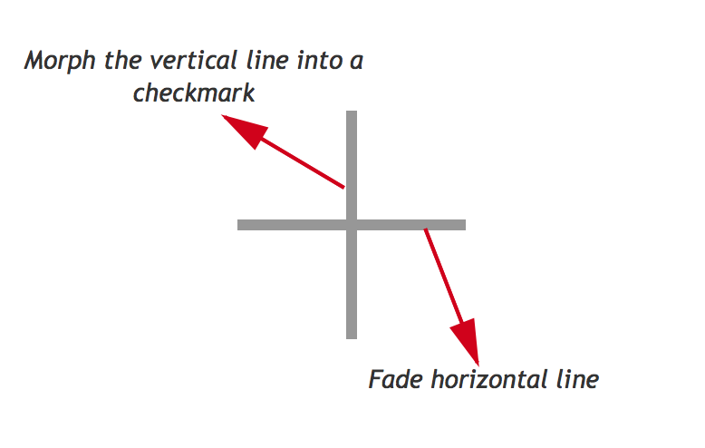
Furthermore, the vertical line is comprised of two paths, a smaller vertical line and a larger one:
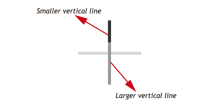
You can see from the diagram above that you can transform the first two targets, sm_vertical_line and lg_vertical_line, into a checkmark by drawing their paths at different angles, which is exactly what you do in the previous code block, along with fading out horizontal_line.
Next, you need to reverse this animation to transform the checkmark back into a plus sign. Create another drawable resource file, this time calling it icn_morph_reverse, and replace it’s contents with the following:
<?xml version="1.0" encoding="utf-8"?>
<animated-vector xmlns:android="http://schemas.android.com/apk/res/android"
  android:drawable="@drawable/icn_add">
  <target
    android:animation="@anim/path_morph_reverse"
    android:name="sm_vertical_line"/>
  <target
    android:animation="@anim/path_morph_lg_reverse"
    android:name="lg_vertical_line" />
  <target
    android:animation="@anim/fade_in"
    android:name="horizontal_line" />
</animated-vector>
The two lines that make up the final vertical line in the plus icon will now morph back into their original states and the horizontal line will fade into view, creating a smooth effect.
Now, to complete the animation. Open DetailActivity.kt and add the following to onClick(), at the end of the if branch before the else:
addButton.setImageResource(R.drawable.icn_morph)
val animatable = addButton.drawable as Animatable
animatable.start()
Here you set the image resource of the button to the icn_morph drawable you created earlier, extract the animatable from it, and then kick-off the animation.
Finally, add the following to the very bottom of the else branch:
addButton.setImageResource(R.drawable.icn_morph_reverse)
val animatable = addButton.drawable as Animatable
animatable.start()
Here you’re doing almost exactly the same as the previous step, except you assign icn_morph_reverse as the image resource so the animation plays out in the opposite direction.
Along with morphing the icon, the user’s click also adds the text from todoText to the toDoAdapter and refreshes the place activity list. This is not yet visible because of the white text, but in the next section, you’ll add vibrant color to your views so that the text stands out.
Build and run, and watch the magic unfold before your eyes! The FAB icon now morphs between a checkmark and a plus sign when it’s tapped.

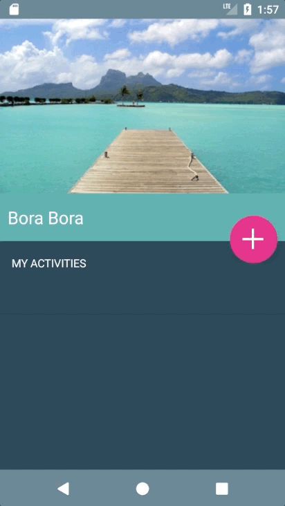
Adding Dynamic Colors to Views Using Palette API
It’s time to add colors to this view using the Palette API. And not just any colors—as before, they will be dynamic colors!
In DetailActivity, flesh out colorize() by adding the following:
val palette = Palette.from(photo).generate()
applyPalette(palette)
Just like you did previously, you generate a palette from a photo – although this time you do it synchronously – and then pass that palette onto applyPalette(). Replace the existing method stub for applyPalette() with this code:
  private fun applyPalette(palette: Palette) {
    window.setBackgroundDrawable(ColorDrawable(palette.getDarkMutedColor(defaultColor)))
    placeNameHolder.setBackgroundColor(palette.getMutedColor(defaultColor))
    revealView.setBackgroundColor(palette.getLightVibrantColor(defaultColor))
  }
Here you’re using the dark muted color, the muted color, and the light vibrant color as the background colors of the window, title holder, and reveal view respectively.
Finally, to kick-off this chain of events add the following line to the bottom of getPhoto():
colorize(photo)
It’s that time again… build and run your app! You can see the detail activity is now using a color scheme derived from the palette of the associated image.