PaintCode Tutorial: Dynamic Buttons
Learn how to make beautiful resizable and recolorable buttons, using a popular tool called PaintCode that automatically creates Core Graphics code for you as you draw!
Version
- Other, Other, Other

PaintCode is a neat app where you can draw user interfaces like in Photoshop – but instead of generating an image, it generates Core Graphics code!
This is really cool for several reasons:
- Saves development time. If you were writing the Core Graphics code manually, it would take you much longer than using PaintCode. And time is money!
- Saves binary size. By drawing a view in code, you no longer have to include the images in your binary, reducing your binary size.
- Make it dynamic. And finally, since you’re creating your view in code you can do some cool things you couldn’t do if you were pre-generating the graphics – like easily changing the color of various aspects of the control at runtime.
Full disclosure: We received some review copies of PaintCode to generate this tutorial. However, any opinions in this article are honest and my own.
To get the most of this tutorial, you need some basic knowledge of iOS development. Also, it is helpful (but not 100% necessary) if you have some basic knowledge of Core Graphics. If you are new to Core Graphics, check out our Core Graphics tutorial series.
Without further ado, it’s time to get started!
Getting Started
To follow along with this set of PaintCode tutorials, you’re going to need PaintCode. You can download the trial app, or you can get the full app on the Mac App Store.
Note: If you’re reading this post during WWDC 2013, you are in luck: PaintCode is currently having a 25% off WWDC sale!
Even though the app is expensive, in my opinion it is well worth the price for the reasons explained in the introduction. But if you’re not sure, download the trial and go through this tutorial to see for yourself!
Creating Your First Dynamic Button
Before writing a single line of code, you’ll use PaintCode to design your entire button from scratch.
Launch PaintCode, go to File\Save, and name your project DynamicButton. This way you can periodically save your work as you go through this tutorial.
Click the Canvas button on the bottom right of the screen, and set the canvas size to be 480 by 150 pixels as shown in the screenshot below:
Now change the color of the canvas to dark grey by clicking on the Underlay color value and entering 50 50 50 for the RGB values, as so:
Note: By default you are working on the non-retina version. If you’d like to view the retina version, click the Retina button next to the Canvas button. It’s a toggle button which will switch you between the retina and non-retina versions.
Now click the Round Rect button in the top toolbar and drag out a rectangle in your canvas.
You’ll notice that when you select a shape on your canvas, the panel on the left displays the properties for that shape. So ensure that the rounded rect on your canvas is selected, and set the following properties:
- X: 4
- Y: 4
- Width: 473
- Height: 41
Next you need to change the Fill value to set the button color.
In the left hand pane, click on the value for Fill, choose Add New Gradient… from the pop up dialog, and name the new gradient ButtonGradient. Now, click on the bottom left color stop. The color stops are the circles along the bottom edge of the gradient which indicate the various colors that compose the gradient.
Next, click on the color swatch on the lower right of the dialog, and enter 255 0 0 for the RGB values, as shown in the screenshot below:
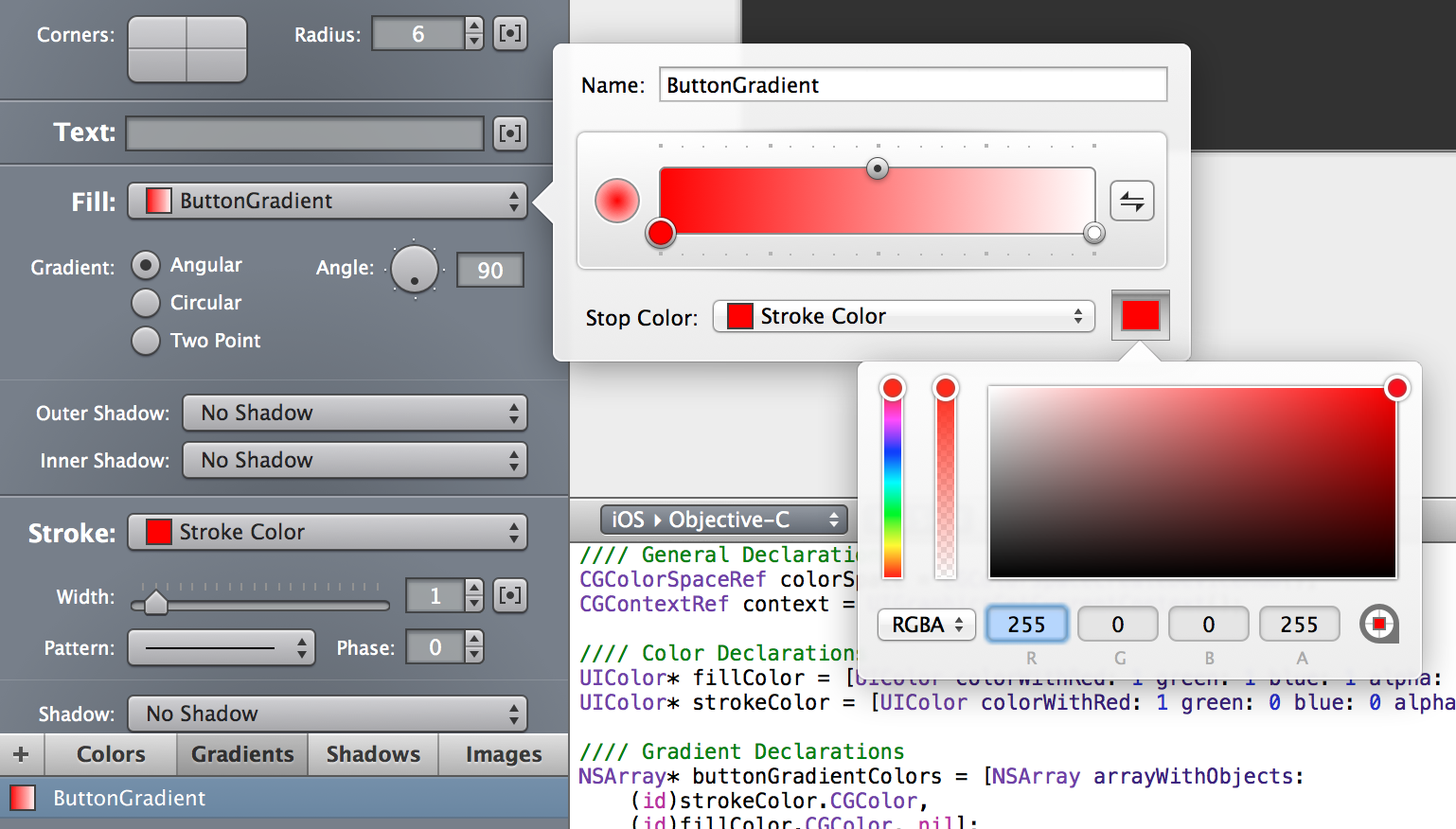
Click the color swatch again to close the color dialog.
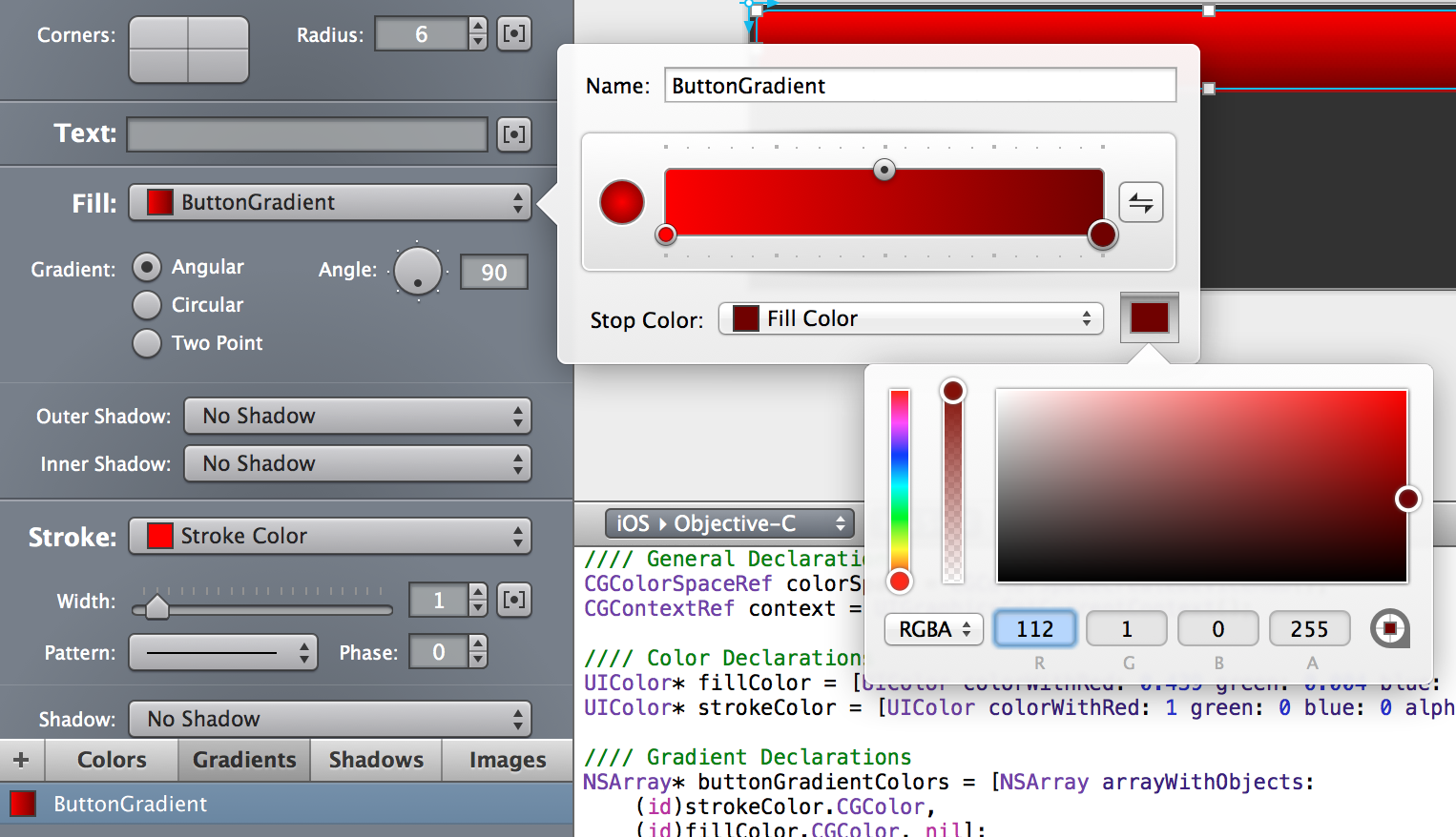
Now, click on the right color stop, click on the color swatch, and modify the RGB values to 112 1 0 as below:
PaintCode provides you with the ability you to name each color used in a shape so that you can refer to them later in your code. If the Code pane isn’t open at the bottom of your window, use the View > Code menu option to open it. Take a look at the code created, and you should see the references to the two colors you just created, as highlighted in the following image:
It’s a good idea to give your colors descriptive names to keep track of them.
Select the Colors tab located on the bottom section of the left panel, then double-click Fill Color. Change the Name value on the pop up to ButtonColorDark, as shown below:
Give this color a name as well, following the same steps as above to rename Stroke Color to ButtonColorLight.
Switch back to the shape properties in the center section of the left pane. Click on the Stroke dropdown and choose System Colors > Common Colors > BlackColor, to change the stroke color to black, as illustrated below:
Increase the Width parameter to 2 under the Stroke sub-section, as so:
Now give the button an outer glow by selecting Add New Shadow… from the dropdown for Outer Shadow under the Fill sub-section, like in the screenshot below:
Change the Name of the shadow to OuterGlow; this gives it a memorable name just as you did with the colors above. Next, click on the dropdown menu next to Color, and click on the white square in the color grid. Click on the color rectangle, which is now white, and lower the opacity to 128.
Change the offsets and blur radius as shown below, and click outside the popup to close it:
Move to the Colors tab and rename Glow to InnerGlowColor.
Next, add an inner highlight to Inner Shadow by selecting Add New Shadow… from the dropdown. Rename the shadow to Highlight, set the color to white, the alpha to 130, and change the offsets and blur radius as shown below:
The color name may already be set to Shadow Color 2 depending on the workflow you followed, but if not, modify the name of this color to match.
Your button should look like the one below:
At this point, the button looks pretty cool, but it’s just a fixed size. To make it resizable, you need to put a frame around it. The idea is that in code you will change the size of this frame, and in the next few steps you will set up PaintCode so that anything inside the frame resizes appropriately.
Adding a Button Frame
Select Frame from the top toolbar and draw a frame around the button shape. Set the frame properties as shown below:
Multi-select the Frame and the Rounded Rectangle shapes, and group them using the Option-Command-G key combination. Alternately, you can use the Selection > Group menu item to perform the same task. Rename the group to Button.
Note that you can now see the grouped shape and its two sub-shapes in the top section of the left hand pane, as shown below:
Select the Rounded Rectangle in the left panel. Look at the icon showing the item constraints – it’s the box within a frame, with straight bars and springs next to the shape placement and dimension values.
You’ll want your button to be resizable horizontally and vertically, while remaining centered horizontally in the frame. This means the top, left, and right constraints connecting the frame and the box should be straight (think rigid), and the bottom should be a spring (think flexible). This will keep the button centered in the frame.
However, inside the box, the vertical and the horizontal constraints should be springs. This allows the button to stretch to fill the frame.
To modify the constraints of your object, simply click the straight rod or the spring representing the constraint you wish to change to alternate it between a straight rod and a spring.
When you have finished modifying the constraints, they should look like the image below:
All done? Great! Now you can select the Frame surrounding your button, and drag its transform handles around the screen to see the button resize, just as in the screenshot below:
That completes the creation of your button in PaintCode — now you’re ready to hook it up with some code.
Bringing Your Button Into Your iOS App
You now have a complete button to use in your project — all without writing a stitch of code! But don’t worry, code fiends, it’s time to roll up your sleeves and use this new button in your project.
There’s a starter project all ready for you that you can use to showcase your new button.
Download the PaintCode Starter Project, extract it to a suitable location on your hard drive, open it in Xcode, and take a look at what’s already in place.
Note: The storyboard for the project has Auto Layout turned off. It’s not a requirement for all new projects, but in this case the elements work better with the good old springs and struts.
The project is a tab bar application with three view controllers; one for each PaintCode element you’ll create in each part of this series. In this PaintCode tutorial you will use the ButtonViewController
class to host your new dynamic button.
There’s also an empty folder within Classes > Views. In this series, this is where you are going to be creating your custom controls. Rather than creating a control from scratch, you will be subclassing existing controls and replacing the draw code.
In this tutorial, you will be subclassing UIButton. Let’s get started!
Creating Your Custom Button
Inside the Classes folder, right-click on the Views folder. Select New\File… and create a new file with the iOS\Cocoa Touch\Objective-C class template. Name the class ButtonView, and make it a subclass of UIButton
.
This class will draw the custom button using the code created by PaintCode.
To get your view all ready for your custom button, open ButtonView.m, delete the initWithFrame:
method and uncomment the code for drawRect:
. The file should now look like this:
#import "ButtonView.h"
@implementation ButtonView
- (void)drawRect:(CGRect)rect
{
// Drawing code
}
@end
drawRect:
is where the magic happens – this is where you will be putting the code that was generated by PaintCode. If you are not familiar with drawRect:
and what it does, refer back to our Core Graphics tutorial series.
Switch back to PaintCode and make sure the Code View is visible. If it’s not visible, use the View > Code menu option to make it visible. Find the option settings along the bottom edge of the main PaintCode view, as shown in the image below:
Set the platform to iOS > Objective-C, the OS version to iOS 5+, origin to Default Origin, and memory management to ARC. If this is your first time using PaintCode — or you haven’t mucked about with these settings before — everything except for memory management should already be set correctly by default.
Copy and paste the code from PaintCode’s code view into drawRect:
. The method should now look like the following:
- (void)drawRect:(CGRect)rect
{
//// General Declarations
CGColorSpaceRef colorSpace = CGColorSpaceCreateDeviceRGB();
CGContextRef context = UIGraphicsGetCurrentContext();
//// Color Declarations
UIColor* buttonColorDark = [UIColor colorWithRed: 0.439 green: 0.004 blue: 0 alpha: 1];
UIColor* buttonColorLight = [UIColor colorWithRed: 1 green: 0 blue: 0 alpha: 1];
UIColor* innerGlowColor = [UIColor colorWithRed: 1 green: 1 blue: 1 alpha: 0.502];
UIColor* shadowColor2 = [UIColor colorWithRed: 1 green: 1 blue: 1 alpha: 0.51];
//// Gradient Declarations
NSArray* buttonGradientColors = [NSArray arrayWithObjects:
(id)buttonColorLight.CGColor,
(id)buttonColorDark.CGColor, nil];
CGFloat buttonGradientLocations[] = {0, 1};
CGGradientRef buttonGradient = CGGradientCreateWithColors(colorSpace, (__bridge CFArrayRef)buttonGradientColors, buttonGradientLocations);
//// Shadow Declarations
UIColor* outerGlow = innerGlowColor;
CGSize outerGlowOffset = CGSizeMake(0.1, -0.1);
CGFloat outerGlowBlurRadius = 3;
UIColor* highlight = shadowColor2;
CGSize highlightOffset = CGSizeMake(0.1, 2.1);
CGFloat highlightBlurRadius = 2;
//// Frames
CGRect frame = CGRectMake(0, 0, 480, 49);
//// Button
{
//// Rounded Rectangle Drawing
CGRect roundedRectangleRect = CGRectMake(CGRectGetMinX(frame) + 4, CGRectGetMinY(frame) + 4, CGRectGetWidth(frame) - 7, 41);
UIBezierPath* roundedRectanglePath = [UIBezierPath bezierPathWithRoundedRect: roundedRectangleRect cornerRadius: 6];
CGContextSaveGState(context);
CGContextSetShadowWithColor(context, outerGlowOffset, outerGlowBlurRadius, outerGlow.CGColor);
CGContextBeginTransparencyLayer(context, NULL);
[roundedRectanglePath addClip];
CGContextDrawLinearGradient(context, buttonGradient,
CGPointMake(CGRectGetMidX(roundedRectangleRect), CGRectGetMinY(roundedRectangleRect)),
CGPointMake(CGRectGetMidX(roundedRectangleRect), CGRectGetMaxY(roundedRectangleRect)),
0);
CGContextEndTransparencyLayer(context);
////// Rounded Rectangle Inner Shadow
CGRect roundedRectangleBorderRect = CGRectInset([roundedRectanglePath bounds], -highlightBlurRadius, -highlightBlurRadius);
roundedRectangleBorderRect = CGRectOffset(roundedRectangleBorderRect, -highlightOffset.width, -highlightOffset.height);
roundedRectangleBorderRect = CGRectInset(CGRectUnion(roundedRectangleBorderRect, [roundedRectanglePath bounds]), -1, -1);
UIBezierPath* roundedRectangleNegativePath = [UIBezierPath bezierPathWithRect: roundedRectangleBorderRect];
[roundedRectangleNegativePath appendPath: roundedRectanglePath];
roundedRectangleNegativePath.usesEvenOddFillRule = YES;
CGContextSaveGState(context);
{
CGFloat xOffset = highlightOffset.width + round(roundedRectangleBorderRect.size.width);
CGFloat yOffset = highlightOffset.height;
CGContextSetShadowWithColor(context,
CGSizeMake(xOffset + copysign(0.1, xOffset), yOffset + copysign(0.1, yOffset)),
highlightBlurRadius,
highlight.CGColor);
[roundedRectanglePath addClip];
CGAffineTransform transform = CGAffineTransformMakeTranslation(-round(roundedRectangleBorderRect.size.width), 0);
[roundedRectangleNegativePath applyTransform: transform];
[[UIColor grayColor] setFill];
[roundedRectangleNegativePath fill];
}
CGContextRestoreGState(context);
[[UIColor blackColor] setStroke];
roundedRectanglePath.lineWidth = 2;
[roundedRectanglePath stroke];
}
//// Cleanup
CGGradientRelease(buttonGradient);
CGColorSpaceRelease(colorSpace);
}
If you read through the code, you will see that it’s using Core Graphics to do the drawing. Although some (or most) of the methods may be new to you, they aren’t really that difficult to understand. Besides, this is what our friend Mr. PaintCode is here for; to avoid having to learn Core Graphics and spend sleepless nights struggling with custom drawing code! :]
Note: Don’t worry about the code, spacing or syntax in drawRect:
for now. You’ll come back to this code shortly and make some edits to this method, including updating the syntax to modern Objective-C.
Now it’s time to test the button.
Locate the storyboard in your Project Navigator and go to the ButtonViewController scene. Drag a View object from the Object Library and set its X and Y coordinates to 20 and 35. Next, set its Width and Height to 280 and 41.
Finally, update the view’s Autosizing widget so it only allows the button to resize horizontally, as shown below:
Switch to the Identity Inspector and set the class to ButtonView
.
Note:You might be wondering why you used a UIView
in the storyboard, when ButtonView
is a subclass of UIButton
. The reason is that UIButton
is a subclass of UIView
and thus a button is a view.
Later on in this PaintCode tutorial you will make the button act and behave just like it should. After all — it is a UIButton
subclass!
Time to test things and see your new custom control in action!
Click Run and take a look at your shiny new button for the very first time:
Umm…the button looks kinda cut off. What’s going on?
Take a look at drawRect:
in ButtonView.m:
- (void)drawRect:(CGRect)rect
{
...
//// Frames
CGRect frame = CGRectMake(0, 0, 480, 49);
...
}
Aha! The button’s frame is being calculated with fixed values for width and height. What you want is to have dynamic width and height values — and respond accordingly to the frame you use to create the button.
To fix this situation this, simply modify the line which sets the frame
variable as follows:
- (void)drawRect:(CGRect)rect
{
...
//// Frames
CGRect frame = rect;
...
}
The above code simply sets the view’s frame as the frame for drawing the button.
Run the project one more time and behold!
Yay! The button is being drawn just as intended. Rotate your simulator (or your device) and notice how the button resizes horizontally but keeps its height, just as expected.
You’ve made great progress so far — but what if you made the button even more dynamic?
Setting Button Properties Dynamically
Controlling the button’s size dynamically is one thing — but you’re going to take things to the next level and add some sliders to the ButtonViewController
scene that control the RGB values for the color of the button.
Switch back to the storyboard and add three Slider objects from the object library and position them right below the button view. In the Size Inspector, update the Autosizing widget for all three sliders as shown:
Optionally, you can move the button down a bit and add a label right above the button that reads “Tap Me” so your users know that it’s a button they can tap and interact with. This is what the scene should look like at this point:
In the Attributes Inspector, change the Min Track Tint color of the sliders to the following RGB values:
- Top slider: R:255 G:0 B:0
- Middle slider: R:0 G:255 B:0
- Bottom slider: R:0 G:0 B:255
Your sliders should now resemble the ones in the following screenshot:
Note: Sometimes the Background color of the slider changes when you set the Min Track Tint. This appears to be an issue with Xcode, but you can fix this by simply setting the Background color to Default.
Switch to ButtonViewController.m, and add the following import and class extension with outlets to the top of the file:
#import "ButtonView.h"
@interface ButtonViewController ()
@property (weak, nonatomic) IBOutlet UISlider *blueSlider;
@property (weak, nonatomic) IBOutlet ButtonView *buttonView;
@property (weak, nonatomic) IBOutlet UISlider *greenSlider;
@property (weak, nonatomic) IBOutlet UISlider *redSlider;
@end
Connect the buttonView
outlet to the UIView
for the button, and the UISlider
outlets to the corresponding sliders on the storyboard. If you are unsure how to connect views to outlets, check out our How To Create a Simple iPhone App series.
In order to make the button’s color change as you drag the sliders, the ButtonView
class needs to be updated as the slider values change.
Open ButtonView.h and add the following three properties between the @interface and @end lines:
@property (assign, nonatomic) CGFloat blueColor;
@property (assign, nonatomic) CGFloat greenColor;
@property (assign, nonatomic) CGFloat redColor;
These properties simply store the current RGB color of the button.
Now switch to ButtonView.m and take a look at drawRect:
. Notice how the section with the Gradient Declarations
uses the slightly longer (and older) array notation. To maintain good coding practices, replace the Gradient Declarations
line with the following code:
NSArray *buttonGradientColors = @[(id)buttonColorLight.CGColor, (id)buttonColorDark.CGColor];
Next, replace the whole section with the “Color Declarations” comment with the following code:
-(void)drawRect:(CGRect)rect {
...
// 1
UIColor *buttonColorLight = [UIColor colorWithRed:self.redColor green:self.greenColor blue:self.blueColor alpha: 1];
// 2
if (self.state == UIControlStateHighlighted) {
buttonColorLight = [UIColor colorWithRed:self.redColor green:self.greenColor blue:self.blueColor alpha:0.5];
}
// 3
CGFloat buttonColorLightRGBA[4];
[buttonColorLight getRed:&buttonColorLightRGBA[0]
green:&buttonColorLightRGBA[1]
blue:&buttonColorLightRGBA[2]
alpha:&buttonColorLightRGBA[3]];
// 4
UIColor *buttonColorDark = [UIColor colorWithRed:(buttonColorLightRGBA[0] * 0.5)
green:(buttonColorLightRGBA[1] * 0.5)
blue:(buttonColorLightRGBA[2] * 0.5)
alpha:(buttonColorLightRGBA[3] * 0.5 + 0.5)];
// 5
UIColor *innerGlowColor = [UIColor colorWithRed:1 green:1 blue:1 alpha:0.53];
UIColor *shadowColor2 = [UIColor colorWithRed:1 green:1 blue:1 alpha:0.51];
...
}
Here’s what the above code does:
- Creates a local
UIColor
variable for the light color of the button (remember, you set that up in the gradient editor) with the color values stored in the class properties. - Lowers the alpha value of the color to 50% if the user is touching the button, which is indicated by the
UIControlStateHighlighted
state. This gives the user some visual feedback for the button tap. - Loads the RGB color values for the light color into an array of
CGFloat
values. - Creates the button’s dark color (remember, you set that up in the gradient editor) based on the light color.
- Creates the inner glow and shadow colors based on static values.
It’s a good idea to start your application with a default color already set for the button. Since the button is loaded from a storyboard, you’ll need to implement initWithCoder:
(in ButtonView.m) to achieve this:
-(id)initWithCoder:(NSCoder *)coder {
if (self = [super initWithCoder:coder]) {
self.redColor = 1.0f;
self.greenColor = 0.0f;
self.blueColor = 0.0f;
self.contentMode = UIViewContentModeRedraw;
}
return self;
}
This sets the button’s initial color to red as soon as it is loaded from the storyboard, and the view’s content mode to UIViewContentModeRedraw
.
Note: If you’re wondering why initWithCoder:
was overridden and not initWithFrame:
, it’s because initWithFrame:
is used to create a view programmatically, whereas initWithCoder:
is used to create UI elements via a NIB or storyboard.
There’s one last thing to do before testing your changes. Switch to ButtonViewController.m and implement viewDidLoad
as follows:
-(void)viewDidLoad {
[super viewDidLoad];
[self.redSlider setValue:self.buttonView.redColor];
[self.greenSlider setValue:self.buttonView.greenColor];
[self.blueSlider setValue:self.buttonView.blueColor];
}
The above code sets the value for each slider to the RGB components of the button’s initial color.
Build and run, and modify the slider controls to see how the the button’s color changes, as demonstrated in the screenshot below:
Oh, wait — the app isn’t responding! Why is that?
There are outlets hooked up to the sliders, but currently ButtonViewController
has no way to detect or respond to changes in the slider values. You’ll need to add some IBAction
code to handle these changes.
Responding To Actions
Responding to events from the sliders and the button is not too difficult to implement.
Add the following method to ButtonViewController.m:
-(IBAction)sliderValueChanged:(UISlider *)slider {
if (slider == self.redSlider) {
self.buttonView.redColor = self.redSlider.value;
} else if (slider == self.greenSlider) {
self.buttonView.greenColor = self.greenSlider.value;
} else if (slider == self.blueSlider) {
self.buttonView.blueColor = self.blueSlider.value;
}
[self.buttonView setNeedsDisplay];
}
The above method receives a pointer to the slider whose value has changed. You compare the pointer against your slider outlets and update the button’s color according to the change made to the slider.
Notice that you call setNeedsDisplay
on the button at the very end of the method in order for the draw method to be called again to use the new color.
Now switch to the storyboard, right-click on each slider in turn, and connect the Value Changed event to the ButtonViewController's
sliderValueChanged:
method, as shown in the screenshot below:
Build and run your project again, and try once more to move the sliders around to change the button’s color, as below:
Hey — it works! You now have not only a dynamically sizing button, but one whose color can be changed dynamically as well.
Go ahead and tap on your button to see what happens.
Oh, right — it doesn’t appear to do anything yet. The button doesn’t highlight to indicate it was tapped, nor is there any indication that the button is billing your credit card for $99.95 at this very moment. (Just kidding! :])
There are no actions hooked up to this button at this point — that’s your next task!
Finishing Touches
Go back to ButtonView.m and add the following methods:
-(void)setEnabled:(BOOL)enabled {
[super setEnabled:enabled];
[self setNeedsDisplay];
}
-(void)setHighlighted:(BOOL)value {
[super setHighlighted:value];
[self setNeedsDisplay];
}
-(void)setSelected:(BOOL)value {
[super setSelected:value];
[self setNeedsDisplay];
}
The code above informs the button that it needs to redraw itself whenever it’s enabled and disabled, selected and unselected, or highlighted and unhighlighted. This allows the color changes for the highlighted state to show up.
Next, add the following method to ButtonViewController.m:
-(IBAction)buttonTapped:(UIButton *)button {
ButtonView *buttonView = (ButtonView *)button;
NSString *messageString = [NSString stringWithFormat:@"Red: %f\nGreen: %f\nBlue: %f\n Alpha: %f",
buttonView.redColor,
buttonView.greenColor,
buttonView.blueColor,
buttonView.alpha];
UIAlertView *alertView = [[UIAlertView alloc] initWithTitle:@"Button Colors"
message:messageString
delegate:nil
cancelButtonTitle:@"Dismiss"
otherButtonTitles:nil];
[alertView show];
}
This method simply presents an alert view when the button is tapped, showing the button’s current RGB and alpha values.
On the storyboard, connect this method to the Touch Up Inside
event of the button.
Build and run your project one final time, tap the button and check out the results! You should see something similar to the screenshot below:
Perfect – things are working just as they should!
Where To Go From Here?
You can download the final project with the PaintCode file and Xcode project here.
Congratulations – you are now well on the road to leveraging the full power of PaintCode. It will help you design custom and dynamic UI elements for your apps in a fraction of the time!
There’s still two parts left in the series; part two will walk you through constructing a custom progress indicator and part three will show you how to make some neat dynamic bezier arrows!
For now though, you can take your current project a little further by trying out some of the following sugestions:
- Play around with PaintCode and learn more about its features and the available tools.
- Add text, more shadows, or other PaintCode elements or shapes to your button.
- Override
initWithFrame:
inButtonView
so you can create dynamic buttons programmatically. - Create a custom initializer for
ButtonView
that lets you set the initial frame and RGB values.
We hope you’ve enjoyed this PaintCode tutorial and we’re looking forward to seeing you in the next parts of the series. Things will get a bit more advanced as you move through the next two parts of this series — but we know you’re up to the task!
Happy PaintCoding – and as always, if you have any questions or comments please join the forum discussion below!
Comments