Development Tutorial for iPhone X
In this iPhone X tutorial, you’ll learn how to update an existing app and create an app from scratch that is correctly designed for the new iPhone X. By Audrey Tam.
Everyone’s excited about the iPhone X, the “iPhone that is entirely screen” — and what a screen! Plus Face ID, TrueDepth selfie/animoji camera, 12-megapixel wide-angle and telephoto rear cameras, A11 Bionic neural engine chip, and wireless charging.
But the amazing new screen requires a few changes to your app design. In this tutorial, you’ll explore the new aspect ratio, and build an app with a search controller integrated into the navigation bar.
Then you’ll explore how to fix an app that was created shortly before the iPhone X announcement: is it enough to just turn on safe area? Read on to find out.
What’s Different?
First, a quick rundown on what’s different about the iPhone X screen:
- Screen size is 375 x 812 points, so the aspect ratio is 9:19.5 instead of 9:16. That’s 145 pts more than the iPhone 6/7/8’s 4.7″ screen but the status bar uses 44 pts, and the home indicator almost doubles the height of the toolbar.
- Screen resolution is 3x: 1125 x 2436 pixels.
- Screen design must take into account the sensor housing, home indicator and rounded corners.

- In portrait, the status and navigation bars occupy 88 pts, or 140 pts for large titles. The toolbar is 83 pts instead of 44 pts. In landscape, the toolbar is 53 pts, and layout margins are 64 pts instead of 20 pts.
- In portrait, the status bar is taller — 44 pts, not 20 pts — and uses space not used by the app, either side of the sensor housing. And it doesn’t change size to indicate phone, location-tracking, and other background tasks.
Geoff Hackworth’s Medium article has super-helpful diagrams of the new screen anatomy, courtesy of his Adaptivity app.
Getting Started
Download the starter package, and unzip it.
First, see for yourself what happens when you load a 9:16 image into an iPhone X screen. Open AspectRatioSample, then open Main.storyboard. Set View as to iPhone X, and select the image view. In the Attributes Inspector, switch Content Mode between Aspect Fit and Aspect Fill:

The 8Plus image were created by stacking two image views, building and running in the iPhone 8 Plus simulator, then taking a screenshot. So the image’s aspect ratio is 9:16.
The image view’s constraints are set to fill the safe area, so its aspect ratio is 9:19.5.
In Aspect Fit, the black view background shows above and below the image (letter-boxing). Aspect Fill covers the view, but crops the sides of the image.
In landscape orientation, Aspect Fit would pillar-box the image (show the background view on the sides), and Aspect Fill would crop the top and bottom.
Assuming you don’t want to create different images just for iPhone X, and you want to cover the view, then you’re going to get cropping.
Designing a New App
Close AspectRatioSample, and open NewCandySearch. Build and run on the iPhone X simulator:

This is a master-detail app with a list of candies. The detail view shows an image of the selected candy.

I’ll wait while you get your favorite snack! ;]
Scroll the table view, to see that it makes no attempt to avoid the home indicator. This is perfectly OK for vertically scrollable views and background images.
- Avoid the sensor housing and home indicator, except for background image and vertically scrollable views.
- Avoid placing controls where the home indicator overlaps, or corners crop.
- Don’t hide or draw attention to sensor housing, corners or home indicator.
Use Auto Layout
Open Main.storyboard, select either view controller, and show the File Inspector:
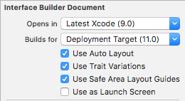
New projects created in Xcode 9 default to using Auto Layout and Safe Area Layout Guides. This is the simplest way to reduce the work needed for iPhone X design.
- Use safe area layout guides.
- Use margin layout guides.
- Center content or inset it symmetrically.
Use Standard UI Elements
Now you’re going to add a search bar with scope bar. And you might as well opt for the new large title, too.
Select Master Scene/Navigation Bar, show the Attributes Inspector, and check the box for Prefers Large Titles:

While you’re here, select the table view’s cell, and set its background color to light gray:
Next, open MasterViewController.swift: it already has most of the search controller code. You just have to replace the TODO comment in setupSearchController() with this:
// In iOS 11, integrate search controller into navigation bar
if #available(iOS 11.0, *) {
  self.navigationItem.searchController = searchController
  // Search bar is always visible
  self.navigationItem.hidesSearchBarWhenScrolling = false
} else {
  tableView.tableHeaderView = searchController.searchBar
}
If the device is running iOS 11, you set the navigation item’s searchController property; otherwise, you put the search bar in the table view’s table header view.
Build and run on the iPhone X simulator. Admire the large title, then rotate the simulator to landscape, and tap the search field to show the scope bar:

The search field, cancel button and scope bar are all nicely inset from the rounded corners and sensor housing. The cell background color extends all the way across, and the table view scrolls under the home indicator. You get all these behaviors free, just for using standard UI elements.
Build and run the app on the iPhone 8 simulator, to see that it looks fine there, too:


Here are some other recommendations:
Status Bar
- The iPhone X status bar is higher, so dynamically position content based on the device type, instead of assuming a fixed 20-pt height.
- Always show the status bar unless hiding it adds real value to your app.