Jetpack Compose Animations Tutorial: Getting Started
In this tutorial, you’ll build beautiful animations with Jetpack Compose Animations, and discover the API that lets you build these animations easily. By Andres Torres.
Jetpack Compose is a new and super awesome toolkit for building native Android UI in a declarative fashion. Building declaratively means the code describes how the UI should look based on the available state, instead of changing the UI every time the state changes. Because of this, Jetpack Compose lets you develop apps using a more modular approach by writing less code and organizing it in smaller and reusable components, which are easier to maintain. But what about Jetpack Compose Animations?
The declarative nature of Jetpack Compose allows the developers to write beautiful and complex animations in an expressive and intuitive way. The flexibility that Jetpack Compose Animations API provides makes it really easy to animate any component’s property to convey information to the user, using meaningful motion! :]
In this tutorial, you’ll learn about Jetpack Compose Animations: how they work behind the scenes, the different options for animating your components, and how to take advantage of them to improve your UI.
In the process, you’ll learn how to:
- Define a start and end state for your transitions.
- Describe your transition in terms of duration and type of animation.
- Use different predefined transition builders, such as tween, repeatable and keyframes.
- Use easing functions to provide more realism or fluidity to your animations.
- Make everything work together in a modular and reusable fashion.
Animations are there to work in favor of the user experience and Jetpack Compose Animations have made this easy. Time to take your app to the next level!
It’s also important to remember that Jetpack Compose is still under development, so it might change in the future. Furthermore, you’ll need Android Studio 4.2 Canary, which is also a bit brittle. Nonetheless, this tutorial will help you prepare for their stable release.
Getting Started
Download the starter project by clicking on the Download Materials button at the top or bottom of the tutorial. Then, open the starter project in Android Studio, where you’ll find Favenimate, a playground for your future animated button.
Then build & run the app. You’ll see the following screen:

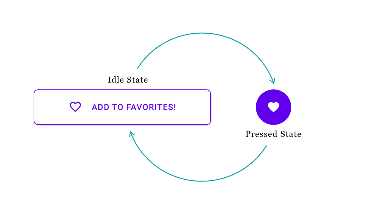
This app is just a showcase to animate a button with a very common functionality that can be reused in any number of apps. Right in the middle of the screen is the button you’ll animate. This button doesn’t do anything now, but in this tutorial, you’ll learn how to animate this button from an idle state to a pressed state and backward.
If you inspect the project closely, you’ll notice a special annotation in the MainActivity.kt file, called @Preview. It is a new annotation, from the Jetpack Compose toolkit, that lets you preview all UI elements within Android Studio. When you build the app at least once, you can interact with individual components, within the IDE. You won’t have to build the app or navigate to certain screens. Simply preview the component! You can see the annotation and special preview controls in the IDE below.

In the first selection, you can see the annotation within MainContent. Because of this annotation, you can preview your components, using the side menu. In the second selection, you can see the side menu and its options. Right now, you’re using the split option, which lets you preview both the code and the design. This is very similar to what you’re used to from XML.
Finally, in the third selection, you can see something called interactive mode. Using interactive mode, you can interact with your components! This allows you to click your buttons and preview them, focus text input, and much more. You can try it out yourself, by tapping on the interactive icon.
Setting up Your Component
Open AnimatedFavButton.kt. This is the file where you’ll work most of the time. Add the following code at the top of the file:
enum class ButtonState {
    IDLE, PRESSED
}
This creates an enum with the different states of your button, namely an idle and a pressed state. You need this, as you’ll have to differentiate between your component being idle, and the user interacting with it! :]
Next, replace the AnimatedFavButton function with the following code:
@Preview //1
@Composable //2
fun AnimatedFavButton() {
    val buttonState = remember { mutableStateOf(ButtonState.IDLE) } //3

    //Transition Definition

    FavButton()
}
Here’s a code breakdown:
-
As mentioned before,
@Previewwill allow you to visualize this component in Android Studio, without having to build the entire app. -
@Composabletells the compiler that the function is a composable function, which will serve as the reusable component for your animated button. - This line defines the initial state of the component as
IDLEand remembers the state even if the UI component draws again. Because the state is mutable, you can change it, forcing the component to draw with the new state.
Before adding some nice vibes to the button, let’s take a step back to review some theory behind Jetpack Compose Animations.
Working With Jetpack Compose Animations
The simplest way to work with animations in Jetpack Compose is by using the Transition component. This component lets you define several things for your animations:
- Start and end states.
- The animation timer.
- Callback for when the animation completes.
- Composable content wrapper function, that lets you add UI elements that you want to animate.
Besides defining this Transition component, you need to also define the start and end state properties as well as describe how these properties must be animated in terms of duration and behavior. This might sound like a lot, but it’s a fairly easy and straightforward process. To show you how easy, let’s start animating the width of the button. :]
To maintain modularity and simplicity in the project, create a new file called AnimPropKeys.kt, in the UI package, with the following code:
import androidx.compose.animation.DpPropKey

val width = DpPropKey()
Jetpack Compose Animations are achieved through the update of PropKeys. A PropKey refers to a property and an animation vector you want to animate. You can easily create your own custom PropKeys but Jetpack Compose Animations come with several built-in PropKeys that make the work incredibly easy. You’ll explore a few of them in this tutorial.
As you might quickly realize, DpPropKey is a built-in PropKey that animates density pixel values. And because you’re going to animate the width of the button, this key works like a charm. :]