Jetpack Compose Animations Tutorial: Getting Started
In this tutorial, you’ll build beautiful animations with Jetpack Compose Animations, and discover the API that lets you build these animations easily. By Andres Torres.
Changing Colors Between States
Changing the shape of your button is something that will quickly grab the user's attention, but you can do even better. Color changes can also quickly remind the user that something just happened and they might need to pay attention.
For your button, you'll invert the colors from one state to the other. Luckily for you, changing colors is just as easy as changing the width or the shape of something. Open AnimPropKeys.kt and add the following code to the end of the file:
val backgroundColor = ColorPropKey()
val textColor = ColorPropKey()
Make sure to add any missing imports! Here, you use another built-in property key but this one, instead of updating dp values, will update... you've guessed it, color values!
Now, move to AnimatedFavButton.kt, and add to the idle state:
this[textColor] = purple500
this[backgroundColor] = Color.White
Make sure to add the following imports to avoid errors:
import androidx.ui.graphics.Color
import com.raywenderlich.android.favenimate.ui.purple500
Next, add the following to the pressed state:
this[textColor] = Color.White
this[backgroundColor] = purple500
Add to the transition from idle to pressed:
backgroundColor using tween(durationMillis = 3000)
textColor using tween(durationMillis = 500)
And finally, add the same code, to the pressed transition:
backgroundColor using tween(durationMillis = 3000)
textColor using tween(durationMillis = 500)
You should be familiar with what you just did! You simply set up some values for different PropKeys as well as their behavior and duration on specific transitions. To make everything come together, you need to pass the state and the button state to the actual button content like you did for the button. Open ButtonContent.kt and change the signature of the ButtonContent to the following:
fun ButtonContent(
   buttonState: MutableState<ButtonState>,
   state: TransitionState
) {
// the body does not change
}
Finally, you need to update the properties to their state values rather than fixed values. Update the color parameter of the Text and the tint parameter of the favorite border Icon to state[textColor]. The resulting code should look like this:
@Composable
fun ButtonContent(
buttonState: MutableState<ButtonState>,
state: TransitionState
) {
Row(verticalGravity = Alignment.CenterVertically) {
Column(
Modifier.width(24.dp),
horizontalGravity = Alignment.CenterHorizontally
) {
Icon(
tint = state[textColor], // new code
asset = Icons.Default.FavoriteBorder,
modifier = Modifier.size(24.dp)
)
}
Spacer(modifier = Modifier.width(16.dp))
Text(
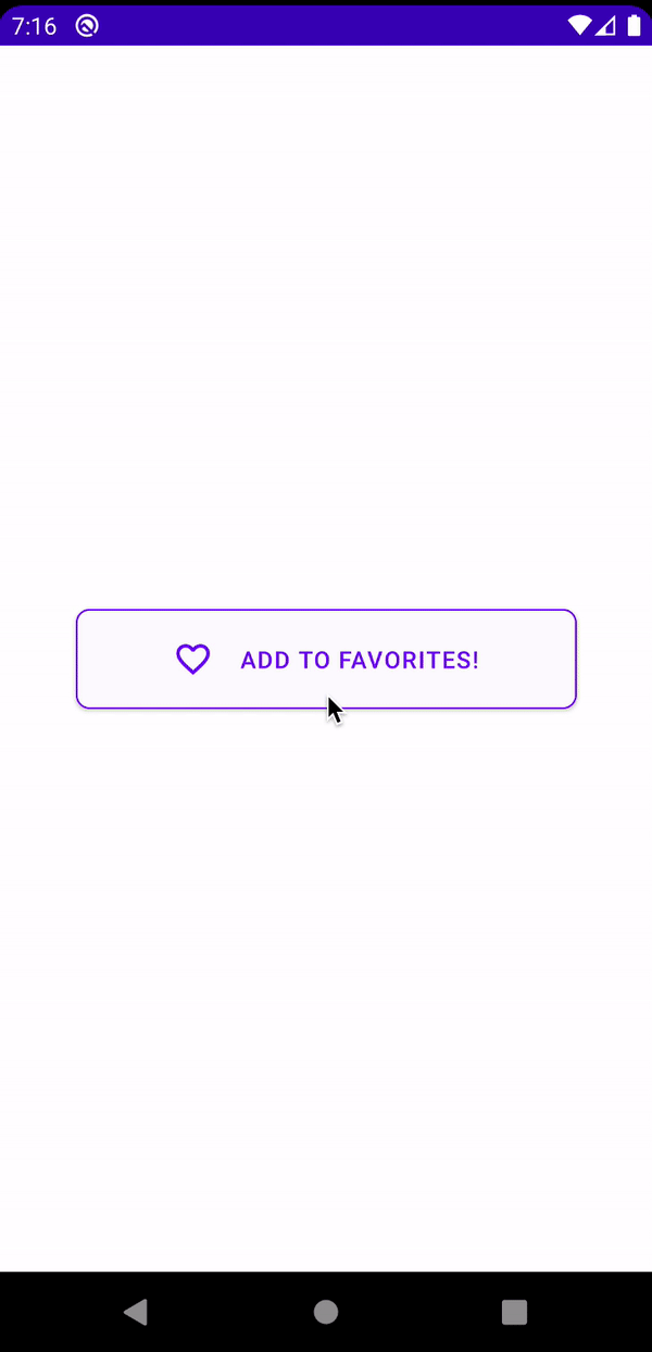
"ADD TO FAVORITES!",
softWrap = false,
color = state[textColor] // new code
)
}
}
On FavButton.kt, update the backgroundColor parameter to state[backgroundColor]. Also, remember to pass the correct parameter to ButtonContent due to the change of signature:
Button(
  border = BorderStroke(1.dp, purple500),
  backgroundColor = state[backgroundColor],
  ...
) {
  ButtonContent(buttonState = buttonState, state = state)
}
Build and run. Check it out!

Look how gracefully your button transitions from one color to another! Even though you're only setting up an initial and final color, Jetpack Compose Animations are smart enough to know how to transition smoothly between them. :]
Fading in/out Button Content
Before doing more fancy stuff, you'll work with another built-in key, the FloatPropKey. As its name implies, this key updates float values. You'll fade in and out the opacity of the content of the button with this key. Add the following values to AnimPropKeys.kt:
val textOpacity = FloatPropKey()
val iconOpacity = FloatPropKey()
You have just set two property keys for the text and icon opacity.
On AnimatedFavButton.kt, add the following code to the idle state:
this[textOpacity] = 1f
this[iconOpacity] = 0f
To the pressed state:
this[textOpacity] = 0f
this[iconOpacity] = 1f
To the transition from idle to pressed:
textOpacity using tween(durationMillis = 1500)
iconOpacity using tween(durationMillis = 1500)
And to the transition from pressed to idle:
textOpacity using tween(durationMillis = 3000)
iconOpacity using tween(durationMillis = 3000)
Open ButtonContent.kt and replace ButtonContent with the following:
@Composable
fun ButtonContent(
        buttonState: MutableState<ButtonState>,
        state: TransitionState
) {
    if (buttonState.value == ButtonState.PRESSED) { //1
        Row(verticalGravity = Alignment.CenterVertically) {
            Column(
                    Modifier.width(24.dp),
                    horizontalGravity = Alignment.CenterHorizontally
            ) {
                Icon(
                        tint = state[textColor],
                        asset = Icons.Default.FavoriteBorder,
                        modifier = Modifier.size(24.dp)
                )
            }
            Spacer(modifier = Modifier.width(16.dp))
            Text(
                    "ADD TO FAVORITES!",
                    softWrap = false,
                    modifier = Modifier.drawOpacity(state[textOpacity]), //2
                    color = state[textColor]
            )
        }
    } else {
        Icon( //3
                tint = state[textColor],
                asset = Icons.Default.Favorite,
                modifier = Modifier.size(48.dp).drawOpacity(state[iconOpacity]) //4
        )
    }
}
Add the following imports to avoid errors:
import androidx.ui.material.icons.filled.Favorite
import androidx.ui.core.drawOpacity
Here is a breakdown of the previous code:
- Based on the state of the button, you switch the component that works as the content of the button, either a
Rowor anIcon. - You add a modifier to the text that will slowly fade it in/out based on the button state.
- You add a full heart icon that will appear when the button is in pressed state.
- This is a modifier on the icon that will slowly fade it in/out based on the button state.
Build and run. See how the transparency changes in your components seamlessly, providing an incredibly smooth experience to the user.
Jetpack Compose Animations once again prove how easy it is to build beautiful UI, with meaningful motion! :]
Animating Idle State Using Keyframes
In the last two sections of this tutorial, you'll truly elevate your component by adding some custom animations with the help of some unexplored, built-in animation builders. In this section, you'll animate the pressed state of your button to give a wink to the user. :]
Open AnimPropKeys.kt file and add:
val pressedHeartSize = DpPropKey()
Now, open AnimatedFavButton.kt and, in both idle and pressed states, add:
this[pressedHeartSize] = 48.dp
Add the following code to the transition from idle to pressed:
pressedHeartSize using keyframes {
  durationMillis = 2200
  48.dp at 1700
  12.dp at 1900
}
The keyframes builder allows you to define an exact value for a specific frame of the animation. Through pairs of values and durations, you define the needed value on specific frames of the animation. Note that Jetpack Compose Animations will transition smoothly between the start, end, and defined states. If you see an error with the durationMillis property saying it should be greater than 0, just ignore it. It seems to be a bug with Android Studio, but you should be able to run the code.
Open ButtonContent.kt file and replace the modifier for the favorite Icon with:
modifier = Modifier.size(state[pressedHeartSize]).drawOpacity(state[iconOpacity])
Now, you can build and run your project. Check out the quick "wink" the pressed state gives you. :]
