Beginning Auto Layout Tutorial in iOS 7: Part 2
An Auto Layout tutorial that is fully up-to-date with Xcode 5 and iOS 7! By Matthijs Hollemans.

Note from Ray: Tutorial Team member Matthijs Hollemans (the iOS Apprentice Series author) has ported this tutorial to iOS 7 as part of the iOS 7 feast. We hope you enjoy!
In part 1 of this Auto Layout tutorial you saw that the old “struts-and-springs” model for making user interfaces cannot easily solve all layout problems. Auto Layout is the solution, but because this technology is so powerful it is also a bit more tricky to use.
Thankfully, Xcode 5 makes Auto Layout a lot easier. If you tried Auto Layout in Xcode 4 and gave up, then we invite you to give it another try with Xcode 5.
In this second part and final part of the Auto Layout tutorial series, you’ll continue learning all about constraints and how to apply them!
A little runtime excursion
This Auto Layout tutorial begins with a very simple app that looks like this:

It has two buttons that have their background color set just so it’s clearer to see their boundaries. The buttons have a number of constraints between them. If you’ve been following along with the previous part you can continue using your existing app. Simply remove the other two buttons from the canvas.
If you’re starting from scratch, create a new iPhone application using the Single View Application template. Drag two buttons into the scene and give them a background color. Use the Editor\Pin menu to make a Vertical Spacing constraint between the two buttons (40 points), and a Bottom Space to Superview constraint on the lower button (20 points). Use the Editor\Align menu to center the yellow button horizontally in the container, and again to align the left edges of both buttons.
Playing with this in Interface Builder is all well and good, but let’s see how this works at runtime. Add the following method to ViewController.m:
- (IBAction)buttonTapped:(UIButton *)sender
{
    if ([[sender titleForState:UIControlStateNormal] isEqualToString:@"X"]) {
        [sender setTitle:@"A very long title for this button"
                forState:UIControlStateNormal];
   } else {
        [sender setTitle:@"X" forState:UIControlStateNormal];
   }
}
This toggles between a long title and a short title for the button that triggered the event. Connect this action method to both of the buttons in Interface Builder. Ctrl-drag from each button to the view controller and select buttonTapped: in the popup.
Run the app and tap the buttons to see how it behaves. Perform the test in both portrait and landscape orientations.

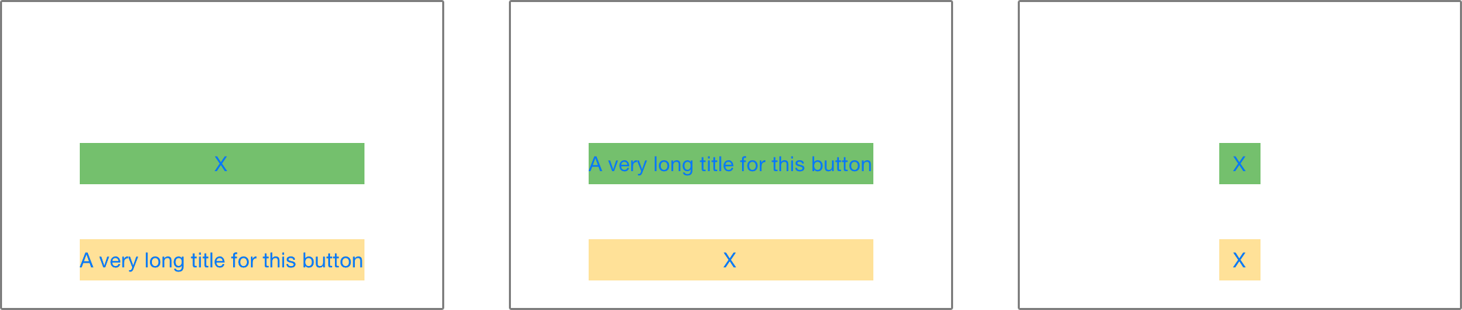
Regardless of which button has the long title and which has the short title, the layout always satisfies the constraints you have given it:
- The lower button is always center-aligned in the window, horizontally.
- The lower button always sits 20 points from the bottom of the window.
- The top button is always left-aligned with the lower button and 40 points above it.
That is the entire specification for your user interface.
For fun, remove the Leading Alignment constraint (select it in the outline pane and press Delete on your keyboard), then select both buttons in Interface Builder and from the Align menu pick Right Edges. Now run the app again and notice the differences.
Repeat, but now choose Align\Horizontal Centers. That will always center the top button with respect to the bottom button. Run the app and see how the buttons act when you tap them. (Remember, if you get a dashed orange box when you change the constraints, you can use the Editor\Resolve Auto Layout Issues menu to update the button frames accordingly.)
Fixing the width
The Pin menu has an option for Widths Equally. If you set this constraint on two views, then Auto Layout will always make both views equally wide, based on which one is the largest. Let’s play with that for a minute.
Select both buttons and choose Editor\Pin\Widths Equally. This adds a new constraint to both buttons:

You have seen this type of constraint before, in the first part of this tutorial. It looks like the usual T-bar but in the middle it has a circle with an equals sign.
Even though there are two T-bars, in the Document Outline this shows up as a single Equal Widths constraint:

Changing the label text on one button will now change the size of the other one as well. Change the bottom button’s label to “X”, just to make it really small. You will notice that the top button no longer fits its text:

So how does Auto Layout know which button’s size to use for both of them? If you pay close attention, you’ll see that the top button’s frame is no longer correct:

Obviously this is not what you want, so select the top button and choose Size to Fit Content from the Editor menu (or press ⌘ =). Now the text fits inside the button again – or rather, the button fits around the text – and due to the Equal Widths constraint the yellow button also resizes.
Run the app and tap the buttons. The buttons always have the same width, regardless of which one has the largest label:
Of course, when both labels are very short, both buttons will shrink equally. After all, unless there is a constraint that prevents it, buttons will size themselves to fit their content exactly, no more, no less. What was that called again? Right, the intrinsic content size.
Intrinsic Content Size
Before Auto Layout, you always had to tell buttons and other controls how big they should be, either by setting their frame or bounds properties or by resizing them in Interface Builder. But it turns out that most controls are perfectly capable of determining how much space they need, based on their content.
A label knows how wide and tall it is because it knows the length of the text that has been set on it, as well as the font size for that text. Likewise for a button, which might combine the text with a background image and some padding.
The same is true for segmented controls, progress bars, and most other controls, although some may only have a predetermined height but an unknown width.
This is known as the intrinsic content size, and it is an important concept in Auto Layout. You have already seen it in action with the buttons. Auto Layout asks your controls how big they need to be and lays out the screen based on that information.
Usually you want to use the intrinsic content size, but there are some cases where you may not want to do that. You can prevent this by setting an explicit Width or Height constraint on a control.
Imagine what happens when you set an image on a UIImageView if that image is much larger than the screen. You usually want to give image views a fixed width and height and scale the content, unless you want the view to resize to the dimensions of the image.
So what happens when one of the buttons has a fixed Width constraint on it? Buttons calculate their own size, but you can override this by giving them a fixed width. Select the top button and choose Pin\Width from the menu. This adds a solid T-bar below the button:

Because this sort of constraint only applies to the button itself, not to its superview, it is listed in the Document Outline below the button object. In this case, you have fixed the button to a width of 46 points.
You cannot simply drag the button’s resize handles to make the button wider. If you do, you’ll end up with a whole bunch of orange boxes. Remember that Xcode 5 does not automatically update the constraints for you (unlike Xcode 4). So if you make a change to the button’s frame, it’s up to you to make the constraints match again. The alternative approach is to simply change the constraint instead.
Select the Width constraint and go to the Attributes inspector. Change Constant to 80 to make the button wider:

Run the app and tap the buttons. What happens? The button text does change, but it gets truncated because there is not enough room:

Because the top button has a fixed-width constraint and both buttons are required to be the same size, they will never shrink or grow.
Note: You probably wouldn’t set a Width constraint on a button by design – it is best to let the button use its intrinsic size – but if you ever run into a layout problem where you expect your controls to change size and they don’t, then double check to make sure a fixed Width constraint didn’t sneak in there.
Play around with this stuff for a bit to get the hang of pinning and aligning views. Get a feel for it, because not everything is immediately obvious. Just remember that there must always be enough constraints so that Auto Layout can determine the position and size for all views.
